Top 10 Business Card Designs for 2026 (All Editable)

At a trade show last year I watched someone take a card, look at it for maybe a second and a half, and slide it into the back pocket of their jeans. That's the whole review. A second and a half, and the card either got saved to their phone that evening or went through the wash on Sunday.
Nothing in that second and a half is about your phone number. It's style — the thing the card looks like from arm's length before any word is read. So this is a gallery, not a lecture: ten business card designs for 2026, each one a different visual language, each one built in Ridvay Studio and editable in your browser. Swap the name, keep the look.
One rule before the gallery, because it's the thing most AI card generators get wrong: a business card is 3.5 × 2 inches, and every one of these is built on that canvas at 1050 × 600 px (300 DPI). If you design at some arbitrary square and scale it later, your type shrinks to unreadable and your margins go to nothing. Start at the right size.
The 10 business card designs
1. Ink & Ivory — the minimal card
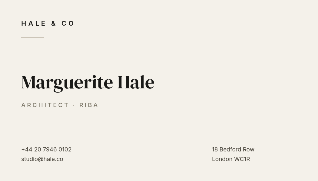
Who it's for: architects, consultants, lawyers, anyone whose pitch is judgement rather than energy.
What defines it: an off-white stock instead of pure white, one high-contrast serif for the name, and roughly 60% of the card left empty on purpose. The contact details drop to 19px and split into two corners so they read as a footnote, not a headline. Confidence here is expressed as restraint — if you add one more element, you lose it.
A minimalist business card, 3.5 x 2 inches, warm ivory background, name in a large high-contrast serif, small letterspaced wordmark top-left with a short rule under it, phone and address in the two bottom corners
2. Big Type — the card that fills itself
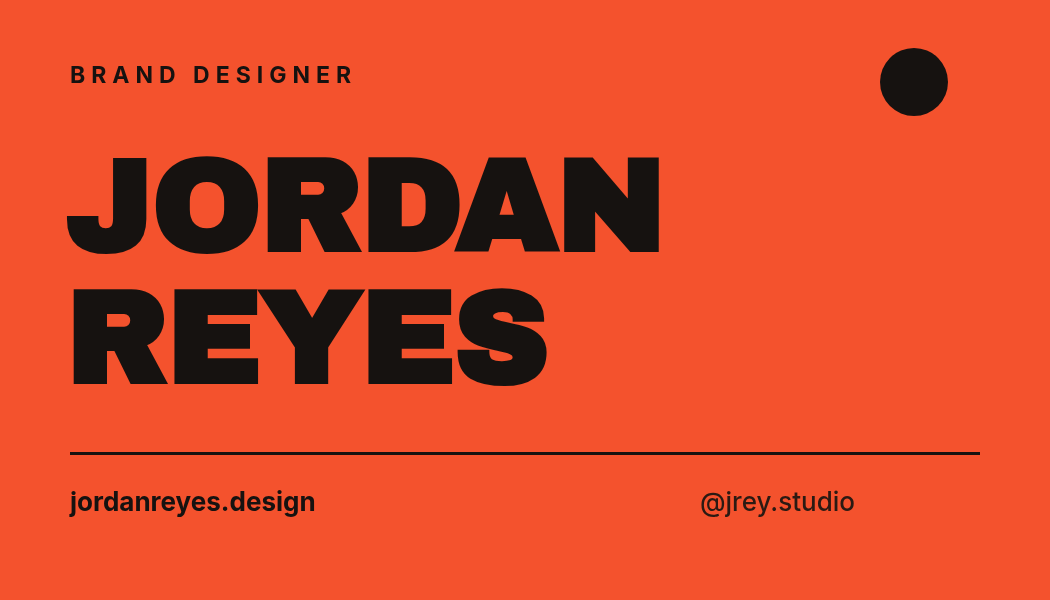
Who it's for: designers, photographers, agencies — people hired partly on nerve.
What defines it: your name at 130px in a heavy condensed face, running nearly edge to edge, on a saturated flat colour. There's no logo because the name is the logo. The trick that keeps it from looking like a school poster is the tight negative letterspacing and the hairline rule that pins the two footer items to a shared baseline.
A bold typographic business card, 3.5 x 2 inches, full-bleed burnt orange background, my name in huge black condensed caps across two lines, role in small letterspaced caps at the top, website and social handle along the bottom above a thin rule
3. Midnight Luxe — black, gold, and a lot of air
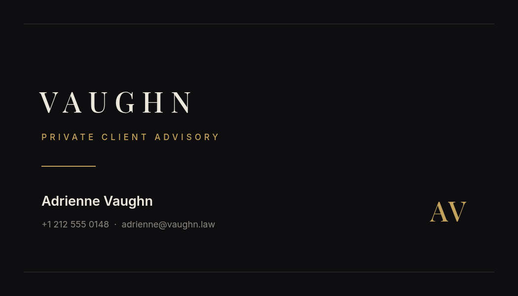
Who it's for: private client services, jewellers, high-ticket consultancies, wealth and legal.
What defines it: near-black rather than pure black, a single warm metallic accent, and wide letterspacing on the wordmark — 14px between letters is what makes serif type feel expensive rather than old. Two hairline rules top and bottom frame the card without drawing a border. The monogram parked at the right edge balances a block of text that's otherwise all on the left.
A luxury business card, 3.5 x 2 inches, near-black background with a muted gold accent, brand name in a widely letterspaced serif, a thin gold rule, name and contact in small sans-serif, initials as a gold monogram at the right edge
4. Split Panel — colour block meets contact block
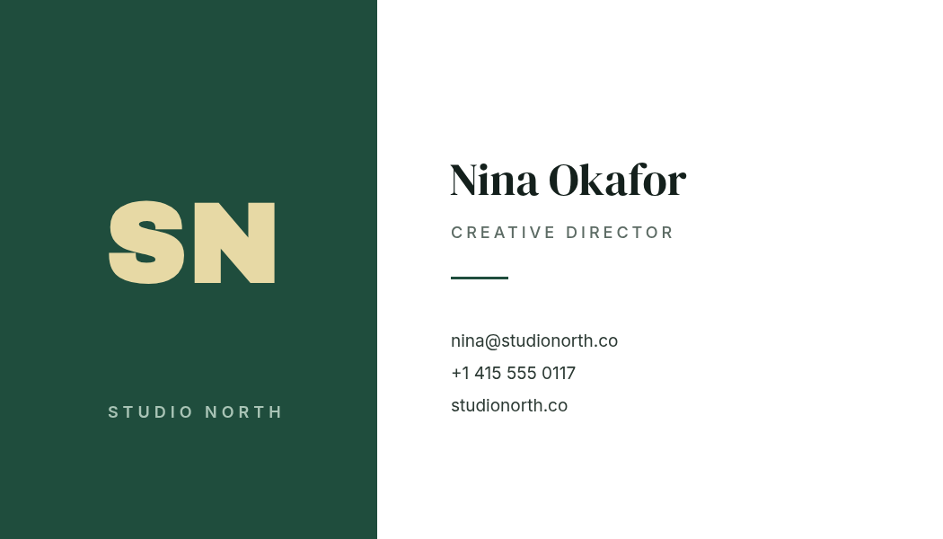
Who it's for: studios and small agencies with an actual brand colour to show off.
What defines it: a hard vertical split at 40% of the width. The colour panel carries the identity — monogram plus studio name — and the white side carries the human. It's the most systematic card here: give five people at the same firm this layout and they'll look like a team without anyone opening a brand manual.
A business card, 3.5 x 2 inches, split vertically with a deep forest green panel on the left third holding a large cream monogram and the studio name, and the person's name, role and three contact lines on white to the right
5. Monogram Badge — the centred, symmetrical card

Who it's for: salons, boutiques, bakeries, wellness — service businesses where the brand mark matters more than the individual.
What defines it: everything on a centre axis, stacked. A filled circle with two initials does the work a logo would, so this is the style to pick when you don't have a logo yet and don't want to fake one. Watch the vertical rhythm rather than the horizontal: badge, brand, name, rule, contact — each gap slightly larger than the type it follows.
A centred business card, 3.5 x 2 inches, cream background, a terracotta circle badge with two initials at the top, salon name in letterspaced caps below it, owner name in a serif, and a hairline rule above a single centred contact line
6. Vertical — the card that's turned 90°
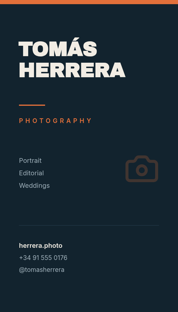
Who it's for: photographers, videographers, creatives who want to be noticed in a stack.
What defines it: the same 3.5 × 2 inches, rotated to portrait (600 × 1050 px). That's the entire idea, and it works because every other card in the pile is landscape — yours is the one that's physically the wrong way round in the hand. Portrait gives you a natural three-band structure: name up top, services in the middle, contact at the base.
A vertical portrait business card, 600 x 1050 px, dark teal background with a burnt orange bar across the top, photographer name in heavy caps stacked on two lines, a short list of services in the middle, and contact details under a hairline at the bottom
7. Swiss Grid — the engineer's card
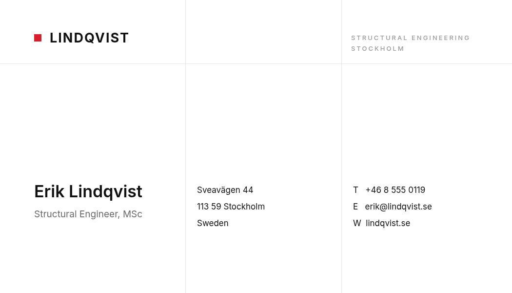
Who it's for: engineers, architects, technical consultants, anyone who'd rather look precise than warm.
What defines it: the grid is visible. Three columns, one horizontal rule, and every block starting on the same baseline. Contact details get single-letter labels — T, E, W — instead of icons, which reads cleaner in print and never renders as a broken glyph. The one 15px red square is the entire colour budget, and it's enough.
A Swiss grid business card, 3.5 x 2 inches, white background with faint vertical column rules, a small red square beside a bold surname wordmark, name and role in the left column, address in the middle, and T E W contact lines in the right column
8. QR-First — the card that saves itself
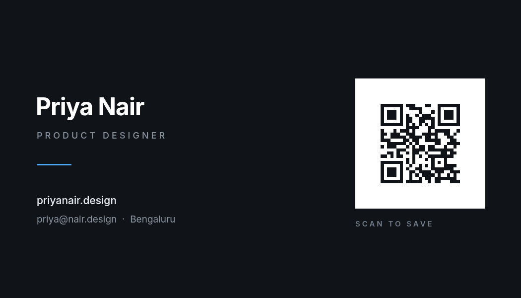
Who it's for: anyone at events, and anyone whose real contact surface is a portfolio site.
What defines it: the QR isn't a small courtesy in the corner — it's a 262px white panel, the second-biggest thing on the card after the name. The white plate is the point: a QR printed straight onto a dark background scans badly, and a code with no quiet zone around it often doesn't scan at all. Give it a white bed with ~26px of margin on every side and it works at arm's length in bad lighting.
The QR here is a real, scannable vector generated from a URL — not a picture of a QR code — so it stays crisp at any print size. We wrote up the scanning rules in more detail in how to put a QR code on a flyer people actually scan.
A dark business card, 3.5 x 2 inches, name in large bold sans on the left with role and website below a short blue rule, and a real scannable QR code to my portfolio on a white panel on the right with SCAN TO SAVE underneath
9. Warm Botanical — earth tones and a serif

Who it's for: florists, cafés, ceramicists, wellness practitioners, makers.
What defines it: a sand background instead of white, two large low-contrast circles behind the type for depth, and a palette borrowed from the material world — sage, terracotta, clay. The small leaf mark sits alone in the top-left corner where a logo would go. Keep the circles under about 20% contrast against the background or they stop being texture and start being shapes.
A warm botanical business card, 3.5 x 2 inches, sand background with two large soft beige circles on the right, a small green leaf mark top-left, studio name in a serif, EST year in letterspaced caps, and contact details under a terracotta rule
10. Terminal — the dark tech card

Who it's for: developers, technical founders, indie hackers, dev-tool companies.
What defines it: near-black with faint vertical grid lines, one electric accent, and a geometric-mono type feel — including a comment-syntax tagline (// ship faster, break less) that would be a gimmick anywhere else and is correct here. The email in mono is a small honesty signal: this person types for a living.
A dark tech business card, 3.5 x 2 inches, near-black background with faint vertical grid lines, lowercase startup name in bright green geometric sans, a code-comment tagline, founder name and role, monospace email and GitHub link, and a small terminal icon in a glowing square on the right
Building one in Ridvay Studio
Pick the style that matches the work you do, then make it yours. Paste this into Ridvay Studio — it's the prompt behind card #1, with the details swapped for placeholders:
A minimalist business card, 3.5 x 2 inches, warm ivory background, my name in a large high-contrast serif, a small letterspaced wordmark top-left with a short rule under it, role in letterspaced caps, phone and email in the bottom-left corner and address bottom-right
What comes back isn't a flat image you regenerate until you get lucky. It's an editable design — the name is a text layer, the rule is a shape, the background is a fill — so the next three minutes look like this:
- Click the name and drag the size up until it fills about two-thirds of the card's width. On a minimal card the name is the only thing carrying hierarchy, so it has to be unambiguously the largest element.
- Push the contact block down and shrink it to ~19px. Details you'd never read aloud shouldn't compete with the one thing you want remembered. This is the same contrast-of-scale idea from design principles for non-designers.
- Recolour the rule to your brand colour and leave everything else neutral. One accent, used once, reads as deliberate; the same colour used four times reads as a template.
- Apply your brand kit if you have one, and the fonts and palette drop onto the card in one click — the way to keep a card, a flyer and an Instagram post looking related.
Then duplicate the page for the back. Backs are free real estate that most people waste: a solid colour block with just the logo, or the QR panel from card #8, is better than a repeat of the front.
Design your business card in Ridvay Studio →
Getting it printed without surprises
Three things separate a card that looks like the screen from one that comes back wrong.
Bleed. Printers cut through a stack, and the blade wanders by a millimetre or two. Any colour that runs to the edge — the orange of card #2, the green panel of card #4 — needs to extend about 1/8 inch (roughly 36px at 300 DPI) past where the cut will land, and nothing you need to read should sit within that same margin of the edge.
Resolution. Export at 300 DPI, which is what the 1050 × 600 canvas gives you at 1×. Anything you drop in — a logo, a photo — has to be sharp at that size too; a 200px logo scaled up will print soft even though the card around it is crisp. There's more on this in why your design prints blurry.
Colour. Screens are RGB and presses are CMYK, so bright saturated colours — that orange especially — come back a little duller than they look here. Nudge them brighter before you send, or pick a colour that's already inside CMYK's range. RGB vs CMYK covers what shifts and by how much.
Which one is yours?
If you're stuck between two, the tiebreaker isn't taste — it's the room. A card that gets handed over at a conference table can be quiet and minimal, because you're already talking. A card left in a bowl by a till has about a second to be picked up out of forty others, and that's what Big Type and Vertical are for.
All ten are editable, all ten are free to open, and none of them needs a designer. Start from whichever one is closest and change the parts that aren't you.