Top 10 Wall Calendar Designs for 2027 (All Editable)

Nobody buys a wall calendar in January. They buy it now — in the quarter when print shops quote, Etsy sellers list, and somebody in marketing remembers the client gift was supposed to go out in November. If you're designing a 2027 calendar, this is the window.
So here are ten wall calendar designs, all made in Ridvay Studio, all editable, each one a real page with real 2027 dates in it. Every style has the prompt that produced it and a link that opens it in the editor with your name on it instead of mine.
But before the gallery, the thing that makes calendar design different from every other artifact I've covered here.
The grid is the product
A poster gets looked at once. A calendar gets looked at from three metres away, at an angle, by someone who is already halfway out the door and just wants to know whether the 14th is a Tuesday.
That single fact settles most of the design decisions:
- The date grid gets the bottom 40–45% of the page, minimum. Below that, the numerals shrink past the point where you can read them standing up. On a 1080px-wide page, I keep date numerals at 52–62px — that's about 12–15mm printed on A3, which is the smallest thing you can read across a kitchen.
- The art zone gets what's left, and it has to survive being ignored for 30 days at a stretch. Loud is a bad bet. The calendars that stay on walls are quiet.
- Colour the weekend. One colour change across the last two columns gives the eye a fence post every seven days. It's the cheapest legibility win in the whole artifact, and eight of the ten designs below use it.
- Pick a week start on purpose. Monday-first is the European default, Sunday-first the American one. Get it wrong for your audience and the calendar is subtly unusable all year. All ten of mine start Monday.
And the one that catches people out: 2027 has two six-row months. May and August both spill onto a sixth week row. If you lay out your grid for five rows because January happened to fit, your design breaks twice — and it breaks after you've approved the proof. Build the grid at six rows, then let the short months breathe.
Right. The ten.
1. Swiss Grid Minimal
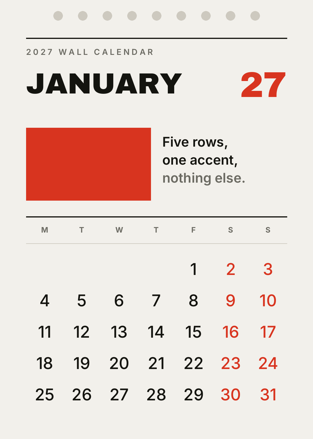
Rules, one accent colour, and a lot of nothing. The month in heavy sans at the top left, the year cropped to two digits in red at the right, a solid colour block doing the work a photo would normally do.
Who it's for: design studios, architecture practices, anyone who wants the calendar to disappear into a white wall until it's needed.
A 2027 wall calendar page for January, Swiss style, off-white background, JANUARY in heavy black sans at the top left, 27 in red at the right, a solid red rectangle, thin horizontal rules, Monday-start date grid with red weekends
2. Oversized Type
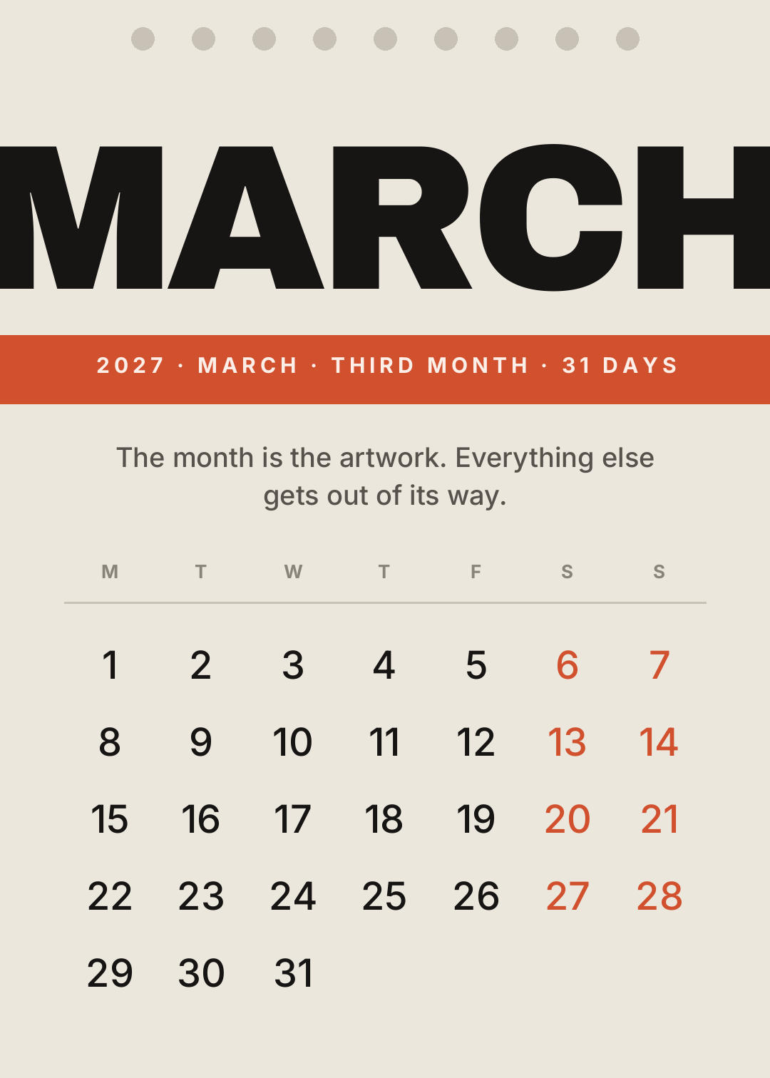
The month name set so large it runs off both edges, with a coloured information bar under it. No illustration, no photo — the typography is the artwork.
This is the cheapest style to produce well, because there's nothing to source. It's also the least forgiving: at 290px the letterforms are furniture, so a weak typeface has nowhere to hide.
Who it's for: creative studios, record shops, cafés — anywhere a poster would work but a calendar has to earn the nail.
A 2027 wall calendar page for March, cream background, the word MARCH in enormous black condensed type bleeding off both edges, an orange information bar underneath, Monday-start date grid
3. Botanical Line Art
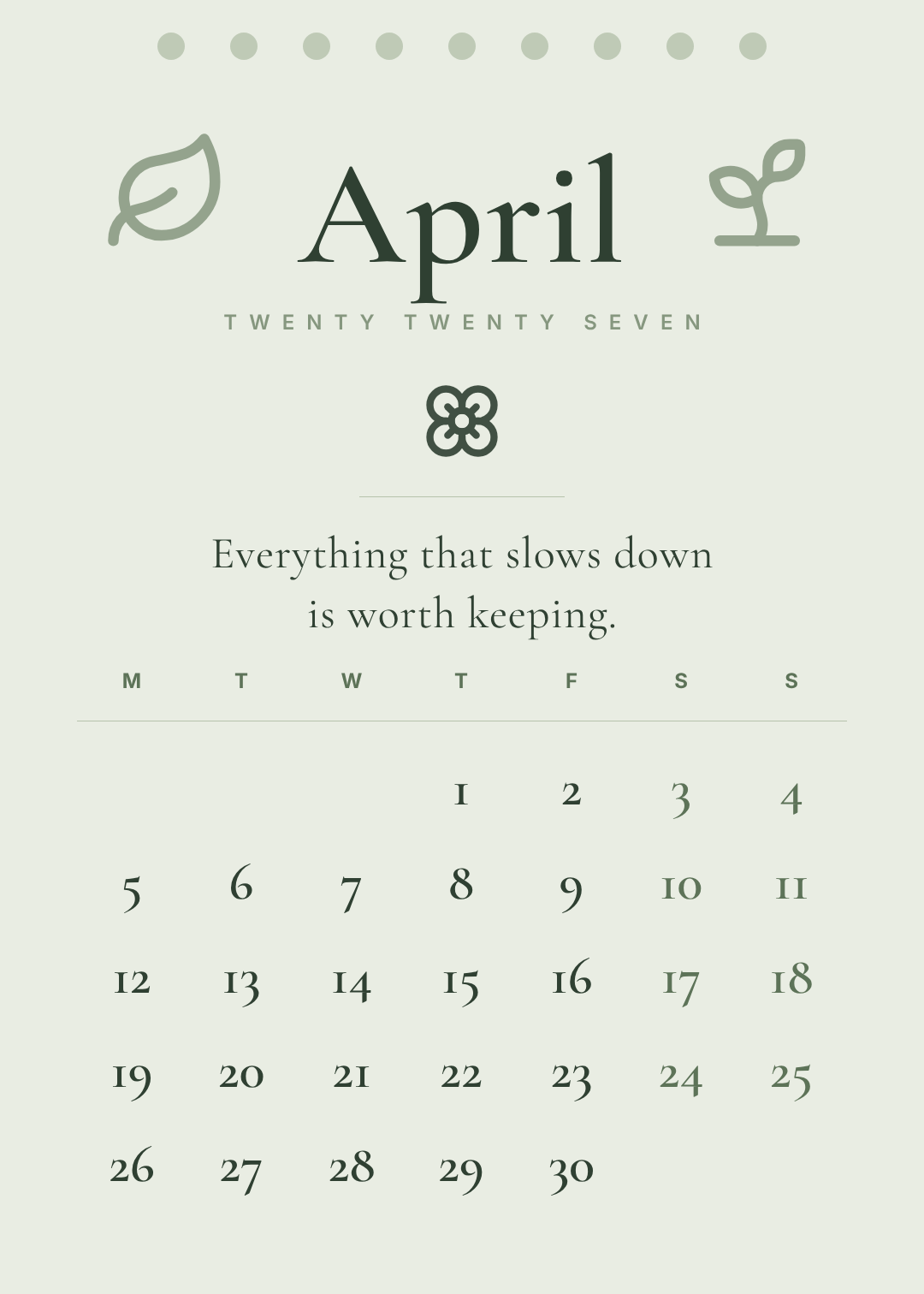
Sage, deep green, thin-stroke leaves, and a serif with old-style numerals — the figures that dip below the baseline, so 3 and 5 hang low like lowercase letters.
Worth knowing: old-style numerals look beautiful and scan slower. That's a real trade, not a mistake. For a calendar somebody stares at lovingly, it's fine. For a shared office wall, use lining figures.
Who it's for: Etsy sellers, florists, wellness brands — the gift market, where the calendar is the present.
A 2027 wall calendar page for April, soft sage green background, thin line-art leaf and sprout illustrations, April in an elegant serif, a short quiet line of copy, Monday-start date grid in the same serif
4. Photo Half-Page
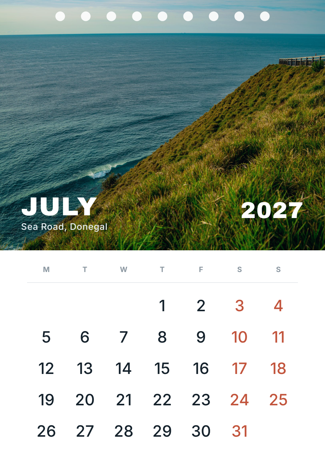
The classic, and still the best-selling format in every print shop in the world: a photo on the top 55%, a clean white band with the grid below it, the month set over the bottom of the image in white.
The trick that makes it look professional rather than homemade is the tint — a barely-there dark scrim over the photo so white type stays readable no matter which photo you swap in next month. Set it once, and all twelve pages work.
Who it's for: travel, tourism boards, pet and family calendars, charities selling a member photo competition.
A 2027 wall calendar page for July, large landscape photograph of a coastal cliff path filling the top half, a dark tint over it, JULY in white heavy sans over the photo, white band below with a Monday-start date grid
5. Blueprint Dark

Near-black page, monospace everywhere, hairlines at about 10% opacity so the grid is felt rather than read, and one cyan accent marking the weekend.
February 2027 is the one month of the year that fits in exactly four rows with no spill — 28 days starting on a Monday. A dark, technical layout is the one style where that tidiness actually shows.
Who it's for: engineering teams, workshops, gyms, studios with black walls.
A 2027 wall calendar page for February, near-black background, monospace type, FEBRUARY in white heavy sans, a cyan accent rule, faint hairline grid lines, Monday-start date grid with cyan weekends
6. Risograph Colour-Block
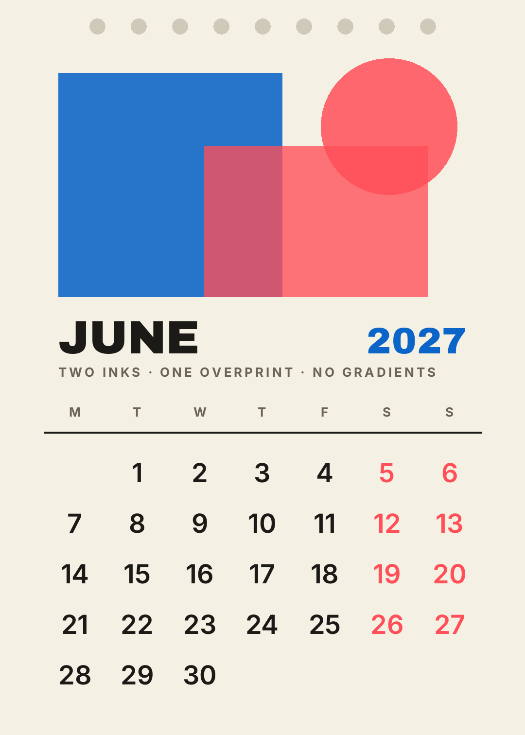
Two flat inks, overlapping, with the overlap showing through — the look of a risograph print, which is genuinely two passes of translucent ink on cheap paper.
The whole style depends on committing to two colours and no gradients. Three inks and it stops reading as riso and starts reading as a mistake.
Who it's for: indie print shops, record labels, zine makers, anyone selling at a market stall.
A 2027 wall calendar page for June, risograph style on cream paper, two overlapping flat ink blocks in bright blue and red with visible overprint, JUNE in heavy black sans, Monday-start date grid
7. Playful Kids
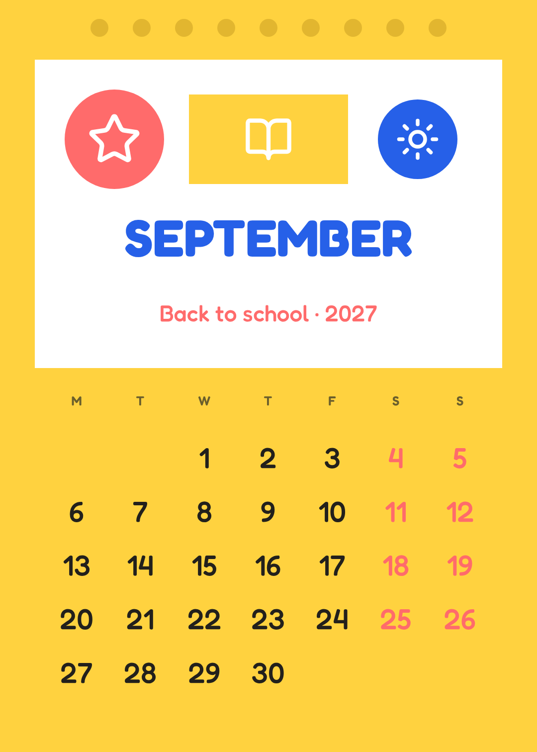
Bright yellow page, a white panel, three chunky shapes with icons in them, and a rounded typeface for the numerals so the dates match the drawing rather than fighting it.
Counterintuitive point: kids' calendars need bigger date numerals than adult ones, not smaller. They're hung low, read by someone counting days to a birthday, and the whole job is "how many more sleeps".
Who it's for: families, nurseries, primary schools, paediatric practices.
A 2027 wall calendar page for September, bright yellow background, a white panel with three chunky rounded shapes in coral, yellow and blue holding a star, book and sun icon, SEPTEMBER in a rounded friendly font, Monday-start date grid
8. Editorial Serif
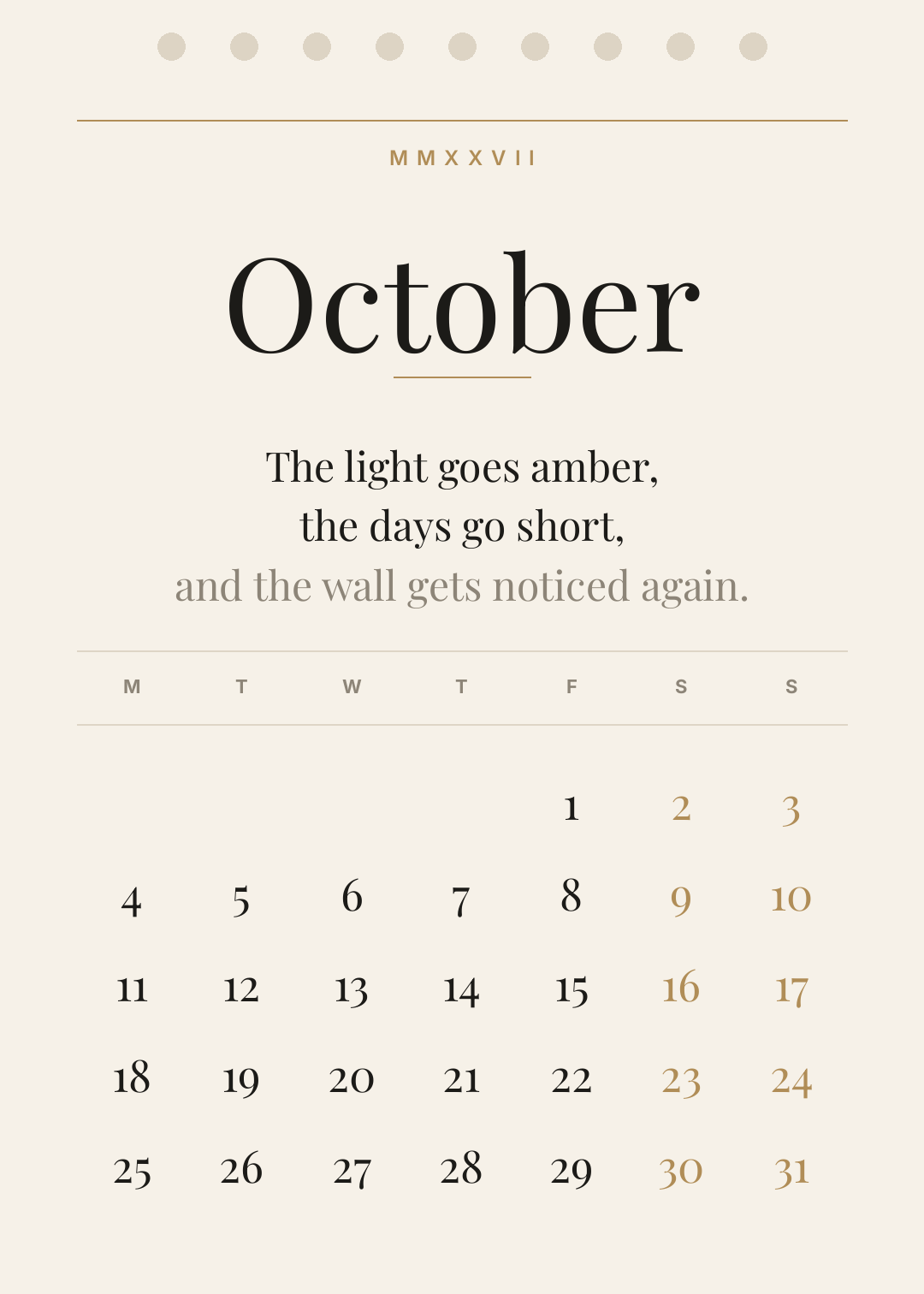
Cream, ink, one gold hairline, a high-contrast serif and enough margin to feel expensive. The year in Roman numerals at the top because this style can carry it.
Everything here is restraint: two rules, one accent, and three lines of copy that are allowed to be a little bit sentimental because October is.
Who it's for: boutique hotels, salons, jewellers, wine shops — the places where the calendar is part of the interior.
A 2027 wall calendar page for October, cream background, October in a large elegant high-contrast serif, MMXXVII in small caps above it, thin gold hairlines, three short sentimental lines, Monday-start date grid in the same serif
9. Year at a Glance
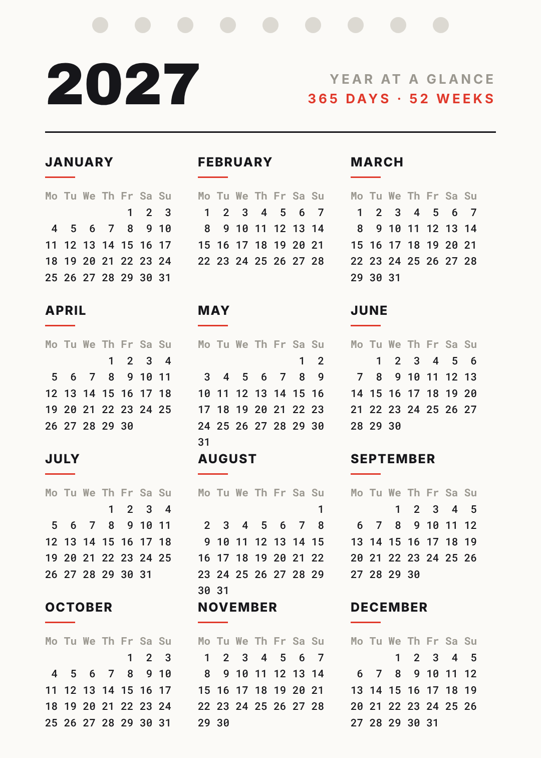
All twelve months on one sheet, in a 3×4 block, set in monospace so every column lines up without any layout work at all.
That's the actual trick here, and it's worth stealing: in a monospace typeface a mini-month is just six lines of plain text with spaces in them. No grid, no tables, no fiddling. It's the only calendar style that gets easier the more dates you put on it.
Who it's for: ops teams, project managers, anyone who plans in quarters and needs the whole year visible at once.
A 2027 year-at-a-glance wall calendar, off-white background, 2027 large in black at the top, all twelve months in a three by four grid set in monospace with small red rules under each month name
10. Brand Calendar
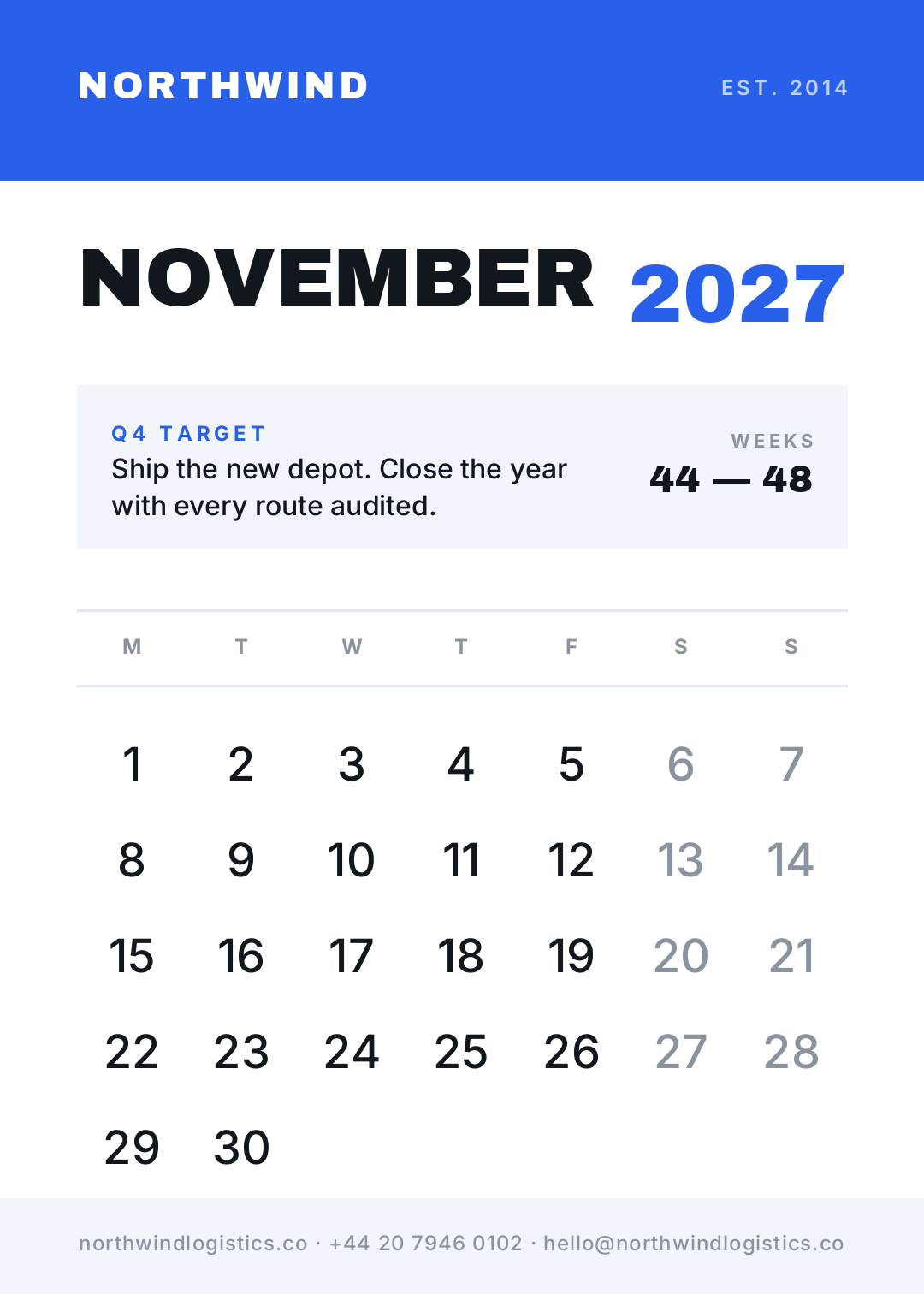
The one people actually get asked to make: a company calendar for clients and staff. Brand bar at the top, logo lockup, the month in the brand's heavy face, a quarterly goal in a tinted box, week numbers, and contact details in the footer.
Week numbers are the detail that separates a corporate calendar from a decorative one. If your business talks in "week 46", printing it means nobody has to count.
Who it's for: any business printing a client gift, and every ops team that has ever argued about which week week 1 is.
A 2027 wall calendar page for November, white background, a blue brand bar across the top with a company name, NOVEMBER in heavy black sans with 2027 in blue, a tinted box with a Q4 goal, week numbers, Monday-start date grid, contact details in a footer
Building one in Ridvay Studio
Take number 10, because it's the one with a real brief behind it. Say you're Northwind Logistics and 400 client calendars have to be at the printer by mid-October.
Paste this into Studio:
A 2027 wall calendar page for November, white background, a blue brand bar across the top with the company name NORTHWIND, NOVEMBER in heavy black sans with 2027 in blue, a tinted box holding a Q4 goal, week numbers, a Monday-start date grid, and contact details in a footer
What comes back isn't a flat image you have to regenerate when it's nearly right. It's an editable design — the brand bar is a shape you can recolour, NOVEMBER is a text layer, and every date column is its own text element you can nudge. Four edits get it to press:
- Click the brand bar and drop in your own colour. If you've saved a brand kit, apply it and the bar, the month and the accent all move together — which matters when you're about to repeat this twelve times.
- Push the date numerals up to about 56px. That's the 40/45% rule from the top of this post: if the grid looks comfortable on screen it's usually too small on the wall. Make it look slightly too big.
- Recolour the weekend columns to a muted grey rather than the brand blue. Weekends should read as different, not as important.
- Duplicate the page eleven times and change the month. Same layout, new dates — and when you get to May and August, that sixth row is already accounted for.
Then export at print resolution. Calendars are the one thing people genuinely print large, so it's worth two minutes on DPI and canvas size before you send the PDF — a grid that looks crisp at screen size can go soft at A3, and you find out 400 copies later.
Start your 2027 calendar in Studio →
Printing it
A few numbers, because calendars are a print product and the file is the deliverable:
- A3 (297×420mm) is the standard wall size. A4 is the standard desk size. Design at the aspect ratio you'll print — a 5:7 page like the ones above crops badly onto A3 if you leave it to the printer.
- Wire binding needs a top margin of at least 15mm that nothing important sits in. Every design above leaves that room; the dots at the top are where the wire goes.
- Export at 300 DPI. An A3 page at 300 DPI is 3508×4961px. If your export is 1080px wide, it will print soft, and it will print soft on all twelve pages.
- Check your six-row months before the proof, not after. For 2027 that's May and August.
Ten styles, one grid discipline, and a window that closes around the end of October. The gallery above is all editable — pick the one that matches the wall it's going on and change the name on it.