Top 10 Car Brochure Designs for 2026 (All Editable)

A dealership near me hands out a flyer that is one photo of a silver sedan, the word SALE in red, and eleven lines of small print. It has everything on it. It says nothing.
That's the recurring failure in car collateral. A car carries more sellable facts than almost any other product — trim, engine, mileage, warranty, monthly payment, financing terms, trade-in value, dealer address, opening hours — and the instinct is to fit all of them onto one page. The brochures that actually move metal do the opposite. Each one picks a single job and lets the other ten facts go.
So this is a car brochure design gallery organised by job, not by decoration. Ten layouts, ten different buyers, ten different things the page is trying to get someone to do. Each one below was composed in Ridvay Studio and each is editable — real text, colour and shape layers you can move, not a flat JPEG you'd have to regenerate to change a price.
Grab the prompt under whichever one fits your lot.
1. Midnight Luxury
What defines it: a full-bleed hero photo on black, a gold hairline rule as the only ornament, and a three-number spec row. No badges, no starbursts, nothing that could be mistaken for a discount.
Who it's for: premium and performance inventory, where the flyer's job is to make the car feel expensive before anyone sees the price.

A luxury car brochure on near-black: full-width hero photo of a dark sedan, thin gold rule, model name in heavy uppercase, a three-column spec row of horsepower, 0–60 and MPG, price and a "Book a test drive" button.
2. Whitespace Spec Minimal
What defines it: one number, enormous, on a near-white page. The photo is demoted below the fold and everything else is a caption to that number.
Who it's for: EVs and anything sold on a single figure — range, MPG, warranty years. If a buyer's whole question is "how far does it go," answer it at 200px and stop talking.

A minimal EV brochure on off-white: model name in heavy uppercase, then "412" set enormous with "miles of range" underneath, a wide photo of a white electric car, and a bottom row of three small stats in blue.
3. Lifestyle Warm
What defines it: the photo shows people, not sheet metal. Cream paper tone, a serif headline about the buyer rather than the vehicle, and feature chips instead of a spec table.
Who it's for: family SUVs and minivans. Nobody buys a third row because of the cubic feet — they buy it because of the scene in the photo.
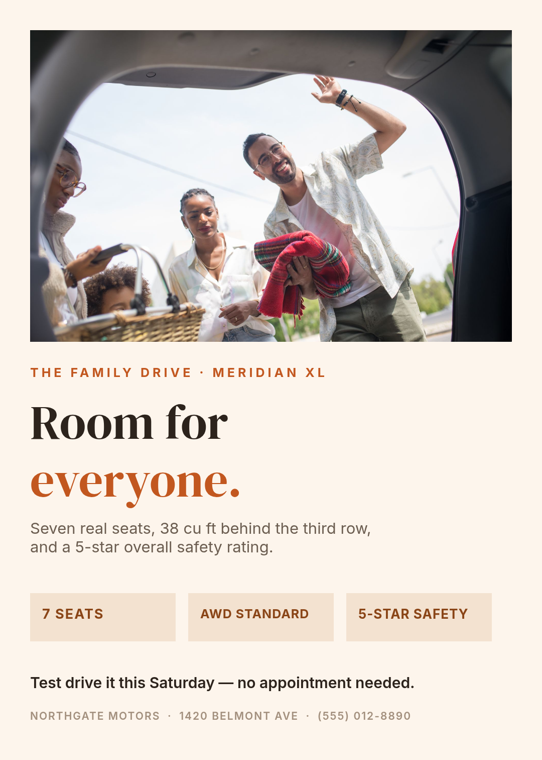
A warm family SUV brochure on cream: candid photo of a family loading luggage into a boot, a serif headline reading "Room for everyone.", two lines about seven seats and safety, three feature chips, and a test-drive line at the bottom.
4. Inventory Grid
What defines it: four to six vehicles as equal cards — photo, mileage, price — with a coloured contact bar welded to the bottom edge. Density is the message: we have stock.
Who it's for: used lots and weekly inventory sheets. This is the one that goes in the window and gets photographed on someone's phone.

A used car inventory flyer on dark navy: blue header reading "12 Cars Under $20,000", a two-by-two grid of vehicle cards each with a photo, model, mileage and a yellow price, and a full-width yellow contact bar at the bottom.
5. Loud Sale Banner
What defines it: three colours at maximum volume, a dated deadline bar across the top, and the saving set larger than the car. The photo is a supporting actor.
Who it's for: event weekends. It's not subtle and it isn't trying to be — the entire design exists to communicate a number and a date from across a forecourt.
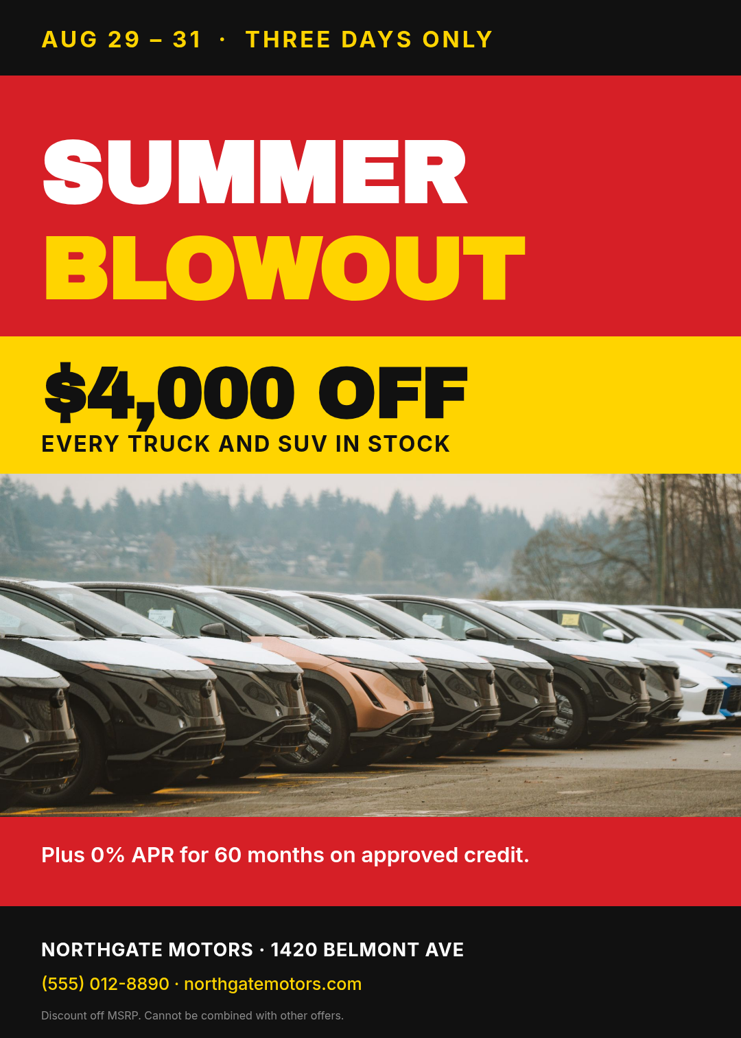
A loud car sale flyer in red, yellow and black: black date bar reading "three days only", "SUMMER BLOWOUT" in huge condensed caps, a yellow band with "$4,000 OFF", a wide photo of a dealership lot, and a black footer with the address.
6. Technical Spec Sheet
What defines it: a two-column table with hairline rules, engineering blue, and zero persuasion. Labels left, figures right, one row per fact.
Who it's for: trucks, fleet buyers, and anyone comparing three vehicles side by side. A shopper with a clipboard doesn't want adjectives — give them a table they can scan in ten seconds.
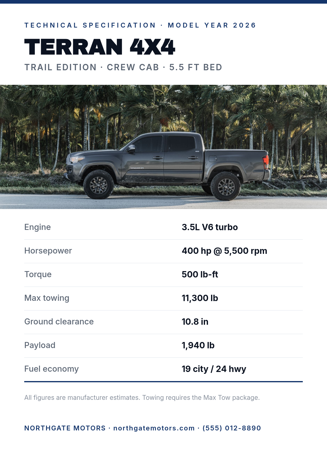
A technical specification sheet on white: navy hairline at the top, model name in heavy caps, a wide photo of a grey crew cab pickup, then a seven-row table of engine, horsepower, torque, towing, clearance, payload and fuel economy with thin dividers.
7. Auction Catalogue
What defines it: a ruled border, cream stock, a display serif, and lot lines set like a printed programme. It borrows the visual manners of something that predates the internet.
Who it's for: classic dealers, restorations and auction houses. Here the typography is the provenance claim — a sans-serif sale flyer would undercut a 1967 coupé.

A vintage classic car auction brochure on cream paper: thin ruled border, "The Classics / Autumn Auction" in a display serif, a photo of a restored 1960s car, three lot lines with estimates, and the auction date in serif at the bottom.
8. Off-Road Cinematic
What defines it: the photo is the page — a full-bleed background under a heavy dark scrim, with type sitting directly on it and one high-visibility accent colour. Specs live in a translucent panel so they stay readable over the mud.
Who it's for: trucks, 4x4 trims, adventure packages. The scrim is the trick: without it, white type over a dark photo turns to soup wherever the image gets busy.
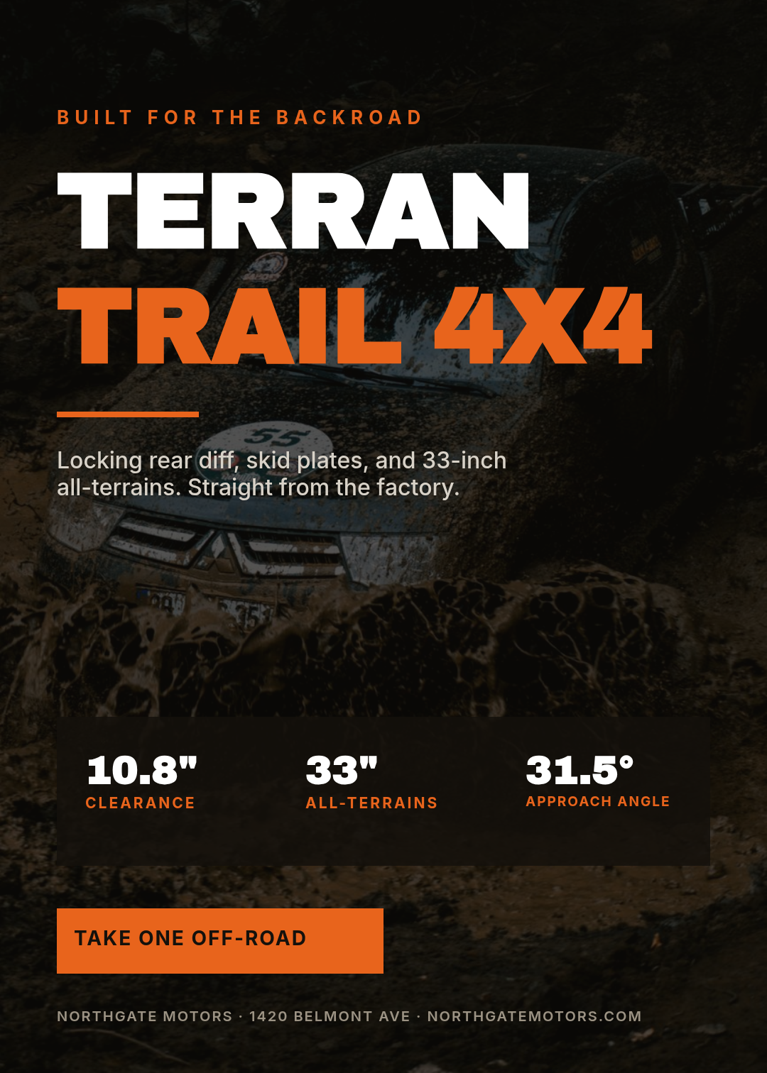
An off-road truck brochure: full-bleed photo of a pickup on a muddy mountain trail with a dark overlay, "TERRAN / TRAIL 4X4" in huge caps with the second line in orange, a translucent panel with three spec figures, and an orange call-to-action button.
9. Payment-First Card
What defines it: it looks like a fintech product page, not a car ad. A white card floats on grey, the monthly payment is the hero, and the terms sit in a clean key-value list beneath it.
Who it's for: lease and finance promotions. Most buyers shop by monthly payment, so lead with the payment and let the car appear at the bottom as reassurance.

A car finance offer flyer: light grey background with a white card, green accent bar, "$289" set enormous with "per month for 36 months", a three-row terms list, a green "Check your rate" button, and a photo band of an SUV at the bottom.
10. Scan-to-Book Split
What defines it: a hard vertical split — dark panel of type and a QR code on the left, photograph on the right. One instruction, one scan target, nothing competing.
Who it's for: lead generation. Window cards, service-desk stands, anything whose only job is to move someone from standing there to holding a booking.

A split test-drive flyer: left half dark navy with "Scan. Pick a time." in heavy caps, two lines of body text and a large QR code on white; right half a full-height photo of someone being handed car keys.
Which one should you actually print?
Pick by what you want the reader to do next, not by which looks nicest on screen:
- Get them onto the lot this weekend → Loud Sale Banner or Inventory Grid.
- Get them to book → Scan-to-Book Split. It's the only one with a single action on it.
- Get them to compare you against another dealer → Technical Spec Sheet.
- Get them to feel something about the car → Midnight Luxury, Lifestyle Warm or Off-Road Cinematic, depending on who's buying.
- Get them past the sticker price → Payment-First Card.
If you find yourself wanting two of these on one page, that's the signal to print two flyers.
Building one in Ridvay Studio
Every design above came from a sentence. Here's the one behind the spec sheet — paste it into Studio as-is:
A technical specification sheet for a 2026 crew cab pickup on white: navy hairline at the top, model name in heavy uppercase, a wide photo of a grey truck, then a seven-row table of engine, horsepower, torque, towing, clearance, payload and fuel economy with thin dividers between rows.
What comes back isn't a picture of a brochure. It's an editable design: the model name is a text layer, the hairline is a shape, the table rows are individual text elements, and the photo is a swappable image layer. So the next four edits are the ones that turn a generic example into your flyer:
- Click the model name and retype it. The heading is a live text layer — no regenerating, no re-prompting. Same for every figure in the table.
- Swap the photo for your own. Select the image layer and upload a shot of the actual vehicle on your lot. The layout holds; only the picture changes.
- Recolour the navy to your dealer colour. Change the hairline and the value column together and the whole sheet reads as your brand instead of the default.
- Apply your brand kit so the fonts and palette carry across every flyer you make after this one — which is the difference between ten designs and one identity. There's more on that in how to build a brand kit that stays consistent.
One more edit worth making on the Scan-to-Book design: replace the QR code's destination with your real booking URL. QR codes in Studio are generated as true vectors, so they stay sharp at any print size — and there's a short guide on putting a QR code on a flyer people actually scan if you want the placement rules.
Start from the spec sheet prompt in Studio →
Printing and posting them
These are all built at 1080 × 1512, which is a hair off A4 proportions and close enough that they print cleanly on letter or A4 with a small trim. Two things worth doing before you send anything to a printer:
- Export at 2× or higher. A design that looks crisp on a screen can still land soft on paper — the fix is resolution at export time, not a bigger font. See why your design prints blurry.
- Resize rather than rebuild. The same brochure needs to exist as a square post and a story. Studio resizes a finished design to another platform's dimensions and reflows the layers, so you're not rebuilding the Loud Sale Banner four times for one weekend.
If you want the folded three-panel version instead of a single sheet, the trifold brochure walkthrough covers panel order and what belongs on each fold — the same styles above work inside it.
Start with one
The dealer with the eleven lines of small print isn't failing because they lack a designer. They're failing because nobody made them choose what the page was for. Pick the one job your next flyer has, take the matching prompt above, and change the words.