Top 10 Certificate Designs for 2026 (All Editable)

A friend finished a twelve-week evening course last month and forwarded me the certificate she'd been issued. Times New Roman. A clip-art ribbon in the top corner. Her name typed into a text box in a slightly different font, because whoever made it had saved the template as a PDF and re-typed over the top of it.
She didn't print it. She didn't post it anywhere. Three months of Tuesday nights, and the artifact at the end went into a Downloads folder and stayed there.
That's the whole job of a certificate design, and almost every template gets it backwards. Nobody frames a piece of paper because the border is pretty. They frame it because the document makes the thing they did look like it counted. Below are ten certificate designs for 2026 — ten different answers to that, not ten border variations — with the prompt that made each one and a link to open it in the editor.
One rule runs through all ten, so it's worth saying before the gallery: the recipient's name is the design. Open any bad certificate and the biggest thing on the page is the phrase CERTIFICATE OF ACHIEVEMENT — words that describe the document to nobody in particular — while the name of the person it's for sits at 24pt in the middle. Flip that. Shrink the page to a thumbnail and squint: the first thing you read should be the name, and the second should be what they did. Everything else is decoration and can be as small as it likes.
1. The Classic Gold Frame
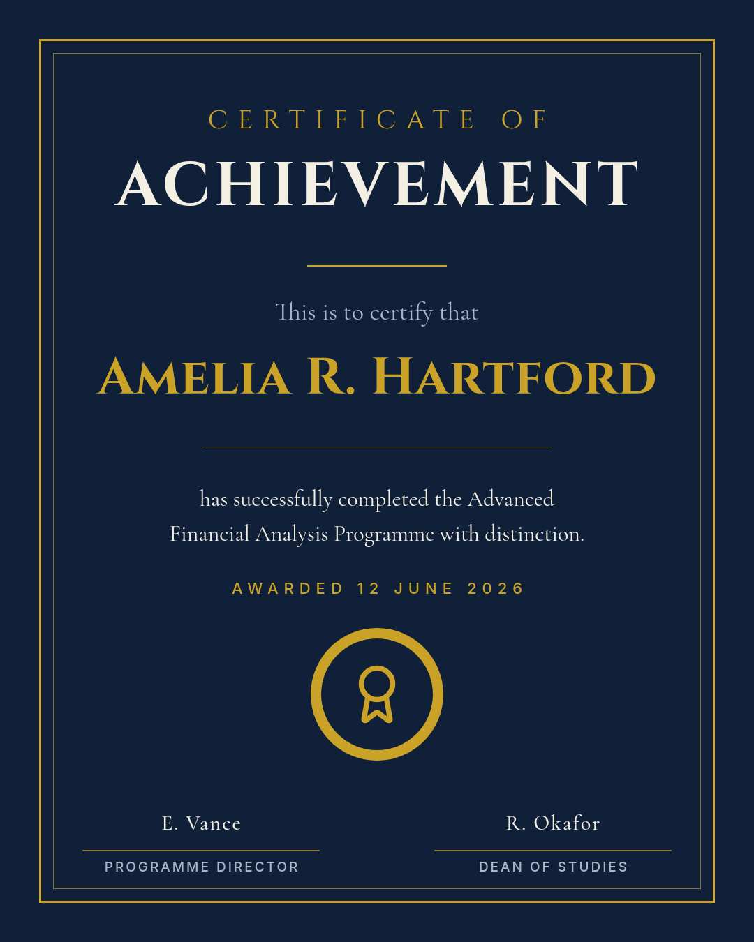
Best for: universities, schools, formal awards — anything that is genuinely going to be framed and hung.
Deep navy, a heavy gold outer rule with a hairline inside it, engraved serif caps, a seal, two signatures. This is the design people picture when you say the word certificate, and there's no shame in that: for a graduation or a formal award, familiarity is the effect you want.
The trap is ornament creep. Add one corner flourish and you'll want four, then a ribbon, then a guilloche pattern behind the text. Hold the line at two rules — thick outer, hairline inner — and let the gold appear in exactly three places: the frame, the name, the seal. Gold on every element stops reading as engraved and starts reading as a discount voucher.
A formal certificate of achievement, portrait, deep navy background with a gold double-rule border, engraved serif capitals, a gold seal near the bottom and two signature lines.
2. The Swiss Minimal
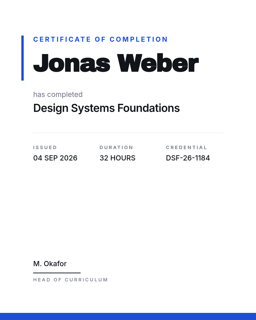
Best for: tech companies, online courses, internal training that arrives as a PNG in Slack.
White page, one accent bar, everything locked to a single left margin, and the recipient's name set enormous at the top. No frame at all.
That missing frame is the point. A border is a print convention — it exists to tell your eye where the paper ends. When the certificate lives its whole life as an image in an email, the frame is doing nothing but eating the space your name should occupy. Put the details that actually matter (issued, duration, credential ID) in a tidy three-column row underneath and stop there.
A minimal Swiss-style certificate of completion, portrait, white background, no border, the recipient's name very large and left-aligned in a bold sans, a thin blue accent bar, and a three-column row of issue date, duration and credential ID.
3. The Black-and-Gold Luxury

Best for: hospitality, long-service awards, member clubs, luxury and heritage brands.
Near-black field, a hairline gold rule top and bottom, an old-style serif, and a small monogram medallion instead of a seal. Compare it to the first design and you'll notice this one has almost nothing on it.
That's the whole trick. Expensive reads as restraint, not as more gold. Track the eyebrow line out to a genuinely wide letterspacing — far wider than feels comfortable — and let the empty space carry the weight. If you find yourself adding a flourish here, you've moved the brand a notch down-market.
A luxury certificate of excellence, portrait, near-black background, thin gold hairline rules top and bottom, an elegant serif name with wide letterspacing, and a small circular gold monogram medallion.
4. The Corporate Bracket
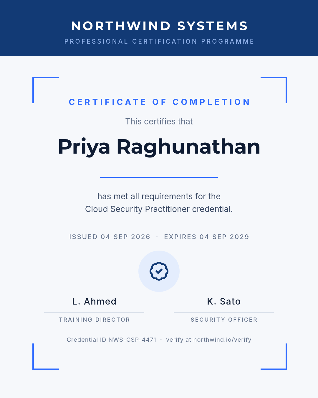
Best for: compliance training, professional certifications, anything that expires.
A solid brand band across the top, four corner brackets standing in for a frame, two signatures, and a badge in the middle. Structurally it's the most conservative layout here, which is exactly right for a document someone's employer will file.
The part most templates leave out is the part that makes it credible: an issue date, an expiry date, a credential ID and a verify URL. A certification nobody can check isn't a certification. If your programme has a verification page, put the address on the artifact in small type at the bottom — it costs you one line and it's the difference between a document and a claim.
A corporate certificate of completion, portrait, light background with a navy header band for the company name, blue corner brackets, two signature lines, and a small line at the bottom with a credential ID and verify URL.
5. The Playful Classroom

Best for: primary schools, reading clubs, kids' sports, summer camps.
Three bright colours, a rounded typeface, a dotted border and one big star badge. It should look like it was made for a nine-year-old, because it was.
Children's design goes wrong through colour count, not brightness. The dots around this border cycle red, teal, yellow, red, teal, yellow — a strict rotation of three. The moment a fourth colour joins, the border stops reading as a pattern and starts reading as clutter. Pick three, rotate them, and let the badge be the only thing that breaks the rhythm.
A playful star reader award certificate for a child, portrait, warm cream background, a dotted border cycling three bright colours, a big yellow star badge, and a rounded friendly typeface.
6. The Art Deco Society
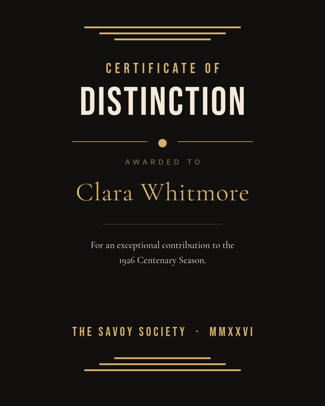
Best for: galas, anniversaries, societies, hospitality and hotel awards.
Black and gold again — but where design three was about emptiness, this one is about geometry. Stepped bars fan out at the top and bottom, condensed capitals carry the award type, and a small diamond splits the rule under the eyebrow.
Deco is a grid, not a texture. Three bars of decreasing width, symmetrical, will say 1926 faster than any ornamental swirl you can find in a clip-art pack. If you want to push it further, add a fourth bar — don't add a filigree.
An art deco certificate of distinction, portrait, black background with gold stepped bar fans at the top and bottom, condensed capitals for the award type, and an elegant serif recipient name.
7. The Botanical Frame
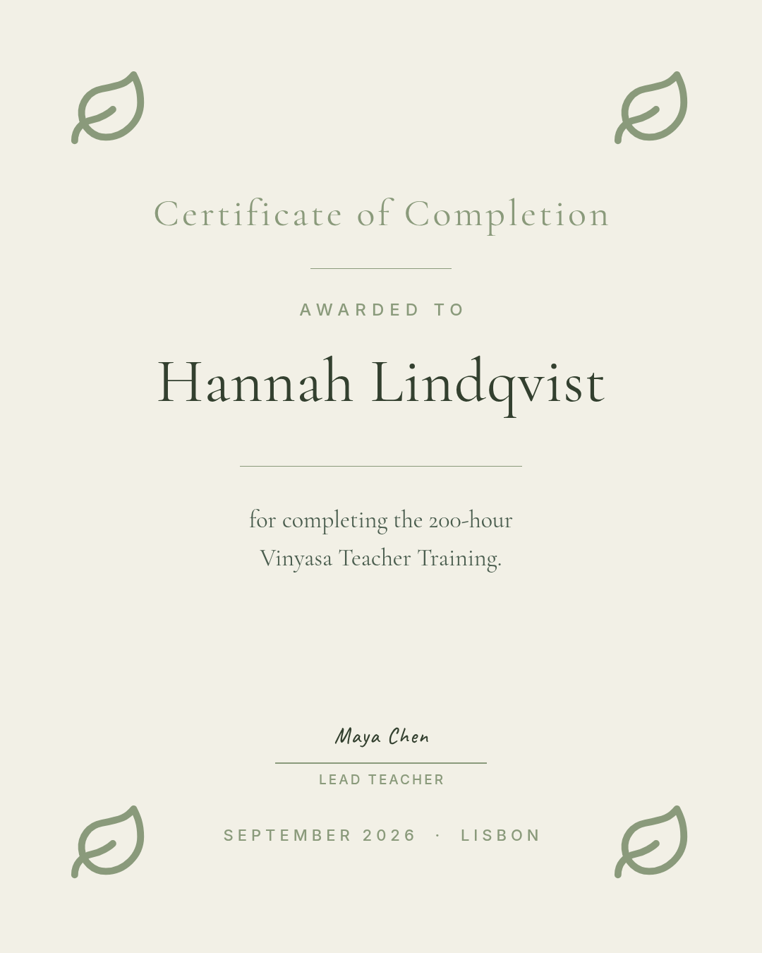
Best for: yoga teacher training, wellness workshops, floristry and craft courses.
Warm off-white, four sage line-art leaves in the corners, a light old-style serif, and a handwritten signature. The corners are doing the frame's job at about a quarter of its visual weight.
Keep the botanicals as outlines. The instant you fill those leaves with solid colour the document turns into a wedding invitation — same shapes, completely different genre. Line weight is the entire difference, and it's worth checking at print size rather than on screen.
A botanical certificate of completion, portrait, warm off-white background, sage green line-art leaf illustrations in the four corners, a light serif for the recipient's name, and one handwritten-style signature line.
8. The Verified Badge
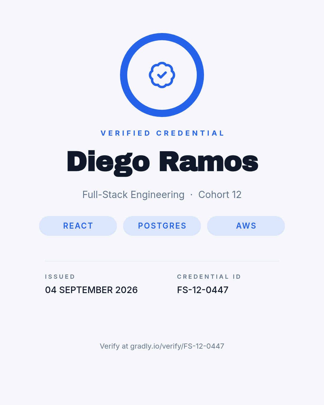
Best for: bootcamps, micro-credentials, anything designed to be posted on LinkedIn.
The badge is the hero and it sits at the very top, above the name. That inversion is deliberate: this certificate's real life is as a square thumbnail in a feed, cropped from a portrait image, and the top third is all anyone sees before they decide whether to click.
Underneath, three skill chips and a metadata row. Design the top third so it survives on its own, then treat everything below it as the detail people read after they've already tapped.
A modern micro-credential certificate, portrait, light grey background, a large blue circular verified badge at the top, the recipient's name in a heavy sans, three rounded skill chips, and a row with issue date and credential ID.
9. The Editorial Split

Best for: award programmes, agencies, competitions, annual prizes.
A full-height colour panel down the left edge carries the award name; everything else is left-aligned in the white column beside it. It's the only design in this set that isn't centred, and that's precisely why it stands out in a row of certificates.
Give the panel exactly one job — the award title and a small mark — and resist putting content in it. The moment you start filling the panel with dates and signatures it stops being a spine and becomes a second column, and the layout loses the thing that made it interesting.
An editorial award certificate, portrait, a full-height dark green panel down the left side holding the award name, and the recipient's name plus citation left-aligned in a white column beside it.
10. The Brutalist Type

Best for: design studios, indie awards, modern institutions that would rather not issue a certificate at all.
No seal, no frame, no ornament. The word CERTIFICATE broken across two lines at a size that nearly fills the page, two heavy black rules, and the recipient's name in the single accent colour the design allows itself.
This is the most opinionated design of the ten and the easiest to ruin. Every decorative element you add makes it worse, not more finished — a small flourish in the corner here doesn't read as a nice touch, it reads as a mistake. If the finished thing feels too bare, make the type bigger rather than adding anything.
A brutalist typographic certificate of completion, portrait, off-white background, the word CERTIFICATE set enormous in a heavy black sans across two lines, thick black rules, and the recipient's name in a single red accent colour.
Making your own in Ridvay Studio
Every design above started as one sentence. Here's the one I'd type for a course that doesn't fit any of the ten cleanly:
A certificate of completion for a twelve-week evening pottery course, portrait, warm off-white background with sage line-art leaves in the corners, a light serif for the recipient's name, one signature line and space for the date.
What comes back isn't a flat picture you have to regenerate when something's wrong. It's an editable design — the eyebrow line, the name, the citation, the leaves, the rules are separate layers you click and change. That's the difference that matters when you're issuing forty of these and the fortieth name is twice as long as the first.
Four edits to make straight away, each one tied to something above:
Click the recipient's name and drag the size up until it's the first thing you read at thumbnail size. That's the rule at the top of this post, and AI-generated first drafts almost always undersize it.
Select the small line above the name and push its letter-spacing out — wider than feels right. One control, and it's most of what separates the luxury design from the classroom one.
Swap the two accent colours for your own. With a brand kit saved, the palette and fonts drop onto every text and shape layer at once instead of one at a time.
If the certificate needs to be verifiable, add a credential ID line under the date — the move that makes design four credible.
Generate your certificate in Studio →
Printing it, or sending it
The ten designs in this post are 1080 × 1350 so they sit well in a feed and on this page. A certificate you're actually going to print needs a different canvas, and that's a one-click resize rather than a rebuild:
Resize to A4 or US Letter before exporting for print — the layout reflows, the layers stay where they belong.
Export PDF for print, PNG for everything else. Email, LinkedIn and messaging apps all want the PNG.
Never flatten the name layer. Keep it as live text and issuing the next thirty-nine is thirty-nine text edits, not thirty-nine rebuilds.
Share a link instead of an attachment when the recipient just needs to see it — a share link opens in a browser with no download and no 12 MB email.
One print check worth doing before a batch: if your certificate has hairline gold rules like designs one and three, look at them at 100% zoom in the exported PDF. Hairlines are the first thing to disappear on a home printer — here's why that happens and what to do about it.
If you'd rather walk through the whole thing step by step instead of starting from a style, the how-to guide covers building one from scratch.