Top 10 Gym Poster Design Ideas for 2026 (All Editable)

There's a gym two streets from my flat with a poster in the window advertising a 30-day challenge. It's a Word document. Centered Calibri, a stock photo of a woman holding a kettlebell like it's a handbag, and the start date in a font size you can only read if you stop walking and lean in. Nobody leans in.
Good gym poster design isn't about being clever. It's about picking a look and committing to it hard enough that someone reads the thing from the pavement. Most gyms never get that far because they never decide what style they're making — they just start typing.
So here are ten. Ten genuinely different gym and workout poster designs, each one built and rendered, each with the exact prompt behind it and a link to open and edit it. Pick the one that matches your gym's actual personality, not the one that looks most like everyone else's.
1. Brutalist stat wall
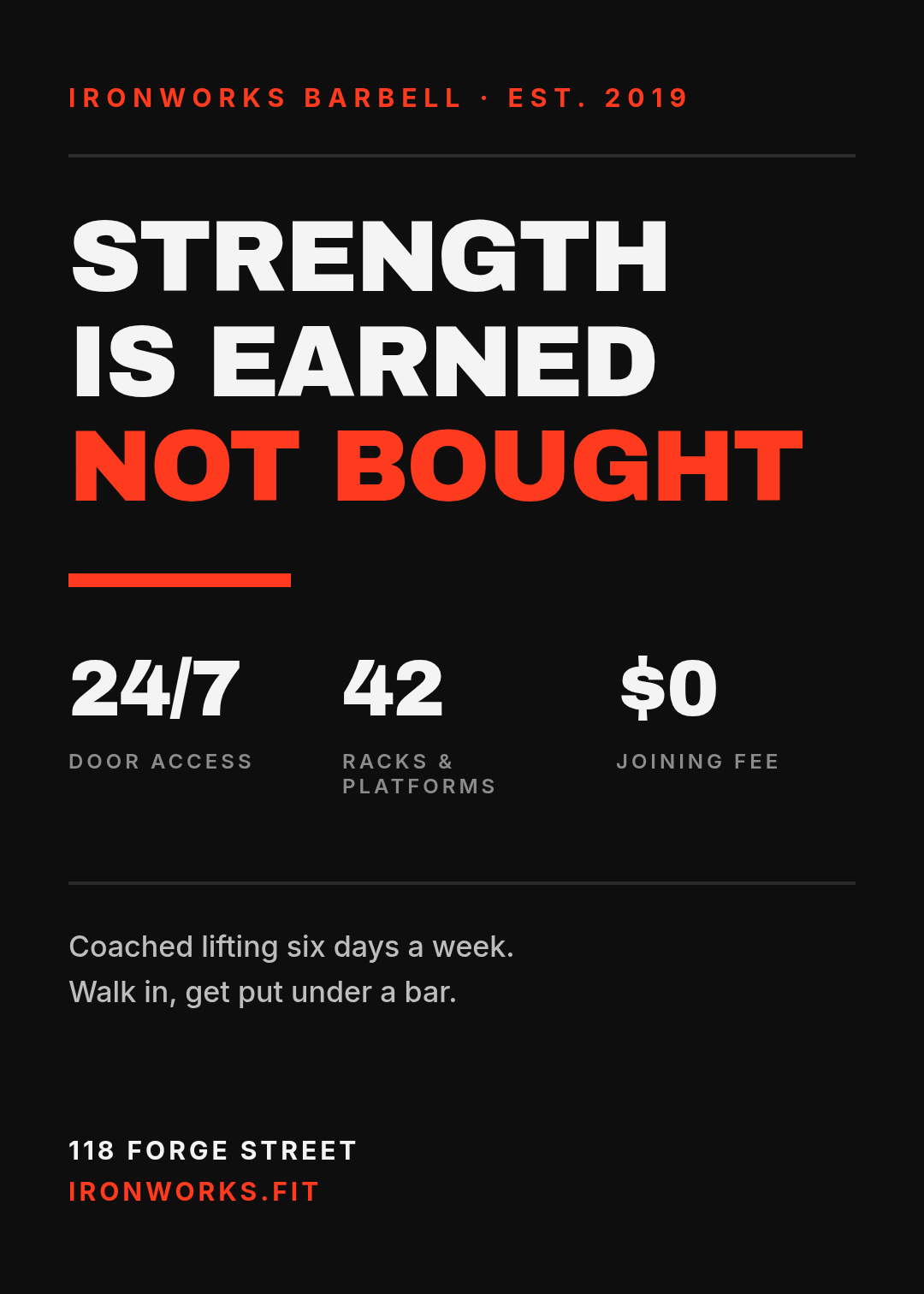
Black, one hot accent, type so big it's almost rude. No photo, no gradient, nothing decorative — the numbers are the decoration. This is the style for barbell gyms and strength clubs where the customer is buying seriousness.
The move that makes it work: three hard facts in a row (24/7, 42 racks, $0 joining fee) sitting under the headline. Specifics read as confidence. "Great facilities" reads as nothing.
Make a brutalist gym poster, near-black background, one red accent, giant condensed all-caps headline "Strength is earned not bought", a row of three big stats underneath, address at the bottom
2. Retro strength club
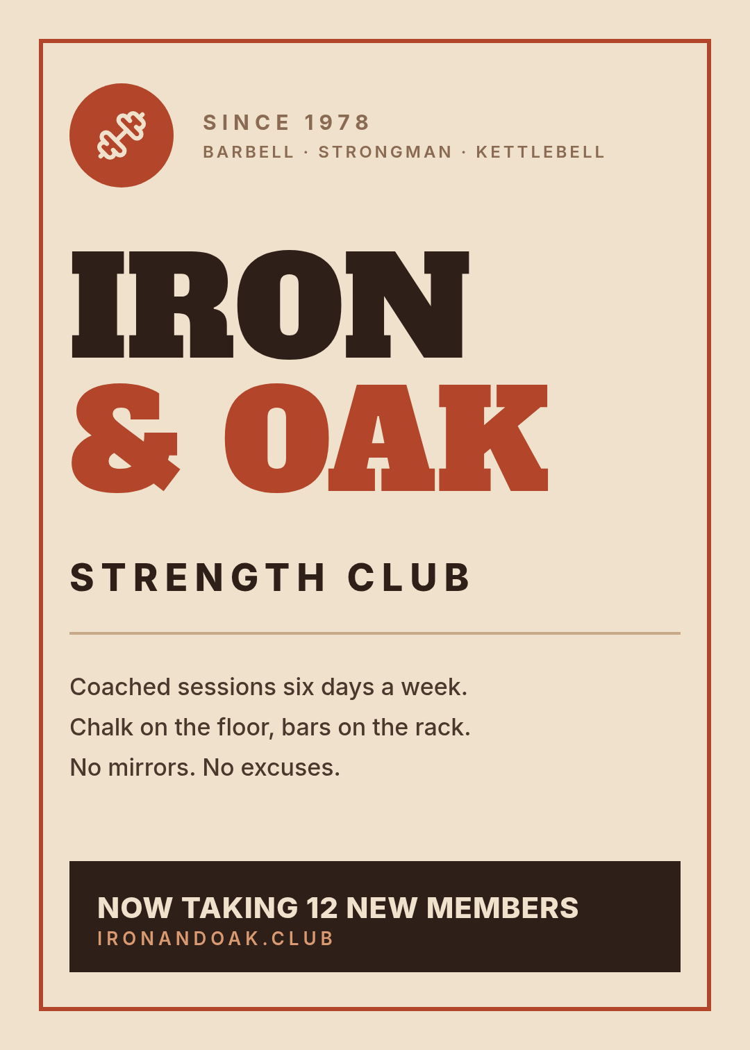
Cream paper, rust red, a fat slab serif, a thin printed border, a badge in the corner. It borrows from 1970s athletic clubs and it's the fastest way to look established rather than new.
Worth noticing what's not here: no photo of anyone lifting. Retro strength posters sell the club, not the workout. "No mirrors. No excuses." does more than a picture of a squat rack would.
Retro 1970s strength club poster, cream background, rust red and dark brown, heavy slab serif headline "Iron & Oak", thin printed border, circular badge with a dumbbell icon, dark banner at the bottom reading "Now taking 12 new members"
3. Neon HIIT

Near-black, electric lime, cyan, and two diagonal bars slicing the page. Diagonals imply speed — that's the whole trick. Use it for HIIT, bootcamps, spin, anything sold on intensity.
The hero here is a number, not a word. 45 is the promise; "minute HIIT bootcamp" is just the label. If your class has a number in it — 45, 30, 20 — that number should be the biggest thing on the poster.
Neon HIIT bootcamp poster, near-black background, electric lime and cyan, giant number 45 as the hero, headline "Minute HIIT Bootcamp", two diagonal accent bars, class times at the bottom, cyan block reading "First class free"
4. Chalkboard WOD

Slate green-black, chalk white, a handwritten headline over a monospaced list. This is a CrossFit box board turned into a printable poster, and it works because the content is the design — the workout, laid out in two columns, movements left and reps right.
Mono type does the alignment for you. Every rep number lines up without you touching a thing, which is why it's the right font choice for anything list-shaped.
CrossFit WOD poster, dark slate chalkboard background, handwritten script headline "Murph", monospace two-column list of movements and rep counts in chalk white and yellow-green, handwritten note at the bottom
5. Editorial minimal
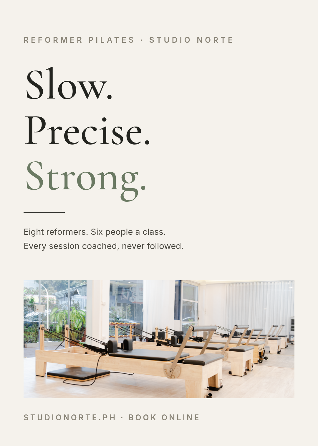
Warm white, a high-contrast serif, sage green, and about 40% of the page left empty on purpose. This is the boutique end — pilates, reformer, yoga, recovery studios — where the product is calm and the poster has to feel calm too.
The photo sits at the bottom as a band, not a background. Text over photo is the most common way a fitness poster gets unreadable; putting the image below the type sidesteps the problem entirely. (If you do want text on top of an image, there's a whole method for making it readable.)
Minimal editorial pilates studio poster, warm off-white background, large elegant serif headline "Slow. Precise. Strong." with the last word in sage green, two lines of small body text, a wide photo of a bright reformer pilates studio across the lower third
6. Duotone athlete
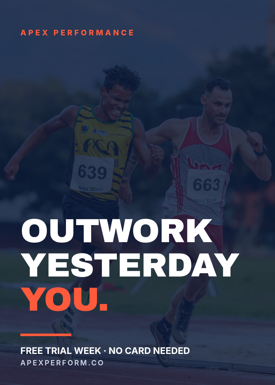
One full-bleed photo, one heavy colour scrim over it, headline knocked out in white at the bottom. The scrim is what separates this from every amateur photo poster — it flattens the image into a single tone so type can sit anywhere without fighting detail.
Bottom-anchored text also matters. Photos are busiest in the middle where the subject is; the bottom third is usually the calmest strip on any action shot.
Gym motivation poster, full-bleed photo of an athlete sprinting on a track, heavy deep-blue duotone overlay, huge white headline "Outwork yesterday you" at the bottom with the last line in orange, small footer with a free trial offer
7. Class schedule grid
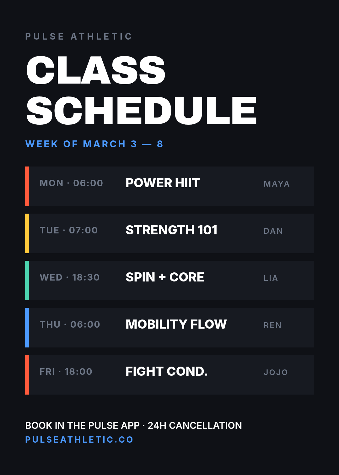
Not every gym poster is marketing. This one is furniture — the thing on the wall by the door that people photograph with their phone. Dark panels, a colour chip per class type, day and time in muted grey, class name in white and bold.
The colour chips are the only decoration and they're doing real work: they let a regular find "the green one" without reading. Keep the chip colour consistent week to week and you've built a tiny visual language for free.
Gym class schedule poster, dark charcoal background, headline "Class Schedule", five rows each with a coloured chip, day and time, class name in bold white and the coach's name in grey, footer with booking instructions
8. Challenge countdown

A giant number, a progress bar that's already two-thirds full, and a countdown. Every element is designed to make standing still feel expensive.
This one has a trick the others don't: the line reading "Starts in 13 days" isn't typed. It's a live token — {{time.countdown:2026-09-01T06:00}} — that recalculates every time the poster renders. Print it once and the printed copy is frozen, but the screen version on your front-desk display or in an email counts itself down. Same for the spots-taken bar; drag its width as the challenge fills.
30-day fitness challenge poster, dark background, giant orange number 30, headline "Day Shred Challenge", an orange progress bar showing spots taken, a countdown line, three short benefit lines, gym name at the bottom
9. Locker-room quote

Black, a serif, one gold word, an oversized quote mark ghosted into the background. No offer, no times, no phone number — this style exists to be framed and hung, and adding a call to action would ruin it.
The rule for quote posters: break the line where a person would breathe. "The bar / doesn't care / how you feel / today." The line breaks are the delivery. Set them by hand; never let the text box decide.
Black gym wall print poster, elegant serif quote "The bar doesn't care how you feel today" broken across four lines with the last line in gold, a huge faint quote mark in the background, small gym name and print size at the bottom
10. Membership price card

Three panels, the middle one inverted and taller with a POPULAR chip. The lightest design on the list, because pricing has to feel honest, and dark-and-shouty reads as a hard sell.
The overhang on the middle panel is deliberate — it's 80px taller than the other two, top and bottom. That one asymmetry does more to steer the choice than any amount of colour would. If you're building a price list of any kind, the same logic applies to menus and service lists.
Gym membership pricing poster, light off-white background, headline "Membership Plans", three pricing panels side by side, the middle one dark navy and taller with an orange POPULAR chip, three features listed under each price, footer reading "Cancel anytime"
Building one in Ridvay Studio
Every poster above was made the same way: one sentence in, an editable design out. Take the challenge poster — here's the prompt that produced it:
A 30-day fitness challenge gym poster, dark background, one giant orange number as the hero, headline "Day Shred Challenge", a progress bar showing 37 of 60 spots taken, three short benefit lines, gym name and website at the bottom
What comes back isn't a flat JPEG you have to regenerate when something's wrong. It's a real design with real layers — every headline, stat, bar and panel is a separate object you click and change. Four edits get it to your gym:
- Click the big number and retype it. 30 becomes 21, or 6 if you're running a six-week block. The type scales with the box, so it stays the hero.
- Drag the progress bar's right edge. That's your spots-taken counter. Do it again next Monday.
- Swap the accent colour. Select the orange elements and drop in your brand hex — or apply a saved brand kit and the accent, fonts and logo all land at once.
- Resize it for Instagram. One click turns the 5:7 print poster into a square post or a story, and the layout reflows instead of cropping your headline in half.
If none of the ten fit, start from a blank prompt instead of a template — there are more starting points in the template gallery, and the animation tools at /studio/animations will turn any of these into a moving version for your gym's screen.
Generate a gym challenge poster now →
Printing and posting these
All ten are 1080 × 1512 — a 5:7 ratio, which is close enough to A4 and to 18 × 24 in that it prints without awkward cropping. A few things that decide whether the printed version looks like the screen version:
- Export at 2×. A poster that looks sharp on a monitor at 1080px wide will look soft at A3. Export at double size and the print shop stops asking.
- Keep everything important 80px from the edge. Every design above respects that margin. Print trimming eats a few millimetres and it always eats the bit you cared about.
- Check it from three metres. Stand back from your screen at the distance people will actually be from the wall. If the headline survives and the phone number doesn't, that's usually fine — but you should know which is which before it's on 200 sheets of paper.
- For window posters, invert. Dark backgrounds read better through glass in daylight; light backgrounds disappear into reflections.
The gym near me could fix its window in about twenty minutes. Pick a style — any of these ten — type one sentence, change the dates, print it. The Calibri is not a budget problem. It's a decision nobody made.