Top 10 Infographic Designs for 2026 (All Editable)

A founder I know put eleven statistics on one slide, coloured them six different ways, and asked me why nobody remembered any of them. The numbers were fine. The problem was that she'd picked a look first and poured the data in afterwards — and eleven facts in a decorative grid is not an infographic, it's a wall.
Most infographic design ideas you'll find online are style swipes: this palette, that illustration set. Useful, but backwards. The first decision isn't colour. It's which layout archetype matches the shape of what you're trying to say — because a timeline and a comparison and a ranked list are three different arguments, and they don't survive being swapped.
So here are ten. Each one is a real, finished design, each is a different shape of data, and each comes with the prompt that made it and a link to open it in the editor. Steal whichever one matches what you actually have.
1. The vertical timeline
What defines it: one spine down the left, dated nodes hanging off it, nothing competing for the eye. The spine does the work an arrow would otherwise have to do five times.
Who it's for: anything with an order and dates — a company story, a project retro, a product roadmap, a history lesson.
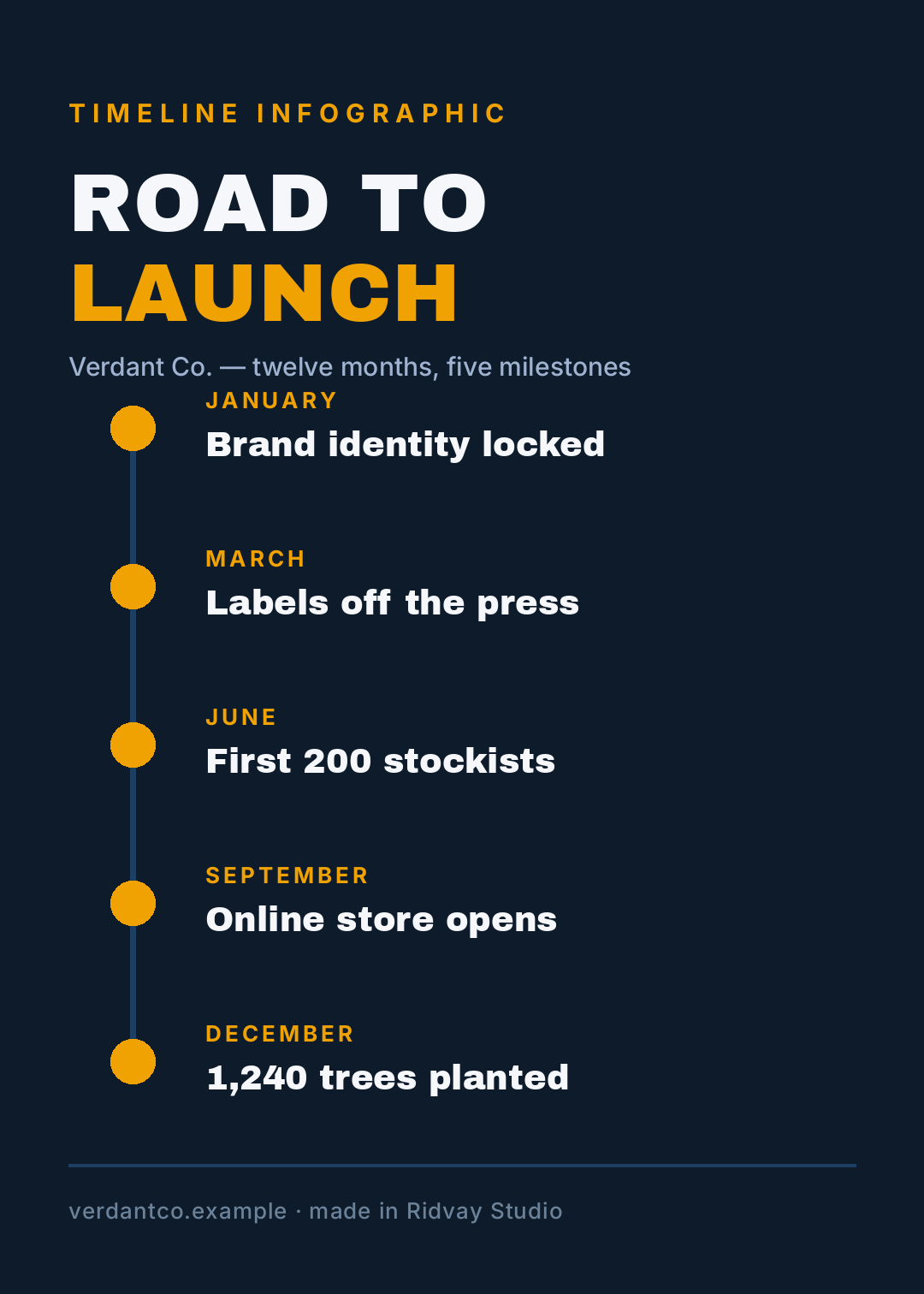
Make a vertical timeline infographic, 1080x1512, dark navy background with a single amber accent. A thin spine down the left with five dots on it. Each dot gets a month label in amber and a short event headline in white. Big headline at the top reading "Road to launch".
The trap here is cramming in twelve events. Five is the number that still reads from across a room. If you have twelve, you have two timelines.
2. The stat hero
What defines it: one number, absurdly large, and almost nothing else. Three supporting figures sit underneath at a fraction of the size so the hierarchy can't be misread.
Who it's for: impact reports, fundraising updates, a single result you want quoted back to you.
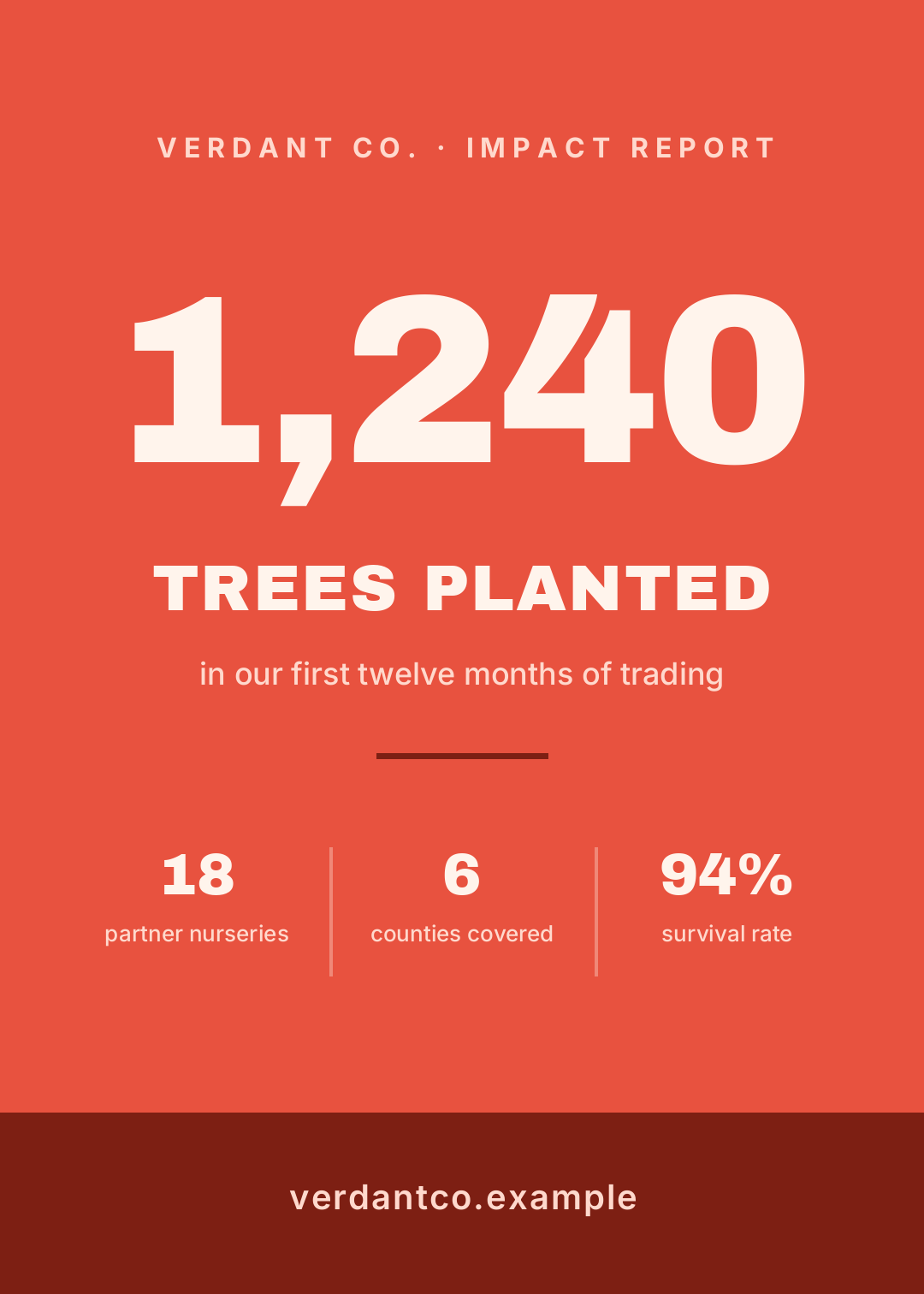
Make a stat hero infographic, 1080x1512, flat coral background, cream text. One enormous number "1,240" centred, "TREES PLANTED" under it, then a row of three smaller supporting stats separated by thin rules. Dark band at the bottom with the website address.
This is the layout people are most scared of, because it looks empty in the editor. It isn't empty — it's loud. Resist filling the space.
3. The split comparison
What defines it: the canvas is cut in half and the two halves are styled as opposites — cream against near-black here. Both columns answer the same questions in the same order, which is the only thing that makes a comparison honest.
Who it's for: rent vs buy, plan A vs plan B, us vs the old way.
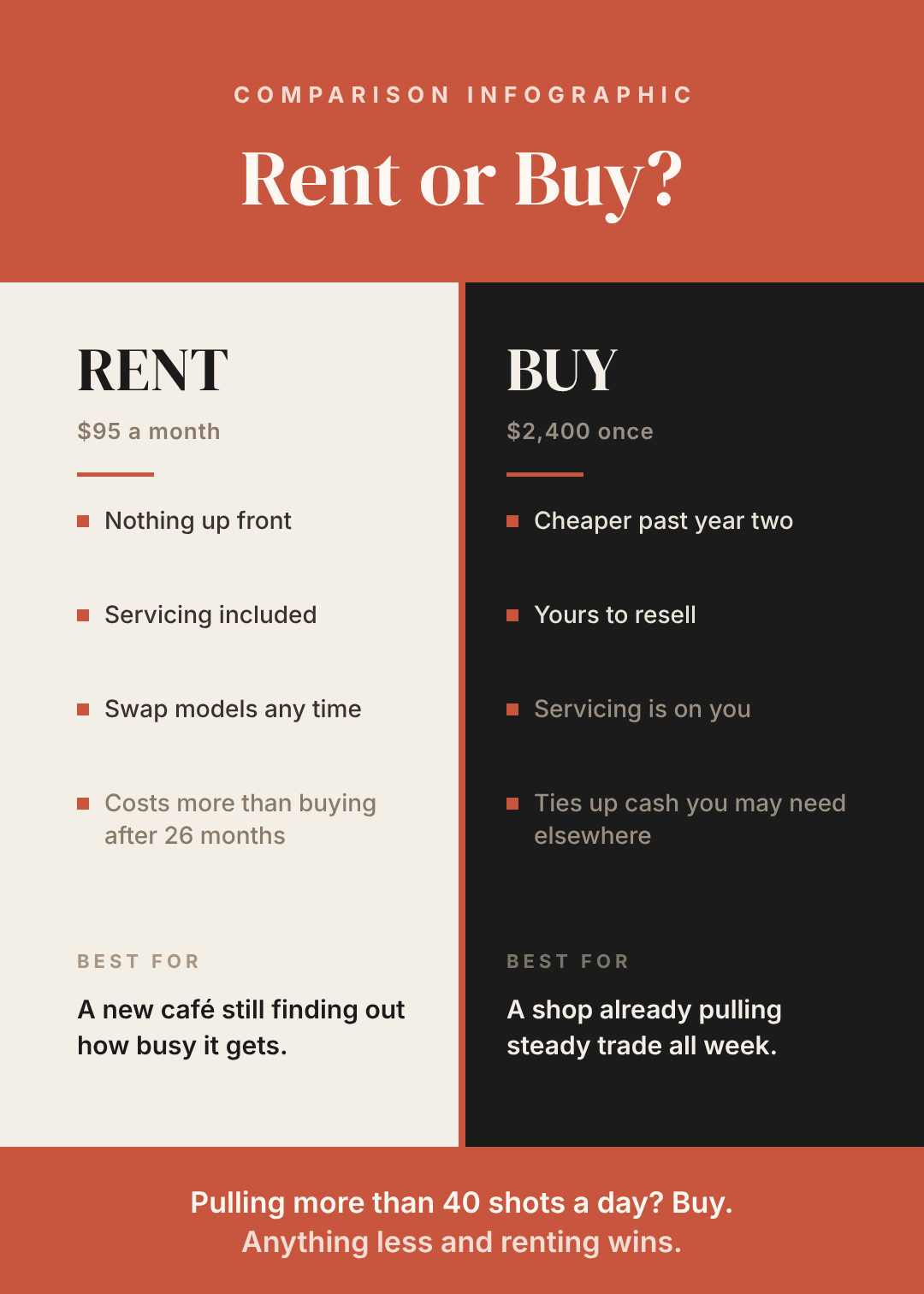
Make a side-by-side comparison infographic, 1080x1512. Terracotta header band with "Rent or Buy?" in a serif. Below it, split the page: cream left column headed RENT, near-black right column headed BUY. Four matching bullet points each, a "BEST FOR" note at the bottom of each column, and a terracotta verdict band across the foot.
Note the verdict band. A comparison that doesn't commit to an answer is just a table, and nobody shares a table.
4. The numbered process flow
What defines it: numbered blocks connected by a vertical line, each with a title and exactly one line of explanation. The connector is what turns a list into a process.
Who it's for: onboarding, how-it-works sections, internal SOPs, anything where step 3 has to come after step 2.
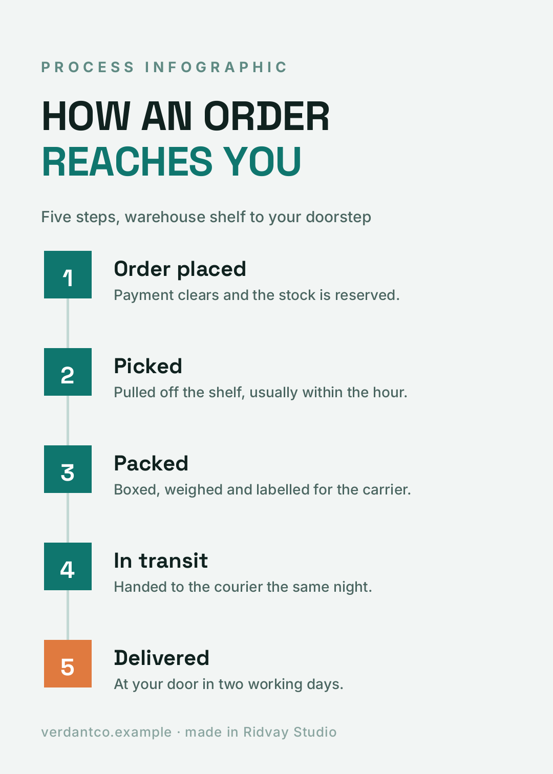
Make a five-step process infographic, 1080x1512, off-white background with deep teal accents. Numbered squares down the left joined by a thin connector line. Each step has a bold title and one line of description. Headline "How an order reaches you". Make the final step's square a warm orange.
The last step is a different colour on purpose. It's the only visual cue telling you where the sequence ends.
5. The pyramid
What defines it: stacked tiers that get wider toward the bottom, so width literally means foundation. It's the one archetype that argues about order of operations rather than quantity.
Who it's for: priorities, maturity models, dependency stacks, anything where the bottom has to be true before the top matters.
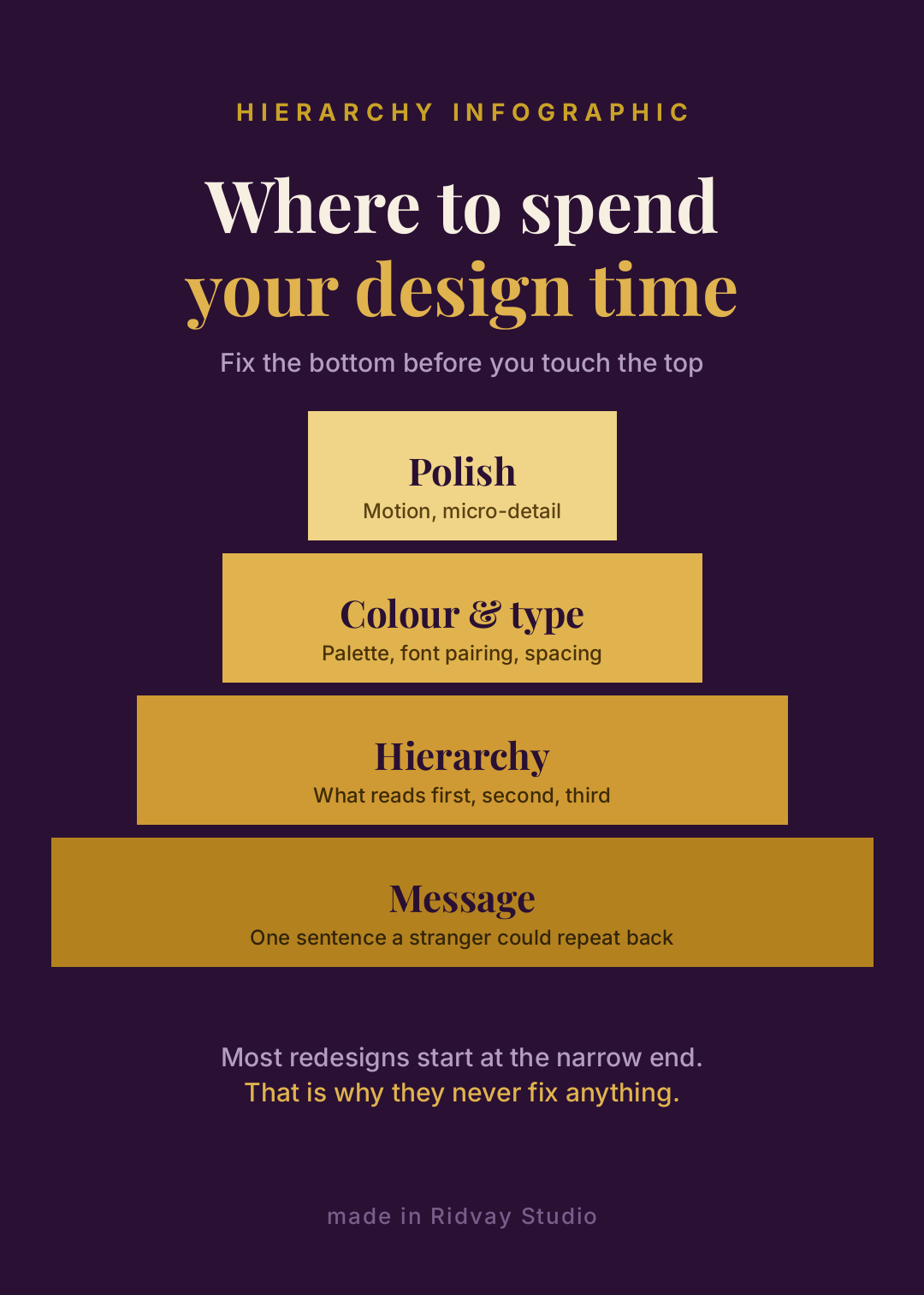
Make a pyramid infographic, 1080x1512, deep plum background. Four stacked gold tiers getting wider toward the bottom, each with a serif label and a small caption. Top tier "Polish", bottom tier "Message". Headline "Where to spend your design time".
6. The anatomy callout
What defines it: one object in the middle, thin leader lines out to labels on both sides. It's the diagram-iest of the ten, and the most persuasive when you're teaching.
Who it's for: product explainers, "parts of a good X" posts, teardown content, anything physical or on-screen.
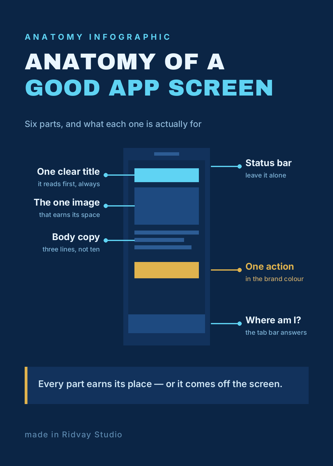
Make an anatomy infographic in a blueprint style, 1080x1512, deep navy background with cyan leader lines. A simple phone wireframe in the centre with a header bar, image block, three text lines, a gold button and a tab bar. Thin horizontal callout lines to six labels, three on each side. Headline "Anatomy of a good app screen".
Keep the leader lines horizontal. Diagonal callouts look sophisticated and read worse at every size below full screen.
7. The cycle
What defines it: four nodes sitting on a ring, so there's no first and no last. If your process has an ending, this is the wrong layout and it will quietly lie for you.
Who it's for: content loops, feedback loops, seasons, anything genuinely continuous.
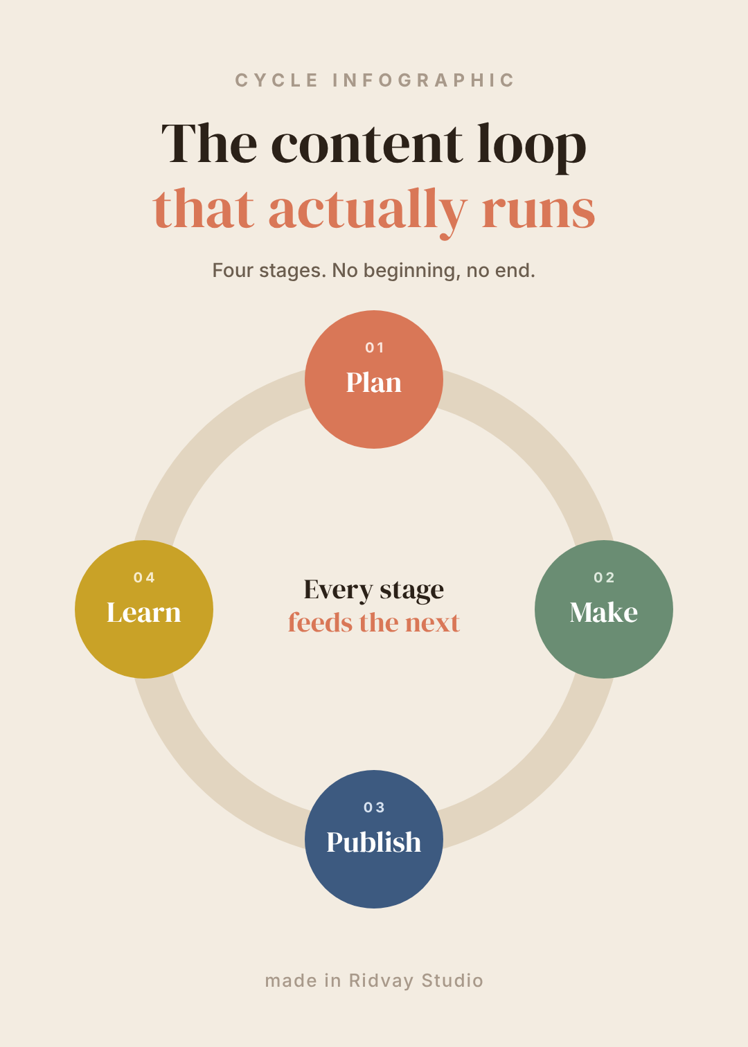
Make a cycle infographic, 1080x1512, warm sand background. A thick ring in the centre with four coloured circles sitting on it at top, right, bottom and left — terracotta, sage, blue and mustard. Each circle has a small number and a serif word: Plan, Make, Publish, Learn. Two lines of serif text in the middle of the ring.
8. The ranked bar
What defines it: sorted horizontal bars on a dark ground, with a grey track behind each one so you can see what the bar didn't fill. High-contrast, condensed type, no chrome.
Who it's for: budgets, survey results, traffic sources — any set of quantities that are only interesting relative to each other.
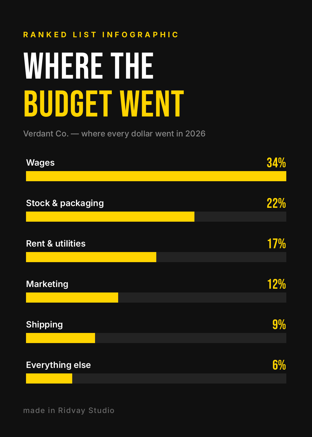
Make a ranked bar chart infographic, 1080x1512, black background with one bright yellow accent. Six horizontal bars sorted longest to shortest, each on a dark grey track, each with a label above it on the left and a big percentage on the right. Condensed headline "Where the budget went".
The grey track is the whole trick. Without it, a 34% bar and a 22% bar just look like two bars.
9. The map
What defines it: a geographic outline with pins, and — critically — labelled callouts instead of a legend. A legend makes people look back and forth; a callout puts the fact next to the place.
Who it's for: coverage, store locators, regional results, "where our customers are".
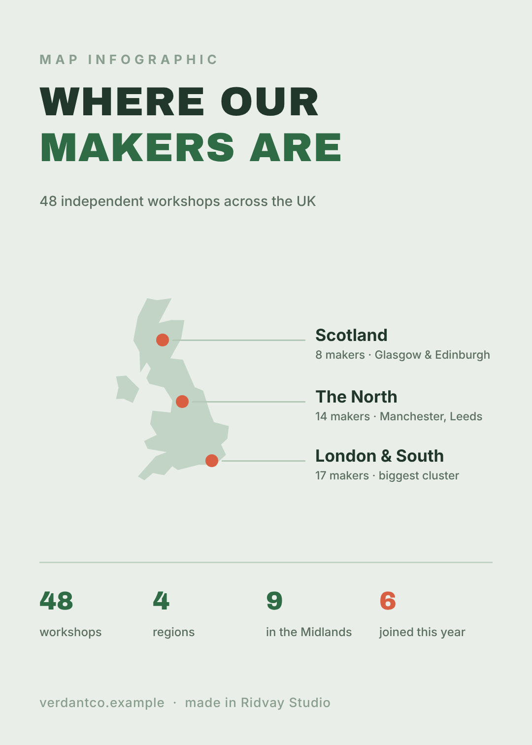
Make a map infographic, 1080x1512, pale sage background. A UK outline map on the left with three orange pins, each connected by a thin horizontal line to a label on the right giving the region and its number. A row of four big green figures along the bottom. Headline "Where our makers are".
Only reach for a map if the geography is the point. If your London number is interesting because it's big, not because it's London, you want #8.
10. The data dashboard
What defines it: a 2×2 grid of small panels, each a different chart, under a newspaper-style masthead. It's the only one of the ten built to carry several unrelated facts without collapsing.
Who it's for: annual reviews, monthly updates, year-in-numbers posts.
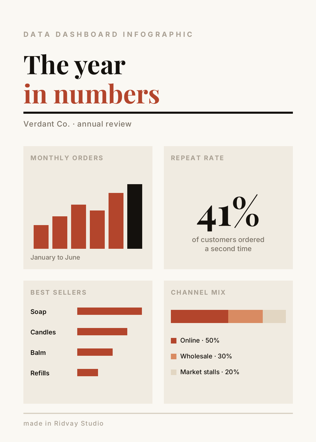
Make an editorial data dashboard infographic, 1080x1512, warm off-white paper background with a deep rust accent and a serif masthead reading "The year in numbers". Below a thick rule, a 2x2 grid of four panels: a small column chart, one big percentage, four ranked horizontal bars, and a stacked bar with a legend.
Four panels is the ceiling. At six, every panel is too small to read and you've made a poster about having a lot of data.
Building one in Ridvay Studio
Say you've got the budget numbers and you want #8. Type this:
Make a ranked bar chart infographic, 1080x1512, black background with one bright yellow accent. Six horizontal bars sorted longest to shortest, each on a dark grey track, with the category label above the bar and the percentage on the right. Condensed headline "Where the budget went".
What comes back isn't a flat picture you have to re-roll until it's right. It's an editable design — the headline is a text layer with its own font and size, every bar is a shape with its own width and fill, the grey tracks are separate shapes behind them. You change things instead of regenerating them.
Three edits that turn the template into yours:
- Retype the labels and drag each bar's width to match your real numbers. The bar is a rectangle; its width is the data. This is the step that takes four minutes and is the entire job.
- Click the headline and pull the size up until it fills the column. Per #2 above, the thing you want remembered should be embarrassingly large — and on a ranked chart that's the question, not any single bar.
- Recolour the top bar and leave the rest. One highlighted bar turns a chart into an argument. Select it, change the fill, done — the other five stay where they are.
If you've set up a brand kit, apply it and all six bars plus both fonts snap to your palette in one click, which is how you keep a year of monthly updates looking like they came from the same company.
Make your own ranked-bar infographic →
Getting it out: post, print, or both
All ten above are 1080×1512 — a 5:7 shape that behaves well on Pinterest, fits an Instagram portrait post with almost no crop, and prints cleanly at roughly A4 proportions.
- For social: export PNG and post it. If you want the same infographic as a story and a feed post, resize rather than rebuild — one click re-flows it to the new canvas and you nudge what moved.
- For print or slides: export at 2× or 3× so the type stays sharp, or drop it into a deck as a full-bleed slide. If it's going on paper, check your colours survive the trip — RGB and CMYK don't agree about bright accents, and the yellow in #8 is exactly the kind that shifts.
- For a doc or a post: the long-form version of this — outline, hierarchy, what to cut — is in how to make an infographic with AI.
Pick the shape, then the palette
If you take one thing from these infographic design ideas, make it the order of operations. Look at what you actually have — a sequence, one number, two options, a loop, a set of quantities, a place — and let that pick the layout. Colour is the last decision, not the first, and it's the easiest one to change later.
Then make the thing. Ten minutes for the first draft, and the editing is where it gets good.