Top 10 Instagram Story Designs for 2026 (All Editable)

Open Instagram, tap into any Story, and cover the top and bottom of your phone with two fingers. The band that's left — roughly the middle three-quarters of the screen — is the only part of an Instagram Story design you actually control. Everything above it is progress bars, profile row and the close button. Everything below it is the reply bar, the share arrow and, on some phones, a gesture strip.
On a 1080×1920 canvas that band is about y 250 to y 1670. Put a headline at y 120 and Instagram draws a progress bar through it. Put your handle at y 1800 and the reply field sits on top of it. Nearly every Story design that looks broken is broken for that one reason, not for taste.
So here are ten Instagram Story designs for 2026 that all obey it — ten different jobs, ten different looks, all built at 1080×1920 in Ridvay Studio. Each one has the prompt that made it and a link to open the real file and edit it. None of them are flat images: every headline, panel and colour is a layer you can click.
1. The This-or-That Poll
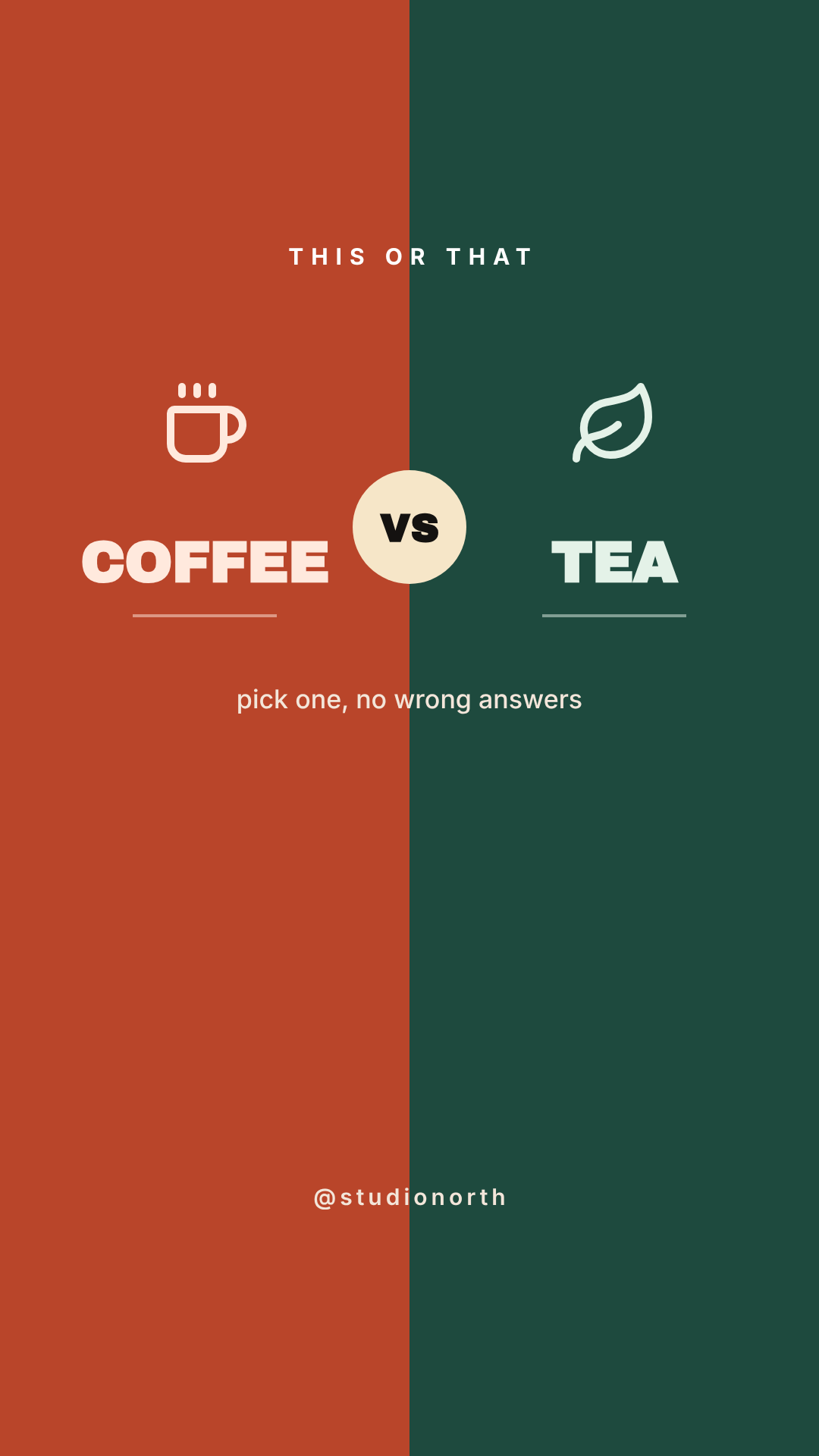
What defines it: a hard vertical split, one word per side, a badge on the seam. Who it's for: anyone who wants replies without asking a question — brands testing two products, creators warming up a cold audience.
The design deliberately stops at about y 950. That gap underneath isn't laziness; it's where the poll sticker goes. Draw all the way down and you'll spend five minutes dragging the sticker around looking for somewhere it doesn't cover a word.
Instagram Story 1080x1920, split vertically into a burnt orange half and a dark green half, THIS OR THAT small caps at the top, the word COFFEE on the left and TEA on the right in heavy condensed caps, a cream circular VS badge on the seam, bottom half left empty for a poll sticker
2. The Countdown Drop
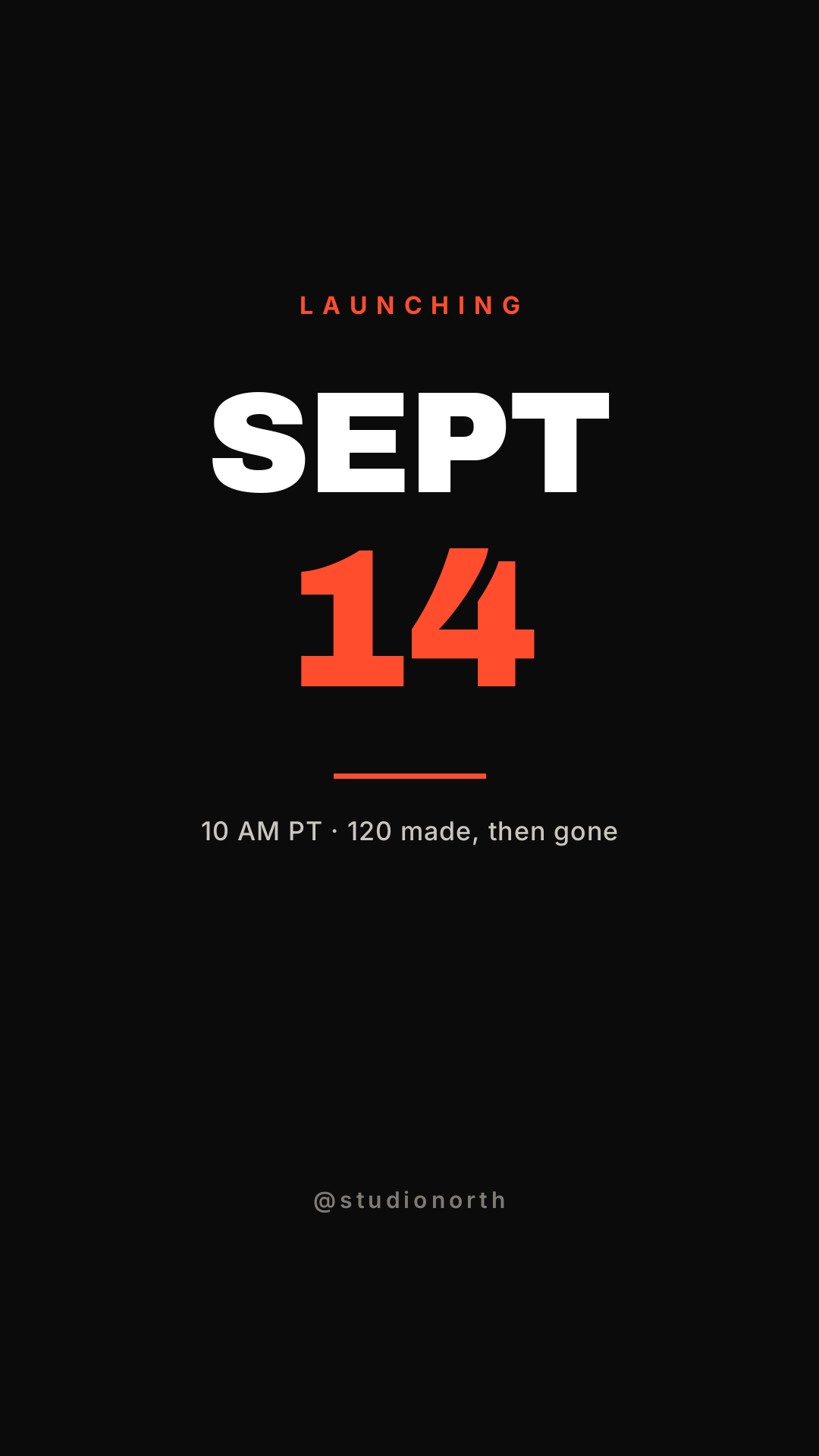
What defines it: one date, set enormous, on near-black. Who it's for: product drops, ticket releases, course enrolment windows.
The thing that kills countdown Stories is decoration. A launch date is already interesting; a starburst behind it isn't. I built the first version of this with a soft radial glow behind the numerals and it rendered as a hard brown disc — a reminder that a "glow" is a photo effect, and a flat colour block pretending to be one just looks like a mistake. Deleted it, and the design got better.
Instagram Story 1080x1920 on near black, LAUNCHING in orange letterspaced caps, SEPT in massive white block capitals with 14 below it in bright orange, a short orange rule, then 10 AM PT and a scarcity line in grey, lower third left clear
3. The Question Box
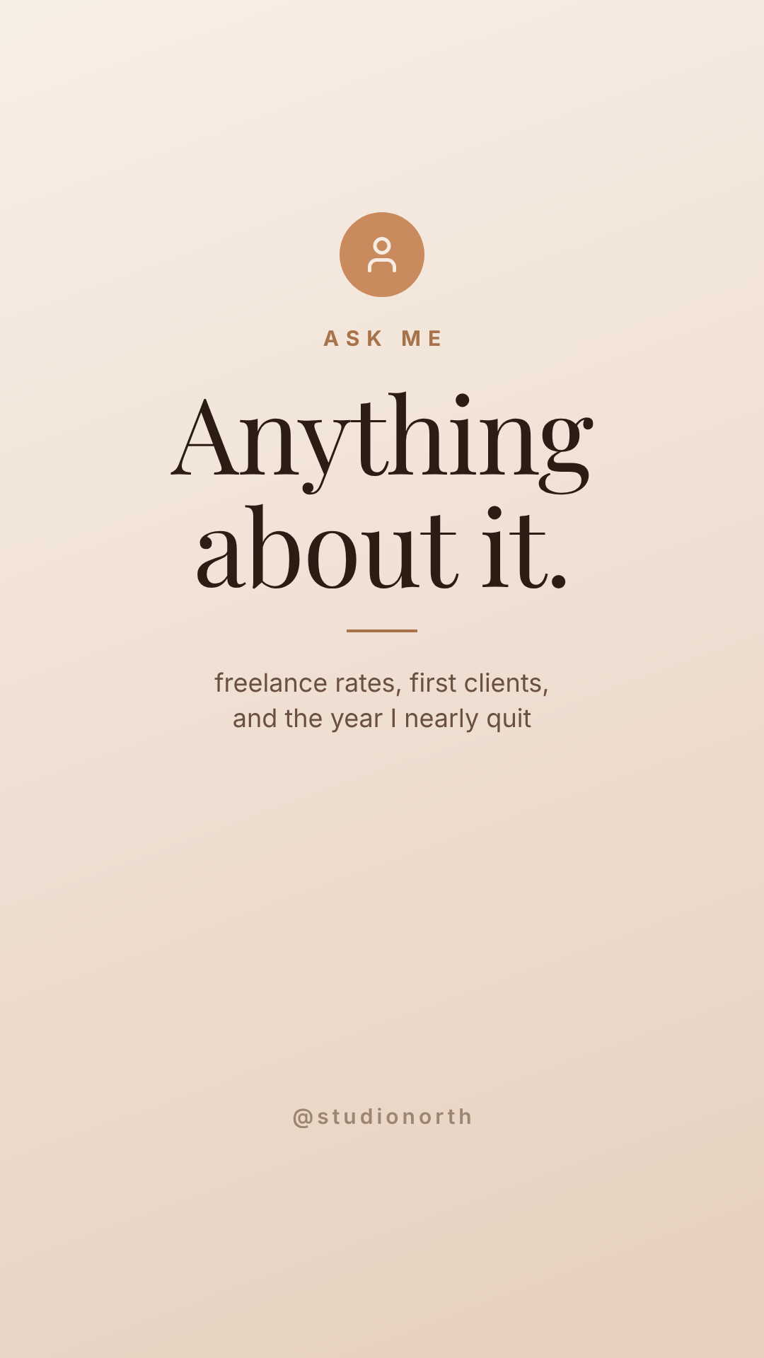
What defines it: soft warm gradient, a large serif, and a genuinely empty lower half. Who it's for: freelancers, coaches, anyone doing an AMA.
The subtext is doing the real work here. "Ask me anything" gets four questions about nothing. "Freelance rates, first clients, and the year I nearly quit" gets forty, because you've told people what's on the table. Name the three topics.
Instagram Story 1080x1920, warm cream to sand vertical gradient, small terracotta circle avatar at the top, ASK ME in letterspaced caps, Anything about it. in a large elegant serif in dark brown, two lines of smaller grey text naming three topics, lower half left empty
4. The Link-Tap Arrow
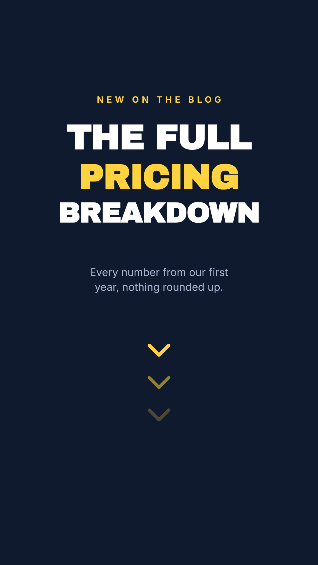
What defines it: a claim up top, and a fading stack of chevrons pointing at the link sticker. Who it's for: blog posts, newsletters, anything that lives off-platform.
Three chevrons at 100%, 55% and 25% opacity read as motion even though nothing moves. One chevron reads as an arrow; three read as go down there and tap. Keep the last one clear of y 1450 so it points at the sticker rather than fighting it.
Instagram Story 1080x1920 on deep navy, NEW ON THE BLOG in yellow letterspaced caps, THE FULL PRICING BREAKDOWN in three lines of heavy block capitals with the middle line in yellow, two lines of pale blue subtext, three yellow downward chevrons fading out toward the bottom
5. The Tap-Through Listicle
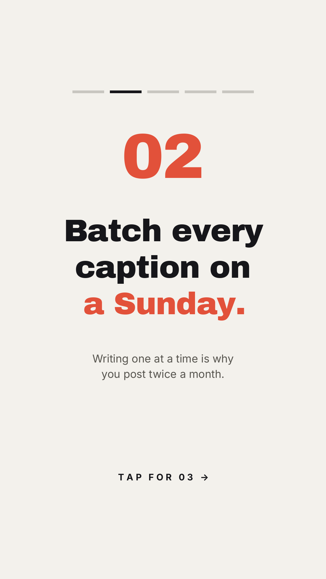
What defines it: five dashes at the top with one filled, one number, one idea. Who it's for: tips, myths, lessons — anything you'd otherwise cram into a carousel nobody swipes.
The dashes are the whole trick. They mimic Instagram's own progress bars, so a viewer instantly knows there are five of these and they're on number two. That's the difference between a Story people tap through and one they tap past.
Instagram Story 1080x1920 on warm off-white, five short progress dashes across the top with the second one filled dark, a large red 02, a three-line headline in heavy black caps with the last line in red, two lines of grey subtext, TAP FOR 03 with an arrow at the bottom
6. The Close Friends Text Takeover
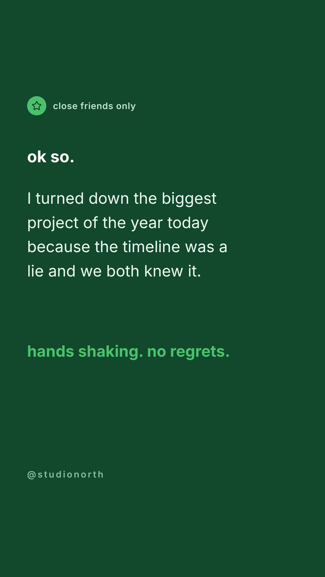
What defines it: Instagram's close-friends green, left-aligned body text, no images and no shapes. Who it's for: founders and creators telling the truth about something.
This one is a design by subtraction. No photo, no icon set, no gradient. The only craft decisions are the line breaks and where the accent colour lands — here on the last line, so it reads like a held breath. If a text Story feels flat, the fix is almost never another element; it's a shorter line and a bigger gap.
Instagram Story 1080x1920 on deep Instagram close friends green, a small green star badge with close friends only beside it, ok so. in bold white, four lines of white body text at readable size, and a final punchline in bright green
7. The Photo Dump Grid
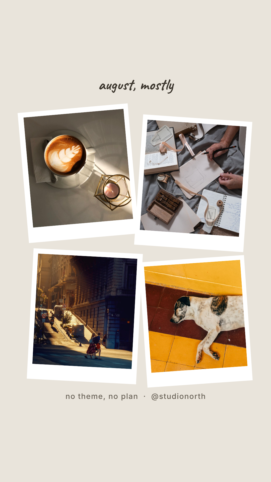
What defines it: four white frames at small opposing angles, handwritten caption, no grid alignment. Who it's for: recaps, month-in-review, travel, anything that would look staged if it were tidy.
The angles have to disagree. Tilt everything −4° and it reads as a broken template; alternate −5°, +4°, +3°, −4° and it reads as photos dropped on a table. Keep the tilts under about 6° — past that it stops looking casual and starts looking like a slideshow transition.
Instagram Story 1080x1920 on warm grey, august mostly in a handwriting font at the top, four white polaroid-style photo frames tilted at slightly different angles in a loose two by two, photos of a latte, a sketchbook, a golden hour street and a sleeping dog
8. The Review Screenshot
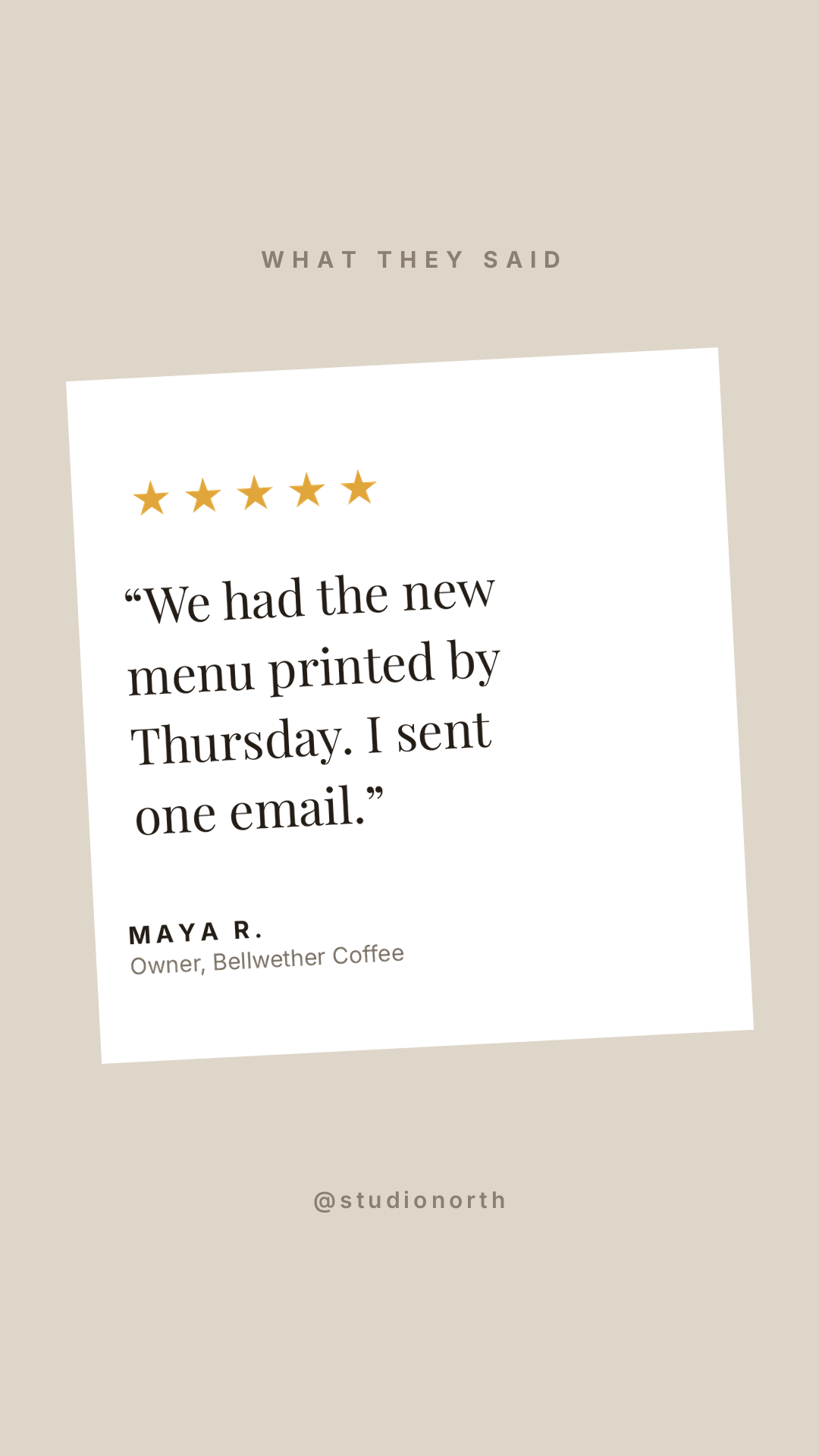
What defines it: a white card on a muted ground, tilted a few degrees so it reads as an object rather than a layout. Who it's for: service businesses posting testimonials without looking like an ad.
Two rules. The stars must be filled — outline stars read as an empty rating at thumbnail size, which is the opposite of what you're posting. And the quote should name a specific thing that happened ("printed by Thursday, I sent one email"), not a feeling. Feelings read as fake; logistics read as real.
Instagram Story 1080x1920 on sand, WHAT THEY SAID in letterspaced caps, a white card tilted three degrees holding five filled gold stars, a four-line customer quote in an elegant serif, and the customer name and business below in small caps
9. The Sale Takeover
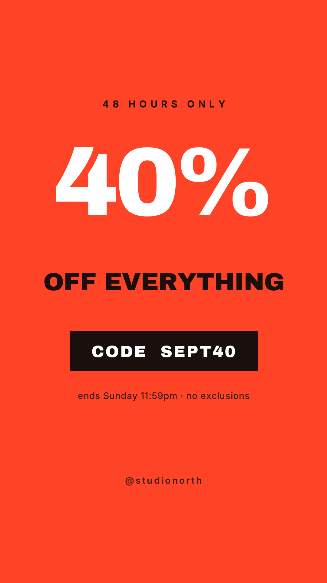
What defines it: one saturated colour edge to edge, one number at 300px+, a code strip. Who it's for: flash sales, end-of-season, anything with a deadline.
Full-bleed colour is the point — a sale Story competes with everything else in the tray, and a white background loses that fight. The black strip behind the code exists so the code survives a screenshot; it's the one thing people zoom in on.
Instagram Story 1080x1920, full bleed bright red-orange, 48 HOURS ONLY in black letterspaced caps, 40% enormous in white, OFF EVERYTHING in heavy black caps, a black strip with CODE SEPT40 in white, and a small fine print line
10. The Weekly Schedule
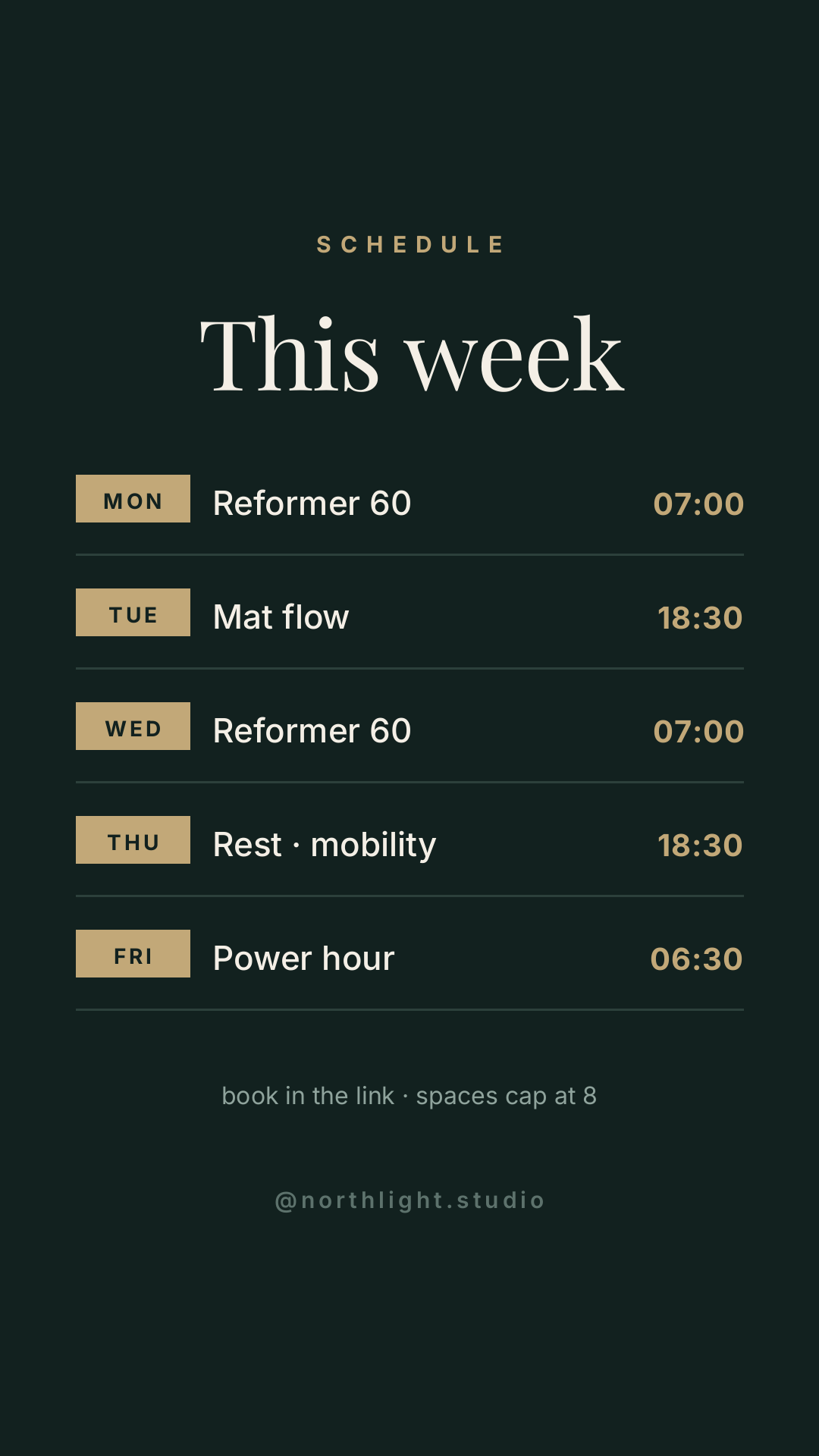
What defines it: a gold day chip, the thing, the time, a hairline rule, repeated five times. Who it's for: studios, gyms, salons, streamers — anyone whose week is the product.
This is the one Story people screenshot, which changes how you build it. Everything must be readable when it's sitting in someone's camera roll with no context, so the day chips are solid blocks rather than text, and the times are in the accent colour so the eye can scan the right-hand edge alone.
Instagram Story 1080x1920 on very dark green, SCHEDULE in gold letterspaced caps, This week in a large cream serif, then five rows each with a small solid gold day chip, a class name in cream and a time in gold, separated by thin hairline rules, and a booking line at the bottom
Building one in Ridvay Studio
Take number 5, the tap-through listicle, because it's the one most people need and the fiddliest to lay out by hand.
Type this into Studio:
Instagram Story 1080x1920 on warm off-white, five short progress dashes across the top with the second one filled dark, a large red 02, a three-line headline in heavy black caps with the last line in red, two lines of grey subtext, TAP FOR 03 with an arrow at the bottom
What comes back is an editable design, not a flat export. The five dashes are five separate rectangle layers. The number, the headline, the subtext and the tap prompt are text layers with their own font, size and colour. Nothing is baked into a picture.
Then make these four edits, each one straight out of the advice above:
- Click the headline and drag the size up until it fills three lines. A Story is read at arm's length in about two seconds — if your headline fits on one line, it's too small, not too concise.
- Recolour the second dash to your accent and leave the rest grey. That's the "you are here" signal from §5, and it's the single edit that makes a Story feel like a series.
- Select the whole text block and check nothing sits above y 250 or below y 1670. Studio shows you the coordinates as you drag. This is the rule the whole post is built on.
- Duplicate the page four times and move the filled dash along. You now have the full set, and every slide is guaranteed to match — which is the thing hand-built Stories never manage.
Make this Story now — the prompt's already filled in →
How to make yours and get it out of Studio
- Start from one of the ten. Every "open and edit" link above opens the real file in the editor. Change the words first, colours second, layout last — in that order you'll finish in ten minutes instead of an hour.
- Apply a brand kit so your palette and fonts land on all five slides at once instead of being retyped per slide.
- Export at 1080×1920 PNG. Instagram re-compresses everything, so export at full size and let it shrink; exporting small and letting Instagram upscale is what makes text look furry.
- Resize for the feed too. One click turns any of these into a 1080×1350 feed post, which is worth doing for the ones with real content in them — the schedule, the review, the listicle.
- Animate it. Ridvay's animated designs turn a Story into a short video export, and Instagram treats a video Story slightly more generously than a still one.
If you'd rather see the whole process end to end on a single Story, the step-by-step version is in How to Make an Instagram Story With AI. For the feed side of the same account, the ten square layouts are in Top 10 Instagram Post Designs for 2026.
Which one should you make first?
If you post rarely: the tap-through listicle, because five slides from one design fills a week. If you sell something: the review screenshot, because it's the only one on this list that does the selling for you. If you're stuck: the this-or-that poll — it takes four minutes, it gets replies, and replies are what get your next Story shown to more people.