Top 10 Logo Designs for 2026 (All Editable)

A logo is the only design you make once and then use ten thousand times. It goes on the sign, the invoice, the app icon, the 32-pixel favicon, the side of a van. Which is exactly why staring at a blank canvas for it is paralysing — you're not picking a picture, you're picking a style, and most people don't have the vocabulary for that yet.
So here are ten. Ten logos I built and rendered, each in a genuinely different style, each with the prompt that made it and a link to open it in the editor and put your own name on it. Pick the one that feels like your business, then change three things.
One rule before we start, because it governs every logo below: your logo has to survive being small and being one colour. If it only works at 400px in full colour on white, it isn't a logo — it's an illustration.
1. The Geometric Monogram

Who it's for: architects, law firms, consultancies, anyone with two founders and a long name.
A monogram buys you a mark without commissioning an illustration. The container does the work — the square is the logo as much as the letters are.
The trap: monograms fail when the two letters have the same silhouette. "OQ" is mush. "KV" works because one letter is angular and one is a wedge. Say your initials out loud and picture them at favicon size before you commit.
A geometric monogram logo for an architecture studio called Kepler & Vance. The letters KV in a heavy black sans, dark navy on an ivory square, wordmark and "architecture studio" centred below on deep navy.
2. The Heavy Wordmark

Who it's for: short, punchy, pronounceable names. Gear brands, agencies, drinks.
No mark at all. The name is the logo, so the typography has to carry every ounce of personality. Which means one deliberate distortion: here it's the tracking pulled to -4, so the letters almost touch and the word becomes a single block.
Wordmarks are also the cheapest logo to own outright — nobody can accuse you of copying a shape you never drew.
A bold wordmark logo for an outdoor supply brand called NORTHBOUND. Ultra-heavy black sans, very tight letter spacing, on a warm amber background, with a small navigation arrow above and a thick rule and "SUPPLY CO. · EST 2019" below.
3. The Circular Emblem

Who it's for: coffee, bakeries, breweries, barbers — anywhere the logo ends up on a cup, a stamp or a window.
The emblem is the most-copied logo shape of the last decade for a good reason: it's self-contained. It sits on any background without a lockup, and it survives being embossed, etched or printed in one colour.
The discipline is containment. Everything lives inside the ring, and nothing touches it. The moment a descender crosses the circle, the emblem stops reading as a seal and starts reading as a mistake.
A circular emblem logo for a coffee roaster called Ferris & Co. A cream ring on deep forest green, with a small coffee cup icon, FERRIS in a classical serif, and COFFEE ROASTERS / EST 1998 stacked below inside the circle.
4. The Negative-Space Mark

Who it's for: apps, health and wellness, anything that wants to look clever without looking busy.
The whole mark here is two circles. One is the brand colour, one is the background colour, and the shape you actually see — a crescent — is the gap between them.
This is the highest-payoff logo style and the easiest to overcook. The test: the empty shape has to be as recognisable as the solid one. A crescent, an arrow, a letter. If you have to explain what's hiding in the negative space, it isn't hiding, it's missing.
A negative space logo for a sleep app called LUNE. A crescent moon made from two overlapping circles in deep navy on a bone background, with LUNE in a heavy sans and "sleep, simplified" below.
5. The Line-Art Icon Mark

Who it's for: outdoors, wellness, small studios, DTC brands with a calm palette.
An icon plus a wordmark is the most flexible lockup there is — you can drop the words for the app icon and drop the icon for the letterhead.
The one thing people get wrong: the icon's stroke weight has to match the type's stroke weight. A hairline mountain over a chunky bold wordmark looks like two logos that met at a party. Here the icon is a 2px line and the wordmark is a light weight at wide tracking. They agree.
A line-art logo for a hiking brand called Fernwood. A thin single-stroke mountain icon in deep green above FERNWOOD in a light sans with wide letter spacing, a hairline rule, and "TRAIL COMPANY" below, on a pale sage background.
6. The Luxury Serif Stack

Who it's for: perfume, jewellery, interiors, hotels, high-end services.
There is nothing in this logo. That's the point. Two words, two hairlines, one descriptor. Luxury on a logo is communicated almost entirely by space — the letter-spacing here is 16, roughly four times what you'd use on body copy.
If your instinct is to add a crest or a monogram or a little flourish, resist it. Every ornament you add moves the brand one notch down-market. The most expensive-looking logos are the ones with the least on them.
A luxury serif logo for a perfume house called Maison Arden. MAISON and ARDEN stacked in a classical high-contrast serif, wide letter spacing, cream on near-black, framed by two thin gold hairlines, with "PARFUMEUR · PARIS" below.
7. The Signature Script
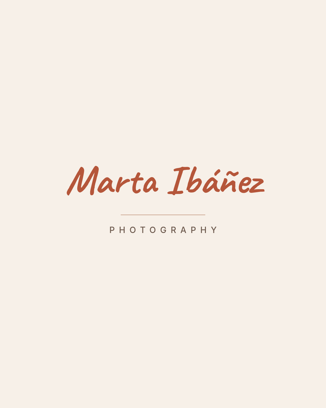
Who it's for: photographers, coaches, makers, therapists — personal brands where the person is the product.
A signature says "you're hiring me, not a company," and for a solo business that's usually the honest positioning.
The rule that saves this style: script for the name, plain sans for everything else. Never two scripts. The handwriting is the personality; the sans underneath is what keeps it legible on an invoice. Also — check it in one colour. A lot of scripts have strokes so thin they disappear at small sizes or vanish in an embroidery file.
A signature script logo for a photographer named Marta Ibáñez. Her name handwritten in terracotta on a cream background, a hairline rule beneath, and PHOTOGRAPHY in a spaced-out sans below.
8. The Retro Badge

Who it's for: workwear, tools, motorcycle shops, hot sauce, anything that wants to look built rather than launched.
A badge is an emblem with corners. Condensed type, a hard border, a limited palette, a rule splitting the name from the descriptor.
The mistake almost everyone makes with retro: reaching for a distress texture. Grunge overlays date instantly and they destroy the mark at small sizes. Retro comes from the letterforms and the palette, not from fake wear. Three colours, a heavy frame, and condensed caps will get you there clean.
A retro badge logo for a workwear brand called Iron Ridge Supply Co. IRON RIDGE stacked in condensed cream caps inside a square cream border on dark brown, with a rust rule, SUPPLY CO. in rust, and EST. MMXIV below.
9. The Abstract Geometric Mark
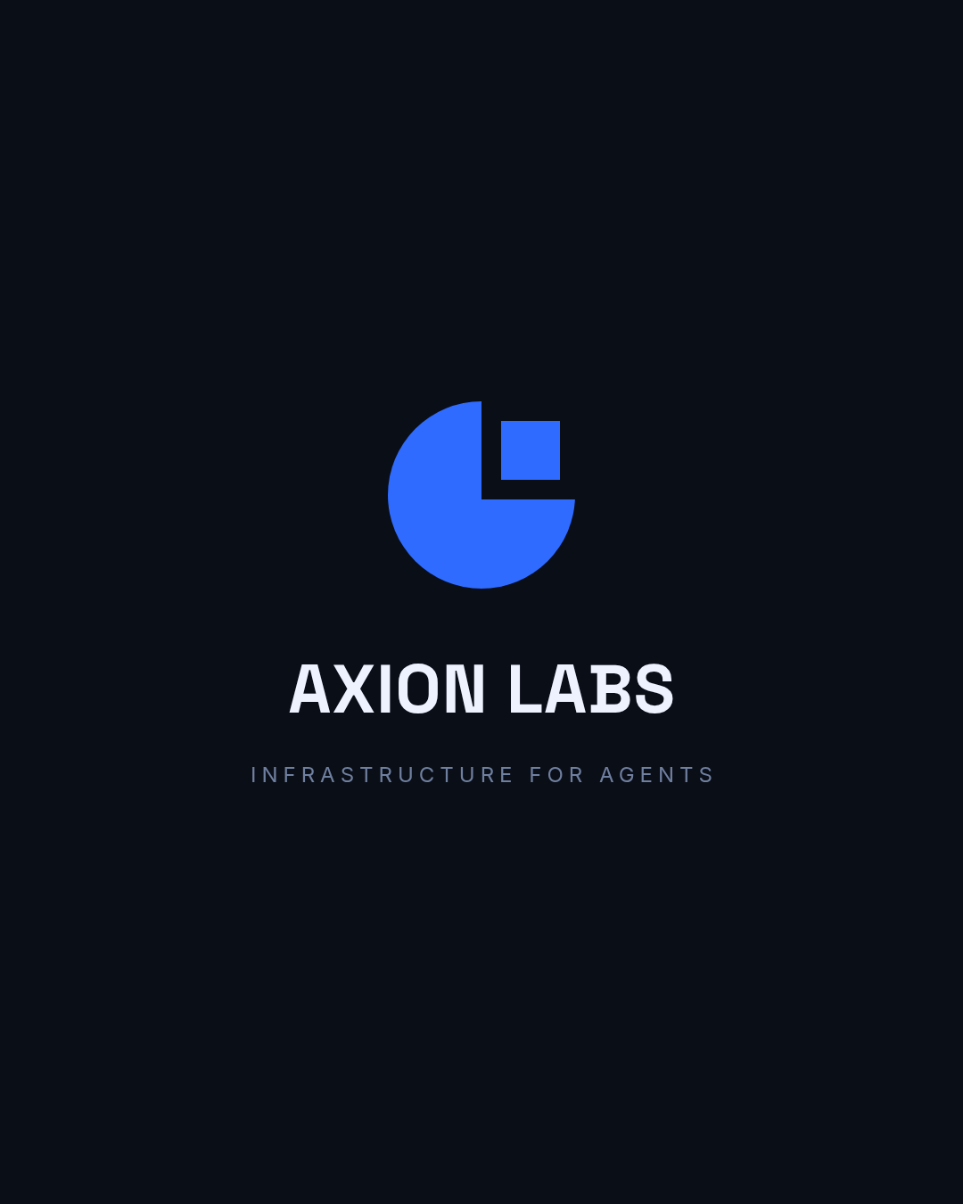
Who it's for: software, fintech, agencies — companies whose product isn't a physical thing you can draw.
An abstract mark means nothing on day one. It only accumulates meaning because you put it everywhere. That's a feature: you're not stuck explaining why a plumbing company has a leaf on it.
The bar is high, though, and it's a simple one: you should be able to redraw the mark from memory after seeing it twice. This one is a circle, a square bite, and a detached square. Three moves. If your mark needs more than four, it's a picture, not a logo.
An abstract geometric logo for a software company called Axion Labs. A bright blue three-quarter disc with a small detached blue square in the missing corner, on near-black, with AXION LABS in a geometric sans and "infrastructure for agents" below.
10. The Playful Rounded Mark

Who it's for: pet care, kids' brands, food trucks, anything that wants to feel approachable rather than expensive.
Friendly is a typographic decision before it's a colour decision. The rounded terminals, the lowercase, the circular container — that's where the warmth comes from. Coral just amplifies it.
What you don't need is a cartoon character. Mascots are expensive to draw, impossible to keep consistent, and they collapse at small sizes. A single simple icon in a circle gets you 90% of the friendliness for 10% of the work.
A playful rounded logo for a pet care business called Pip & Paw. A white paw print inside a coral circle, with "Pip & Paw" in a rounded friendly typeface and "pet care & grooming" below, on a warm cream background.
Building yours in Ridvay Studio
Every logo above started as one sentence. Here's the one for the emblem, verbatim — you can paste it and get the same kind of result:
A circular emblem logo for a coffee roaster called Ferris & Co. A cream ring on deep forest green, with a small coffee cup icon, FERRIS in a classical serif, and COFFEE ROASTERS / EST 1998 stacked below inside the circle.
What comes back isn't a flat picture. It's a real design with separate layers — the ring is a shape, the icon is a vector you can recolour, every line of type is its own text object with its own font, size and tracking. Which means the next part is the actual work:
- Click the wordmark and type your own name. If it's longer than the placeholder, drop the font size before you widen the box — a logo that touches its container reads as cramped.
- Recolour the mark, not the whole design. Select the icon and set
vectorColorto your brand colour, then match the ring to it. Two colours plus the background is the ceiling. - Push the letter-spacing on the descriptor. This is the single edit that moves a logo from "made in five minutes" to "made on purpose" — take the small caps line out to 8–14 and let it breathe. It's the trick doing all the work in #6.
- Shrink the whole canvas to 15% and look again. If the descriptor has turned to grey mush, delete it. Most logos have one line too many.
When you like it, apply it as a brand kit so the same colours and fonts land on every flyer, post and card you make afterwards — that's the part that turns a logo into a brand.
Start with the emblem prompt in Studio →
Exporting a logo you can actually use
A logo file that only exists as one PNG will cause you problems within a month. Before you close the tab, export three versions:
- The full-colour lockup at 2000px wide, for the website header and social profiles.
- A one-colour version — set every element to a single dark hex. This is what goes on invoices, stamps, embroidery and anything printed in one ink.
- A square crop of just the mark, no wordmark, for the favicon and app icon. If your logo is a pure wordmark like #2, use the first letter set in the same type instead.
Then check it at 32px. Everything that survives that is your logo; everything that doesn't was decoration. If the type is coming out fuzzy when you print it large, that's a resolution problem rather than a design one — here's why that happens.
Ten styles, ten starting points. Take the one closest to your business, swap the name, and spend your time on the spacing.