Top 10 Packaging Designs for 2026 (All Editable)

A friend who runs a small supplement brand sent me her carton three days before a 5,000-unit print run. On her laptop it looked fine. I dropped it into a shelf mockup, stood back about a metre and a half, and asked her what the product was. She couldn't tell me either. Protein? Tea? A candle? The name was there. The ingredients were there. Nothing about the look said which aisle it belonged in.
That's the thing most packaging design ideas skip. A poster has one job: stop you. A box has three, in a fixed order, and roughly a second and a half of a stranger's attention to do them in — what is it, who is it for, why this one and not the one beside it. Style is how you answer the second and third without spending words you don't have room for. Picking one isn't decoration. It's the cheapest positioning decision you'll ever make.
So this isn't a mood board. Below are ten packaging styles that will be doing real work on shelves and in unboxing videos through 2026, each with the kind of product it suits, the one rule that keeps it from falling apart, and a finished carton front you can open and edit. Every design here is a real Ridvay design — the prompt that made it is under each one, and the edit link opens the actual layers, not a flat picture.
1. Kraft Minimal
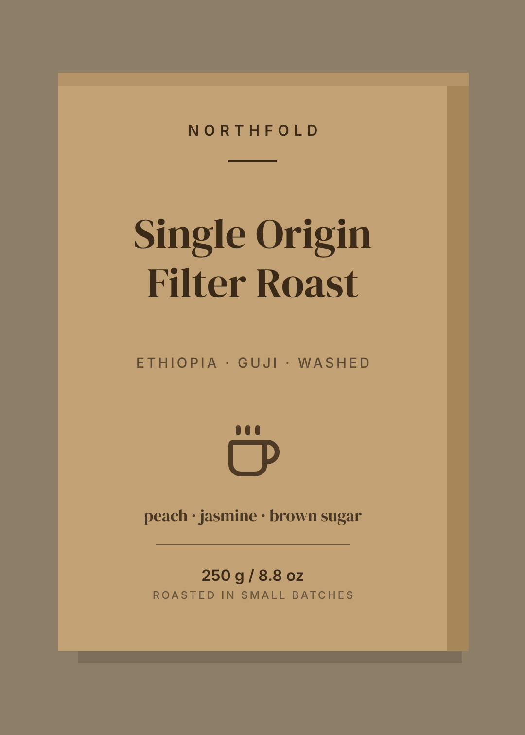
Unbleached board, one ink, and far more empty space than feels comfortable. The restraint is the claim: a brand confident enough not to shout is usually telling you the product costs more because it's worth more.
Best for: small-batch coffee and tea, refills, anything sold on provenance.
The rule: one ink means one ink. The moment you add a second colour, the material stops reading as honest and starts reading as cheap stock with brown printed on it. If you need emphasis, change the size, not the colour.
A tall kraft-brown carton front for single-origin filter coffee, one dark ink only, small letter-spaced wordmark at the top, large serif product name, tasting notes and 250 g at the bottom
2. Typographic Slab
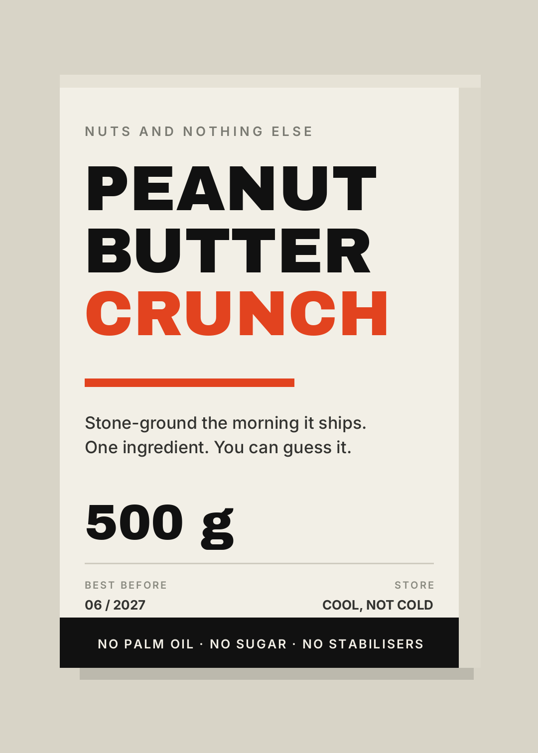
The product name is the design. Type set enormous, stacked flush left, one word flipped to an accent colour so your eye lands somewhere. No illustration, no photo, nothing to hide behind.
Best for: pantry staples, snacks, protein, any DTC brand fighting for attention in a feed as well as on a shelf.
The rule: three words maximum in the stack, and the accent colour goes on the interesting word. "PEANUT BUTTER CRUNCH" works. "PEANUT BUTTER CRUNCH" wastes the one bit of emphasis you get on the least surprising word in the line.
A cream carton front for crunchy peanut butter, three lines of huge black condensed type flush left, the last word in bright orange-red, a thick rule, then 500 g and a black strip along the bottom
3. Botanical Line Art
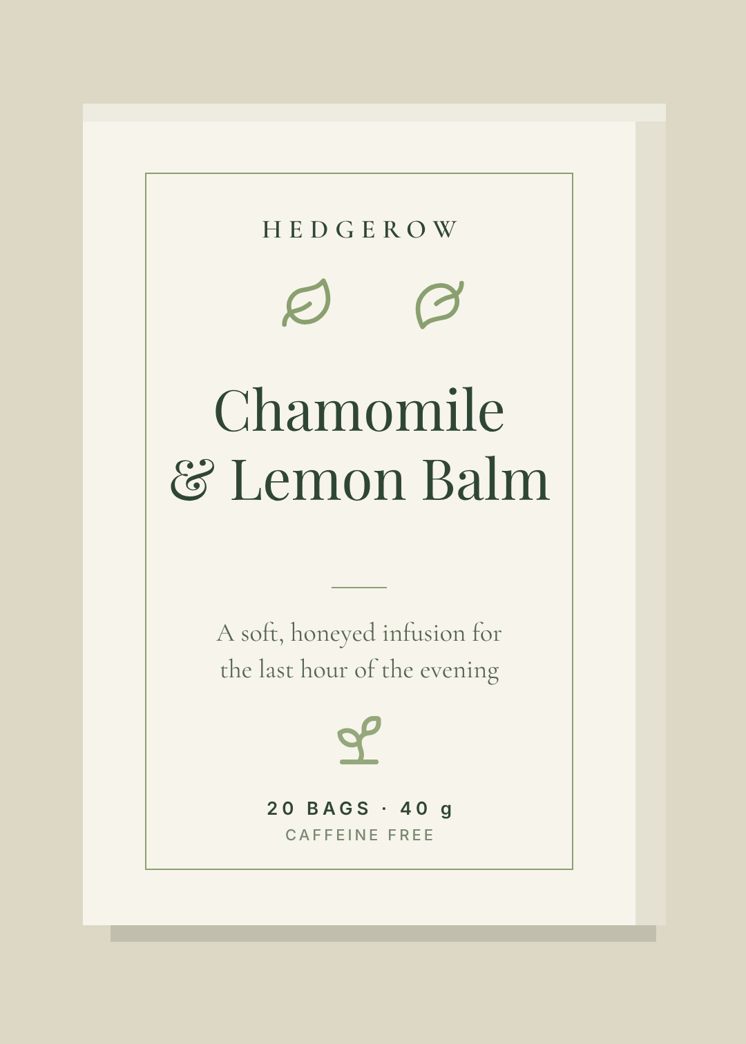
A thin keyline frame, a couple of drawn botanicals, a serif name with room to breathe. It's the oldest look on this list and it keeps working because it signals plant, calm, made by a person faster than any photo of a plant ever does.
Best for: herbal tea, skincare, soap, supplements that want to feel apothecary rather than laboratory.
The rule: line weight discipline. The frame, the leaves and the rules under the name should all be the same hairline. Mixed weights turn a delicate layout into a cluttered one immediately.
An off-white tea carton front with a thin sage-green keyline frame, two small line-drawn leaves, a large Playfair serif name Chamomile and Lemon Balm centred, and 20 bags 40 g at the bottom
4. Monochrome Luxe
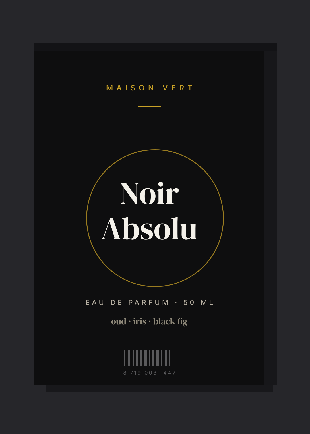
Near-black card, a single metallic accent, type set small and widely letter-spaced, and an amount of empty space that would look like a mistake anywhere else. Luxury packaging buys attention with restraint rather than volume.
Best for: fragrance, premium spirits, high-ticket skincare, anything where the price needs justifying before the customer picks it up.
The rule: the accent is a hairline, never a fill. A thin gold ring reads expensive; a gold-filled circle reads like a discount sticker. Keep the metallic under about 5% of the panel.
A matte black perfume carton front, thin gold ring behind a cream serif name Noir Absolu, MAISON VERT in small gold letter-spaced caps at the top, EAU DE PARFUM 50 ML and a small barcode at the bottom
5. Retro Grocery
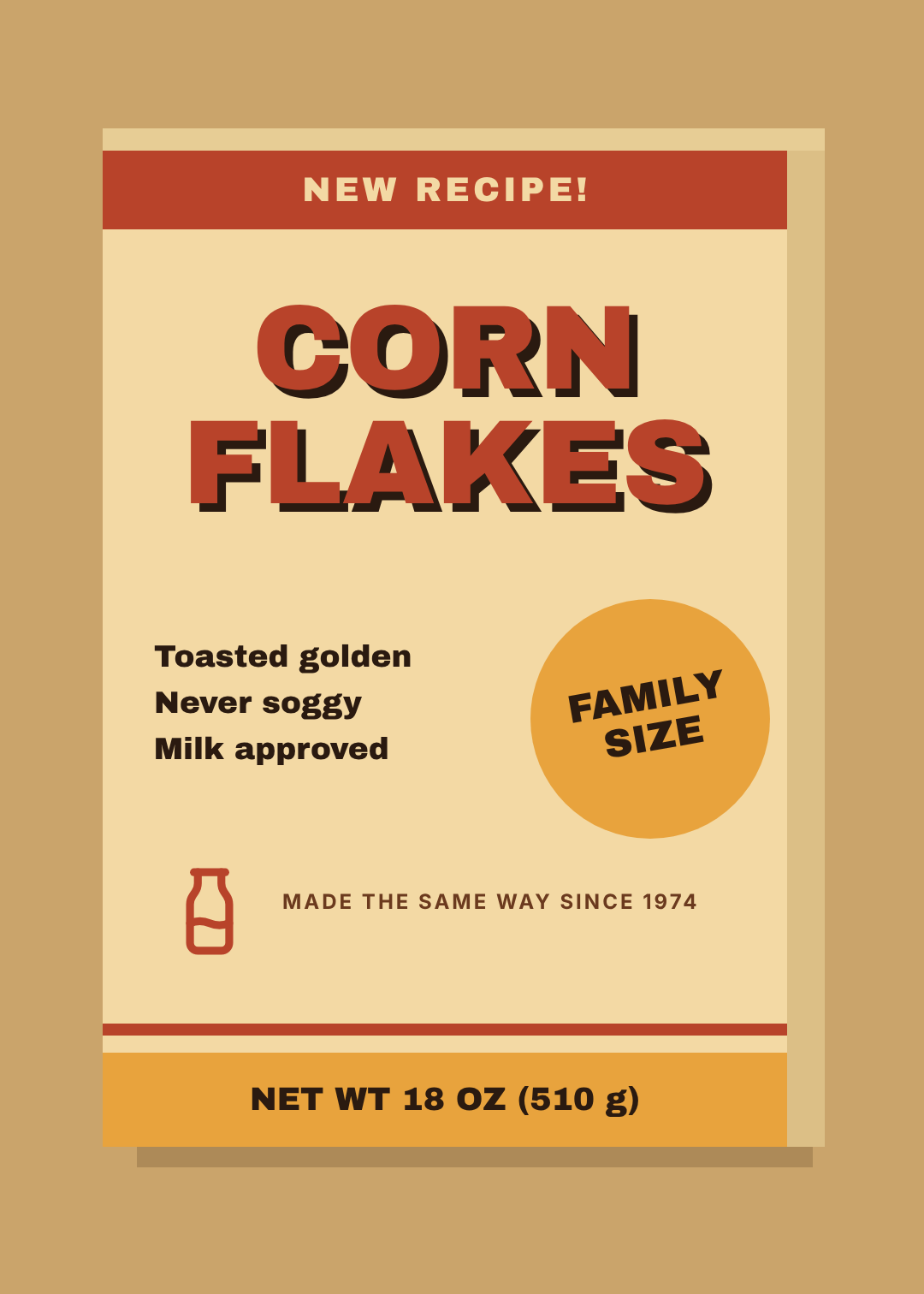
1970s supermarket: heavy display type with a hard offset shadow, rust and mustard bands top and bottom, a tilted burst badge shouting something about size or price. Nostalgia does the positioning for you — it says this recipe hasn't changed without you having to claim it.
Best for: cereal, pantry goods, sweets, craft soda, anything with a heritage story true or borrowed.
The rule: commit to the period palette. Retro done in 2026 brand colours looks like a mistake; retro done in mustard, rust and cream looks deliberate. Two bands, one badge, then stop.
A cream cereal box front in 1970s supermarket style, rust band at the top reading NEW RECIPE, huge CORN FLAKES in rust with a hard dark drop shadow, a tilted mustard FAMILY SIZE badge, mustard band at the bottom with NET WT 18 OZ
6. Pastel Colour-Field
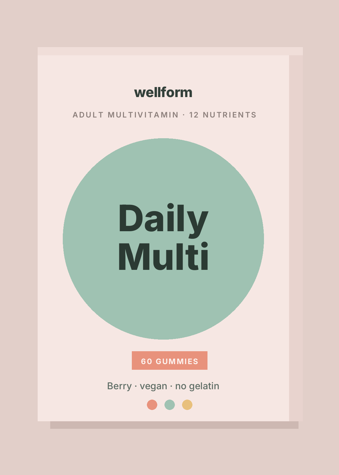
One big soft shape, one heavy friendly sans, two or three muted colours that never fight each other. This is the look that took over wellness and personal care, and it works because low contrast reads as gentle — exactly what a product you put in your body is selling.
Best for: vitamins, period care, pet products, anything medical-adjacent that doesn't want to feel medical.
The rule: low contrast between the shapes, high contrast between text and whatever it sits on. Sage type on a blush panel is the failure mode here — it looks soft in Figma and disappears in a shop.
A blush pink supplement carton front, large sage green circle in the middle, Daily Multi in heavy dark rounded sans inside the circle, a coral pill badge reading 60 GUMMIES, and three small colour dots at the bottom
7. Window Die-Cut
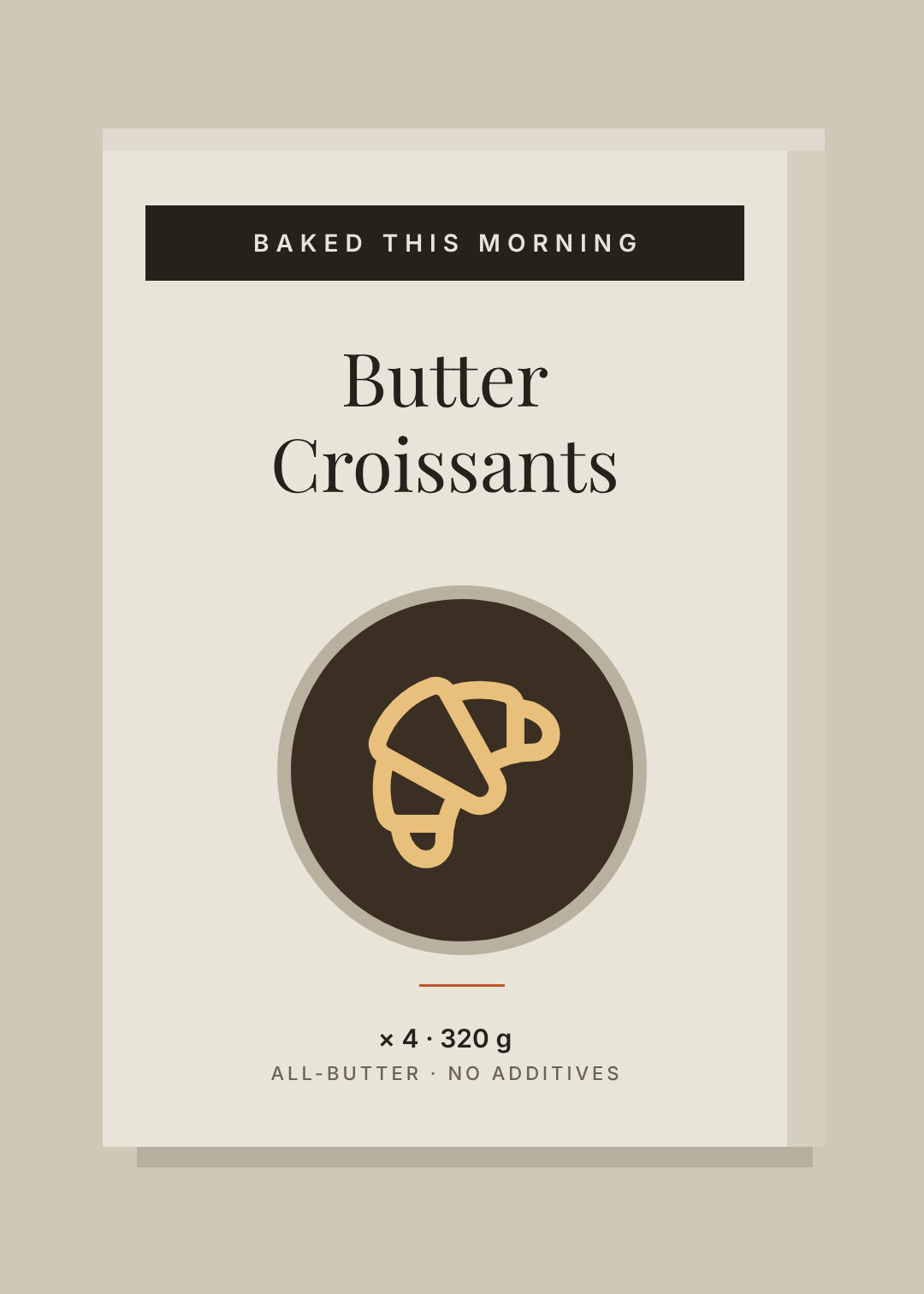
A hole in the box. Still the highest-converting packaging device ever invented, because it replaces every trust claim you could print with the product itself. The layout's whole job is to get out of the window's way.
Best for: bakery, confectionery, toys, candles, anything that looks better than it photographs.
The rule: the window is the hero, so give it the optical centre and let everything else be furniture — a small label plate above, specs below. And check your dieline before you print: a window that clips the product is worse than no window.
A warm off-white bakery carton front with a round die-cut window showing a croissant, a dark label plate at the top reading BAKED THIS MORNING, Butter Croissants in a serif above the window, and x4 320 g below
8. Pattern Wrap
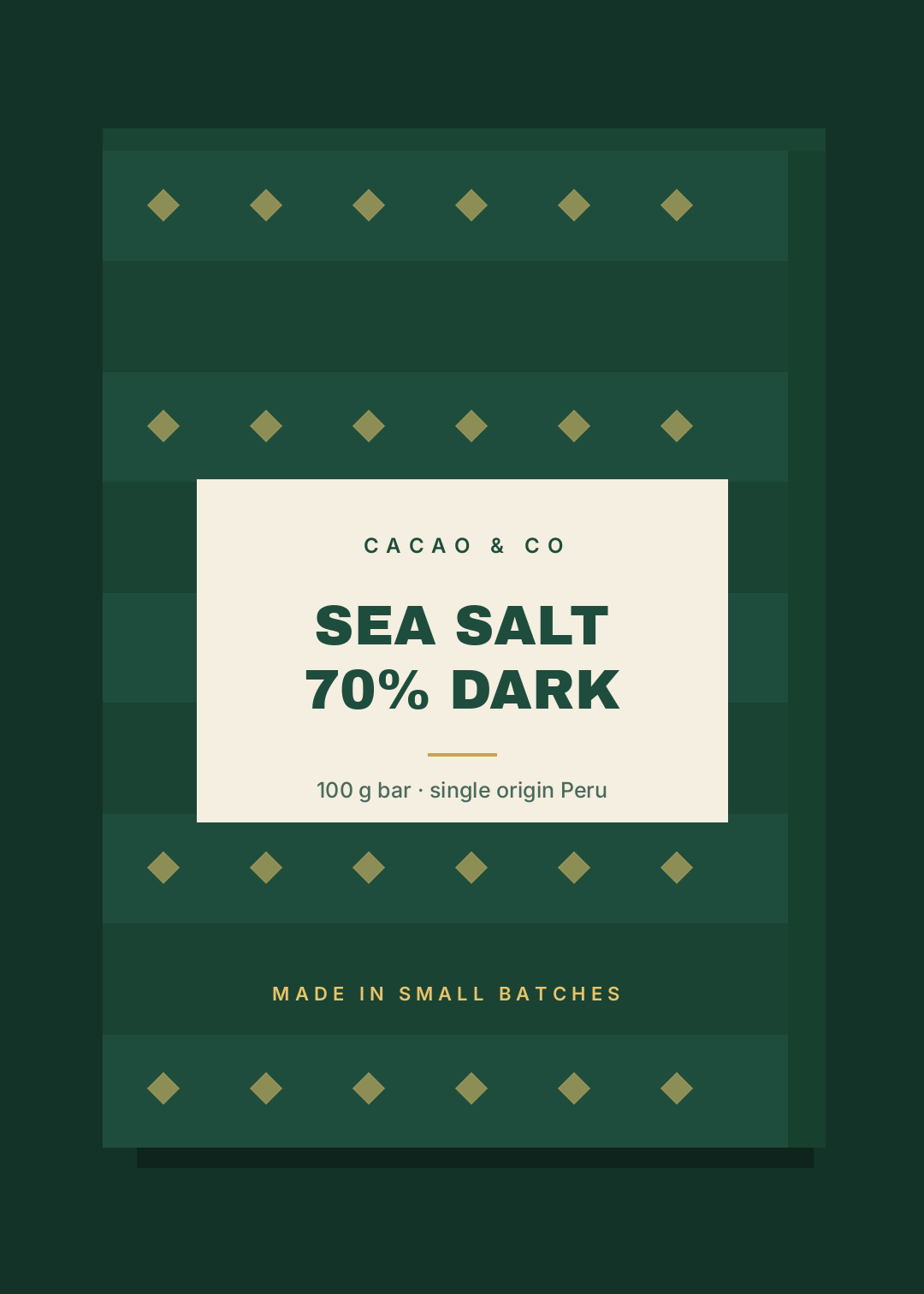
A motif repeated edge to edge across the whole panel, with a clean label plate dropped on top to carry the words. The pattern becomes the brand asset — recognisable at a distance, and it wraps onto every other face of the box for free.
Best for: chocolate, tea, gift sets, socks, subscription boxes — anything bought as a present.
The rule: the plate needs hard edges and real contrast against the pattern. A translucent panel over a busy repeat is where this style goes to die. Solid cream on deep green, every time.
A deep green chocolate carton front with a repeating gold diamond pattern over subtle horizontal bands, a solid cream rectangular label plate in the middle with SEA SALT 70% DARK in heavy green type, and 100 g bar single origin Peru underneath
9. Clinical Data Panel
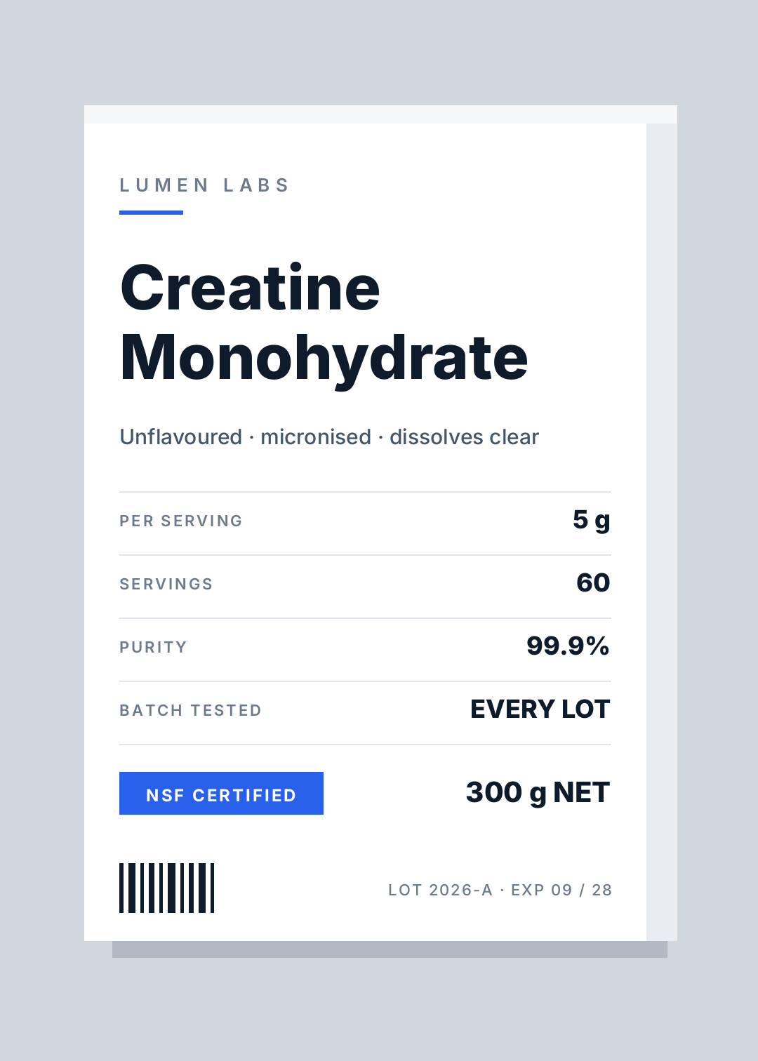
White card, a grid, and the numbers on the front instead of hidden on the back — dose, servings, purity, testing. It's the anti-wellness look: no soft shapes, no reassurance, just the facts a sceptical buyer was going to turn the box over for anyway.
Best for: supplements, nootropics, actives-led skincare, performance nutrition.
The rule: every number must be real and verifiable. This style borrows authority from the convention of a data table, and one invented figure — a purity claim you can't evidence — collapses the whole thing into a lie in a small font.
A white supplement carton front, LUMEN LABS in small grey caps, a short blue rule, Creatine Monohydrate in heavy dark sans, then a four-row data table with per serving 5 g, 60 servings, 99.9% purity and batch tested, a blue NSF CERTIFIED badge and 300 g NET
10. Eco Claim Stamp
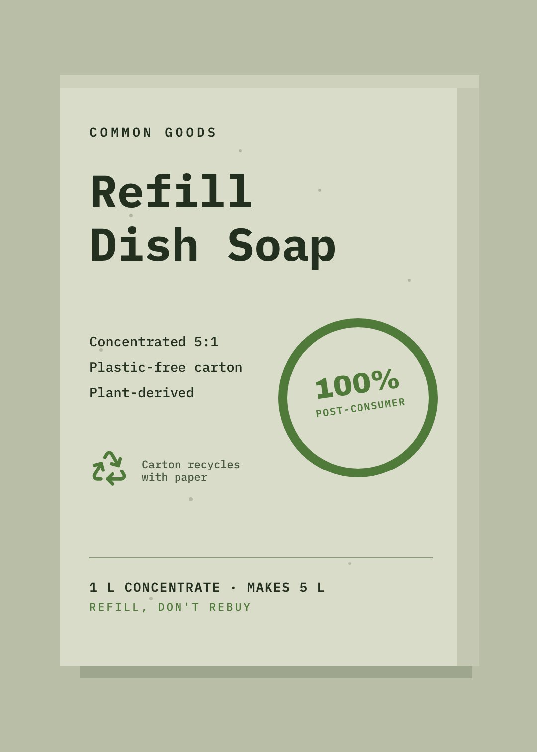
Flecked recycled board, monospace type, and one bold circular stamp carrying a specific claim. The stamp does what a paragraph of sustainability copy can't: it gives the eye a single thing to land on and believe.
Best for: refills, household cleaning, zero-waste ranges, anything sold on replacing a plastic version.
The rule: the stamp says a measurable thing. "100% post-consumer" is a claim. "Eco-friendly" is a mood, and shoppers have learned to read it as nothing at all. Put the number in the circle or don't use the circle.
A recycled greenish board refill carton front with paper flecks, COMMON GOODS in monospace caps, Refill Dish Soap in large monospace, a green circular stamp reading 100% POST-CONSUMER, three short bullets on the left and 1 L CONCENTRATE MAKES 5 L at the bottom
Building one in Ridvay Studio
Pick the style closest to your product and change the words — that gets you 80% of the way in about a minute. If you'd rather start from your own brief, type it into Studio and edit what comes back. Here's the one that produced the kraft carton above:
A tall kraft-brown carton front panel for single-origin filter coffee, one dark ink only, small letter-spaced wordmark at the top, large serif product name, tasting notes and 250 g at the bottom
What you get back is a real design, not a flat image: the wordmark, the product name, the rule, the icon and the spec lines are separate layers with their own fonts, colours and positions. So the next four edits are the ones that actually matter:
- Click the product name and cut it to two words. Long names are the single most common reason a carton stops reading at distance. If it won't fit on two lines at that size, the name is the problem, not the layout.
- Drag the spec block down until it sits below the halfway line. Weights, counts and legal text belong in the bottom third — that's where every shopper's eye already goes to look for them.
- Swap the accent colour to your brand's. One click on the rule, one on the icon. If you've set up a brand kit, apply it and both update together, along with the fonts.
- Resize for the other faces. Duplicate the page, change the canvas to your side-panel dimensions and pull the same layers across — the ingredients face and the top flap are the same brand assets at different scales, not new designs.
Getting it to the printer without surprises
Three things turn a good carton front into a printable one, and all three bite after you've approved the artwork.
Ask your printer for the dieline first. It's a flat template showing the panels, the fold lines and the glue tab. Your front panel is one rectangle on it. Designing the front and then discovering the fold runs through your product name is the most expensive way to learn this.
Keep anything important 5 mm off every fold and edge. Cutting and creasing drift a little on every run. Type that sits tight to a crease will look crooked on at least some of the boxes.
Export at print resolution and expect the colour to shift. Screens are RGB and cartons are CMYK, so the electric accent you picked will print duller — that's why your design prints the wrong colour, and it's worth knowing before you sign off rather than after. The same goes for size and DPI: design at the real panel dimensions, not at a convenient screen size.
If the box has a card or a leaflet inside it, that's a separate small design worth doing properly — a packaging insert is the cheapest reorder tool you own.
Which one is yours?
If you're not sure, use the aisle test: cover the words on each of the ten above and ask what kind of product it is. The styles that still answer are the ones doing their job. That's the only test that matters at a metre and a half.
All ten are editable, all ten are free to open, and none of them require a designer to change.