Top 10 Podcast Cover Art Designs for 2026 (All Editable)

I shrank all ten of the covers below to 55 pixels wide — roughly the size Apple Podcasts actually renders artwork at in a Browse row — and looked at them from arm's length. Six survived. Four turned into grey mush with a smear where the show name used to be.
That gap is the whole problem with podcast cover art. You upload a 3000×3000 file. Almost nobody ever sees it at 3000×3000. The decision to tap happens at thumbnail size, in a scrolling list, next to forty other squares competing for the same half-second.
So the ten styles here aren't sorted by what looks good in a portfolio. They're sorted by what still reads when it's the size of a fingernail. Each one is a real design, generated and then hand-edited in Ridvay Studio, with the prompt that made it and a link to open and change it. Pick one, put your show's name in it, ship it.
The only test that matters for podcast cover art
Before the styles, the rule they all obey: one thing has to survive the shrink. Not three things. One.
That one thing is usually the show name set enormous, or a single shape with a hard silhouette — a circle, a band, a face. Everything else on the cover is a detail for the people who already tapped. Host name, tagline, "new episodes Tuesdays", a network logo: all fine, all invisible at 55px, all there for the show page rather than the browse row.
The failure mode is always the same — a cover that is four things at 40% size each. It looks balanced on your monitor and dissolves in the app.
1. Blackout Type
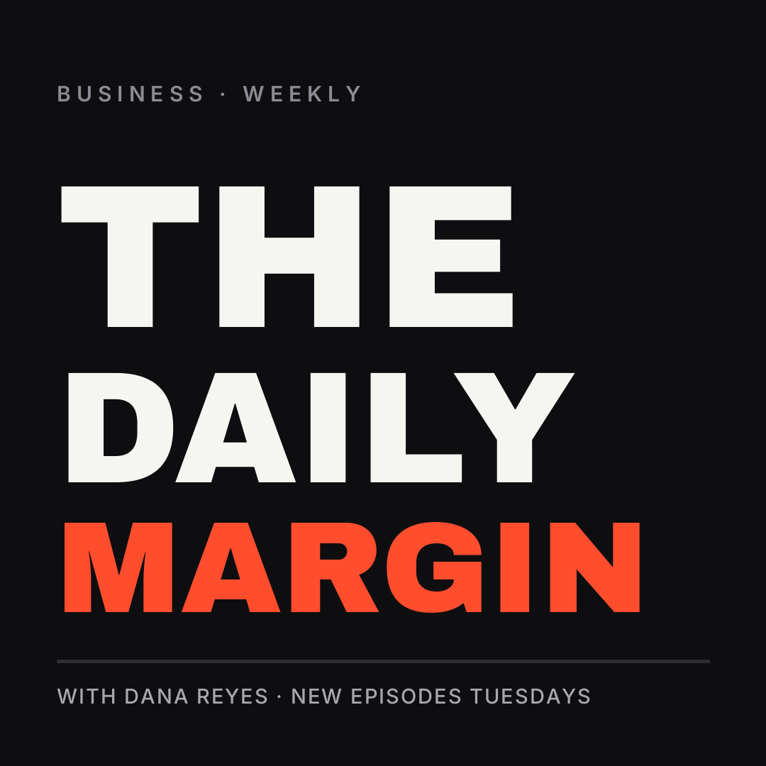
What defines it: the title fills the square edge to edge, broken across three lines sized to fill the width, with one word in an accent color. No photo, no graphic, no mercy.
Who it's for: news, business, commentary — any show where the name is the brand and you want it legible at any size.
This is the style that wins the 55px test outright, because at 55px the cover is still just the word. The accent line gives the eye somewhere to land so it doesn't read as a wall.
A podcast cover, dark near-black square, the show name "The Daily Margin" set in huge condensed black type across three lines filling the whole square, the last word in bright orange, a thin rule and the host name in small caps at the bottom
2. Host Portrait With a Name Band

What defines it: a photo of the host filling the square, with a solid band across the bottom third carrying the show name. The band is the trick — it gives the type a clean, opaque surface instead of fighting the photo.
Who it's for: interview shows, anything where the host's face is the draw.
Two rules or this one dies. Crop tight enough that the face is recognisable at thumbnail size — a full-body shot becomes a smudge. And never set type directly on the photo; that's what the band is for. (More on that in how to put readable text over a photo.)
A podcast cover with a photo of a man in headphones at a studio microphone, darkened, and a solid navy band across the bottom third with the show name "The Long Game" in bold white, a gold kicker line above it and the host name below
3. Retro Record
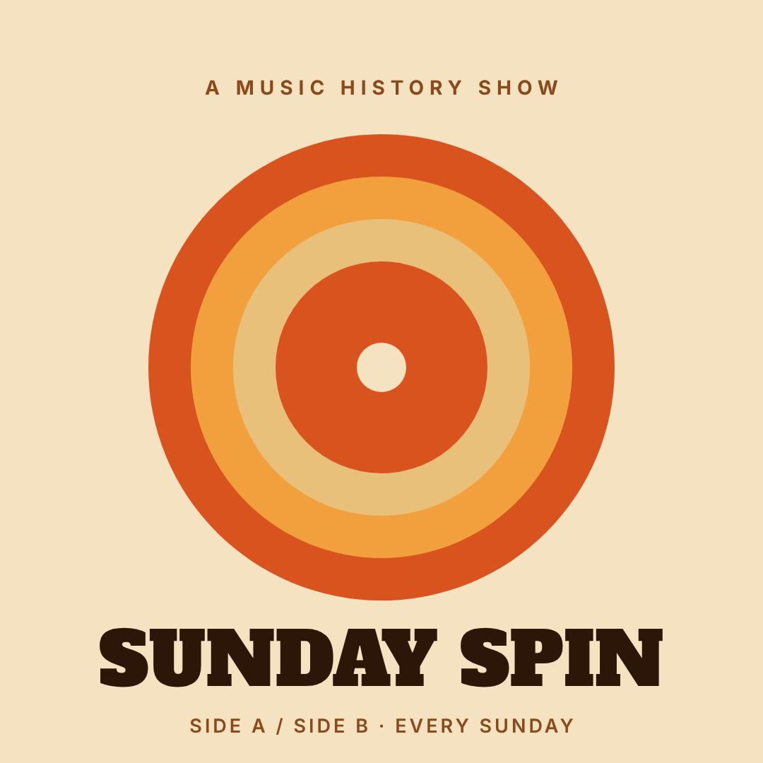
What defines it: concentric rings in a warm 70s palette — burnt orange, mustard, cream — that read as a vinyl record, with a fat slab serif underneath.
Who it's for: music, film, culture, nostalgia shows.
The rings do the shrinking work: a bullseye is one of the few shapes that stays a recognisable shape at any size. Note where the title sits — under the rings, not inside them. An earlier version of this cover had the descriptor line centred in the middle ring and it vanished into the mustard. Large decorative circles will always eat text placed on top of them.
A retro 1970s podcast cover on a cream background, concentric burnt-orange and mustard rings forming a vinyl record in the centre, the show name "Sunday Spin" below in a heavy slab serif, dark brown, with a small tagline underneath
4. Editorial Serif
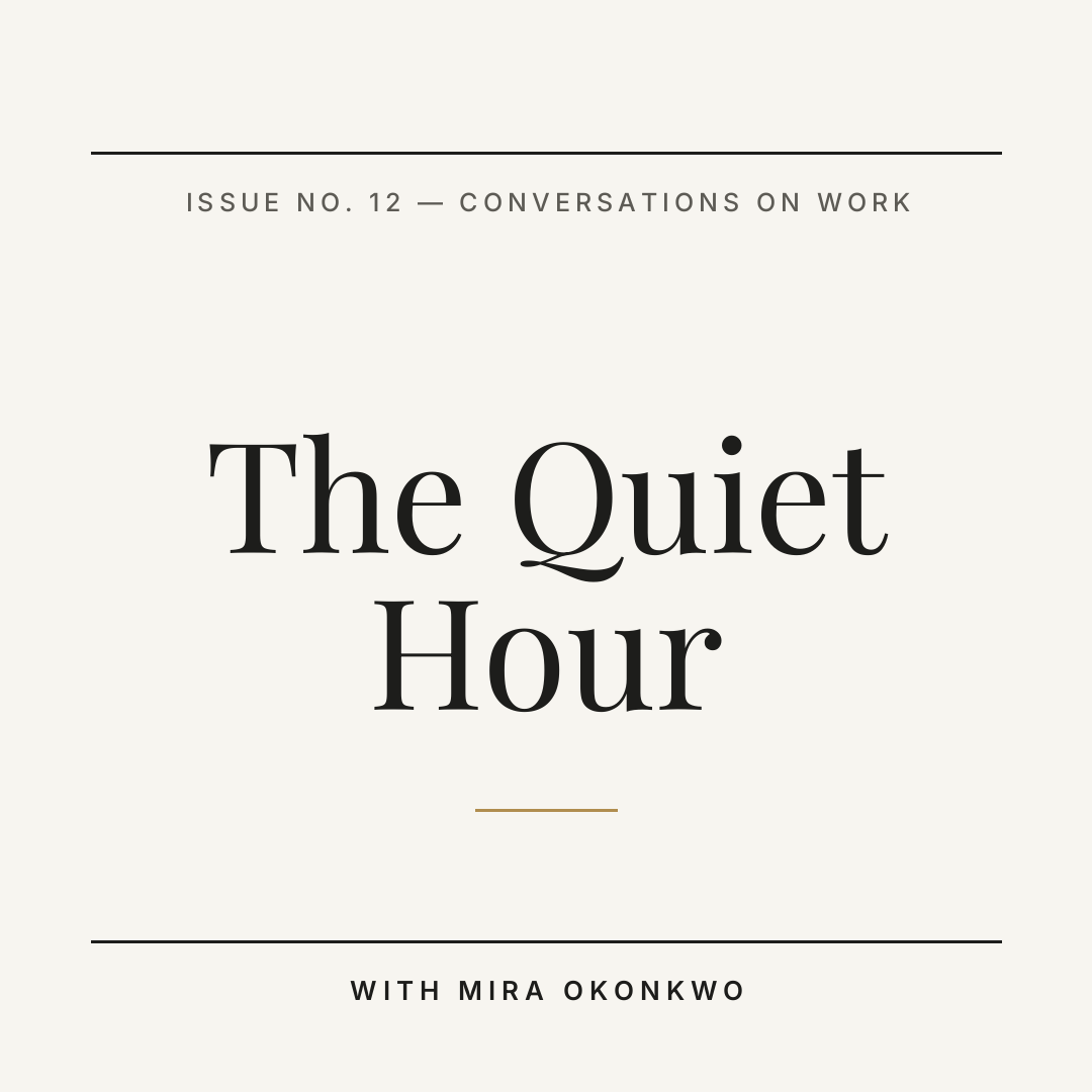
What defines it: off-white paper, a high-contrast serif set large and centred, hairline rules top and bottom, and nothing else. It borrows from magazine mastheads.
Who it's for: longform interviews, essays, business and design shows aimed at people who read.
This is the riskiest style on the list at thumbnail size, and it works anyway because there are only three elements. The moment you add a fourth — a photo, a badge, an episode number — it collapses. Restraint isn't decoration here, it's the load-bearing wall.
A minimal editorial podcast cover on warm off-white, the show name "The Quiet Hour" centred in a large elegant serif over two lines, thin black rules across the top and bottom, a small caps issue line and host name, lots of white space
5. Neon Grid
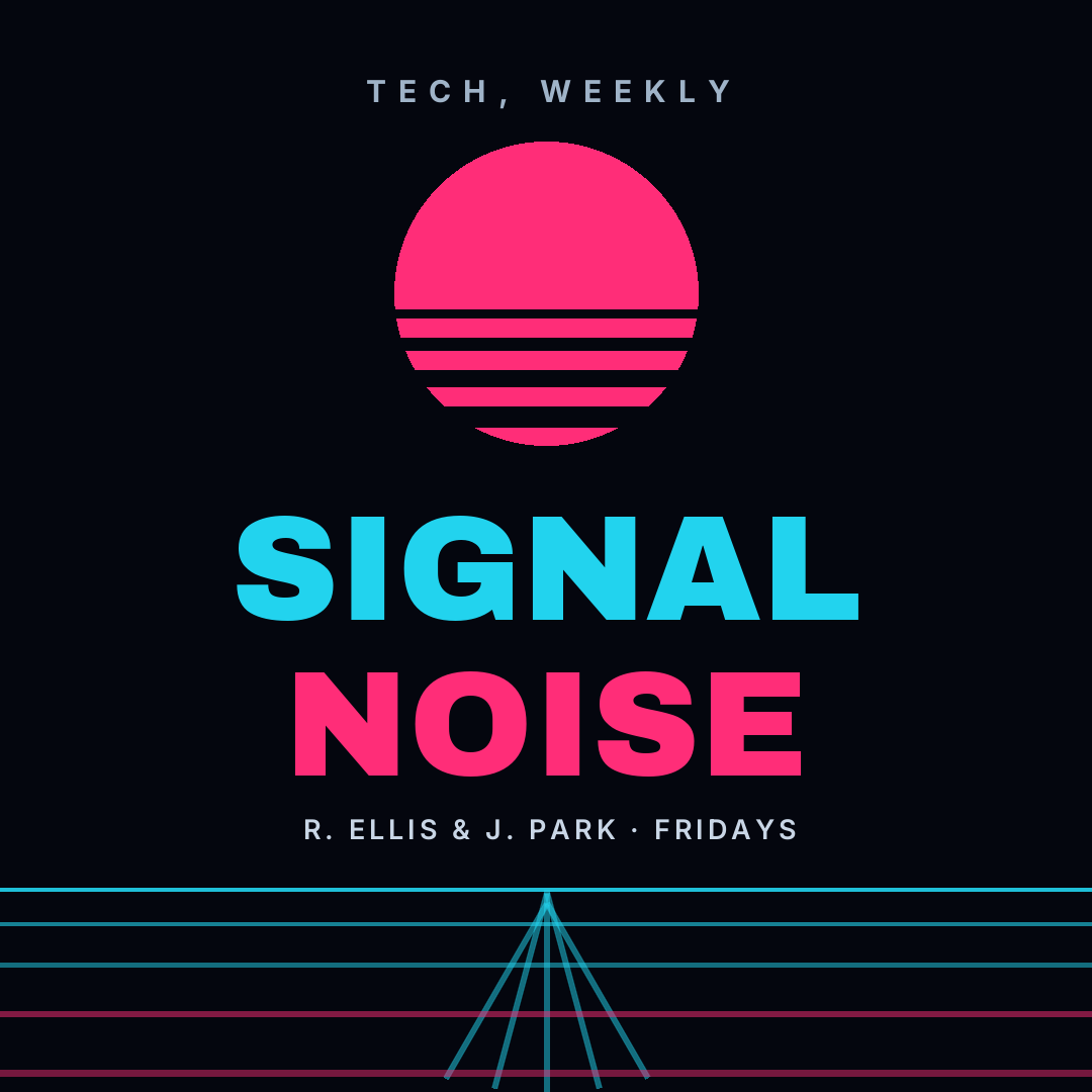
What defines it: near-black background, a sliced sun, a cyan perspective grid on the horizon, and a two-word title split across two neon colors.
Who it's for: tech, gaming, sci-fi, anything with a nerdy audience that reads the palette as a genre signal.
The colors are doing more than looking cool — cyan and hot pink are the two hues that stay separable at small sizes on a dark field. Keep the grid below the type. When I first built this the perspective lines ran up through the footer and the whole bottom half read as a mess of scratches.
A synthwave podcast cover, near-black background, a hot pink sun sliced by horizontal bars at the top, a glowing cyan perspective grid across the bottom, and the show name "Signal Noise" in huge heavy type, SIGNAL in cyan and NOISE in pink
6. True-Crime Noir
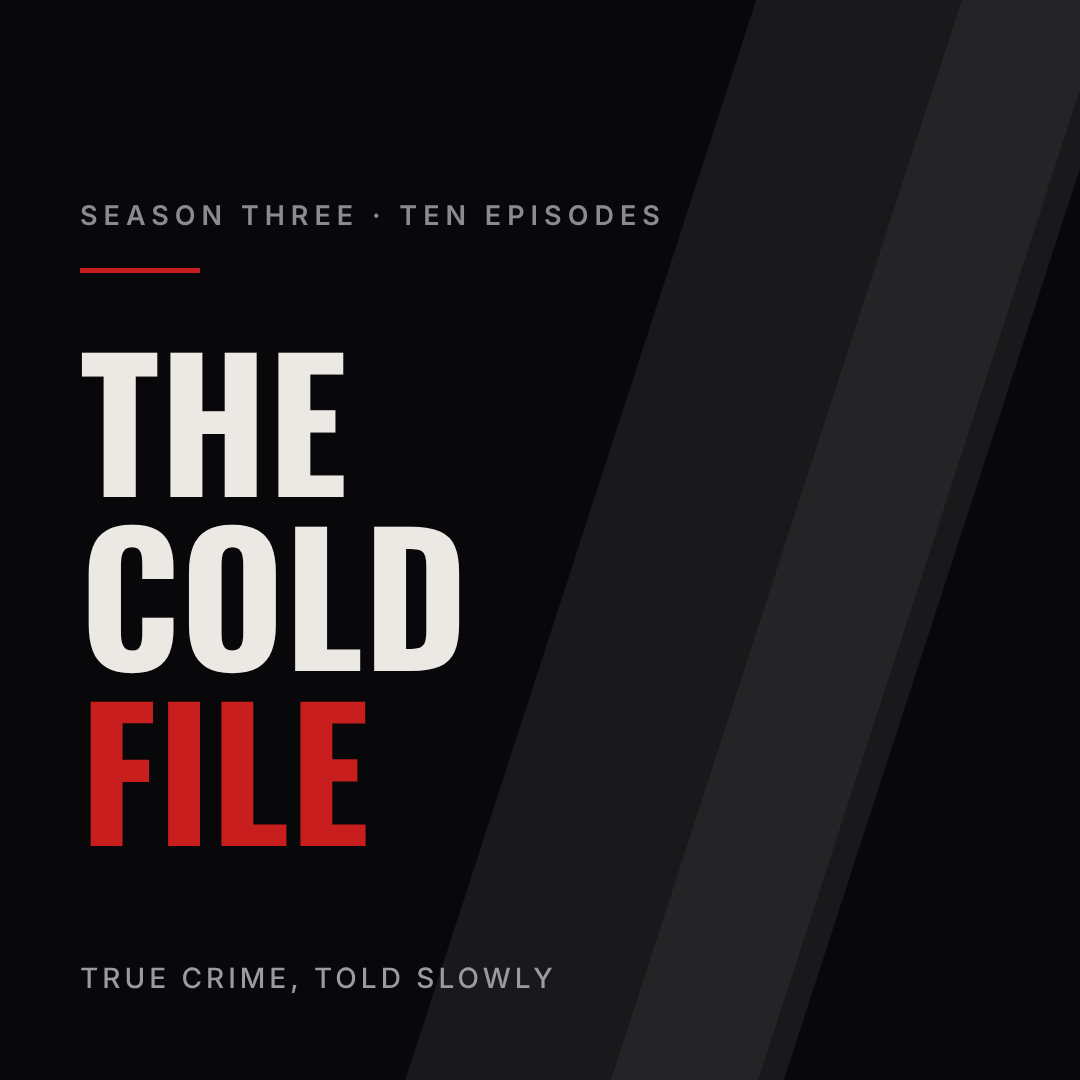
What defines it: almost-black, a single diagonal shaft of dim light, condensed capitals stacked left, and exactly one blood-red word.
Who it's for: true crime, investigative journalism, horror fiction.
True crime is the most crowded shelf in podcasting, so the genre cues are doing real work — a browser scanning the category recognises the palette before they read a word. The one thing to avoid: stock photos of handcuffs or crime-scene tape. Every other show has them. A void with a light in it is more unsettling and, usefully, still reads at 55px.
A dark true crime podcast cover, almost black, with a faint diagonal shaft of light across the right side, the show name "The Cold File" in tall condensed capitals stacked on three lines in bone white with the last word in deep red, a small season line at the top
7. Pastel Badge
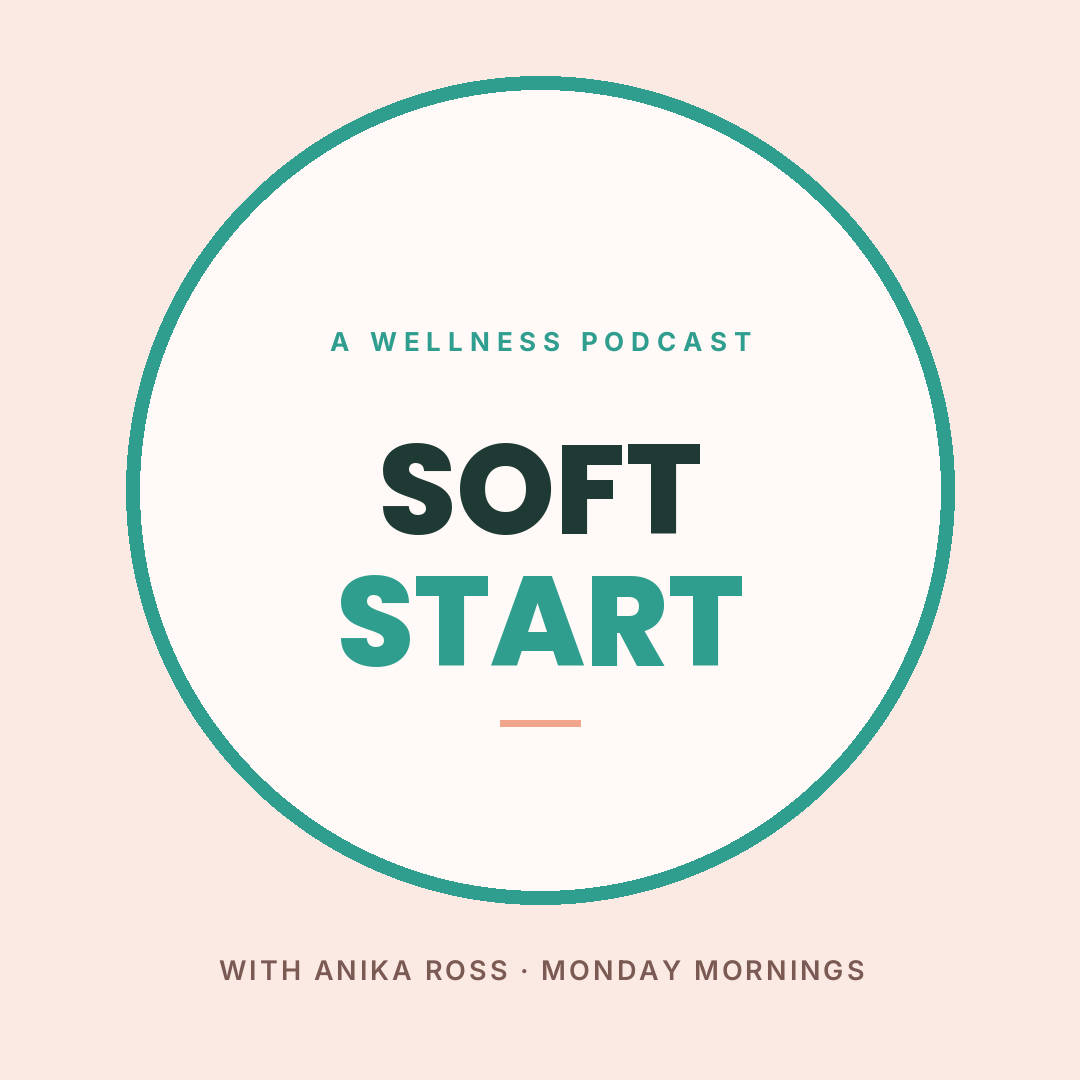
What defines it: a blush background, a large circle outlined in a single accent, and a rounded geometric sans centred inside it.
Who it's for: wellness, parenting, self-help, lifestyle — categories where a hard-edged cover reads as aggressive.
The circle is the whole design. It gives you a clear silhouette at thumbnail size while the palette stays soft, which is the combination this genre usually gets wrong. Most pastel covers are pale type on a pale field, and they disappear. Keep the outline and keep the contrast inside the badge dark enough to read.
A soft pastel podcast cover, blush pink background, a large white circle badge outlined in teal filling most of the square, the show name "Soft Start" centred inside in a rounded bold sans, SOFT in dark green and START in teal, a small caps line above and host name below the circle
8. Duotone Photo
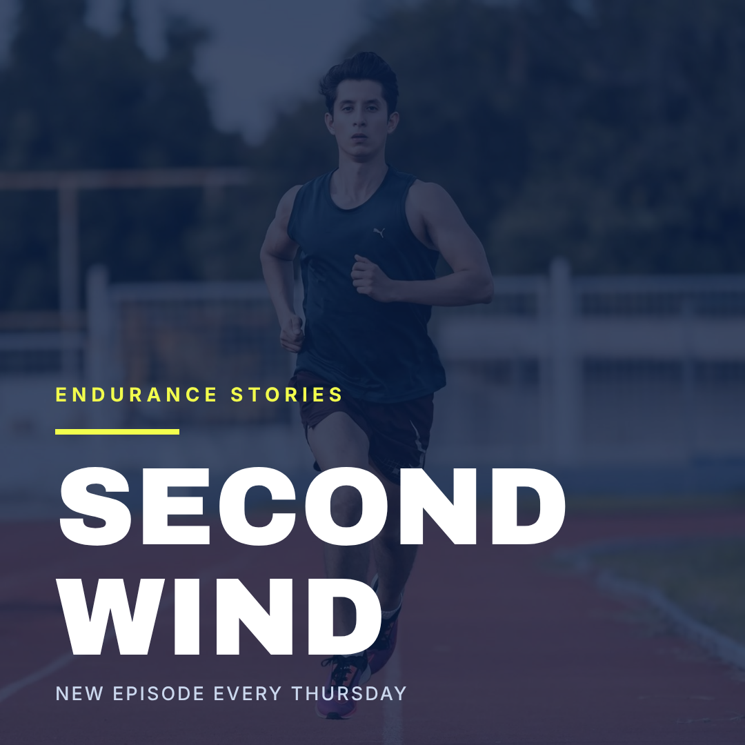
What defines it: a photo flattened under one heavy color wash so it becomes texture rather than subject, with a headline sitting on top and a single acid accent.
Who it's for: sports, music, documentary — shows that want energy without a host's face.
The wash is what makes a stock photo look art-directed instead of borrowed. One warning from building this: don't scrim only the bottom half. A half-height overlay leaves a visible horizontal seam straight across the middle of the square. Tint the whole canvas, then let the type carry the contrast.
A podcast cover of an athlete sprinting on a running track, the whole photo tinted deep navy blue so it reads as one colour, the show name "Second Wind" in huge white block type across the bottom left, a bright acid-yellow kicker line and short rule above it
9. Sticker Collage
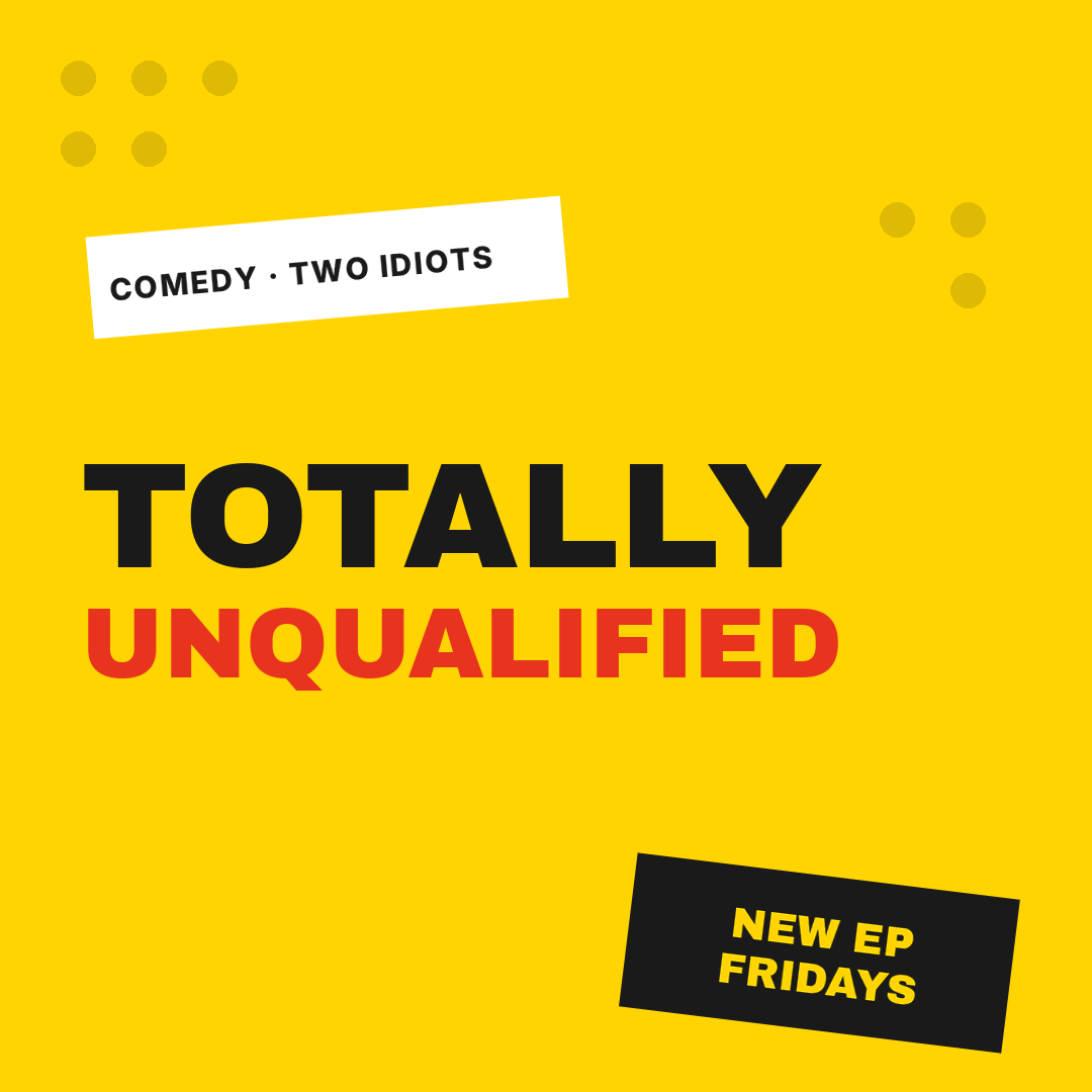
What defines it: a loud flat background, tilted rectangular "stickers" with type inside them, halftone dots in the corners, and a title in two clashing weights.
Who it's for: comedy, chat shows, anything built on personality rather than subject.
Yellow is the reason this one works in a feed — it's the rarest background color in podcast art and it punches out of a list of navy squares. The tilt has to be small, 5–8 degrees. Any more and it reads as a mistake rather than a choice.
A bright yellow comedy podcast cover, a white tilted sticker label at the top with "Comedy · Two Idiots" in bold, the show name "Totally Unqualified" in huge black and red block capitals across the middle, a black tilted sticker at the bottom right reading "New Ep Fridays", halftone dots in the corners
10. Monogram Mark
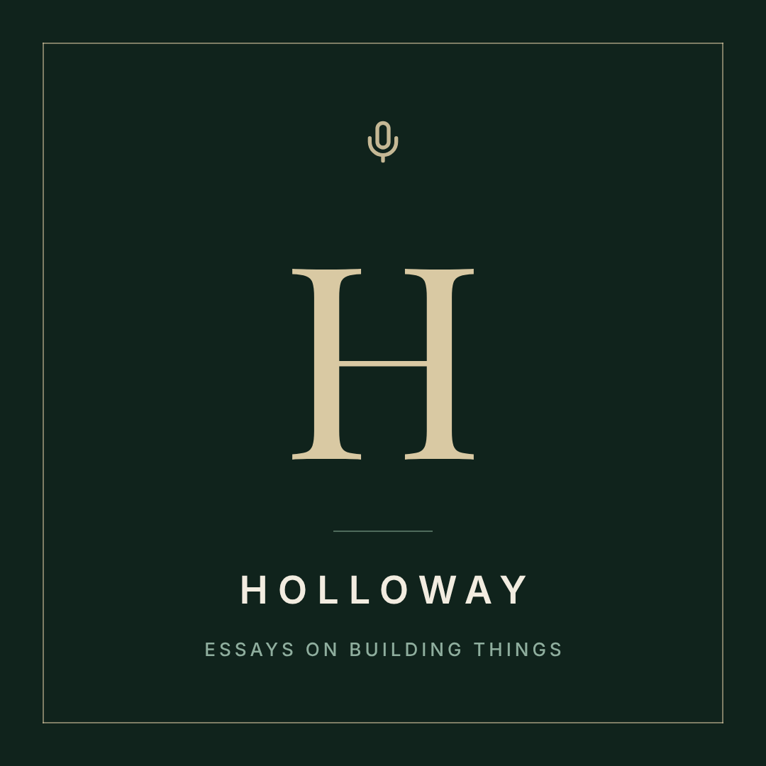
What defines it: a single letter set very large in a high-contrast serif, a hairline frame, a small mic mark, and the show name letterspaced underneath.
Who it's for: solo shows, indie essayists, anything named after a person or a place.
A monogram is the cheapest way to look like you have a brand, and at thumbnail size a single letterform is close to unbeatable — it's one shape with huge negative space around it. It only works if the letter is genuinely large. At 40% of the square it looks like a logo you forgot to finish.
An elegant podcast cover on deep forest green, a large cream capital H in a high-contrast serif centred in the square, a thin hairline border frame inset from the edges, a small microphone icon above the letter, and "HOLLOWAY" letterspaced below with a small tagline
Building one in Ridvay Studio
Every cover above started as one sentence. Here's the exact prompt for the blackout-type one, which is the style I'd hand to a first-time podcaster:
A podcast cover, 1:1 square, dark near-black, the show name "The Daily Margin" in huge condensed black type filling the square across three lines with the last word in bright orange, a thin rule and the host name in small caps at the bottom
What comes back is an editable design, not a flat picture. The headline is a text layer with a real font on it, the orange word is its own line with its own color, the rule is a shape, the background is a fill. Nothing is baked in, so you don't regenerate to make a change — you click it.
Three edits to make next, each one straight out of the rules above:
- Click the headline and push the size up until the longest line nearly touches both margins. That's the 55px test being won. Most people stop 30% too small.
- Recolor just the accent word. Select that line only and change its color — one accent, not two. If your show has a brand color, this is where it goes.
- Shrink the footer line. Host name and schedule should be roughly a fifth the size of the title. If they compete, you have four things at 40% again.
Then use one-click resize to spin the same layout into a 1080×1080 announcement post and a 1080×1920 story for launch day, so your cover, your feed post and your story all look like one show.
Open this cover in Studio and put your show's name in it →
Exporting artwork the directories will accept
Get this wrong and your show sits in review limbo, so it's worth thirty seconds:
- Square, always. 1:1. Not 4:5, not 16:9. Every directory crops to a square and a non-square upload gets rejected or centre-cropped badly.
- 1400×1400 minimum, 3000×3000 recommended. Apple Podcasts sets the floor at 1400px and the ceiling at 3000px; Spotify and the rest follow it. Design at 3000×3000 and you never think about it again.
- RGB, not CMYK. This is a screen-only asset. If you've been doing print work and your file is CMYK, the colors will shift on upload — here's why that happens.
- JPEG or PNG. Flat-color covers like the blackout, badge and monogram styles compress beautifully as PNG. Photo-based covers should be JPEG.
- No episode numbers in the artwork. You will get tired of re-exporting by episode nine.
One last thing worth saying out loud: your cover is allowed to change. Plenty of shows relaunch with new art at episode twenty, once they know what the show actually is. Pick a style from this list, ship it this week, and revisit it when you've got something to revisit.
If you want the process end to end rather than the style menu, there's a walkthrough in how to make podcast cover art with AI. Otherwise, pick your number and go.