Top 10 Real Estate Flyer Designs for 2026 (All Editable)

An agent I know prints 200 flyers for every open house. Same layout every time: photo on top, price under it, five bullet points, headshot in the corner. It works — it just looks like every other sheet on the kitchen island, and buyers walk out of four houses on a Saturday holding four identical pieces of paper.
The fix isn't more information. It's picking a real estate flyer design that matches what you're actually selling. A $4M vineyard estate and a $1,850/month two-bed do not want the same layout, and a vacant lot wants something neither of them would recognise.
Below are ten flyer styles that look different from across the room. Each one has the listing type it's built for, the prompt that produces it, and a link to open it in Ridvay Studio and swap in your own address. All ten are real designs — click any of them and you land in an editor, not a download page.
1. The Full-Bleed Hero

One photo, edge to edge, with a solid dark panel across the bottom holding the price and specs. No frame, no white margin, no competing elements.
Who it's for: the listing where the exterior shot is genuinely good. Curb appeal, a new roof, a corner lot — if the photo sells the house, get out of its way.
The panel is the whole trick. Text laid straight over a photo fights the photo; a solid block underneath it gives you guaranteed contrast at any print quality. (More on that in How to Put Readable Text Over a Photo.)
Make a portrait real estate flyer: full-bleed exterior house photo, a "JUST LISTED" blue pill top left, and a solid dark navy panel across the bottom third with the price in huge white bold, the address under it, a thin blue rule, then a bed/bath/sqft row and the agent's contact line.
2. The Editorial Split

A hard vertical split: photo down the left, cream column on the right with a big serif headline, a short paragraph, and specs set as labelled pairs. The bottom-left block goes dark and carries the price.
Who it's for: character homes, period properties, anything where the story matters as much as the square footage. This is the layout that lets you write a sentence instead of a bullet list.
Notice there's no "3BR/2BA" shorthand anywhere. Labelled pairs — BEDROOMS / 3 — read slower and more expensively, which is the point.
Design a portrait real estate flyer with a cream background: a vertical photo column filling the left half top, a dark charcoal block below it with the guide price in a serif, and a right column with a small "FOR SALE" kicker, a three-line Playfair headline, a short paragraph, four labelled spec pairs, and the agent's name at the bottom.
3. The Swiss Data Grid
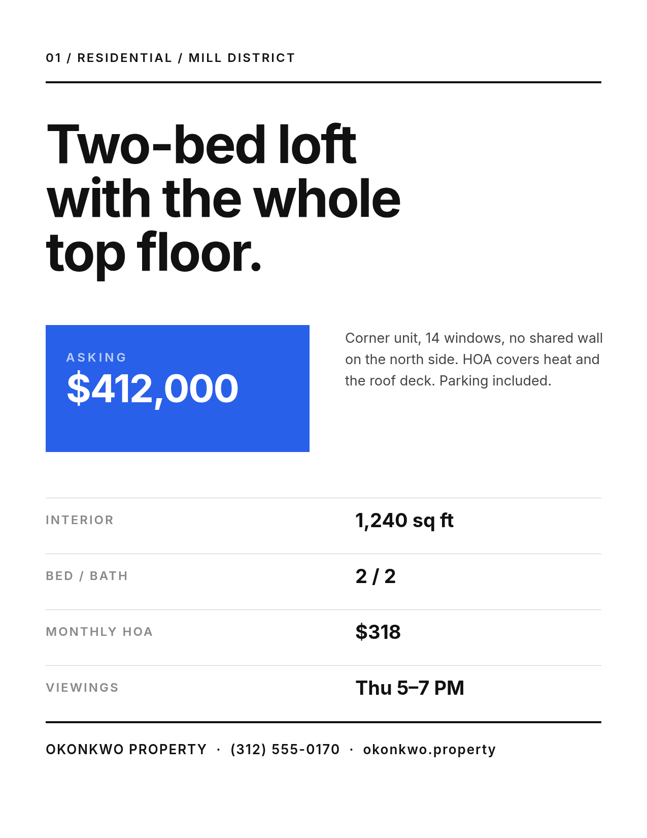
White page, one heavy sans headline, a blue block holding the price, and a spec table ruled with hairlines. No photograph at all.
Who it's for: urban condos and lofts, off-market listings, and every situation where the photos aren't ready yet. It's also the most reliable style to print — no photo means no colour surprises.
The headline does something most flyers don't: it says a sentence. "Two-bed loft with the whole top floor" tells a buyer more in seven words than four bullet points will.
Create a minimal Swiss-style real estate flyer on white: a small "01 / RESIDENTIAL" tag over a thick black rule, a three-line heavy black headline in Inter, a blue rectangle with the asking price reversed out, a short paragraph beside it, then a hairline-ruled spec table with four label/value rows and a bold footer contact line.
4. Dark Luxury

A night exterior under a heavy dark scrim, a hairline gold frame inset from the edge, and a serif name where the address usually goes. The price sits near the bottom in gold, small.
Who it's for: the top of your book. Estates, architectural homes, anything you'd describe as "by appointment."
The counterintuitive bit: the price is the smallest important element on the page. Shouting a number is a discount-store move. Naming the house — Villa Solaine, not 4820 Ridge Road — does more work than any adjective you could add.
Make a luxury real estate flyer: dark night photo of a modern home with a heavy dark overlay, a thin gold hairline border inset 70px, a gold letter-spaced "THE PRIVATE COLLECTION" kicker, a two-line Playfair Display house name in cream, the location under it, a spec row between gold rules, and the price in gold near the bottom.
5. Open House Bold

Photo on the top third, then a black band with OPEN HOUSE at 168px and a yellow bar carrying the date and time. Everything else is small.
Who it's for: the sheet that goes in the sign rider, the coffee shop window, and the neighbour's mailbox. This is the only style here designed to be read at a distance and at speed.
The date is a filled yellow bar, not just yellow text, because the single question this flyer answers is when. If someone can only take one fact off the page, that's the one.
Design a bold open house flyer: bright house photo across the top third, then a black band with "OPEN" in white and "HOUSE" in yellow at huge Archivo Black size, a solid yellow bar with the date and time in black, then the address in white bold, a grey spec line, a thin rule, and the agent's contact line.
6. The Photo Grid Tour

One large hero image, three captioned thumbnails beneath it, then address and price on one line. Captions are what separate this from a collage: KITCHEN, PRIMARY BEDROOM, BACK GARDEN.
Who it's for: homes where the interior is the argument, and buyer tours where someone's seeing six houses in an afternoon and needs a memory hook.
Three thumbnails, not six. A six-up grid shrinks every photo to the point where none of them registers, and a flyer's job is to be remembered, not to replace the listing.
Build a real estate flyer on off-white: a "PRIVATE TOUR" kicker, one wide hero interior photo, three equal photo thumbnails below it with small grey uppercase captions, a rule, then the address in large bold with the city under it and the price in blue on the right, a spec line, and the agent's contact line.
7. The Just Sold Stamp
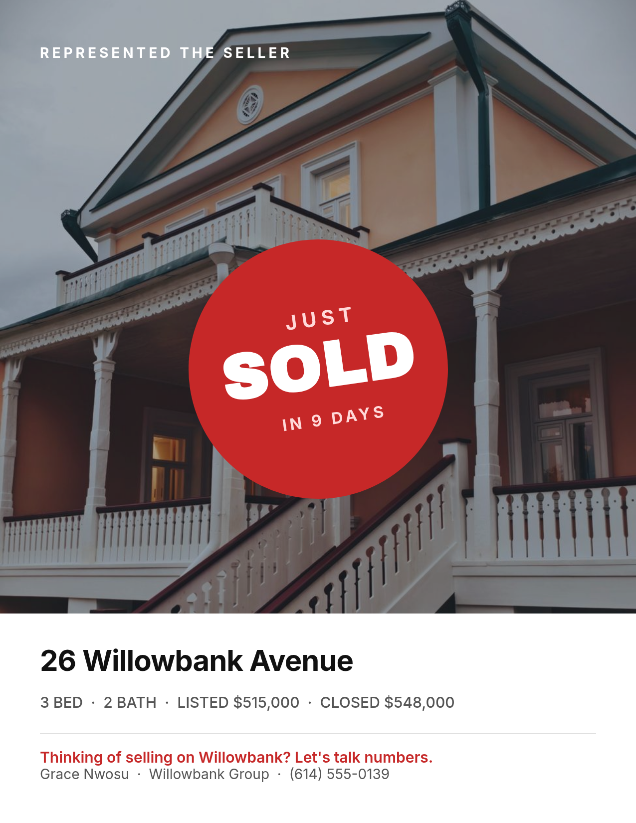
A red circular stamp rotated a few degrees over the house photo, and a white panel at the foot with the listed and closed numbers side by side.
Who it's for: farming a street. This isn't a listing flyer — it's a résumé that happens to have a house on it, and the audience is the neighbours who are thinking about selling next spring.
Put both numbers on it. "SOLD" alone is a fact; "listed $515,000, closed $548,000" is an argument, and it's the reason anyone keeps the sheet.
Create a "just sold" real estate flyer: house photo background with a light dark overlay, a red circle rotated slightly with "JUST" above "SOLD" in heavy white type and "IN 9 DAYS" under it, then a white panel across the bottom with the address in bold, a line showing listed and closed prices, and a red one-line call to action above the agent's contact details.
8. Coastal Soft Minimal
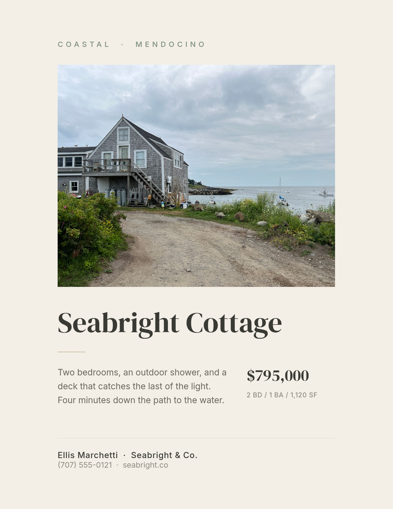
Warm off-white ground, a photo floated inside generous margins rather than bled to the edge, sage and sand accents, and a serif house name.
Who it's for: second homes, cabins, coastal and rural listings — anywhere the buyer is purchasing a weekend rather than a commute.
The margins are the design. Bleeding this photo to the edges would make it a different, louder flyer; leaving four centimetres of paper around it is what makes the property feel unhurried.
Design a soft minimal real estate flyer on warm off-white: a letter-spaced sage "COASTAL · MENDOCINO" kicker, a landscape cottage photo floated with wide margins, a large DM Serif Display house name, a short sand-coloured rule, a two-sentence description on the left and the price with a small spec line on the right, then a hairline rule and the agent's details.
9. The Rental Card
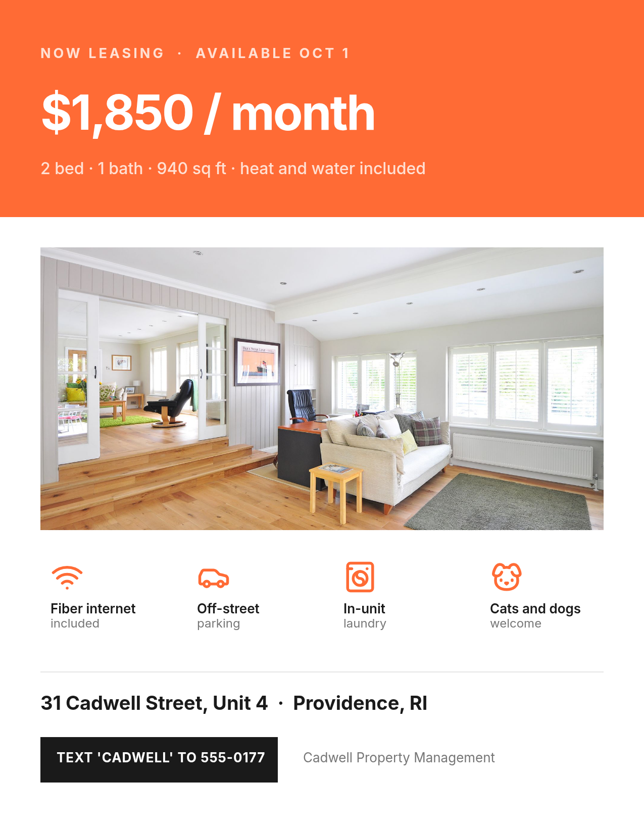
A saturated colour block across the top with the monthly rent set larger than anything else, an interior photo, and a four-icon amenity row: internet, parking, laundry, pets.
Who it's for: leasing. Renters scan for four things — price, size, pets, laundry — and they scan in about three seconds.
Icons earn their space here in a way they don't on a sales flyer. "Cats and dogs welcome" as body text gets skipped; a dog icon gets seen. Note the rent line includes what's covered — heat and water included changes the real number and belongs next to it.
Make a rental listing flyer: a bright orange block across the top third with "NOW LEASING" small, the monthly rent huge in white, and a line of what's included; then an apartment interior photo, a row of four orange amenity icons with two-line labels underneath, the address in bold, a black text-to-enquire button, and the management company name.
10. The Land Plat
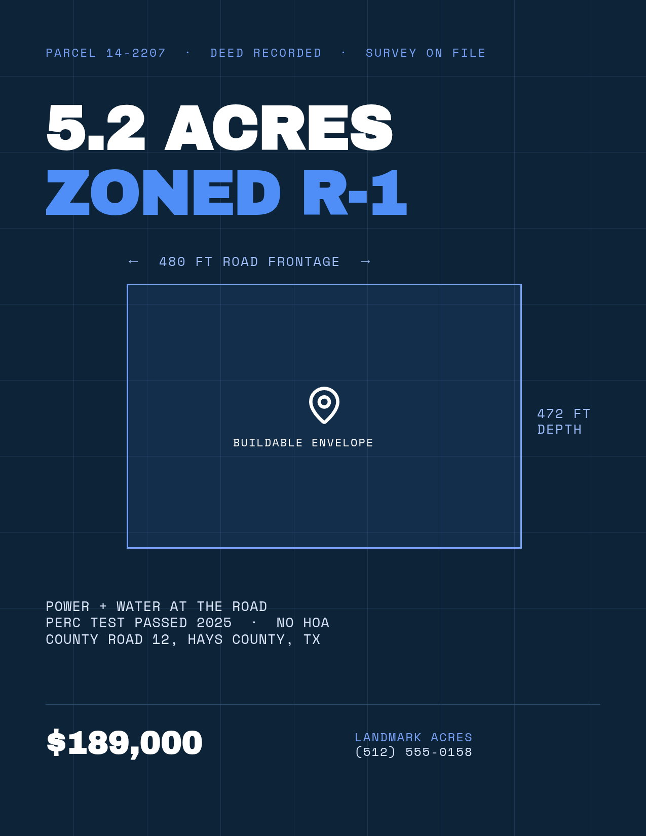
Blueprint navy, a faint survey grid, the lot drawn as an outlined rectangle with dimension labels on two sides, and everything set in a monospace face.
Who it's for: vacant land, lots, and acreage — the one listing type that has no photo worth printing.
Land buyers ask a completely different set of questions, so the flyer answers them: frontage, depth, zoning, utilities at the road, perc test, HOA. A pretty photo of a field answers none of those. Drawing the parcel instead of photographing it is the whole style.
Create a land for sale flyer that looks like a blueprint: deep navy background with a faint blue survey grid, a monospace "PARCEL 14-2207" header line, a huge two-line headline reading "5.2 ACRES" in white and "ZONED R-1" in blue, a rectangular lot outline in light blue with dimension labels on the top and right, a map pin marking the buildable envelope, then monospace lines for utilities and location, the price large, and the brokerage contact.
Building one in Ridvay Studio
Every flyer above started as one sentence. Here's the whole loop with number 5, the open house sheet.
Paste this into Studio:
Design a bold open house flyer for 88 Harlow Street, Portland ME: bright house photo across the top third, then a black band with "OPEN" in white and "HOUSE" in yellow at huge size, a solid yellow bar reading "SATURDAY, SEPT 12 · 1–4 PM", the address in white bold, a grey line reading "3 BED · 2 BATH · 1,650 SQ FT · $429,000", and my contact details at the foot.
What comes back is an editable design, not a flat image. The headline is a text layer with its own font and size. The yellow bar is a shape you can recolour. The photo is a layer you can replace. Nothing about it requires regenerating from scratch, which is the part that makes AI design actually usable — more on that here.
Four edits to make next, each one from the advice above:
- Drop your own photo in. Click the photo layer and upload the listing shot. If the exterior is weak, use a strong interior instead — the Full-Bleed Hero rule cuts both ways.
- Push the date bar wider. Drag it to the full text column. It's the one fact that has to survive being read from a car.
- Recolour the accent. Click the yellow bar and the "HOUSE" line, and set both to your brokerage colour. Save that colour into a brand kit and every flyer after this one starts on-brand.
- Resize for the feed. One click turns the same flyer into a 1080×1350 Instagram post, so the sheet on the island and the post on the grid match.
Start your open house flyer in Studio →
Printing and exporting these
These are all portrait 1275×1650 — US Letter proportions. A few things worth getting right before you send 200 of them to the printer:
- Export at 2× for print. 1275×1650 on screen becomes 2550×3300 at 2× scale, which is a true 300 DPI Letter sheet. Exporting at 1× and printing it is the single most common reason a flyer comes back soft — the full story is in Why Your Design Prints Blurry.
- Watch the saturated blocks. Style 9's orange and style 5's yellow are the two that shift most between screen and paper. If exact colour matters, print one before you print two hundred.
- Keep contact details 24px or larger. On a 1275-wide canvas that's roughly 8pt in print, which is about the floor for a phone number someone reads standing in a driveway.
- Export the same design twice. Once as a print PDF-ready PNG, once resized for the feed. It's the same file, so the sheet and the post never drift apart.
If you're pushing the listing to social rather than to a printer, the square version is a different problem with different rules — that's covered in How to Make a Real Estate Listing Post With AI.
Pick one and change the address
The ten above cover most of what an agent actually prints in a year: three for sales listings at three different price points, one for open houses, one for the interior-led tour, one for farming, one for rentals, one for land. Start from whichever one matches the listing on your desk right now, swap the photo and the numbers, and you're done before the coffee's cold.