Top 10 Resume Design Ideas for 2026 (All Editable)

A recruiter I know spends about seven seconds on a resume before deciding whether it goes in the maybe pile. Seven seconds. She's not reading — she's scanning for shape: is there a name, a current role, a number that means something, and can she find all three without hunting?
Most people fight that with content. They rewrite the summary for the ninth time. But the thing that makes those seven seconds work or fail is usually the layout — where the eye lands first, and whether anything is competing for that spot.
So here are ten resume designs, each one built and rendered, each with the exact prompt behind it and a link to open and edit it. They're not ten skins of the same template. They're ten genuinely different answers to "how should this be organised", and the right one for you depends on your field, your seniority, and honestly on how the thing is going to be read — by a human, or by a parser first.
Pick the one that matches your industry's temperature, not the one that looks most impressive in a gallery.
1. ATS-safe modern

One column, standard section headings, no graphics, no columns for the parser to trip over. A navy name, one blue rule, and that's the entire decorative budget.
This is the one you send when you're applying through a portal and you don't know what's on the other side. It's boring on purpose — every heading is a word an applicant tracking system already knows (SUMMARY, EXPERIENCE, EDUCATION, SKILLS), and the reading order top-to-bottom is the same for a human and a machine.
If you only make one resume this year, make this one. Everything below is a variation you choose once you know who's reading.
Design a clean single-column ATS-safe resume for an operations manager, white background, navy name in bold caps, a blue role line and a blue rule under the header, sections for summary, experience with two bullets per job, education and skills
2. Dark sidebar

A dark column down the left holding name, contact, skills, tools, languages — everything list-shaped — and the white right column carrying the narrative. It's the most popular "designed" resume format for a reason: it separates facts you scan from sentences you read, and it fills a page beautifully even when your career is short.
The honest caveat, because nobody else will say it: some older parsers read two-column layouts in the wrong order, interleaving your sidebar into your job history. If you're applying through a big corporate portal, send #1 and save this for direct applications, recruiters, and anywhere a human opens the file first.
Design a two-column resume for a marketing manager with a dark navy sidebar on the left containing name, contact details, skills, tools and languages in white, and a white right column with a profile paragraph and four jobs
3. Swiss grid
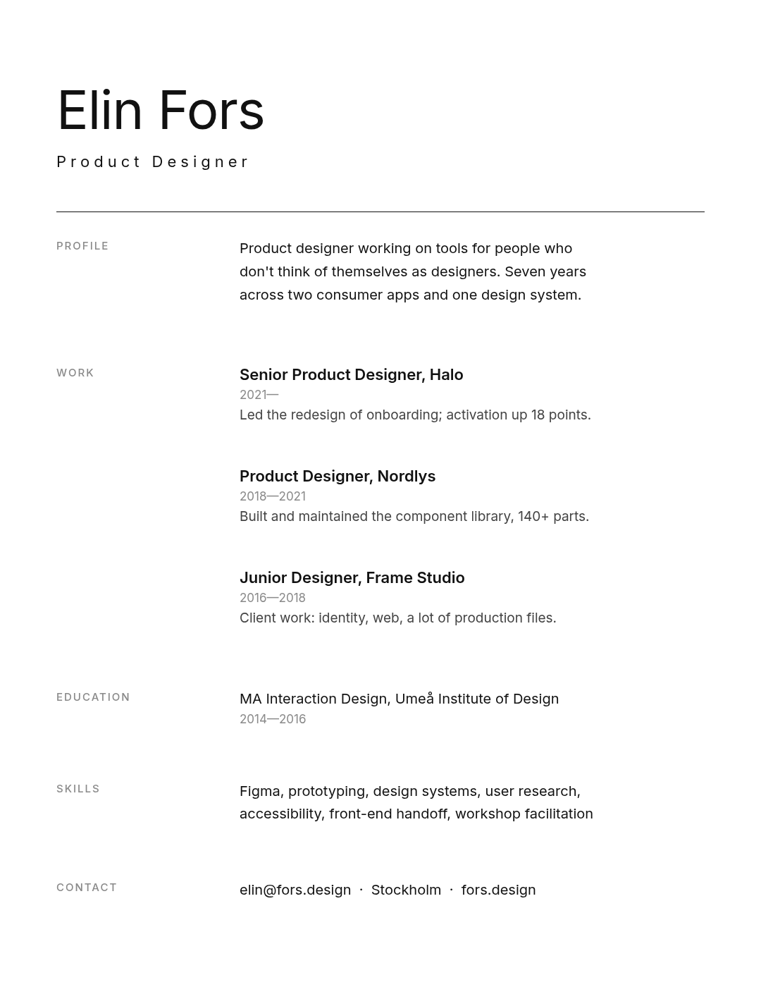
Black on white, one hairline rule, and section labels parked in a narrow left column beside the content instead of above it. No colour at all. The confidence comes from the whitespace — roughly a third of the page is deliberately empty.
The trick that makes this style work is the label column. Because PROFILE, WORK, EDUCATION sit beside their content rather than on top of it, the page reads as a table of contents you can jump around in. It's the format for designers, architects, and anyone whose taste is part of the pitch.
It needs real discipline about length, though: one line per job. If you can't compress a role to a single sentence, this layout will expose that.
Design a minimal Swiss-style resume for a product designer, white background, large light-weight name, one thin black rule, section labels in a narrow left column beside the content, three jobs with one line each, no colour
4. Serif editorial
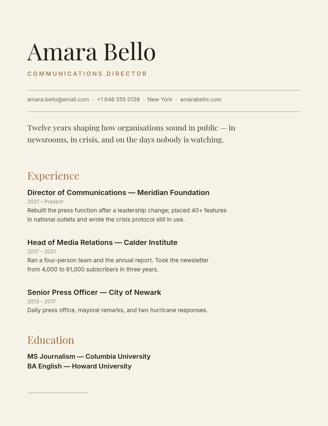
Cream paper, a high-contrast serif for the name, warm brown accents, and two hairline rules bracketing the contact line. It reads like a masthead, which is exactly the point — this is for communications, publishing, law, academia-adjacent roles, and anyone senior enough that gravitas beats novelty.
Note the summary is set in the serif, not the body sans. Two typefaces doing two jobs: the serif speaks, the sans lists. That's a font-pairing decision more than a colour one, and it's most of why the page feels considered. (If pairing type makes you nervous, start here.)
Design an editorial resume for a communications director, warm cream background, large Playfair Display serif name, letterspaced role in warm brown, two hairline rules around the contact line, serif section headings and a serif summary line
5. Bold name banner
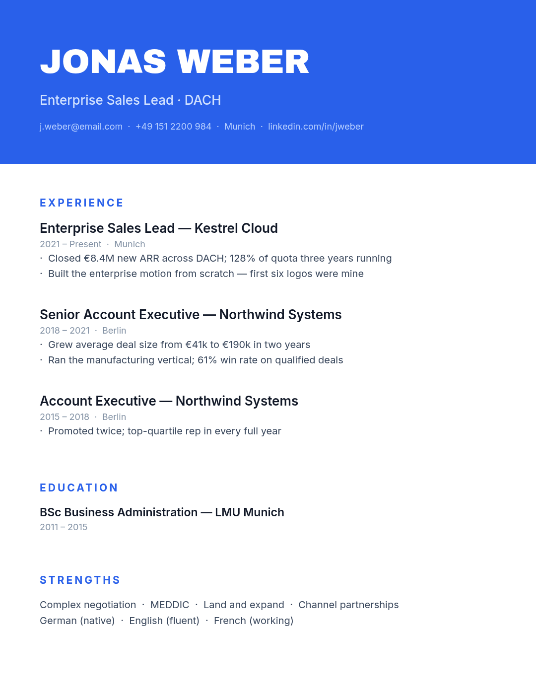
A full-width colour band across the top with your name in it at 68px, and a completely plain body underneath. All the design lives in the first 330 pixels.
This is the highest-impact-per-effort layout on the list. The banner does two things at once: it makes the page instantly recognisable in a stack of thirty PDFs, and it gets the name and role out of the body, so everything below can stay a clean single column — which means it's mostly parser-safe too, unlike #2.
Good for sales, business development, anyone whose job is partly being memorable.
Design a resume for an enterprise sales lead with a full-width bright blue banner across the top containing the name in huge white caps, role and contact line, then a clean white single-column body with experience, education and strengths
6. Impact numbers
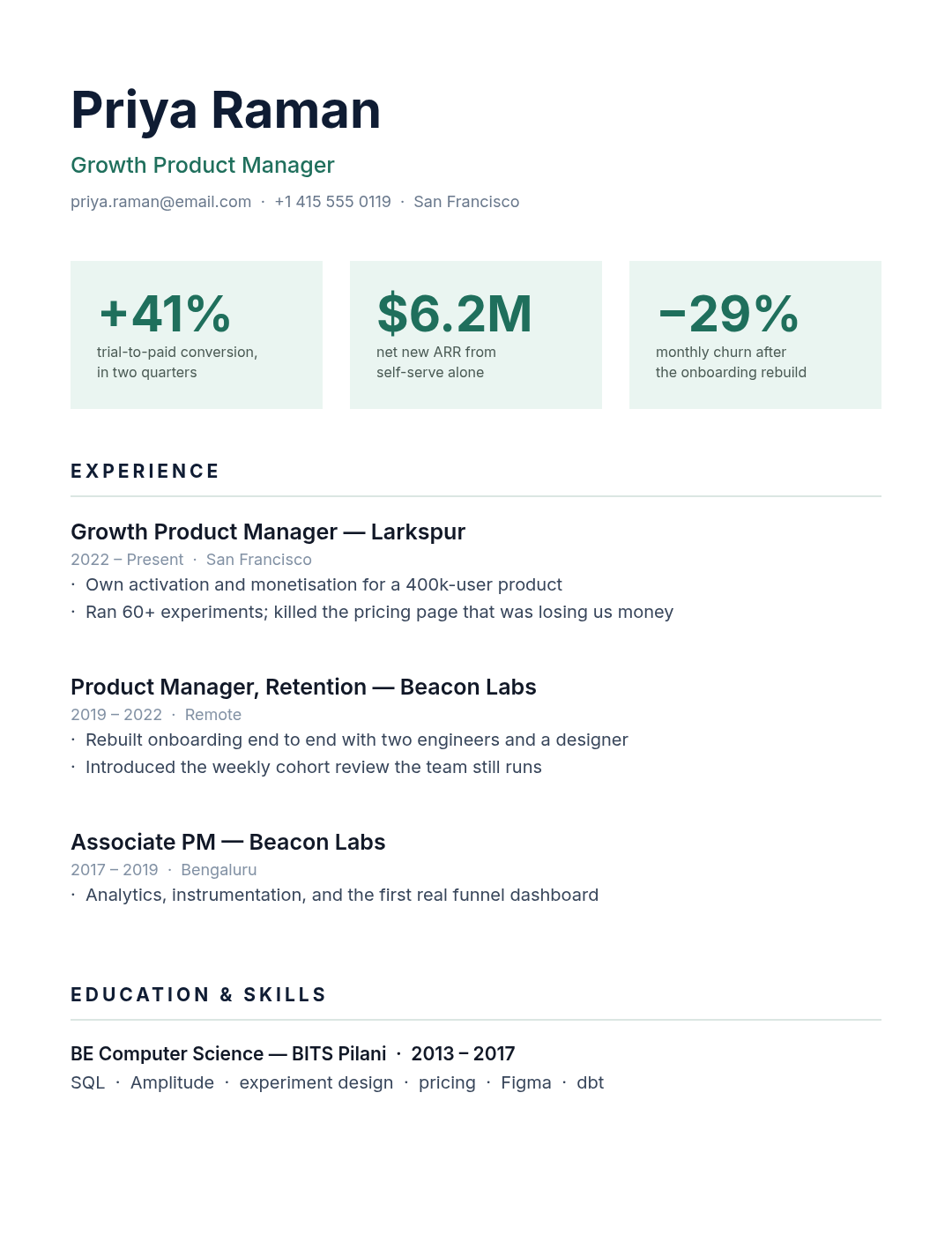
Three stat cards sitting directly under the header — +41%, $6.2M, −29% — each with one line of context, then a normal experience section below.
This is my favourite format on the list and the one most people should steal. Your three best numbers are almost always buried as the third bullet of your second job, where nobody reaches in seven seconds. Pulling them to the top is not decoration; it's putting your strongest evidence where the eye already goes.
Two rules. The numbers must be yours and defensible — you will be asked about all three in the interview. And skip the skill bars people put in this slot instead: "Photoshop ▓▓▓▓░ 80%" means nothing to anyone, because there's no scale. A percentage change in a business metric means something.
Design a metrics-first resume for a growth product manager, white background, three pale green stat cards under the header showing a conversion lift, revenue figure and churn reduction each with a caption, then experience, education and skills
7. Timeline
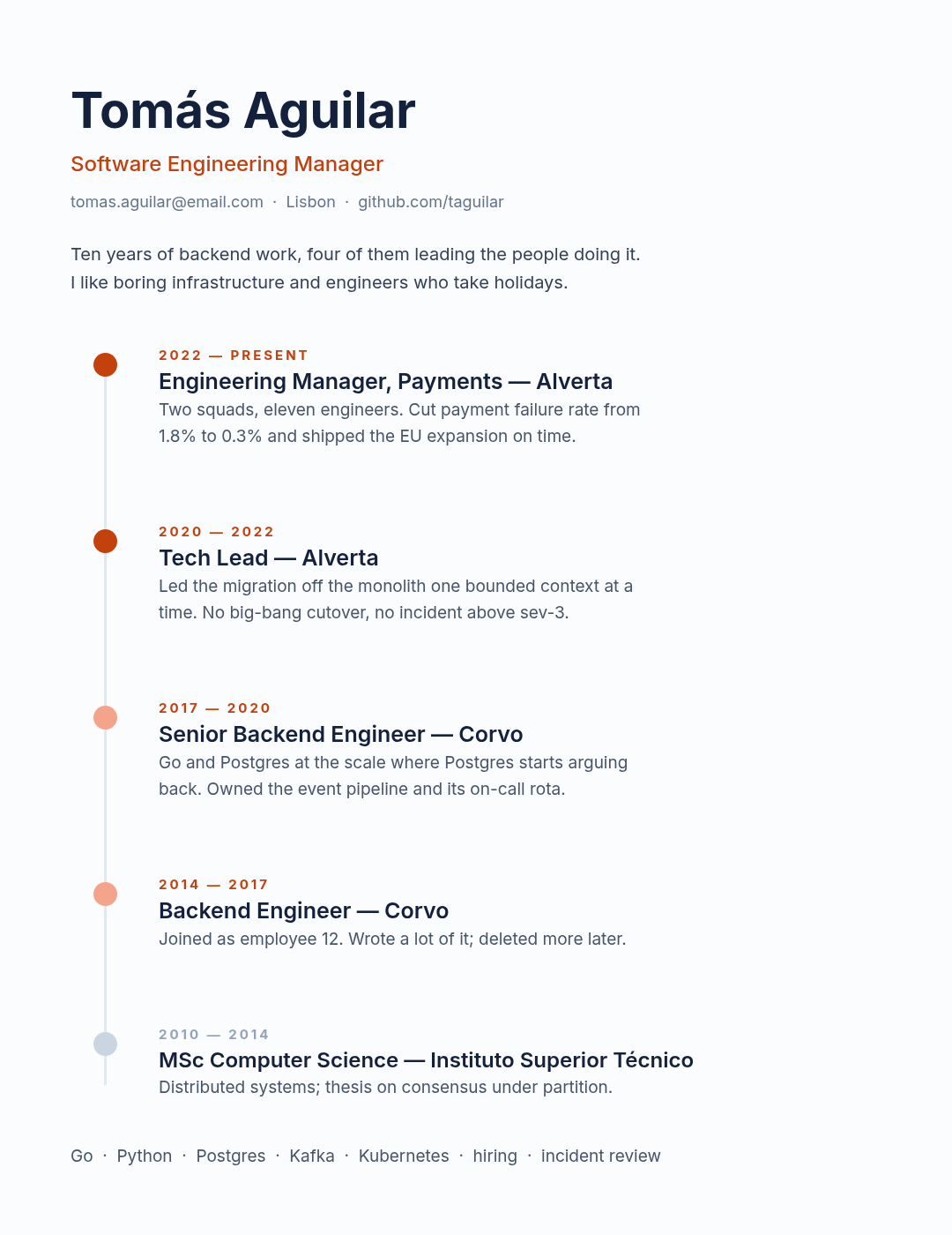
A vertical spine with a dot at every role, dates in small letterspaced caps, and the entries stepping down the right. Education sits on the same spine as the final, faded dot.
Use this when the shape of your career is the argument — steady promotion inside one company, or a clean progression from engineer to lead to manager. The dots fading from solid to pale as you go back in time is doing quiet work: it tells the reader which roles you want weighted.
Don't use it if your history is patchy or non-linear. A timeline draws the eye straight to gaps, which is the opposite of what you want.
Design a timeline resume for a software engineering manager, off-white background, a vertical line down the left with orange dots at each role, dates in small letterspaced caps, five entries including education, and a skills line at the bottom
8. Monospace developer
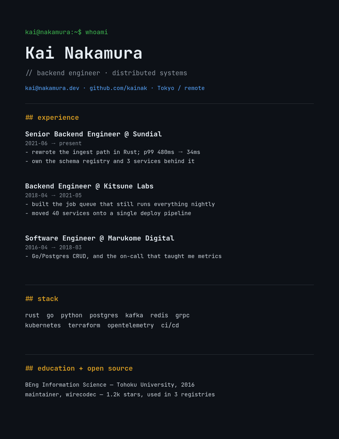
Near-black, monospaced throughout, section headings as ## experience, a green shell prompt at the top, links in terminal blue. It's a joke that lands with exactly one audience, and that audience is the one hiring.
Beyond the in-group signal, mono type does something genuinely useful: it aligns everything for free. Every date, arrow and bullet lines up in a column without you touching a single spacing control, because every character is the same width. That's why it's the right choice for any resume that's mostly short structured lines.
One warning — dark backgrounds eat toner and look grey when printed. This is a screen-and-PDF design. Have a light version for anyone who prints.
Design a dark terminal-style developer resume in monospace type, near-black background, a green shell prompt line at the top, white name, section headings written as ## experience and ## stack in yellow, links in blue, three jobs with dash bullets
9. Creative colour block

Asymmetric blocks — a big orange panel carrying a pull-quote, a teal contact block beneath it, a name at 90px, and a dark strip anchoring the bottom corner. For art directors, creative leads, and studio applications where a safe resume is itself a negative signal.
The quote is the risky, load-bearing element. It works here because it's about how she works rather than an inspirational slogan — a line a colleague would recognise. If you can't write one that specific, delete the block and let the orange panel be a plain field of colour. An empty confident block beats a limp quote.
Absolutely do not send this through a corporate portal.
Design a bold creative resume for an art director, cream background, a large orange block in the top right containing a four-line pull-quote, a dark teal contact block beneath it, huge black stacked name on the left, selected work section and a dark strip in the bottom corner
10. Academic CV

No colour, no columns, a Garamond body, and sections in the order the field expects: appointments, education, publications, grants, teaching. Years hang in the left margin so a reader can scan chronology without reading a word.
This is the one where "good design" means invisible design. An academic CV is a document of record, and any styling that draws attention to itself reads as someone who doesn't know the conventions. It also runs to many pages — this is page one of five, not a one-pager, and that's correct for the genre.
The only real craft decisions here are the year-first hanging indent and the generous leading. Both exist to make a dense page survivable.
Design a traditional academic CV in Garamond on plain white, no colour, name and department at the top with a rule underneath, sections for appointments, education, selected publications with full citations, grants and awards, and teaching, with years hanging in the left margin
Making yours in Ridvay Studio
Every design above was generated from the prompt printed under it, then adjusted. You can start the same way — describe the resume you want and name the style as well as the job:
Design a two-column resume for a marketing manager with a dark navy sidebar on the left containing name, contact details, skills, tools and languages in white, and a white right column with a profile paragraph and four jobs
What comes back is an editable design, not a flat image. The name, every job title, each bullet, the sidebar panel and the rules are separate layers you click and change — which matters more on a resume than on almost anything else, because you'll be tailoring this file for years.
The four edits worth making immediately:
- Replace the placeholder content before you touch the styling. Your text is longer than mine. Fix the words first, then fix the layout around them — doing it the other way means designing twice.
- Click your best number and make it bigger than the sentence around it. Even in the plain layouts. If a figure is worth including, it's worth being findable in the seven seconds.
- Pull the whole thing onto one column if you're applying through a portal, or just keep design #1 open in a second tab as your portal version. Two files, one afternoon.
- Apply your brand kit if you have one — for freelancers and consultants, a resume that matches your site and your invoices is quietly persuasive.
Then export at the largest scale offered, and check the smallest text at 100% before you send it.
Printing and sending
Most resumes are now read on a screen, but the ones that get printed get printed badly. Two things:
Export as PDF where you can, PNG at full scale otherwise. A resume screenshotted at browser size arrives soft, and soft type is the fastest way to look careless. Your canvas here is 1080 × 1400 — fine for screen, and fine printed at A5. For a crisp full-page A4 print, start bigger.
Have a plain version. Whatever style you fall for above, keep design #1 in your back pocket. Portals, agencies and internal HR systems all prefer it, and "I have a nice one and a safe one" is a two-minute problem to solve once.
If you want the writing side rather than the layout side — what actually goes in the bullets, how to phrase results — that's covered separately here.
Ten styles, all editable, all free to start. The best one is the one your industry already expects, executed cleanly.