Top 10 Sticker Sheet Designs for 2026 (All Editable)

I watched someone at a coffee shop go through a sheet of stickers a conference had handed out. She peeled off two, put the rest back in her bag, and stuck the two on her laptop lid next to about fifteen others. Eight designs on the sheet. Two survived.
That's the real brief for sticker design, and it's not the brief most templates are built for. A poster has to be read once from across a room. A sticker has to be something a stranger chooses to carry around on their laptop for two years. It gets looked at from 30cm away, it's 5cm wide, and it sits in a crowd of other people's stickers competing for the same lid.
So the rules are different. Type that works on a flyer disappears at sticker size. A sheet of eight stickers that share no common thread reads as clip art, not as a pack. And the shape — the actual cut line — does more work than anything inside it.
Below are ten sticker sheet designs for 2026. Ten different style families, not ten colour variations, each one a real generated sheet with the prompt that made it and a link to open it in the editor. If you're after the mechanics of bleed, cut lines and export settings, that's a separate piece — how to design a die-cut sticker covers the production side. This one is about what the sheet should look like.
One thing to hold in your head through all ten: a sticker sheet is a set, not a collection. The individual stickers can differ wildly in shape and content, but they must share a palette, an outline treatment and a type voice. Break one of those three and it stops being a pack you'd buy and becomes a page of stuff.
1. The Kiss-Cut Word Pack
Best for: Etsy shops, small brands testing merch, anyone who wants a pack made in an evening.
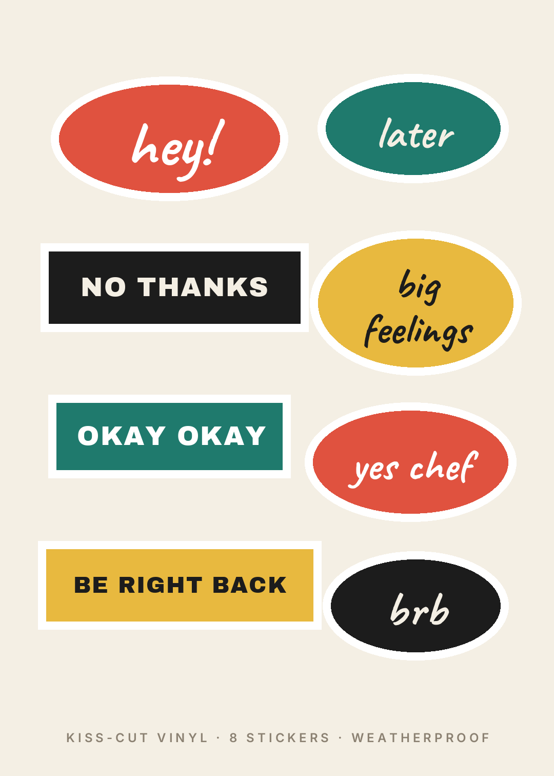
No illustration at all — just words, cut into blobs and bars. This is the cheapest style to make well and the hardest to make badly, which is why it's first. The whole design lives in two decisions: the phrase and the shape it's cut into.
The trick is the pairing. Every soft, lowercase phrase gets a script face inside a rounded blob; every blunt one gets heavy caps inside a hard rectangle. Same sheet, two voices, and the contrast is what stops eight words looking like a spreadsheet. Keep the palette to three colours plus black and rotate them so no two neighbours match.
A kiss-cut sticker sheet on a cream background with eight word stickers: rounded blob shapes in tomato red, teal and mustard with short lowercase phrases in a handwritten script, alternating with hard black and teal rectangles carrying blunt phrases in heavy sans capitals, every sticker with a thick white cut border.
2. The Retro Sunset
Best for: surf and skate shops, coffee roasters, van-life and outdoors brands, festival merch.
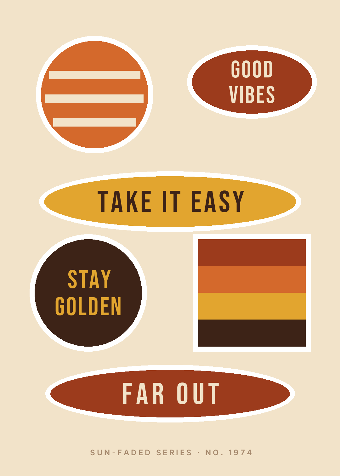
Seventies revival has been the dominant sticker aesthetic for about four years now and it hasn't moved, because it does something useful: warm, sun-faded colour makes a brand-new sticker look like it's been on the bottle since 1974.
The palette is doing all the work — burnt orange, rust, mustard and a sand background, with nothing cool in it anywhere. Add a single blue and the whole thing collapses. The two graphic devices that carry the era are the striped disc and the horizontal band stack; both are just rectangles over a shape, and both read as "sunset" instantly. Set the type in a tall condensed sans with wide letter-spacing and resist adding a groovy script — the condensed caps are what keep it from tipping into pastiche.
A retro 1970s sticker sheet on a warm sand background in burnt orange, rust and mustard with no cool colours: a striped sun disc, a four-band sunset square, and oval and rounded stickers carrying GOOD VIBES, TAKE IT EASY, STAY GOLDEN and FAR OUT in tall condensed capitals with wide letter-spacing.
3. The Bold Outline Doodle

Best for: water bottles, kids' packs, laptop stickers meant to be seen from across a lecture hall.
Thick black keyline, flat single-colour fill, one simple symbol per sticker, nothing else. This is the style that survives being shrunk to 3cm and slapped on a scratched water bottle, and that's exactly what it's for.
The rule that makes or breaks it is one idea per sticker. A pizza slice. A heart. A cloud. The moment you put a symbol and a word and a little background pattern on the same sticker, the outline stops reading and it turns to mud at small size. Keep the fills to four saturated colours, keep the outline weight identical on every sticker — an outline that varies in thickness across the sheet is the single fastest way to make a set look assembled rather than designed.
A bold outline sticker sheet on white: seven stickers with heavy black keylines and flat saturated fills in yellow, hot pink, blue and green, each holding one simple black line symbol — pizza slice, heart, cloud, music note, star, coffee cup — plus one wide yellow bar reading STAY WEIRD in heavy black capitals.
4. The Monoline Minimal
Best for: stationery brands, journals, architecture and design studios, anyone selling to people who own one good pen.
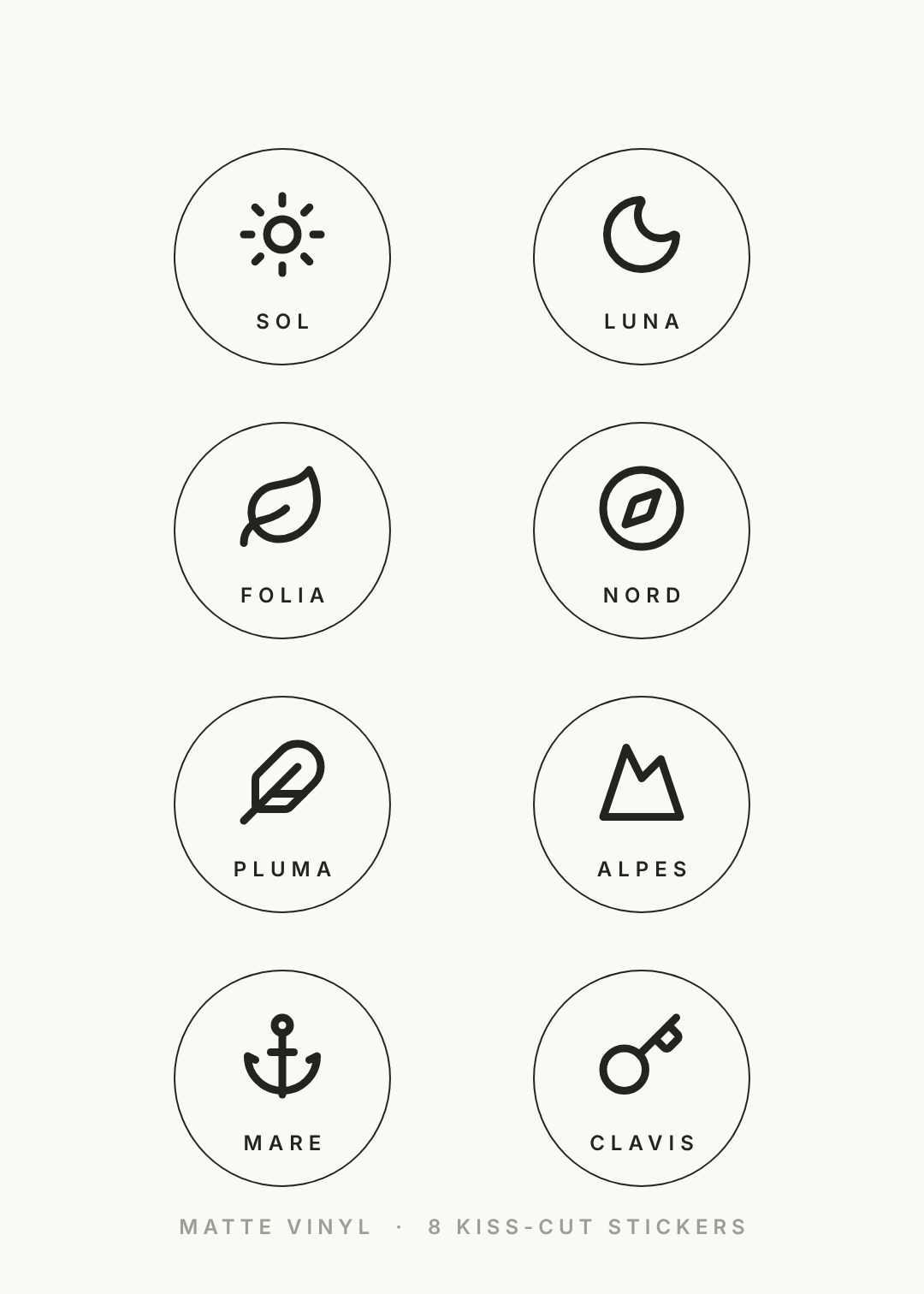
The opposite of style 3, and it sells to a completely different person. One ink colour, hairline strokes, an enormous amount of empty space inside each circle, and a small caps label doing the naming.
This is the hardest of the ten to get right, because every mistake is visible. There's no fill to hide behind. Two things keep it honest: the icon must sit noticeably smaller than you think inside its ring — around 40% of the circle's diameter, not 70% — and the label needs heavy letter-spacing to read as a caption rather than a word. Latin naming is a cheap trick and it works; it turns eight generic icons into a specimen set.
A minimal monoline sticker sheet on warm off-white: eight circles with a hairline dark ink ring, each holding one thin line icon at about 40 percent of the circle width — sun, moon, leaf, compass, feather, mountain, anchor, key — with a small widely letter-spaced label underneath in Latin, no fills and no second colour.
5. The Y2K Chrome
Best for: music merch, gaming and dev-tool brands, anything aimed at people who were online in 2003.
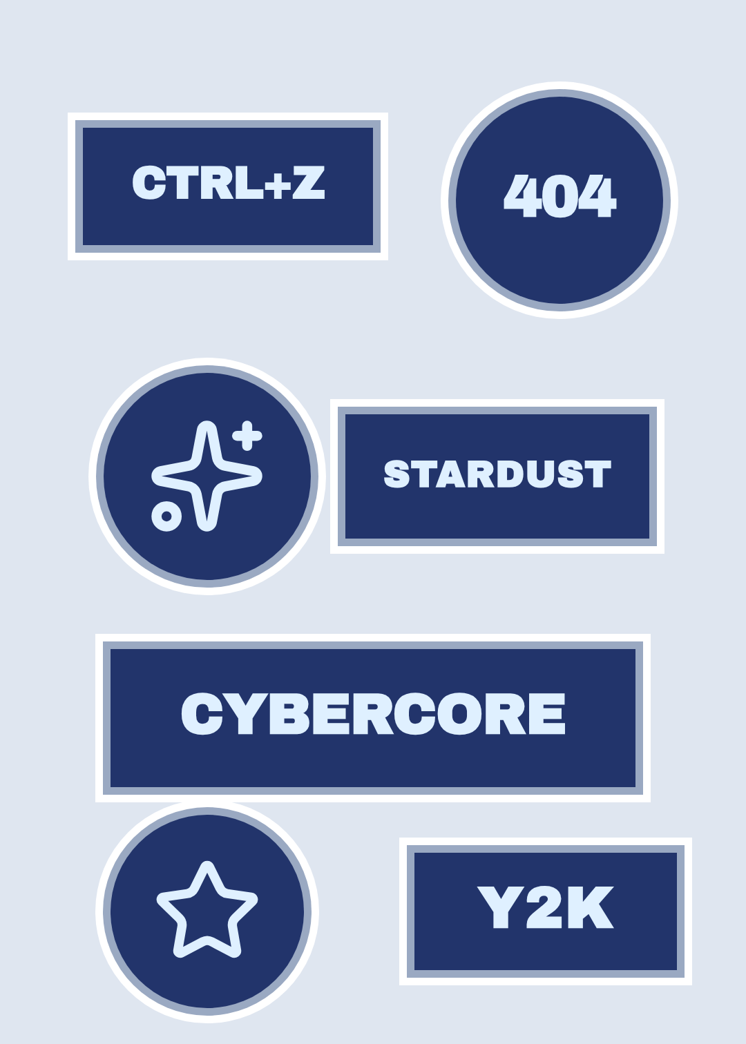
The signature move here isn't the colour, it's the double ring — a silver band between the sticker face and the white cut border. Two offset outlines instead of one is what makes a flat navy rectangle read as bevelled metal without a single gradient.
Keep the words short and technical: error codes, keyboard shortcuts, single made-up compound nouns. Long phrases kill it, because the style depends on very heavy type set very large, and a heavy face at that size only fits four or five characters. Ice-blue type on deep navy, tightened letter-spacing, and one or two sparkle shapes to break the grid of rectangles.
A Y2K chrome sticker sheet on a pale blue-grey background: deep navy stickers each wearing a silver ring inside a white cut border, carrying very heavy ice-blue capitals reading CTRL+Z, 404, STARDUST, CYBERCORE and Y2K, plus two circular stickers holding a sparkle and a star.
6. The Pressed Botanical
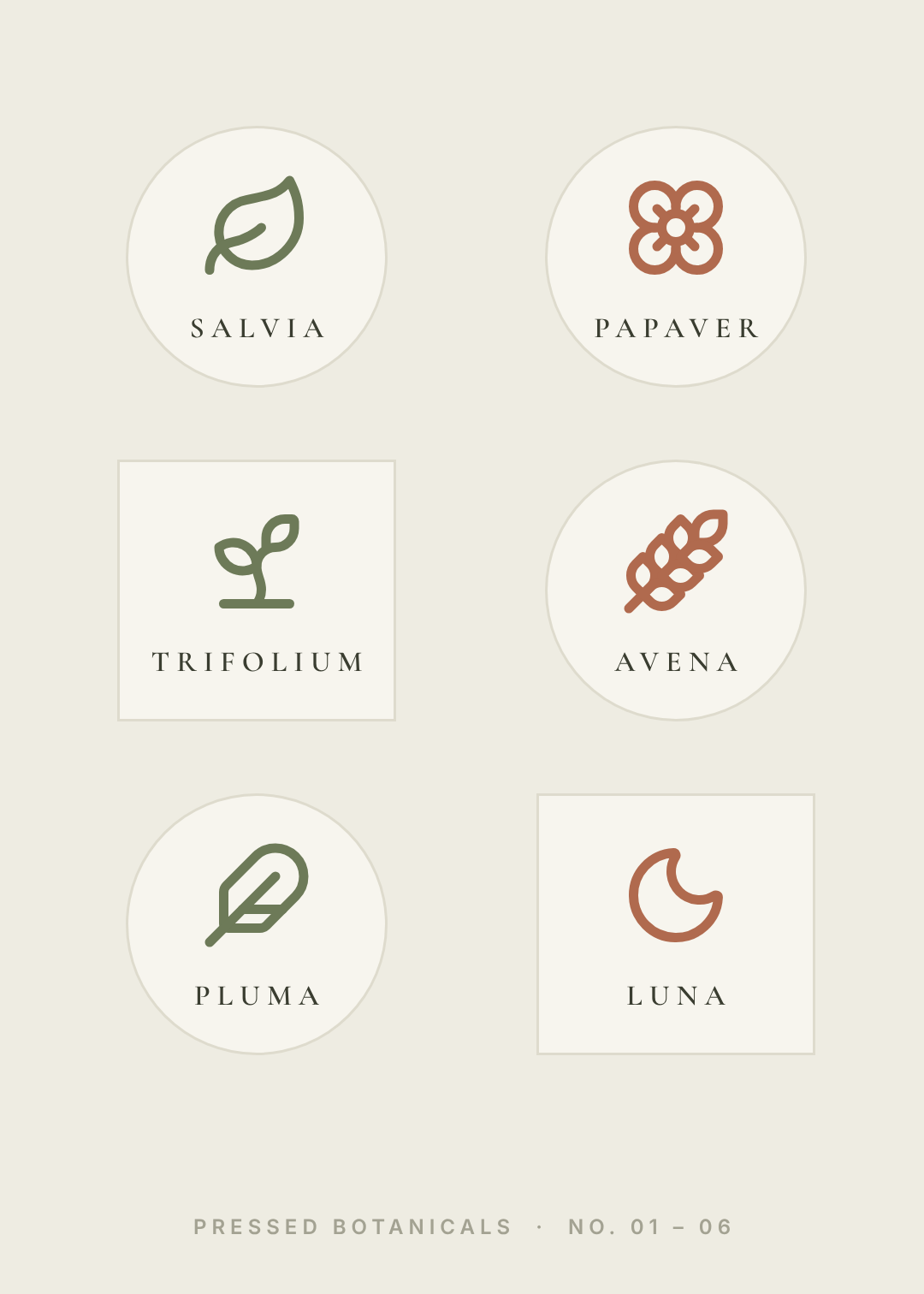
Best for: plant shops, apothecary and skincare brands, wedding favours, journaling packs.
A herbarium sheet rather than a sticker sheet: pale specimens on stone, named in a light serif, arranged like something that was pressed and catalogued.
Two decisions carry it. First, the botanicals stay as outlines — the second you fill a leaf with solid green you've made a wedding invitation, not a specimen. Second, the sticker faces are barely lighter than the background with only a hairline cut edge, so the sheet reads as one continuous page. That's the opposite of every other style here, where the cut border shouts. Mix two or three rectangles into the circles so the grid doesn't lull.
A pressed botanical sticker sheet on muted stone: six pale cream stickers, a mix of circles and squares with only a hairline cut edge, each holding one outlined botanical in sage green or terracotta — sage, poppy, clover, oat, feather, moon — labelled underneath in widely letter-spaced light serif capitals.
7. The Deadpan Type
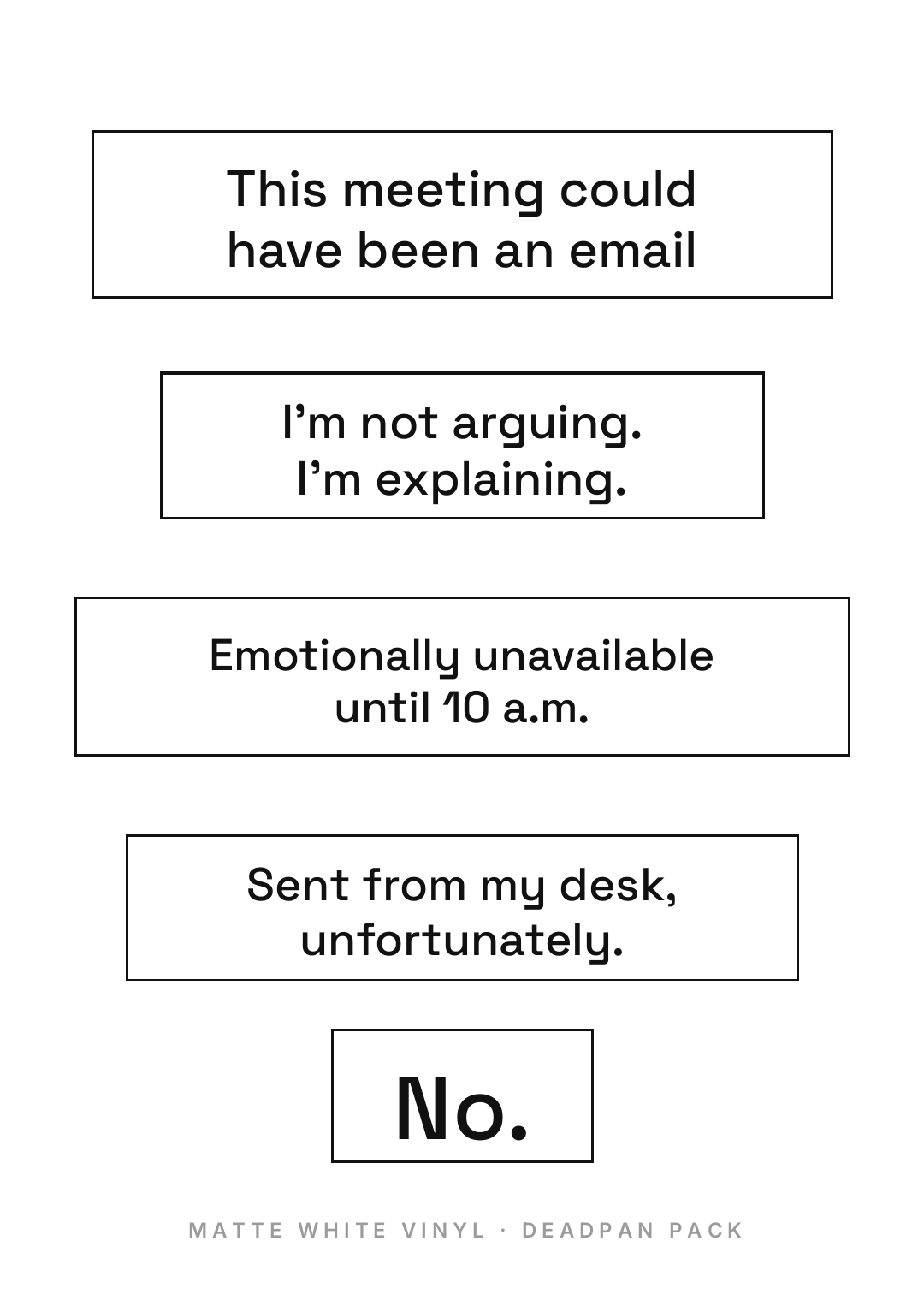
Best for: office merch, conference swag, anything sold to people who work at a desk.
No colour, no icon, no shape play — a hairline black rectangle around a sentence, cut tight to the words. All the personality is in the copy, and the design's entire job is to get out of the way.
Which is why it works: the flatness is the joke. Set anything in this style in a fun rounded font with a pastel background and the line stops being deadpan and starts being a greeting card. Use a plain neutral sans at a modest size, set the punctuation properly (the full stops matter), and vary the sticker widths so each one is cut to its own sentence rather than dropped into a uniform template. One very short sticker among the long ones — here, "No." — gives the sheet a punchline.
A deadpan white sticker sheet: five plain rectangular stickers with a hairline black outline, each cut tight to its own sentence, carrying flat office one-liners in a neutral sans-serif at modest size with correct punctuation, no colour, no icons, one very short sticker among the long ones.
8. The Kawaii Pastel
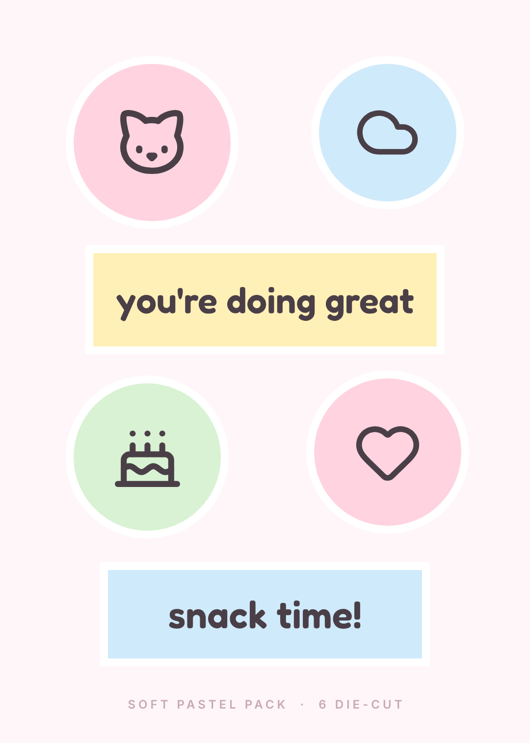
Best for: planner and journaling packs, small gifts, anything sold to people who buy stationery for fun.
Soft pastel fills, a thick white cut border, a rounded friendly typeface, and copy that's kind rather than clever. It's the highest-volume sticker category on the internet and it's also the one most often done badly, usually by adding too many colours.
Four pastels, maximum, and they should be roughly equal in lightness — a pale pink next to a saturated one reads as a mistake, not a range. The thick white keyline is not optional here: it's what separates two low-contrast pastel stickers sitting beside each other and it's what makes the pack look like a product. Encouraging words in a rounded face fill the space between the icons and stop it reading as a child's sticker book.
A kawaii pastel sticker sheet on pale pink: soft pastel circles in blush, powder blue and mint holding simple dark line icons of a cat, a cloud, a cake and a heart, plus two rounded rectangle stickers reading "you're doing great" and "snack time!" in a friendly rounded typeface, every sticker with a thick white cut border.
9. The Planner Functional
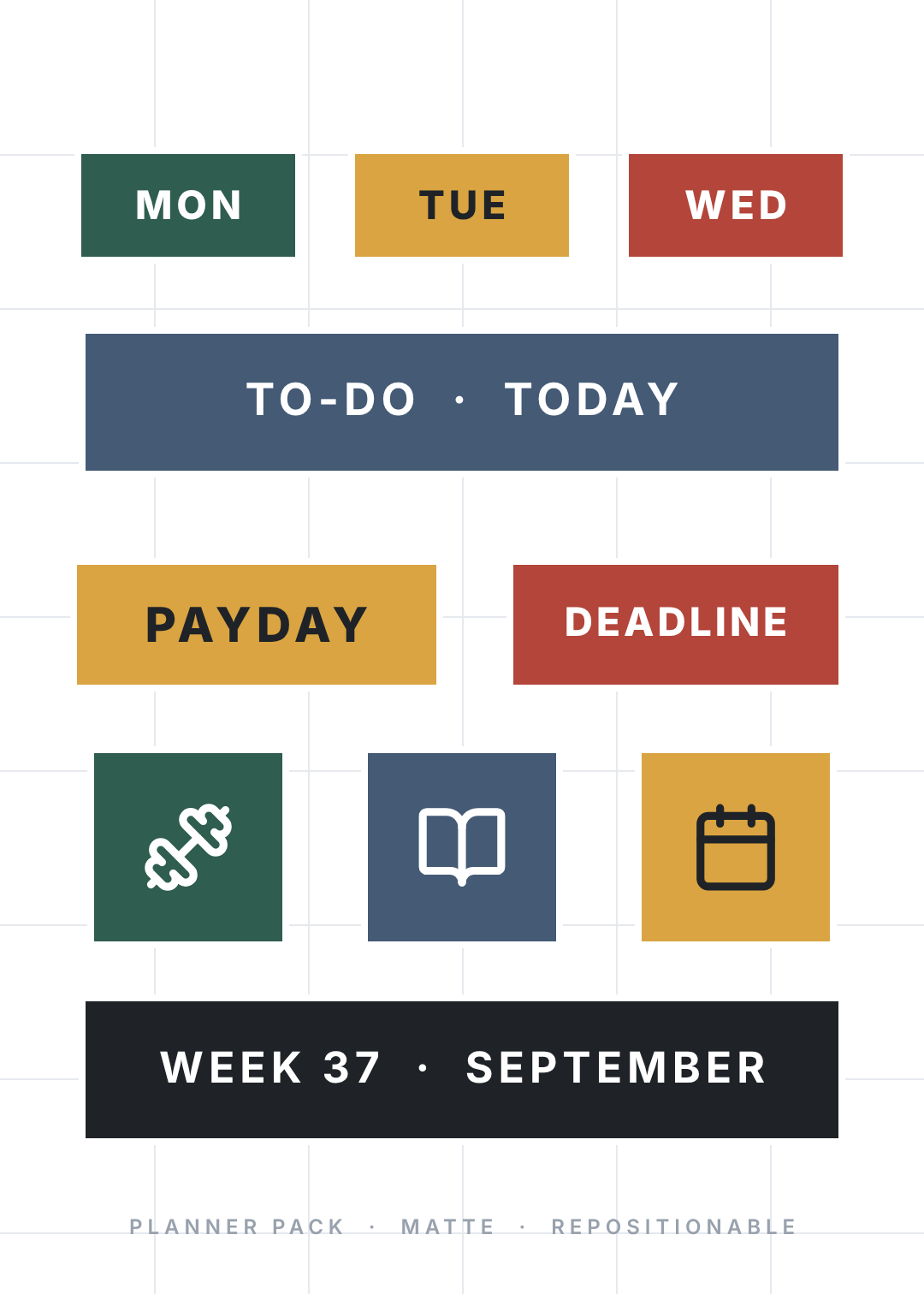
Best for: bullet journals, planner shops, teachers, anyone selling stickers people actually use rather than display.
The only style on this list where the design is subordinate to a job. Day tabs, section headers, flags for recurring events, icon squares for habits. Everything is rectangular, everything aligns to a strict grid, and the sheet is laid out so a pair of scissors or a die can cut it in straight lines.
Two things separate a good functional pack from a pretty useless one. Colour has to be coded, not decorative — one colour means money, one means deadlines, one means health, consistently across the sheet, so a filled-in page stays readable. And the labels have to be generic enough to reuse: PAYDAY and DEADLINE work every month, "Sarah's birthday" works once. Set it in a plain workhorse sans with letter-spacing, and let the faint background grid signal what it's for.
A functional planner sticker sheet on white with a faint grid: rectangular stickers only, aligned to a strict grid — three day tabs reading MON, TUE, WED in coded colours, a wide TO-DO · TODAY strip, PAYDAY and DEADLINE flags, three small icon squares for gym, study and calendar, and a WEEK 37 · SEPTEMBER banner, all in a plain letter-spaced sans.
10. The Brand Merch Pack
Best for: startups, agencies, product launches, anyone who needs something to put in a conference tote.
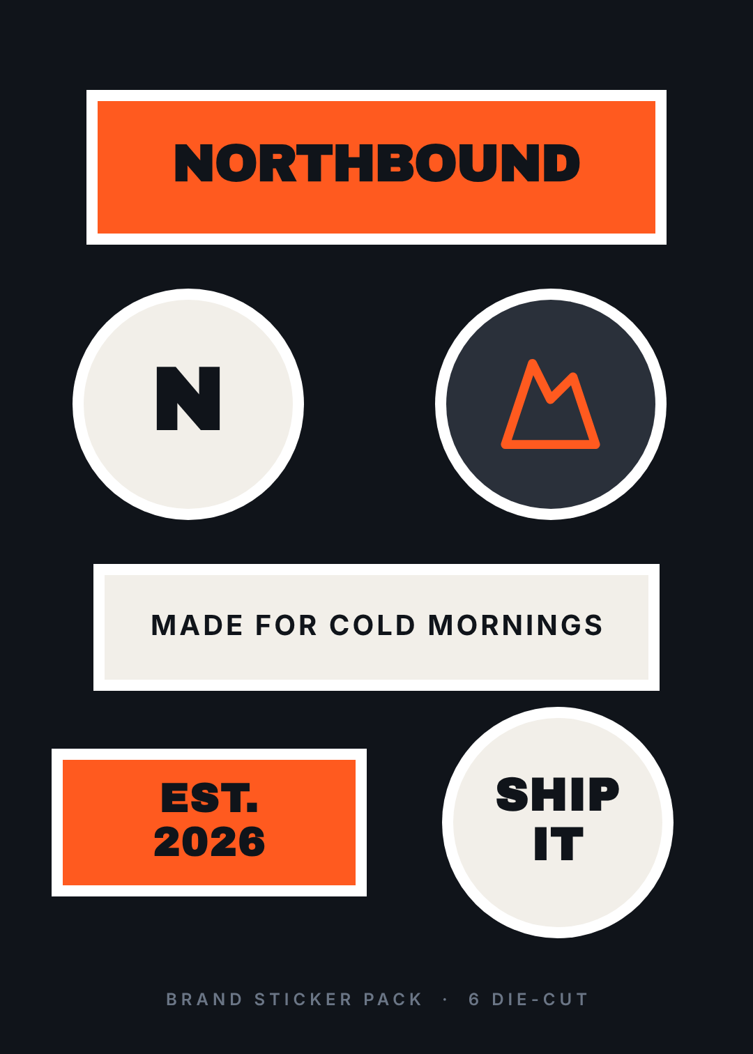
The commercial one. A dark backing sheet, one accent colour, and six stickers that are all the same brand in different forms: the wordmark, the monogram, the icon mark alone, a slogan strip, a founding badge, and one internal-joke sticker that isn't branded at all.
That last one matters more than it sounds. Nobody sticks a logo on their laptop out of affection for your company; they stick the thing that says something about them. Give the pack one sticker with no logo on it — a phrase your users would say — and you've bought the sheet its shelf life. Keep every sticker on one accent plus off-white, and use the dark sheet: it's what makes a white cut border look intentional rather than like a print artefact.
A brand merch sticker pack on a near-black sheet with one orange accent and off-white: a wordmark bar, a circular letter monogram, a circle holding a single line mountain mark, a slogan strip, an EST. 2026 badge and a SHIP IT sticker, every one with a thick white die-cut border, heavy sans capitals throughout.
Building one in Ridvay Studio
Every sheet above was made the same way: type a description, get an editable design back, then fix the two or three things that are wrong. Here's the one from style 1, verbatim:
A kiss-cut sticker sheet on a cream background with eight word stickers: rounded blob shapes in tomato red, teal and mustard with short lowercase phrases in a handwritten script, alternating with hard black and teal rectangles carrying blunt phrases in heavy sans capitals, every sticker with a thick white cut border.
What comes back is not a flat image. It's a real design with real layers — every sticker shape, every white cut border, every phrase is its own object you can click, drag, recolour and retype. That's the part that matters for stickers specifically, because a sheet is never right first time. Three edits I'd make on almost any generated sheet:
- Retype the phrases. The generated words are placeholders. Click any text layer and type your own — the shape behind it stays put, so you can swap "yes chef" for your own in-joke without touching the layout.
- Even out the cut borders. Select each white keyline shape and check they're the same weight. A sheet where one sticker has a fat border and the next has a thin one is the "assembled, not designed" tell from style 3. This is a two-minute fix and it's the single highest-value thing you'll do.
- Recolour to three. Generated sheets usually come back with one colour too many. Click the odd one out, drop in a hex you already have, and the pack immediately reads as a set. If you keep a brand kit saved, apply it here and every sticker snaps to your palette at once.
Then resize. The same sheet exports as a 5×7in kiss-cut sheet, a single 3in die-cut for a print-on-demand listing, or a square for the product photo — same layers, different canvas, no rebuilding.
Make your sticker sheet in Studio →
Getting them printed
Three things decide whether the sheet you exported turns into stickers you'd hand out.
Kiss-cut or die-cut. Kiss-cut means the blade cuts the vinyl but not the backing paper, so the whole sheet stays in one piece and stickers peel off it — that's what all ten designs above are. Die-cut means each sticker is cut all the way through and comes separately. Sheets are cheaper per sticker and better for packs; die-cut singles are better for one hero design.
Bleed and safe area. Extend your background about 3mm past the trim on every side, and keep type at least 3mm inside the cut line. Cutting blades drift by a millimetre or so, and type sitting right against the keyline is the thing that comes back wrong.
Resolution. Design at 300 DPI at final size. A 5×7in sheet is 1500×2100px; a 3in round sticker is 900×900px. Anything below that and the thick outlines you were relying on come out furry.
Which of the ten is yours?
If you're selling: 1, 2 or 10. If you're giving them away at a conference: 3 or 10. If you're making something for yourself: 7 or 9.
And if you can't decide, make two. The whole point of describing a sheet in a sentence is that trying the same eight phrases in a completely different style costs you the time it takes to type the sentence again.