Top 10 T-Shirt Design Ideas for 2026 (All Editable)

I spent an hour last week scrolling a print-on-demand marketplace, and by page four every shirt had collapsed into the same thing: a distressed sans-serif, a sunset arc, and a word like wander. Not bad, exactly. Just interchangeable. The frustrating part is that t-shirt design has more genuinely different looks than almost any other printed thing — a varsity block, a photocopied punk block, and a hairline mountain the size of a postage stamp are three completely different objects — and almost nobody shows them side by side.
So here they are. Ten t-shirt design ideas for 2026 that actually look different from across a room: what defines each style, who it suits, and the exact prompt behind it. Every example below was composed in Ridvay Studio and comes back as an editable design — the words, colors, and shapes are separate layers you click and change, not a flat picture you re-roll until it's close enough. Under each one there's a link that opens that exact design in the editor, so swapping Brookline Rowing Club for your own name takes about forty seconds.
Three things that decide whether a shirt works
Before the gallery, the short version of what separates a shirt people wear from one that stays in the drawer.
It has to read at ten feet. Nobody studies your shirt. They glance at it across a bar. That means one dominant element — a word, a badge, a shape — and everything else supporting it. If your design has two things fighting to be the main thing, it has none.
Fewer colors print better and look more expensive. Two or three ink colors is the sweet spot. It's cheaper on screen printing, it survives fifty washes on DTG, and — this is the part people miss — restraint is most of what makes a graphic look professionally made rather than homemade.
The garment color is part of the design, not the background. A cream graphic on navy and the same graphic on white are two different shirts. Pick the garment first, then design onto it. Every example below is shown on the garment color it was designed for.
1. Vintage varsity — the one that always sells
Stacked block type, a ghosted number behind it, hairline rules top and bottom, and a small "EST." line to finish. It's the oldest trick in apparel and it refuses to die, because collegiate type carries a built-in sense of belonging to something.
Best for: clubs, teams, alumni merch, small-town pride, anything where the shirt says I'm part of this.
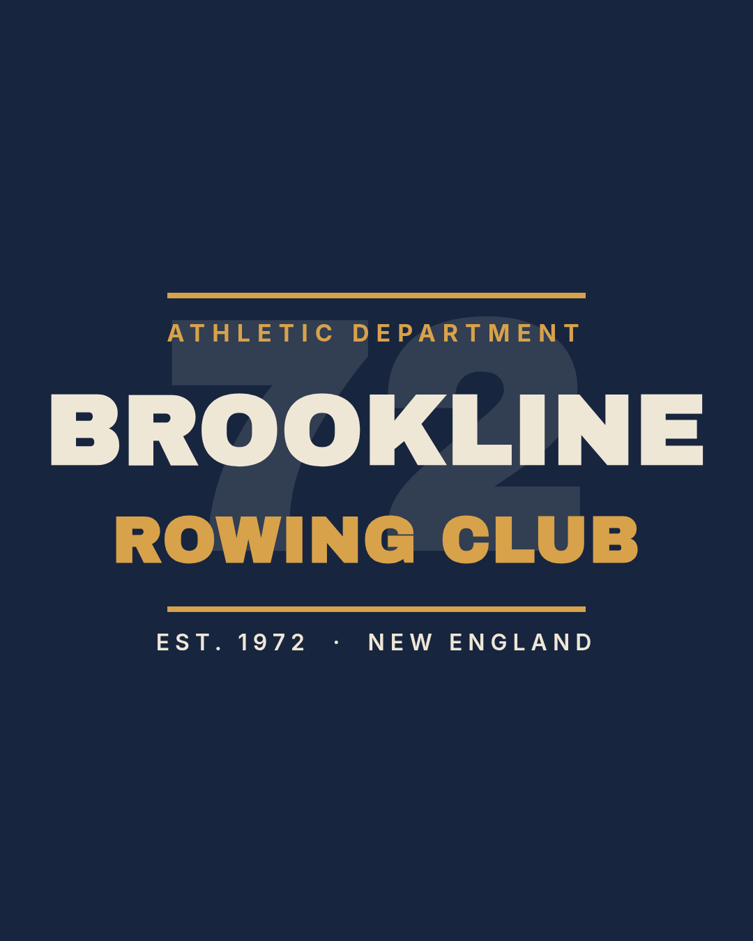
A vintage varsity t-shirt graphic on navy for a rowing club. Cream and gold collegiate block type stacked in two lines, a large ghosted number 72 behind the text, thin gold rules above and below, and a small letterspaced EST. 1972 line at the bottom.
2. Y2K chrome bubble — inflated, glossy, unserious
Fat rounded letterforms with a hard offset shadow, a soft glow behind, and a couple of four-point sparkles. The 2000s revival isn't slowing down, and this is its most wearable form. The trick is the offset: a solid shadow layer sitting down-and-right of the main word does 90% of the chrome effect without any gradient.
Best for: streetwear drops, music merch, Gen-Z audiences, anything that should read as fun rather than earnest.

A Y2K chrome bubble t-shirt graphic on black. The words CYBER ANGEL in a fat rounded bubble font, pale ice-blue with a solid darker blue offset shadow behind each word, a soft blue glow ellipse behind the type, two sparkle icons, and a small letterspaced line reading SYSTEM OVERLOAD · EST. 2000.
3. Retro 70s sunset — the striped sun
A circle sun with horizontal bands cut through it, in rust and burnt orange on cream, under a slab-serif line. Two rules make it work: the stripes should get thicker toward the bottom, and the sun should be a real circle, not a semicircle — a half sun reads as a logo, a full one reads as a poster.
Best for: coffee shops, surf and skate towns, festivals, gift shirts that need to feel warm rather than cool.

A retro 1970s t-shirt graphic on cream. A large burnt-orange circle sun with four horizontal cream stripes cut through the lower half, getting thicker toward the bottom. Below it, GOOD DAYS AHEAD in a heavy retro slab serif, rust on the first line and orange on the second, with a small SUNSET SOCIETY line under a short rule.
4. Minimal line art — the small chest print
One thin-line icon, one lowercase line of text, a hairline rule, and a tiny caption. Nothing else. This is the hardest style to convince yourself to ship, because your instinct on an empty canvas is to fill it — and the restraint is the entire product. Note how small it prints: roughly a quarter of the chest width.
Best for: apparel brands with taste, outdoor and travel labels, anyone whose audience would be embarrassed by a big graphic.

A minimal line-art t-shirt graphic on off-white, printed small on the chest. A single thin-line mountain icon in charcoal, the lowercase words take the long way underneath in a clean light sans, a short hairline rule, and a tiny letterspaced caption reading NO. 04 — SLOW TRAVEL CLUB.
5. Oversized wordmark — one word, chest to chest
A single condensed word blown up until it nearly touches both side seams, in one high-voltage color on black. There is no composition to get wrong, which is exactly why it's the most reliable style here. Pick a word with a joke or an attitude in it; OFFLINE works, AWESOME doesn't.
Best for: merch drops, gym and run clubs, brand statements, anything sold on a photo where the shirt has to be legible in a thumbnail.

An oversized statement t-shirt graphic on black. The single word OFFLINE in a very heavy condensed sans, acid lime green, filling almost the full chest width. A small white letterspaced word PERMANENTLY above it, a short lime rule below, and DO NOT DISTURB in small grey letterspaced caps at the bottom.
6. Outdoor badge — the circle crest
A ring, an icon, a name, a rule, a sub-line, a founding year. National-park merch runs on this pattern, and it's the friendliest style to a real business, because it's the only one on this list that doubles as a logo. Keep the ring thick — a thin circle looks like a mistake at print size.
Best for: trail and coffee brands, breweries, guides and outfitters, staff shirts that should look like heritage rather than uniform.

An outdoor badge t-shirt graphic on forest green. A thick cream circular ring, inside it a line-art mountain icon, PINE HOLLOW in heavy cream caps, a gold rule, TRAIL SUPPLY CO. in small gold letterspaced caps and EST. 1998 below. Under the badge, BUILT FOR THE LONG WALK in small cream caps.
7. Vertical stack — the back print
Letters stacked one per line down the spine, flanked by two hairline rails, with a small tag above. It's a back-print idea first, and it exploits something no front graphic can: a shirt is taller than it is wide. Coloring the last two letters differently gives the column a landing point.
Best for: streetwear, crew and tour shirts, anything where the wearer walking away is the shot.

A streetwear vertical back-print t-shirt graphic on black. The word NOCTURNE stacked one letter per line down the centre in a tall condensed sans, white with the final two letters in red, a thin red vertical rail on each side, a small red 24H badge above, and AFTER HOURS DIVISION in small grey letterspaced caps at the bottom.
8. Cut-and-paste punk — the photocopied block
Words in heavy caps knocked out of solid blocks, each block rotated a couple of degrees off true and stepped down the page. The rotation is doing all the work: at 0° this is a corporate banner, at −4° it's a flyer someone stapled to a lamppost. Keep the angles small and unequal.
Best for: bands, zines, skate brands, event merch, and slogans with some bite.
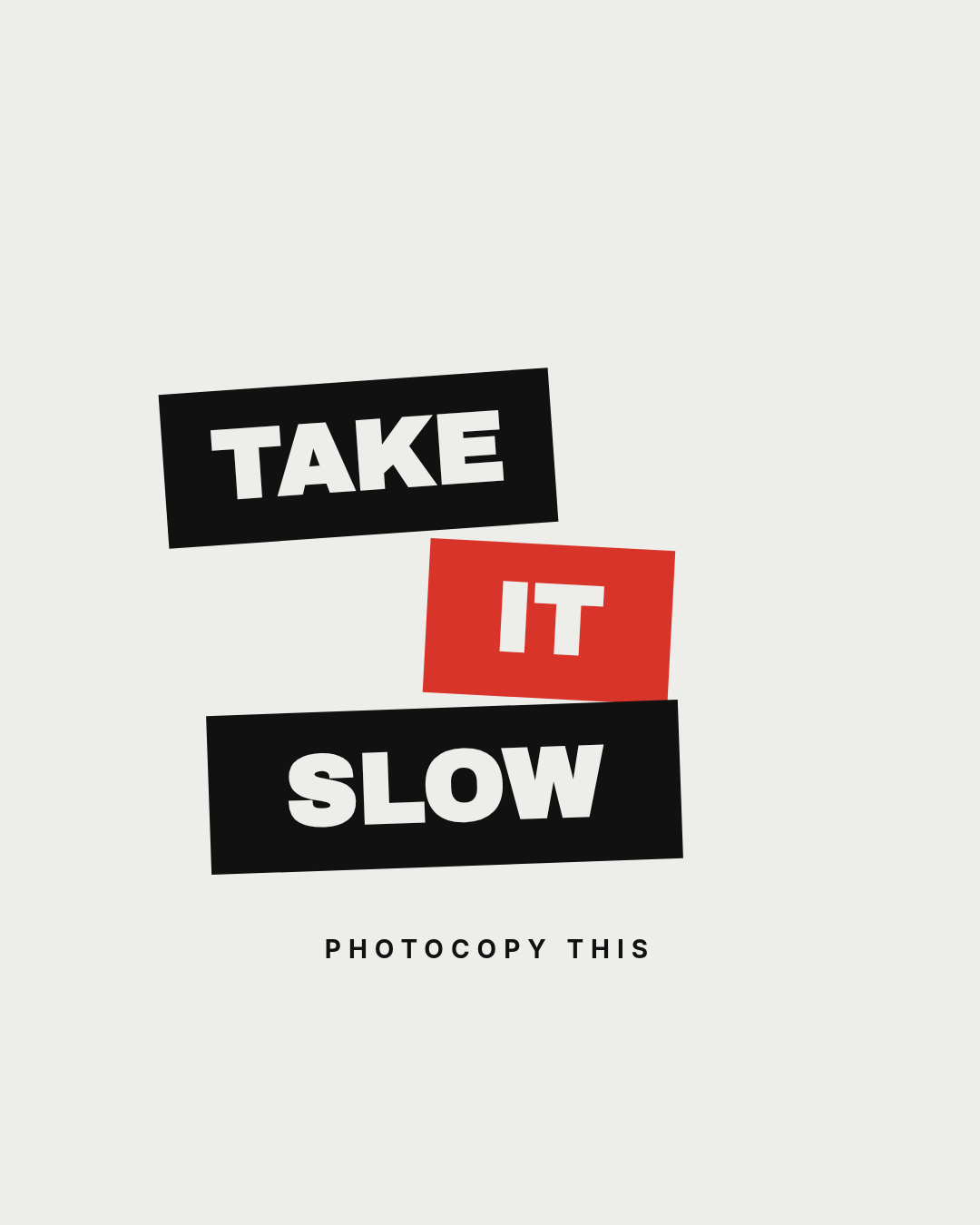
A punk cut-and-paste t-shirt graphic on off-white. Three heavy caps words TAKE, IT and SLOW each knocked out in off-white from a solid rectangular block, two black and the middle one red, each block rotated a few degrees at a different angle and stepped down and across the page. PHOTOCOPY THIS in small black letterspaced caps underneath.
9. Techwear grid — monospace and coordinates
A left-aligned block of monospaced type between two hairlines: a sector label, a headline, some coordinates, an edition number, three small color chips. Deliberately not centered. This is the only style here that looks like data rather than decoration, which is why it stands out on a rack of arcs and sunsets.
Best for: techwear and utility brands, limited runs, conference and product-launch shirts, engineers.

A techwear utility t-shirt graphic on graphite grey, left-aligned. A thin horizontal rule, SECTOR 04 / NORTHBOUND in orange monospace, FIELD TEST UNIT large in white monospace, latitude and longitude coordinates and NO. 0042 — LIMITED RUN in grey monospace below, a second rule, and three small square chips with the first one orange.
10. Botanical script — quiet and giftable
Two words in a high-contrast serif, a leaf either side, a hairline, and a small caps line. It's the style most likely to be bought as a present, and the discipline is keeping the botanicals beside the words rather than behind them — the moment a leaf crosses a letter, legibility goes and the shirt starts to look like a stock graphic.
Best for: plant shops, wellness and yoga studios, market-stall merch, mother's-day and gift ranges.

A botanical t-shirt graphic on cream. The lowercase words grow slowly on two lines in a large high-contrast serif, dark green on the first line and sage on the second, a small line-art leaf tilted on each side above the type, a short hairline rule, and TEND WHAT YOU HAVE in small letterspaced caps below.
Building one in Ridvay Studio
Every design above started as one sentence. Here's the varsity shirt, end to end.
Open Studio and type:
A vintage varsity t-shirt graphic on navy for a rowing club. Cream and gold collegiate block type stacked in two lines, a large ghosted number behind the text, thin gold rules above and below, and a small letterspaced EST. line at the bottom.
What comes back isn't a picture — it's a design. The club name, the number, the rules, and the EST. line are separate layers on a canvas, which is what makes the next four minutes possible:
- Click the club name and type yours. If it's longer than Brookline, drag the font size down until it clears the side margins. That margin is the print edge — text that touches it gets cropped.
- Recolor the gold to your actual color. Select the sub-line, the two rules and the EST. line, and set them all to one hex. Two colors plus the garment is the whole palette, per the rule up top.
- Drop the ghost number's opacity until it reads as texture rather than a second headline. Around 12% is where it stops competing.
- Swap the garment. Change the background color to your blank's actual color — heather grey, sand, black — and check the contrast again. Cream type that sang on navy will disappear on sand.
Then apply your brand kit if you have one, and the palette and fonts carry across every shirt in the range so ten designs look like one collection.
Open this varsity shirt prompt in Studio →
Getting it onto an actual shirt
The gallery above is artwork, not a print file. Three things to do before you send anything to a printer:
- Export big. A 12-inch-wide print at 300 DPI is 3600 pixels. Export at the highest scale Studio offers rather than screenshotting the preview.
- Kill the background. Every design here has a garment-colored canvas so you can see it in context. For DTG or screen printing you want the background transparent, or matched exactly to the blank — an off-by-one navy prints as a visible rectangle around your graphic.
- Check the smallest text. The
EST. 1972line and theNO. 0042line are the ones that fail. If a detail is thinner than about 1mm on the printed shirt, it'll fill in or drop out. Scale it up or cut it.
The full walkthrough — print areas, placement, file setup — is in how to design a t-shirt with AI. This post is the style vocabulary; that one is the process.
Pick one and change the words
The reason a marketplace looks like one long shirt is that everyone starts from the same blank canvas and reaches for the same safe idea. Starting from a style instead — varsity, or techwear, or the small chest print — gets you somewhere different before you've made a single decision.
Ten styles are up there. Open the one closest to what you're selling, replace the name, recolor it, and you've got a shirt in the time it takes to make coffee.