10 Wedding Invitation Styles for 2026 (All Editable)

Every couple I know has had the same evening: laptop open, forty browser tabs of invitation templates, and after two hours everything looks identical — the same script font, the same gold foil, the same eucalyptus sprig in the corner. You don't have a design problem. You have a choosing problem, because nobody ever showed you the actual options side by side.
So here they are. Ten distinct wedding invitation styles, from engraved-formal to boarding-pass playful — what defines each one, who it suits, and the exact prompt that produced it. Every example below was generated in Ridvay Studio and comes back as an editable design — the names, date, colors and fonts are separate layers you click and change, not a flat picture you re-roll. Under each card there's a link that opens that exact design in the editor, so you can swap in your own names in about a minute.
How to choose (three questions, not forty tabs)
- What's the dress code? The invitation makes a promise about the day. A letterpress-style formal card promising "black tie" and a taco truck at the reception is a broken promise — in either direction.
- Does the venue have a look? An Alentejo farmhouse points at terracotta arches; a December castle points at black and gold. Steal from where you're standing.
- How much do you want to say? Traditional wording runs six lines before the date. If that makes you itch, you're a minimalist or scribble couple — don't fight it.
One rule holds across all ten: the names and the date are the design. Everything else is supporting cast.
1. Editorial typography — the words are the design
The strongest current in 2026 stationery: no florals, no borders, just a hard-working high-contrast serif doing everything. It photographs beautifully flat on a table, and it's the hardest style to get wrong because there's nothing to clutter.
Best for: city weddings, design-conscious couples, anyone whose venue is doing the decorating.
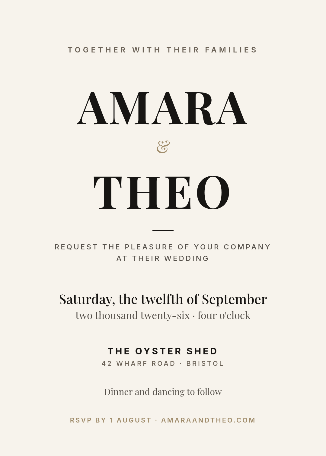
A 5x7 wedding invitation in an editorial, typography-led style — the words are the design, no florals. Cream paper, deep ink-black text, one thin hairline rule. The names as the huge dominant serif headline, a small ampersand between them, all details in a clean sans underneath.
2. The arch — 2026's signature shape
Sculptural die-cut silhouettes — arches, waves, pebbles — are the biggest structural trend in current stationery. You don't need a die-cutting machine: an arch panel on a rectangular card gives you the same architecture for a normal print price.
Best for: Mediterranean and garden venues, couples who want modern without cold.
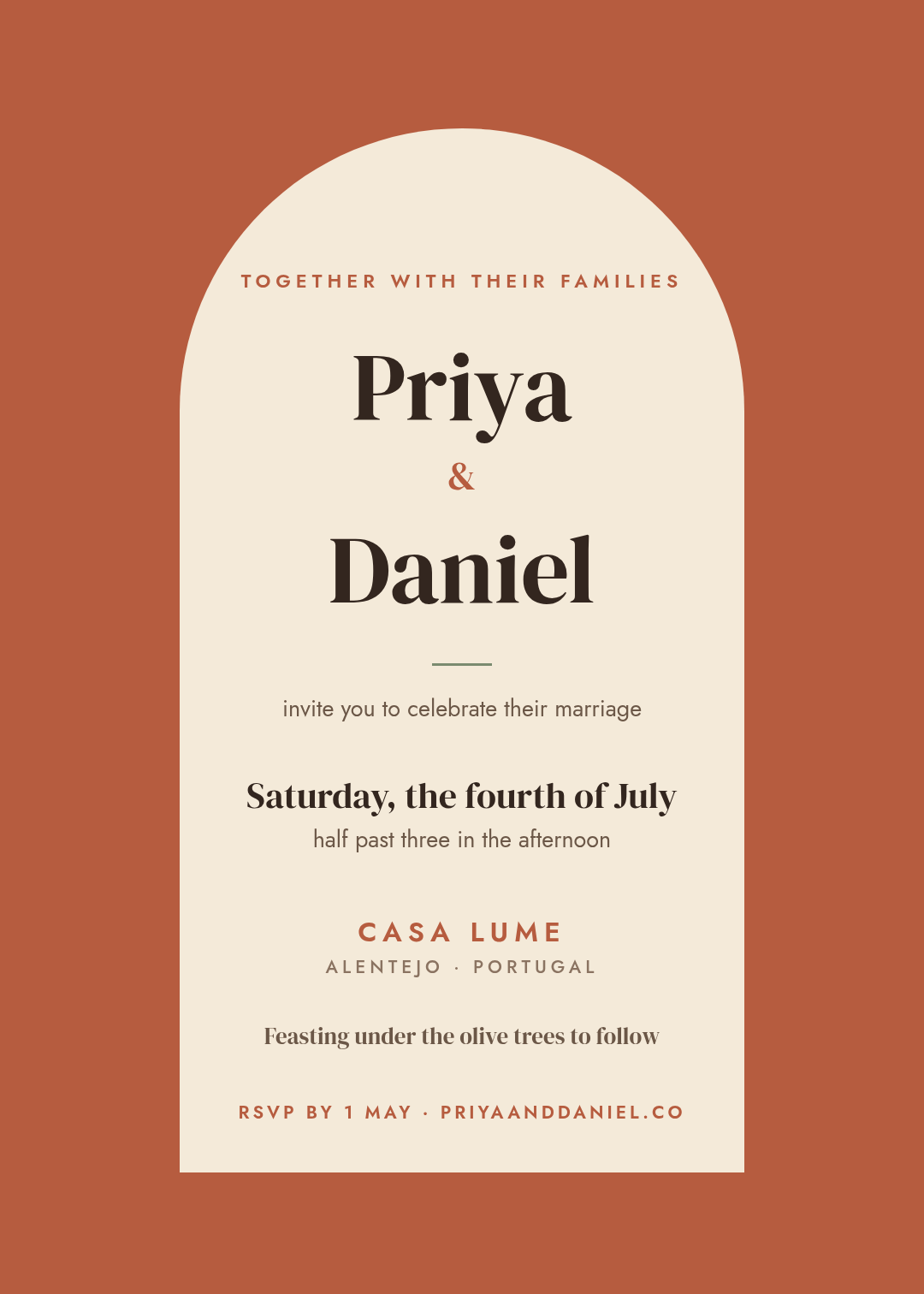
A 5x7 wedding invitation built around a full arch shape — a tall rounded-top cream arch panel on a warm terracotta background, all the wording inside the arch, an elegant serif for the names, one sage-green accent line. No florals — the arch itself is the decoration.
3. Watercolour botanical — handmade warmth
The most-pinned invitation style year after year, and the slight imprecision is the point: it reads as painted, not manufactured. The discipline is keeping the botanicals at the edges — the moment leaves crawl behind the names, legibility dies.
Best for: garden and countryside weddings, spring dates, traditional-leaning couples who find formal too stiff.

A 5x7 wedding invitation with delicate watercolour eucalyptus, olive branches and blush wildflowers garlanded across the top and bottom edges only, a clear ivory centre, the couple's names in a flowing script, formal wording in a refined serif. Sage green and dusty blush palette.
4. Minimalist — the confidence of empty space
Almost nothing on the card, all lowercase, one small accent dot. This style lives or dies on restraint: the empty space is the luxury, the same way it is on a gallery wall. If you add a fifth element, you've left the style.
Best for: modern couples, warehouse and greenhouse venues, anyone allergic to fuss.
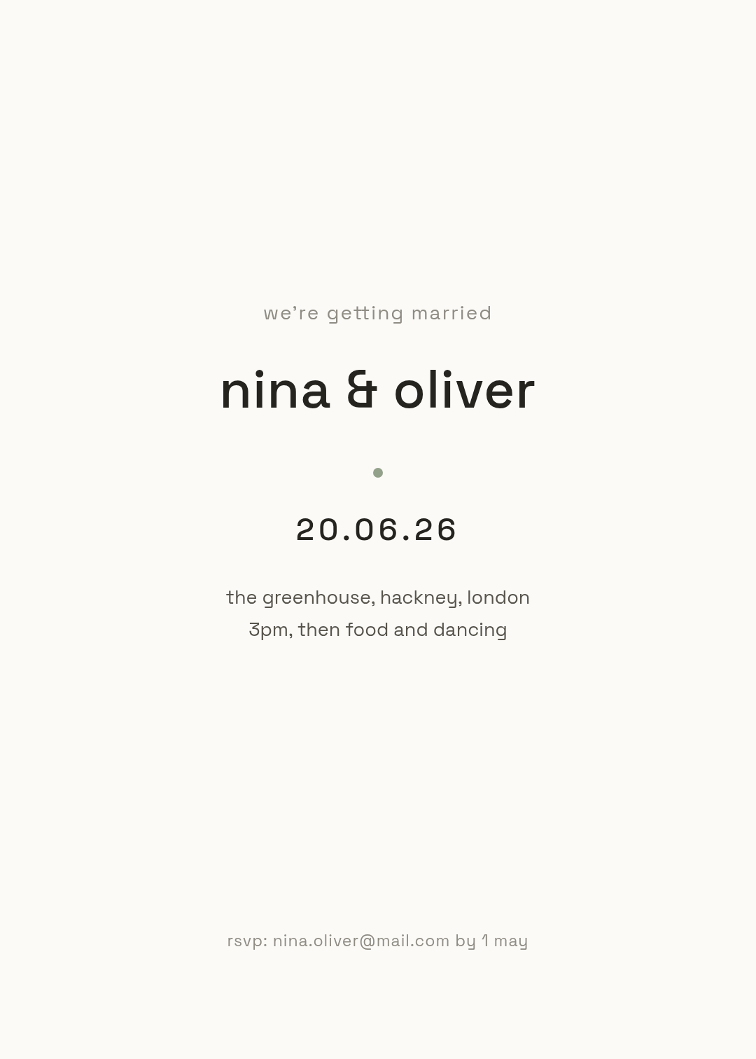
A 5x7 minimalist wedding invitation. Almost entirely empty warm-white space. All text lowercase in a clean geometric sans — a short "we're getting married", the names as the largest element but still restrained, the date as numbers, two quiet detail lines, one small sage dot. No borders, no flowers.
5. Classic formal — the etiquette flex
Engraved-style, centred, spelled-out everything: "Saturday, the seventeenth of October" not "Sat 17 Oct". This is the one style where tradition dictates the wording (more on that below), and the double hairline frame plus a monogram is all the ornament it needs.
Best for: black-tie weddings, hotel ballrooms, when parents are hosting and the guest list skews formal.
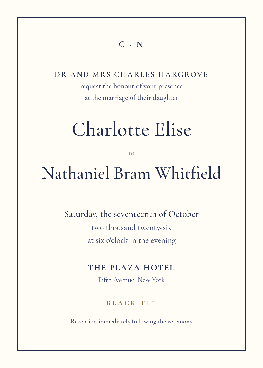
A 5x7 traditional black-tie wedding invitation, engraved letterpress feeling. Ivory background, deep navy classical serif, a thin double-rule frame, a small monogram at the top. Host line, "request the honour of your presence", spelled-out date and time, "Black tie" stated plainly.
6. Retro 70s — colour-block joy
Mustard, burnt orange, a groovy rounded display face and a sun motif. This is the invitation as a mood-setter: nobody receives it expecting a string quartet. It promises a party, so only send it if there is one.
Best for: festival-style weddings, lidos and beach clubs, couples whose Spotify wrapped is mostly disco.

A 5x7 retro 1970s wedding invitation. Bold colour-block bands in mustard, burnt orange and cream, a big rounded groovy display font for the names, a sun-arc motif at the top, the date in a cream pill, "cocktails · tacos · disco" in a dark band. Playful and confident, no script fonts.
7. Hand-drawn line art — casual with a wink
A single-line illustration, handwriting-style accents, and wording that sounds like the couple actually talks ("we did it, we're doing it"). Scribble-style stationery is the anti-formal trend of the moment — spare linework that feels personal without trying hard.
Best for: small weddings, second weddings, farm and pub venues, couples who cringe at "the honour of your presence".
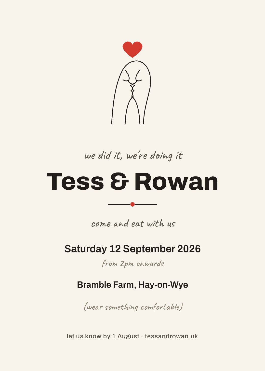
A 5x7 wedding invitation in a hand-drawn style: a minimalist single continuous line drawing of two faces about to kiss with a tiny red heart, casual handwritten-feeling lines like "come and eat with us", bold sans names, cream paper, black ink, one red accent.
8. The photo invitation — lead with the two of you
One great engagement photo, black and white so it stays timeless, and a solid panel for the wording so text never fights the picture. That last part is the whole trick — I wrote a full post on putting readable text near photos, and the safest answer is: don't put it on the photo at all.
Best for: couples with a photo they love, digital-first invitations, save-the-dates.
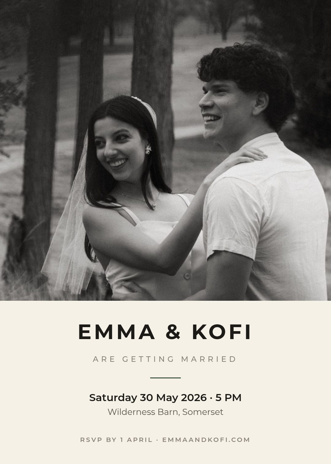
A 5x7 photo wedding invitation. A full-bleed black-and-white photo of the couple laughing fills the top two-thirds; a solid cream panel across the bottom holds the names in wide-tracked caps, the date, the venue and the RSVP. No text over the photograph.
9. The boarding pass — destination weddings, played straight
If guests are flying, make the invitation the ticket: route codes, a boarding time, a tear-off stub, a scannable QR that goes to your wedding site. It answers the destination couple's hardest problem — getting guests to read the logistics — by making the logistics the design.
Best for: destination weddings, multi-day celebrations, couples who met travelling.
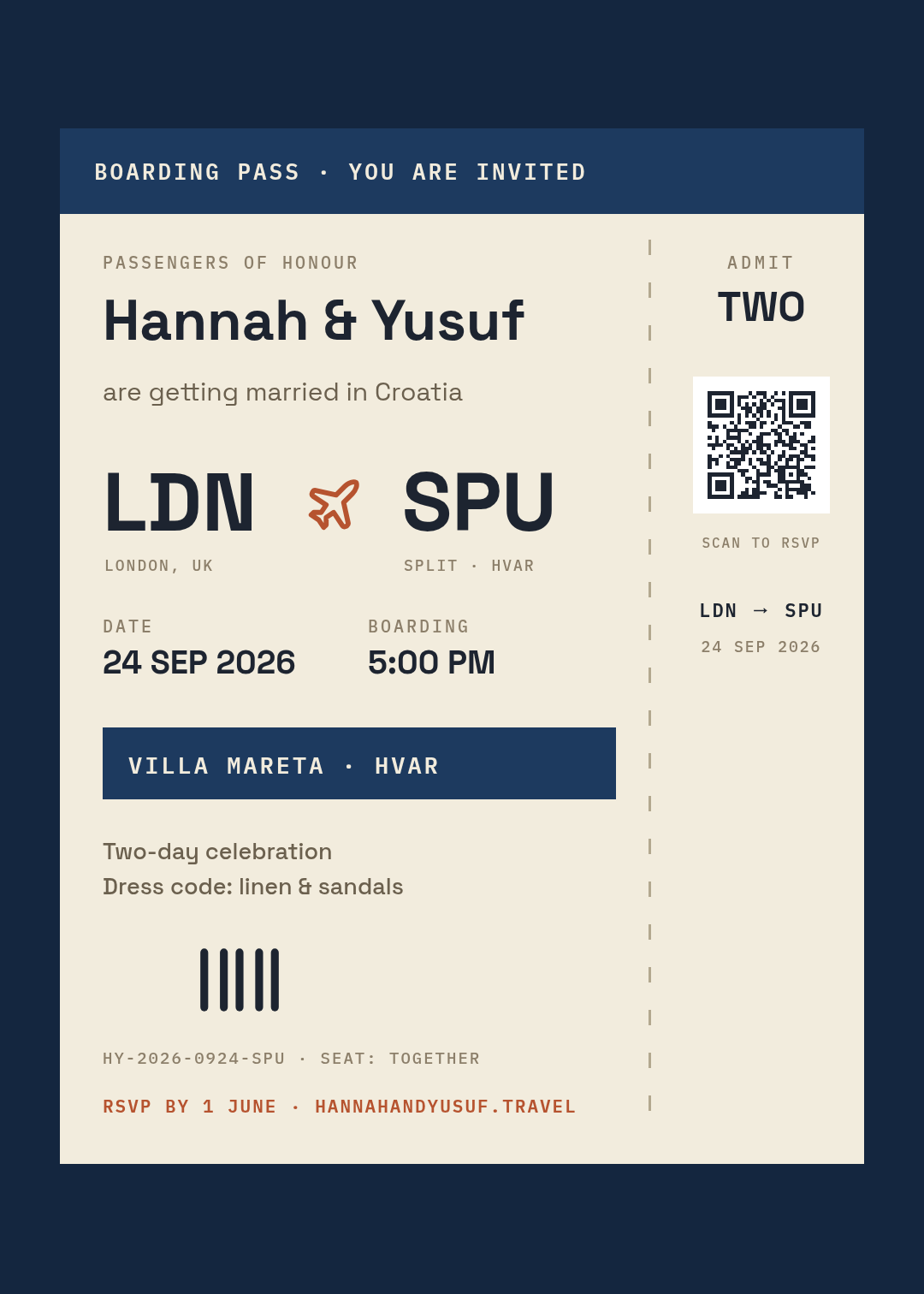
A 5x7 destination wedding invitation styled as a vintage boarding pass: cream ticket on deep navy, route "LDN → SPU" in huge letters with a plane icon, date and boarding-time fields in a mono font, a dashed perforation with a stub reading "ADMIT TWO", a QR code that links to the wedding site.
The QR on that card is a real scannable vector pointed at the couple's site — Studio generates working QR codes, not pictures of them, so it still scans after the printer resizes it.
10. Celestial black & gold — evening drama
Near-black card, gold type, a scatter of stars and a crescent moon. Dark stationery signals an evening wedding before a single word is read, and it's the only style on this list that gets more elegant as the venue gets grander.
Best for: winter weddings, castle and manor venues, black-tie evening receptions.
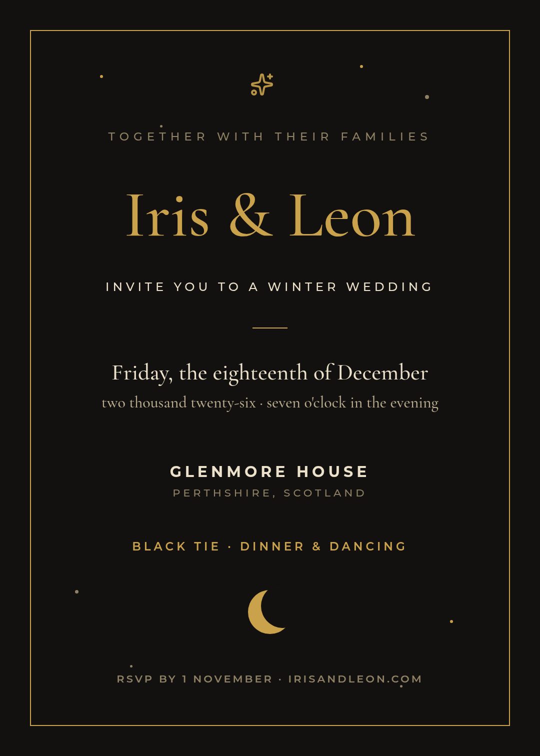
A 5x7 evening wedding invitation: deep charcoal-black background, thin gold frame, tiny scattered gold stars and a crescent moon, the names in an elegant gold serif, spelled-out date, "Black tie · dinner & dancing" in gold caps. No florals — just dark space, gold type and starlight.
The wording rules, in one minute
Whatever style you pick, the text has its own etiquette:
- Host line first — whoever's hosting (traditionally, paying) opens the card: "Mr and Mrs Richard Alvarez request…". Couple hosting yourselves? Skip it or use "Together with their families".
- The request line sets the register. "Request the honour of your presence" is for religious ceremonies; "request the pleasure of your company" for everywhere else; "come and eat with us" for the style #7 crowd. Pick one register and hold it for the whole card.
- Formal cards spell everything out — dates, times, no abbreviations, no punctuation at line ends. Casual cards do the opposite. The mixed version ("Saturday, the 17th of Oct, 6pm") reads as a typo.
- If it's black tie, the card must say so. Dress codes announced later by group chat cause chaos.
- RSVP needs a deadline and a method. "RSVP by 1 August · site.com" — one line, always last.
Making yours (and getting it printed)
Open any example above with its Edit in Studio link — the design loads with every layer editable. Click the names and type your own; the layout holds. Swap the palette (the color combinations post has ready-made pairs), or change a font — one display face plus one text face, never more, per the font pairing rules.
Then three practical checks before print:
- Names biggest, date second. Squint at the card — if the venue address wins, fix the hierarchy.
- Proofread the date against a calendar. "Saturday, the twelfth of September" had better be a Saturday. This is the most-reprinted mistake in wedding stationery.
- Export at 300 DPI and give the printer 3mm bleed if they ask. A 5×7in card at 350gsm is the standard; anything lighter feels like a flyer.
The same design also resizes for the digital half of the job — a story-sized version for the group announcement, a square for the save-the-date — without rebuilding it, so the paper invitation and the Instagram one match.
Start your wedding invitation in Ridvay Studio → — describe your day in one sentence, get an editable card back, and change anything you like.