Top 10 YouTube Thumbnail Designs for 2026 (All Editable)

A thumbnail gets about 0.4 seconds. That's not a metaphor — it's roughly how long a viewer's eye rests on one tile of a YouTube grid before it moves on. In that time nobody reads your title. They register a shape, a face or not-a-face, one or two words, and a colour. Then they either stop or they don't.
Which means the useful question isn't "how do I make a good thumbnail." It's which look am I making. A cooking channel and a systems-design channel and a true-crime series all need thumbnails that work — but they need completely different ones, and copying the wrong style is the most common way a decent video dies at 2% CTR.
So here are ten YouTube thumbnail designs for 2026, each one built and rendered for this post rather than described in the abstract. For every style you get what defines it, who it's actually for, the exact prompt to type, and a link that opens that design in the editor so you can swap the photo and the words and be done.
If you want the mechanics first — safe zones, text size, contrast — that's the thumbnail how-to. This post is the style vocabulary.
1. The Reaction Frame

The one everyone knows: a face carrying one strong emotion on one side, three or four enormous words on the other, an arrow doing the pointing. It works because a face is the only object the human eye finds faster than text.
The rule that makes it work is the dark panel. Without it your white type sits on skin tone and disappears at phone size. Put a 60–70% black rectangle under the words, keep the face fully visible on the other half, and never let type cross onto the face.
Who it's for: vlogs, challenges, reviews, anything personality-led.
A 1280x720 YouTube thumbnail: full-bleed photo of a shocked person on the right, a dark panel over the left half, huge white headline "I TRIED IT FOR 30 DAYS" with DAYS on a red block, small yellow kicker "DAY 30 UPDATE", yellow arrow pointing at the face.
2. The Text Wall

No face, no photo, no arrow. Three lines of very heavy type filling the whole frame, one line coloured. It is the easiest style to execute well and the hardest to execute badly, which is why faceless channels live on it.
The discipline is word count. Three lines, maximum eleven characters each, or the type shrinks below the size that survives a 210-pixel mobile tile. Colour exactly one line — colouring two makes both stop meaning anything.
Who it's for: podcasts, essays, finance and business channels, anyone who doesn't want to be on camera.
A 1280x720 YouTube thumbnail, near-black background, three lines of huge Archivo Black type: "NOBODY / TALKS ABOUT / THIS PART", middle line in yellow, small yellow bar above, grey footer line "EPISODE 47 · THE LONG GAME".
3. The Before / After Split
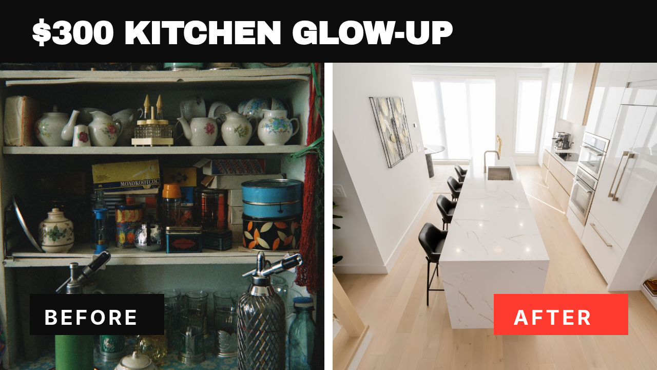
Two photos, a hard white divider down the middle, a chip in each bottom corner. The whole promise of the video is legible without a single word of the title being read.
One thing people get wrong: they shoot the two photos from different angles. Match the framing or the split reads as two unrelated pictures instead of one transformation. Put the price or the constraint in the top bar — "$300", "one weekend", "no tools" — because that's the part that makes it a story rather than a portfolio.
Who it's for: renovation, fitness, restoration, design, detailing, anything with a visible outcome.
A 1280x720 YouTube thumbnail split down the middle: left photo of a dated cluttered kitchen, right photo of a bright renovated kitchen, thick white divider, black top bar with "$300 KITCHEN GLOW-UP", black BEFORE chip bottom-left, red AFTER chip bottom-right.
4. The Editorial Minimal
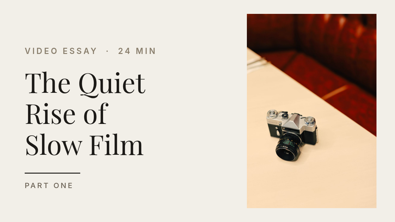
Cream background, a serif headline in sentence case, one small photograph, an enormous amount of empty space. It breaks every "shout louder" rule and that's exactly why it works — in a grid of yellow arrows and screaming faces, quiet is the loudest thing on screen.
It only works if the type is genuinely good. One serif, three lines, real punctuation, no all-caps. The photo is an accent, not the subject, so keep it under a third of the frame.
Who it's for: video essays, documentaries, interviews, film and photography channels, anything long-form.
A 1280x720 YouTube thumbnail, warm cream background, elegant Playfair Display title "The Quiet / Rise of / Slow Film" in near-black on the left, small vertical photo of a vintage film camera on the right, tiny kicker "VIDEO ESSAY · 24 MIN", hairline rule and "PART ONE".
5. The Tutorial Callout

A screenshot with one region boxed in a bright outline, plus a step badge. This is the highest-intent thumbnail on the list: someone searching for a fix wants to see the fix, and a yellow box around a single toggle promises exactly that.
The mistake is pasting the whole screenshot at full size. Nobody can read your UI at thumbnail scale. Crop hard, blur or flatten everything that isn't the point, and let the coloured box carry the meaning.
Who it's for: software tutorials, settings guides, plugin walkthroughs, spreadsheet and editing channels.
A 1280x720 YouTube thumbnail, dark navy background, a stylised app window on the right with a sidebar and four setting rows, one row highlighted with a thick yellow outline box and a green toggle, headline "THE SETTING / EVERYONE / MISSES" on the left with MISSES in yellow, red "STEP 3" chip.
6. The Big Numeral
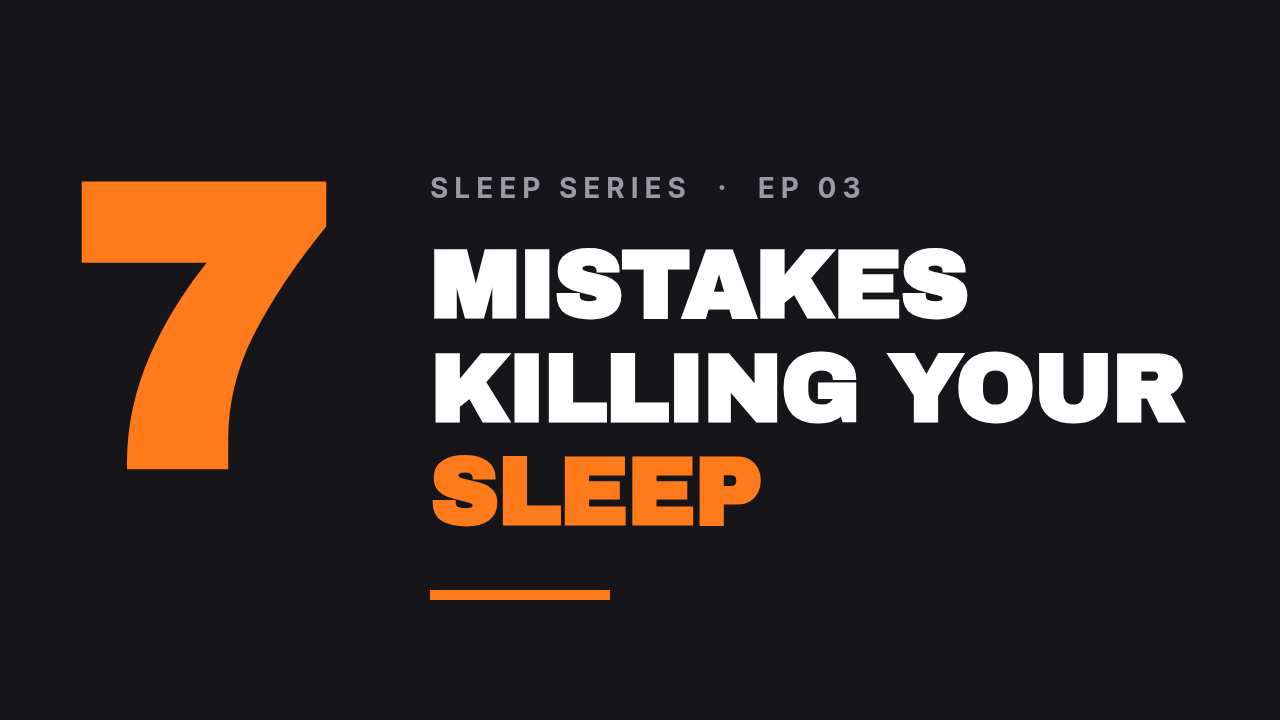
One numeral, set enormous — three or four times the size of the words next to it. The number does two jobs: it reads instantly at any size, and it tells the viewer how long the commitment is.
Keep the numeral under 10. "7 mistakes" is a video; "23 mistakes" is a chore. And set the numeral in the accent colour so it doubles as the thumbnail's colour anchor — you don't need a second accent anywhere else.
Who it's for: tips, listicles, mistakes-and-fixes videos, health and productivity channels.
A 1280x720 YouTube thumbnail on near-black: a giant orange numeral "7" on the left, and to its right "MISTAKES / KILLING YOUR / SLEEP" in heavy white type with SLEEP in orange, small grey kicker "SLEEP SERIES · EP 03".
7. The Gaming Neon

Dark, saturated, high-contrast: a heavily darkened game or city backdrop, a black slab, type in one impossible colour, a badge in a second. It's loud, and in gaming grids loud is the baseline, not the exception.
The trick is that only two colours are allowed to be neon. Everything else — background, slab, secondary text — goes dark and desaturated. Three neons and the frame turns to mud.
Who it's for: gaming, streaming clips, esports recaps, tech unboxings that want energy.
A 1280x720 YouTube thumbnail: rain-slick neon city street at night heavily darkened, black slab on the left holding "ZERO DEATH" in electric lime and "RUN" in white, hot-pink "RANKED #1" badge below, hot-pink "● LIVE" pill top-right.
8. The Travel Wide
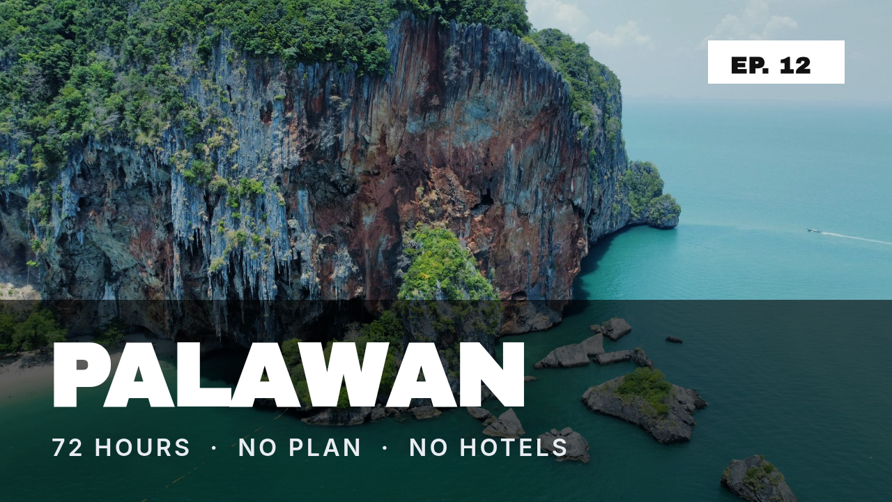
The photo is the product, so the photo gets the whole frame. Type lives in a band across the bottom: place name huge, the constraint underneath in small caps.
The band is non-negotiable. A dark scrim across the lower third is what stops your white place-name from vanishing into a bright sky or a pale beach — the same fix that makes any text over a photo survive. Name a place, not a feeling: "PALAWAN" gets clicks that "PARADISE FOUND" never will.
Who it's for: travel, drone and landscape channels, van life, hiking, food tours.
A 1280x720 YouTube thumbnail: full-bleed aerial photo of a turquoise tropical coastline, dark scrim across the bottom third, "PALAWAN" in huge white type, "72 HOURS · NO PLAN · NO HOTELS" underneath, small white "EP. 12" tag top-right.
9. The Podcast Two-Shot

Two head shots, one on each side, the question in the middle. The format is doing something specific: it tells the viewer this is a conversation, and it lets a guest's face sell the episode when the guest is the reason to watch.
Crop both heads to the same square and the same eye line. Mismatched crops are the single thing that makes a podcast thumbnail look amateur. Put the guest on the right — that's where the eye lands last, and last is what gets remembered.
Who it's for: interview shows, debate formats, co-hosted podcasts, anything with recurring guests.
A 1280x720 YouTube thumbnail on near-black: two square studio headshots, one on the far left and one on the far right, names in small caps underneath with teal rules, centre headline "ARE WE / IN A / BUBBLE?" with the last line in teal, show name "THE SIGNAL SHOW · 047" across the top.
10. The Documentary Cold Open
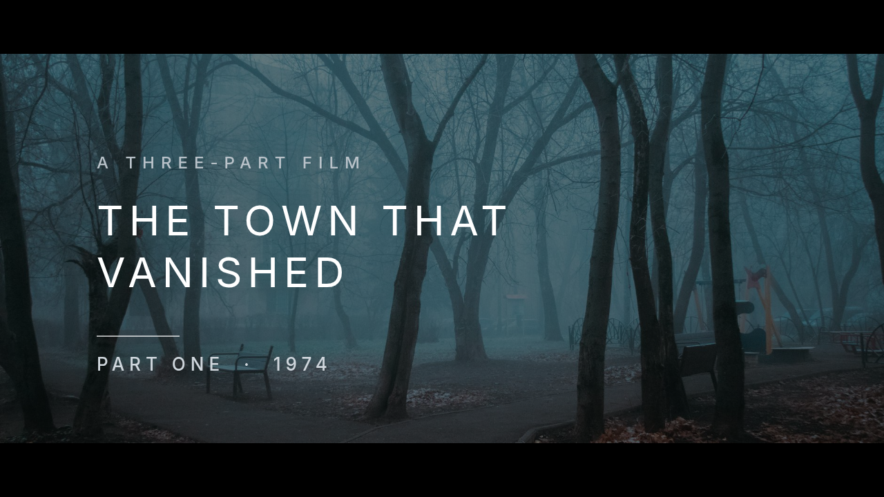
Letterbox bars top and bottom, a muted still, a thin uppercase title with wide letter-spacing. It signals "this is a film, not a video," and it earns the longer watch time that a documentary needs.
Wide letter-spacing is what does the work — 8 to 10 points on the title. Keep the photo desaturated and dark; a bright, colourful still fights the whole mood. And add a small "PART ONE" line, because episode structure is a reason to come back.
Who it's for: documentary series, mysteries, history and true crime, long-form investigations.
A 1280x720 YouTube thumbnail: an empty country road disappearing into thick fog, heavily darkened, black letterbox bars top and bottom, thin white uppercase title "THE TOWN THAT / VANISHED" with wide letter-spacing, kicker "A THREE-PART FILM", hairline rule and "PART ONE · 1974".
Building one in Ridvay Studio
Every thumbnail above was made the same way: one sentence in, an editable design out. Say what you want and press go — this is the exact prompt for the number-six layout:
A 1280x720 YouTube thumbnail on near-black: a giant orange numeral "7" on the left, and to its right "MISTAKES / KILLING YOUR / SLEEP" in heavy white type with SLEEP in orange, small grey kicker "SLEEP SERIES · EP 03".
What comes back isn't a flat picture you have to regenerate when it's wrong. It's a real design: the numeral is a text layer, the headline is a text layer, the accent bar is a shape, the photo is an image layer. Click any of them and change them.
Four edits that turn that generic result into your thumbnail:
- Click the numeral and change it to your number. If your list is 5 items, it says 5. Drag its size up until it's roughly three times the height of the headline — that ratio is what makes the style work.
- Rewrite the headline in three lines, not two. Keep each line under about eleven characters. If a line overflows, cut a word rather than shrinking the type; small type is the one mistake a thumbnail can't survive.
- Recolour the accent. Select the numeral and the bar, set both to one colour pulled from your channel art. Two objects, one colour, and the thumbnail suddenly belongs to your channel instead of to this post.
- Swap the background. Drop in a frame from the video itself and add a dark panel behind the type — the same trick that keeps style #1 and style #8 readable.
Then hit export at 1280×720 and upload. If a layout is nearly right but the wording is off, you edit the words; you don't roll the dice again. That difference is the whole reason editing an AI design beats regenerating it.
Make your own — open Studio with this thumbnail prompt →
Exporting and uploading
A few numbers worth having right, because YouTube is fussy:
- 1280×720 is the canvas. Anything smaller gets upscaled and looks soft on a TV.
- Under 2 MB, JPG or PNG. Export as JPG if a photo dominates; PNG if it's mostly flat colour and type, which stays crisper.
- Test at 210 pixels wide. That's roughly a mobile grid tile. Shrink your export in any image viewer — if you can't read the headline, it's too small, and about 60% of watch time is coming from that size.
- Leave the bottom-right corner clear. The duration stamp sits there and will cover whatever you put underneath it.
One last thing about picking from this list: don't rotate through all ten. Pick one style, use it for your next twenty videos, and change only the words and the photo. A channel whose thumbnails look like a set gets recognised in a grid; a channel that redesigns every week never does. The styles here are ten different answers, but your channel only needs one of them.