Top 10 Black Friday Poster Designs for 2026 (All Editable)

Black Friday 2026 lands on Friday 27 November, which means the posters go up in about ten weeks and most of them will make the same mistake: the shop's logo will be bigger than the discount.
I looked at a row of shop windows last November and counted. Seven posters. On five of them, the percentage was the third or fourth largest thing on the page, sitting politely under a logo and a stock photo of a gift box. You had to walk up to the glass to find out what the sale actually was.
So here are ten Black Friday sale poster designs that don't do that — ten genuinely different looks, from a blacked-out type slab to a terminal window, each built as a real editable design rather than a mockup. Every one has the prompt that made it and a link that opens it in Ridvay Studio so you can put your own numbers in.
One thing before the gallery, because it decides which style you should pick: a Black Friday poster has exactly one job at reading distance, and it isn't your brand. It's the number. Pick the style that lets your number be the biggest thing on the page in a way your customers will recognise as yours.
1. Blackout Type
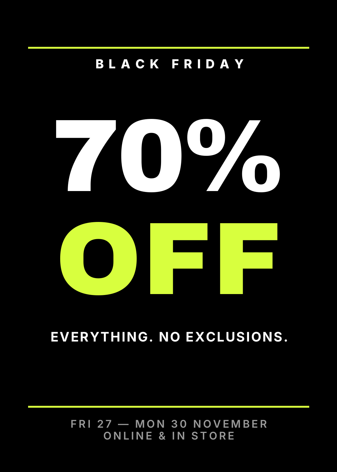
Black ground, two words, one number the size of a dinner plate. There is no illustration, no photo, and no logo above the fold — the discount is the artwork. The acid yellow is doing one job: separating "70%" from "OFF" so the eye lands on the number first and the word second.
Who it's for: any shop with one blunt message and a window to put it in. It is also the safest poster here, because there is nothing in it to get wrong.
The rule that makes it work: if the discount isn't the largest object on the page, it isn't a sale poster. Shrink your logo until it hurts, then shrink it again — footer size, grey, and out of the way.
The prompt:
A Black Friday sale poster, 5:7 portrait, pure black. A huge white "70%" above a huge acid-yellow "OFF", a small letterspaced "BLACK FRIDAY" kicker between two thin rules at the top, and the dates in small grey caps along the bottom. Type only, no images.
Edit this one: open it in Studio
2. The Doorbuster Grid
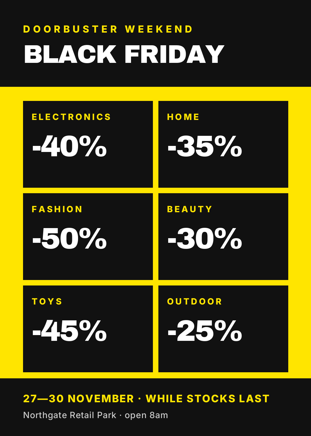
Safety yellow, a black header that runs edge to edge, and six black cells each holding one department and one percentage. It is loud on purpose and it is the only layout here that can carry six offers without turning into a receipt.
Who it's for: multi-department retail — supermarkets, hardware, electronics, anywhere a customer arrives wanting to know which aisle to run to.
The rule that makes it work: one percentage per cell, never a range. "20–50% off" makes a shopper do arithmetic in a car park; "-40%" makes them walk in. If a department genuinely varies, pick the headline number and put the small print in the footer.
The prompt:
A Black Friday doorbuster poster on safety yellow, 5:7. A black header band with "BLACK FRIDAY" reversed out of it, then a 2x3 grid of black cells, each holding one department name and one discount like -40%, and a black footer band with the dates and the store address.
Edit this one: open it in Studio
3. Quiet Luxury

Matte black, a double gold hairline frame, a high-contrast serif set large and calm, and the discount mentioned exactly once, in body copy, in a sentence. Notice that the words "Black Friday" never appear — it's "The Winter Sale", because a brand with a price floor doesn't want to be shelved next to a doorbuster.
Who it's for: jewellery, beauty, tailoring, furniture, anything where a 70% flash would read as trouble rather than as a bargain.
The rule that makes it work: luxury sales never print a big red percentage. The number goes in a sentence, lower-case, alongside a reason and an end time. Scarcity does the persuading, not the arithmetic.
The prompt:
A private winter sale poster, 5:7, matte black with a double gold hairline frame. A large calm serif headline reading "The Winter Sale", one centred sentence in light type mentioning up to 40% off the autumn collection, and a small gold date and brand name at the bottom.
Edit this one: open it in Studio
4. Swiss Minimal
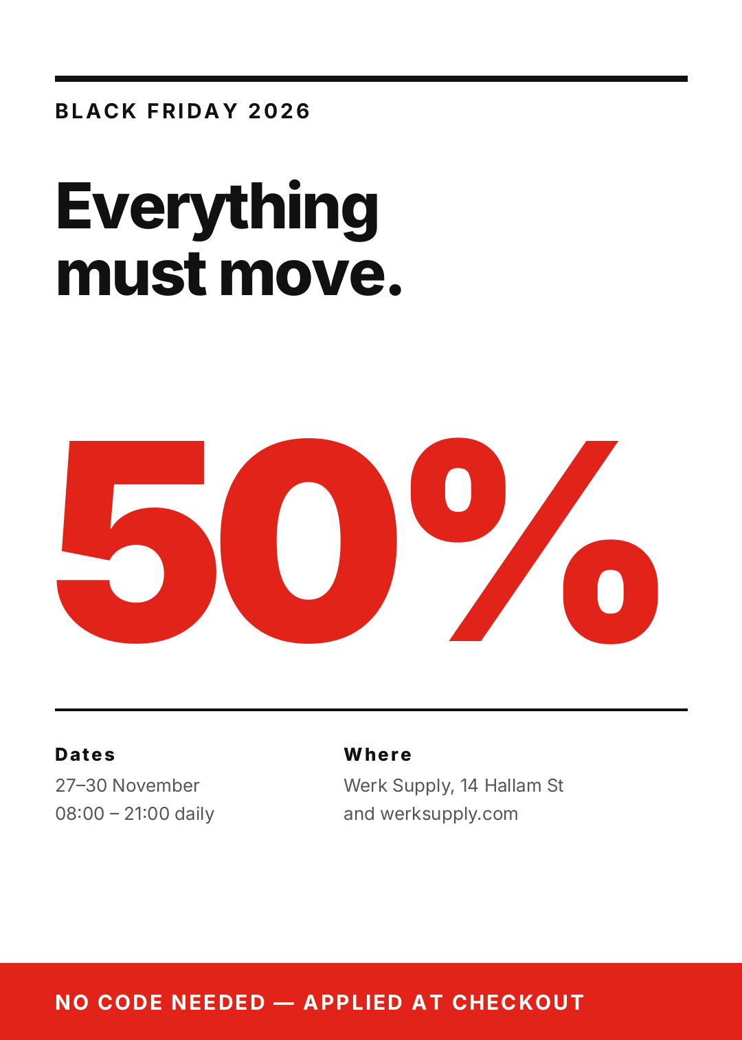
White paper, everything locked to a left margin, a hairline rule at the top and bottom, and one enormous red numeral sitting in the middle with nothing else competing. The details live in two small columns — dates on the left, address on the right — set at the size of a footnote.
Who it's for: design-led shops. Eyewear, furniture, stationery, studio brands, and anyone whose customers would notice a drop shadow.
The rule that makes it work: the white space is the flex. One accent colour, one type family, two weights. The moment you add a second colour to a Swiss layout it stops looking deliberate and starts looking unfinished.
The prompt:
A Swiss minimal Black Friday poster, 5:7, white, everything left-aligned to one margin. A hairline rule at the top, a bold headline reading "Everything must move.", one enormous red 50% filling the middle, two footnote-size columns for dates and address, and a red bar across the bottom.
Edit this one: open it in Studio
5. Retro Seventies
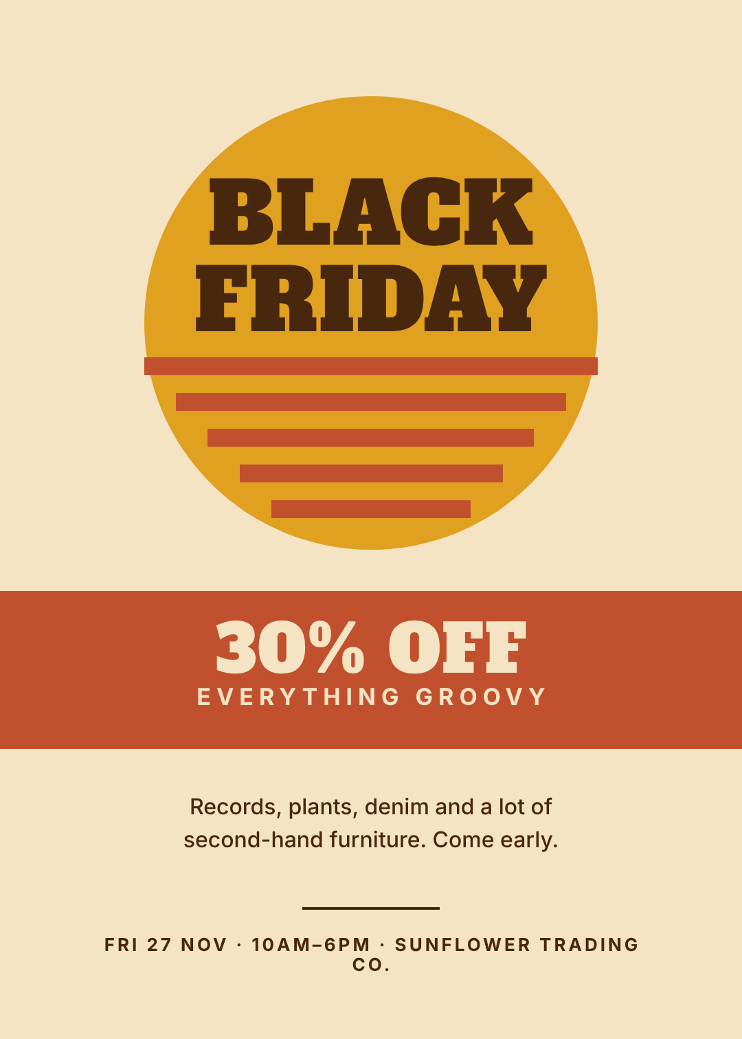
Cream stock, a mustard sun, rust stripes stepping down into a band, and a chunky slab face with the headline stacked dead centre. It's the friendliest poster in the set — a 30% discount presented as an invitation rather than a countdown.
Who it's for: record shops, plant shops, thrift and vintage, cafés, anywhere "Black Friday" needs softening into something that doesn't feel like a stampede.
The rule that makes it work: stay inside a warm palette of three — cream, one mustard, one rust — and use exactly one display face. Retro type plus a neon accent is the single fastest way to make a poster look like a mistake.
The prompt:
A retro seventies Black Friday poster, 5:7, cream paper. A mustard sun with rust stripes stepping down out of it, a chunky slab-serif "BLACK FRIDAY" stacked in the centre, a rust band reading "30% OFF", and warm dark-brown details underneath.
Edit this one: open it in Studio
6. The Photo Hero

A full-bleed photograph, a heavy scrim over the whole canvas, and the type sitting in the lower third where the image is quietest. The photo isn't decoration — it's the reason someone stops, and the scrim is the reason they can still read the offer.
Who it's for: department stores, shopping centres, and any brand selling an atmosphere rather than a shelf.
The rule that makes it work: scrim the whole canvas, not half of it. A half-height dark panel leaves a visible seam straight across the middle of the poster and it is the most common way this style fails. If you want the bottom darker still, stack a second soft panel under the text. More on this in How to Put Readable Text Over a Photo.
The prompt:
A Black Friday poster, 5:7, with a full-bleed photo of a shopper carrying paper bags past lit store windows at night. Put a heavy dark scrim over the whole image, a letterspaced "BLACK FRIDAY WEEKEND" kicker at the top, and "UP TO 60% OFF" in white in the lower third.
Edit this one: open it in Studio
7. Sticker Burst
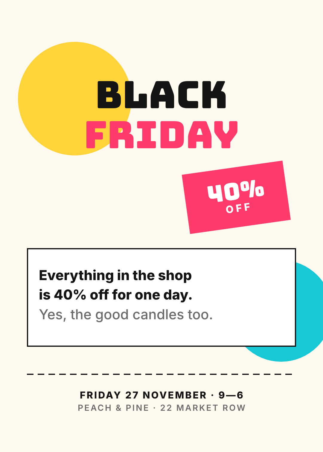
Warm paper, a yellow circle behind the headline, a tilted pink badge holding the number, a bordered white card for the actual sentence, and a dashed rule near the bottom that makes the whole thing feel like something you could cut out. Playful, and legible from three metres.
Who it's for: independent shops, makers, bakeries, gift shops — anywhere the owner answers the door and the tone should sound like them.
The rule that makes it work: one tilted element, not five. A single badge at -8° reads as a sticker; three things at odd angles read as a corrupted file. Everything else stays square.
The prompt:
A playful Black Friday poster, 5:7, on warm cream paper. A yellow circle behind rounded black-and-pink "BLACK FRIDAY" lettering, a tilted pink "40% OFF" badge, a bordered white card holding one sentence, and a dashed rule above the date and address.
Edit this one: open it in Studio
8. Brutalist Type
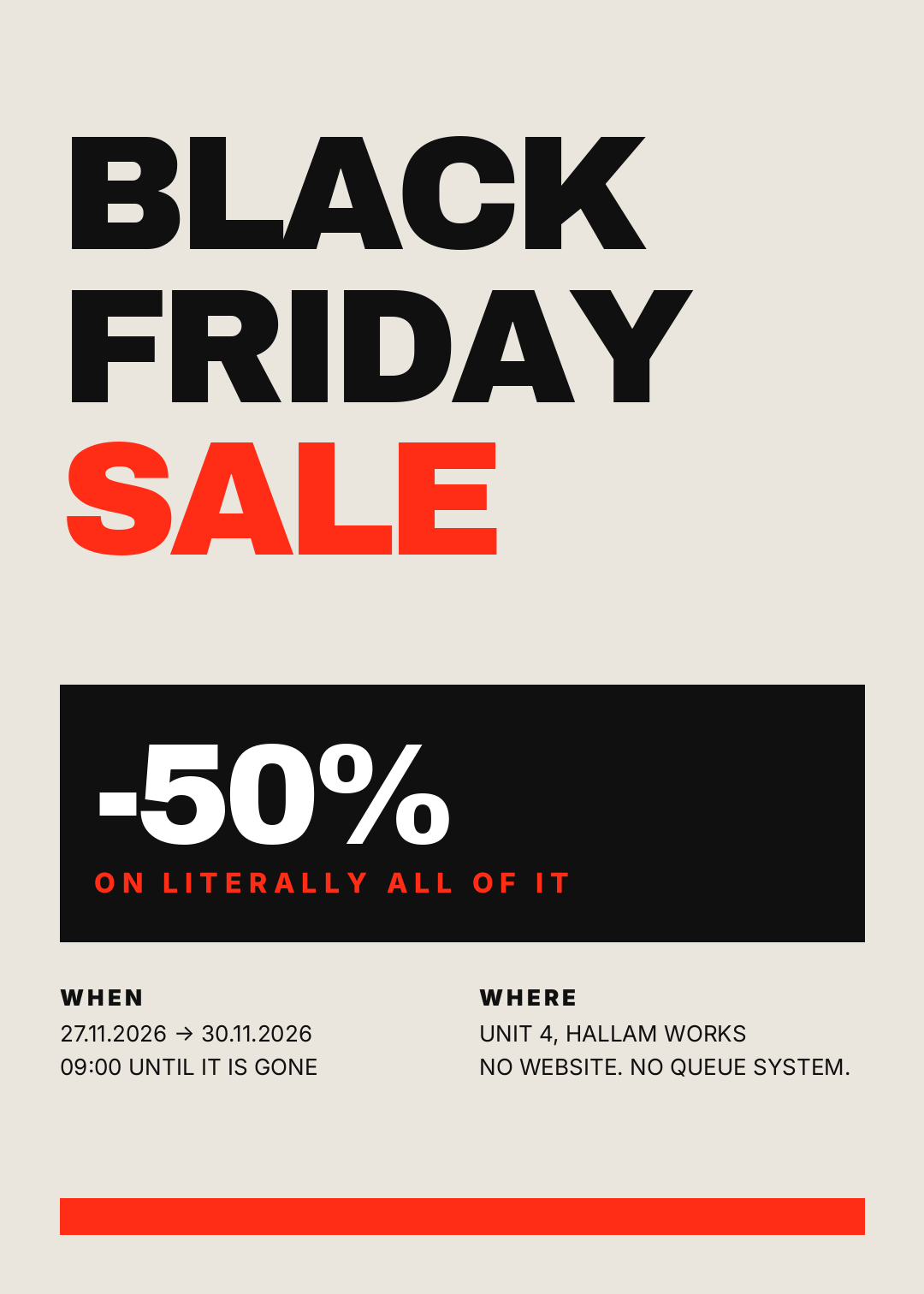
Bone paper, type set so large and so tight it's nearly touching itself, a solid black block holding the discount reversed out, and information set in the plainest possible way underneath. It's deliberately unpolished, and that's the message: the money went into the markdown, not the poster.
Who it's for: streetwear, workwear, clearance, warehouse sales, record fairs.
The rule that makes it work: negative letter-spacing and almost no margin. Brutalist layouts fail when they're polite — if the headline isn't crowding the edges of the page, push it further until it is.
The prompt:
A brutalist Black Friday poster, 5:7, on bone paper. "BLACK FRIDAY SALE" in enormous tightly-spaced type filling the top half, the last word in red, a solid black block with "-50%" reversed out of it, plain WHEN and WHERE columns underneath, and a red bar at the bottom.
Edit this one: open it in Studio
9. The Editorial Split

A hard vertical split: photograph on the left edge to edge, bone paper on the right holding a thin serif headline, two hairline rules, and three short lines of copy. It reads like a page from a lookbook that happens to mention a discount, which is exactly the trick.
Who it's for: fashion and interiors brands that already shoot good product photography and want the sale to look like an edition, not an event.
The rule that makes it work: the photo gets a hard edge and no shadow. The split should look like the page was cut, not like an image was pasted on. Keep the discount inside the headline sentence rather than in a badge.
The prompt:
An editorial Black Friday poster, 5:7, split vertically. A full-height fashion photograph on the left, bone paper on the right holding a thin serif headline reading "The Edit is 40% off.", two hairline rules, three short lines of copy, and the dates in small caps.
Edit this one: open it in Studio
10. Terminal Tech
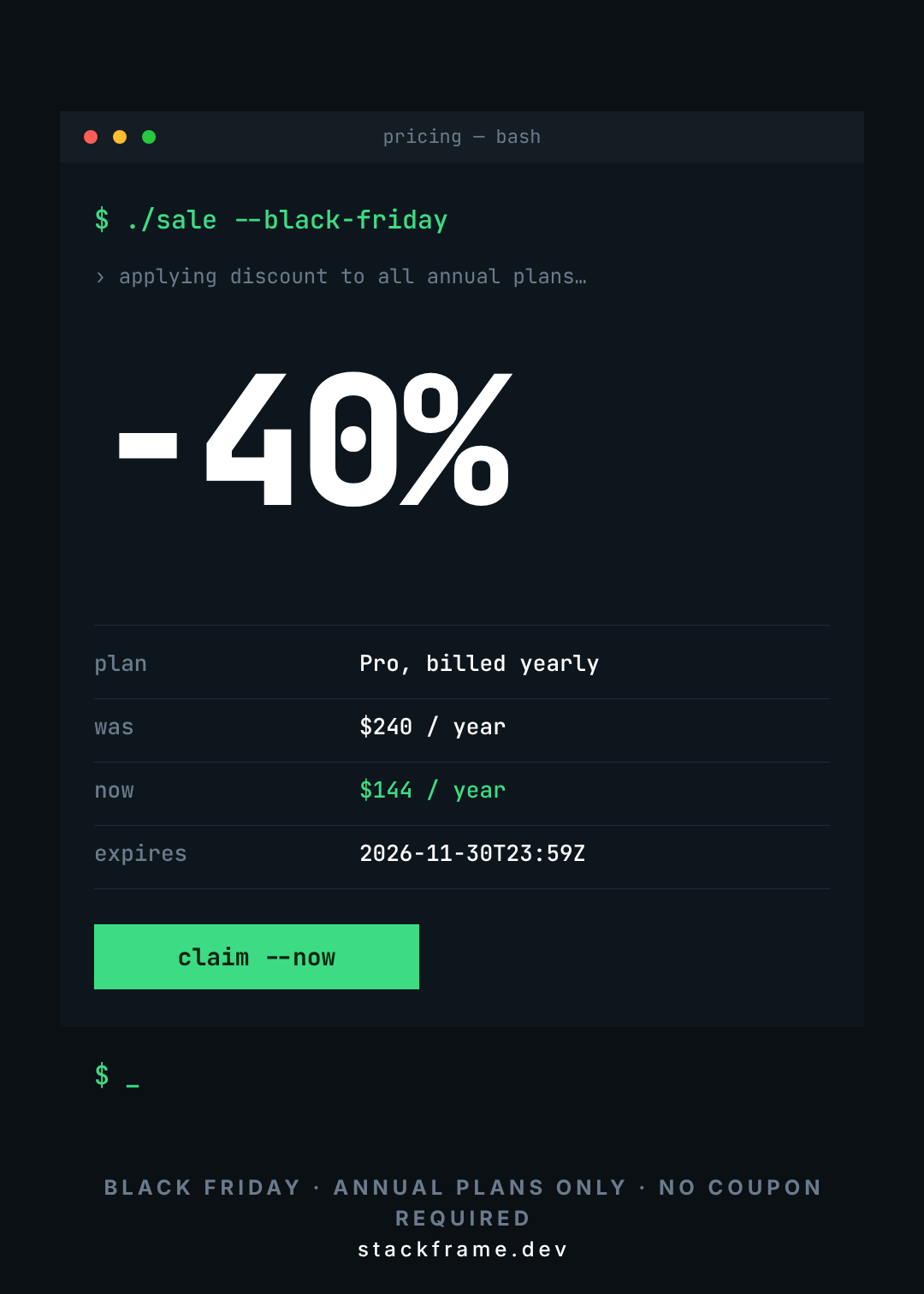
A dark window with three traffic-light dots, a command prompt, a mono -40%, and then the part that actually sells it: a four-row table showing plan, was, now, and an expiry timestamp. The blinking cursor at the bottom is the only decoration in the whole design.
Who it's for: SaaS, dev tools, hardware and gadget brands. It's the one poster here that will get shared in a work Slack rather than a group chat.
The rule that makes it work: show the arithmetic. Software buyers don't want a percentage, they want "$240 → $144". Put the old price and the new price on adjacent rows and let the reader do nothing at all.
The prompt:
A Black Friday poster for a SaaS product, 5:7, styled as a dark terminal window. Traffic-light dots in a title bar, a command prompt line in green monospace, a big "-40%", a four-row table showing plan, was, now and expiry, and a green "claim --now" button.
Edit this one: open it in Studio
Building one in Ridvay Studio
Take the first design — the blackout type poster — and make it yours. Paste this into Studio:
A Black Friday sale poster, 5:7 portrait, matte black background with one acid-yellow accent. Huge "70% OFF" as the hero, a small letterspaced "BLACK FRIDAY" kicker above it, and a footer line reading "FRI 27 - MON 30 NOVEMBER, ONLINE & IN STORE". Type only, no photos.
What comes back isn't a flat image. It's an editable design: the "70%" is its own text layer, the acid-yellow "OFF" is another, the two hairline rules are shape layers, and the footer is a third text block. Nothing is baked in.
Then make four edits, in this order:
- Click the "70%" and drag the size up until it almost touches the rules above and below it. This is the rule from the top of the post, applied — the number should feel slightly too big before it's right.
- Recolour the accent. Click the "OFF" layer and set it to your brand colour. If you've saved a brand kit, one click applies your palette and fonts to the whole poster.
- Rewrite the footer with real dates and a real address. Keep it at footnote size, in grey — that's the hierarchy doing its work, exactly as in the Swiss and brutalist layouts.
- Resize it for the feed. One click turns the 5:7 poster into a 1080×1350 Instagram post and a 1080×1920 story, and the layers reflow instead of being squashed.
Open Studio with this poster prompt →
Printing it, posting it, or both
These are all 1080×1512 — a clean 5:7 — which prints at 5×7 inches, scales straight to A4 or A3, and crops sensibly to a 4:5 feed post.
Three things worth checking before you send anything to a printer. Set up your file at the size you'll actually print, not at screen size — an upscaled 1080px file goes soft on an A3 sheet, which is the whole story of why designs print blurry. Expect your reds and acid yellows to shift when they convert for print; the acid yellow in design #1 and the red in #4 are the two most likely to surprise you, and RGB vs CMYK explains what to do about it. And if the poster is going in a window rather than on a counter, walk outside and look at it from where a customer will actually stand — everything on this list survives that test except the terminal one, which is built for a screen.
If you'd rather work through building a sale graphic step by step instead of picking a finished look, How to Make a Sale Graphic With AI covers the process end to end.
Pick one and put your number in it
Ten styles, ten different kinds of shop. The blackout slab if you want to be unmissable, quiet luxury if a big red percentage would damage you, the doorbuster grid if you've got six departments to shout about, the terminal if you're selling software.
All ten are editable, all ten are free to open, and none of them will take you an evening.