Top 10 Book Cover Designs for 2026 (All Editable)

Amazon shows your cover at roughly 100 pixels wide in search results. That's about the size of your thumbnail on this screen. Everything you agonised over — the texture, the subtitle, the tiny bird in the corner — is gone at that size. What survives is one shape, one or two words, and one colour.
That's the whole job. A book cover isn't a painting; it's a signal that says this is the kind of book you like before anyone reads a single word of the title. Get the genre signal wrong and it doesn't matter how beautiful the artwork is — thriller readers scroll past it, and the literary crowd never sees it either.
So here are ten book cover designs, one per genre archetype, each built around the single rule that makes it work. I made all ten in Ridvay Studio and you can open any of them and start editing. They're at 1600×2560 — the 1:1.6 ratio Kindle Direct Publishing recommends, which also crops cleanly to most print trim sizes.
1. The Block-Type Thriller
For: crime, thriller, domestic suspense.
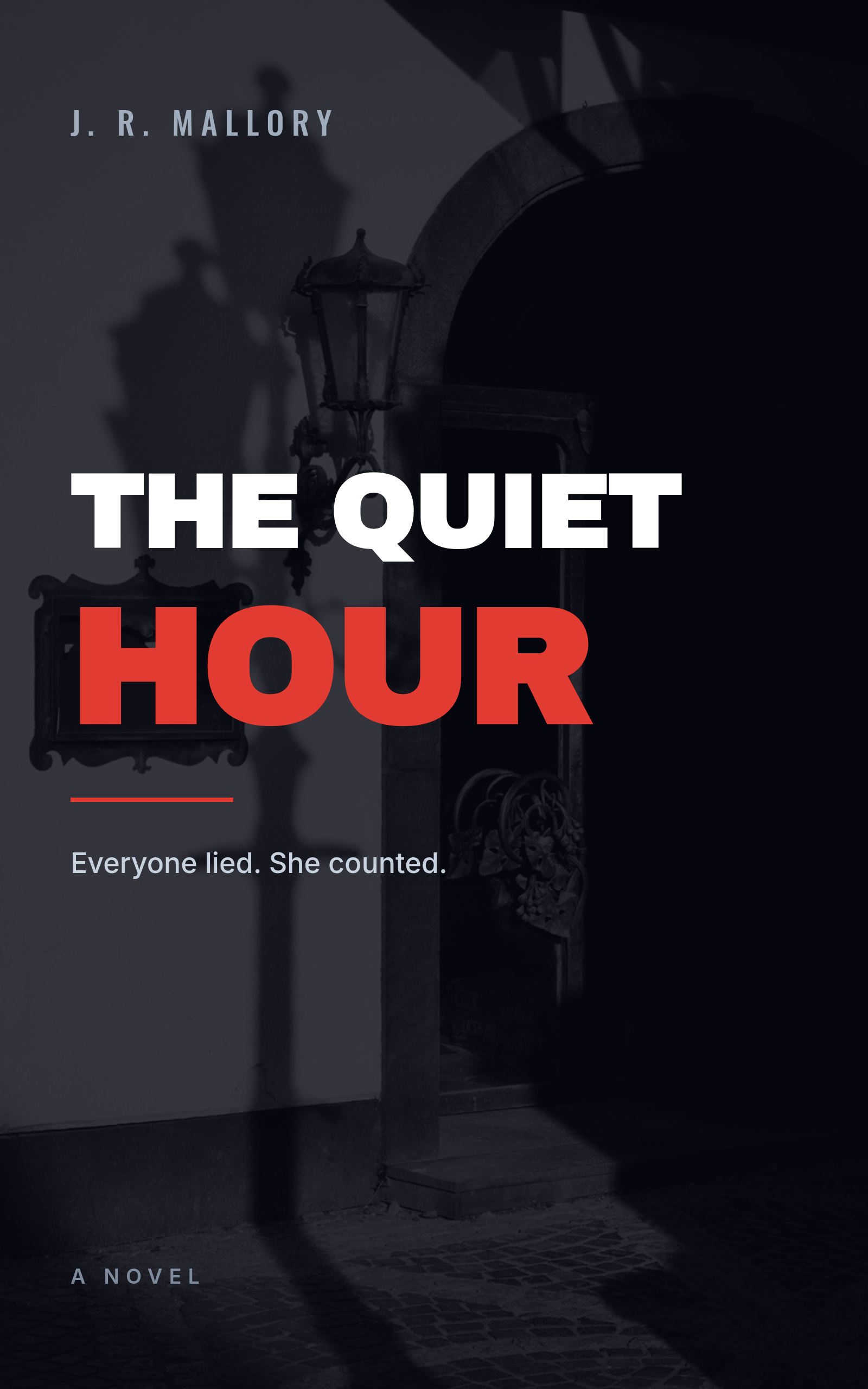
Heavy condensed capitals, stacked, with exactly one word in a hot accent colour. The photograph underneath is doing almost nothing except supplying darkness and a shape to sit the type against.
The rule: pick the one word in your title that carries the threat and colour only that word. In The Quiet Hour it's HOUR — the ordinary word made ominous. If you colour two words, you've coloured none.
A thriller book cover, dark empty doorway at night, heavy condensed white capitals reading "The Quiet Hour", the word HOUR in red, author J. R. Mallory at the top, tagline "Everyone lied. She counted."
2. The Illustrated Rom-Com
For: contemporary romance, cosy fiction, book-club comedy.
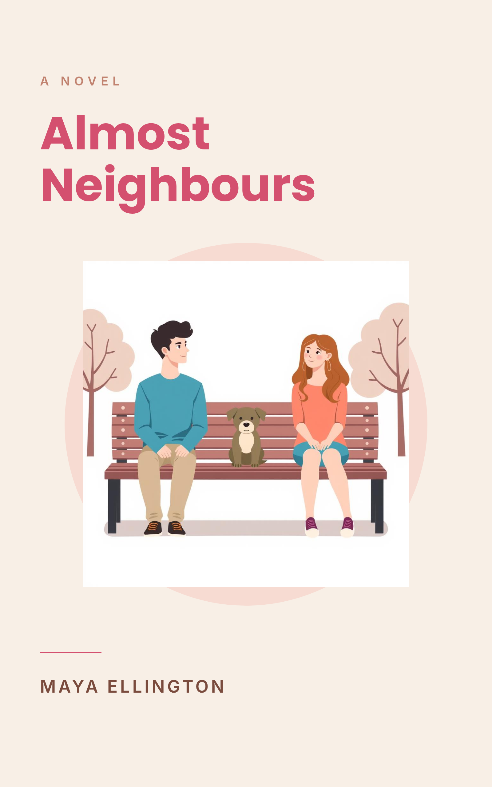
Flat vector people on a warm cream field, with a rounded geometric sans in a confident pink. This look took over romance around 2019 and hasn't let go, because it promises charming, not steamy at a glance.
The rule: illustrate a situation, not a photograph. Two figures at opposite ends of a bench tells you the whole premise before you read the title. Keep the drawing style flat and simple — stylised figures let every reader cast themselves, where a photographic couple just tells them what the protagonists look like.
An illustrated rom-com book cover on cream, flat vector illustration of two people and a dog sitting at opposite ends of a park bench, rounded sans title "Almost Neighbours" in pink, author Maya Ellington
3. The Literary Photo Crop

For: literary fiction, quiet novels, book-club picks.
One macro photograph occupying the top two-thirds, then a calm band of paper colour where the title sits in a serif. No overlap between the photo and the type at all.
The rule: give the title its own ground. Literary covers almost never put text over the image, because the genre signal is restraint. The moment you drop a headline onto the photograph you've made a thriller. (If you do need text on a photo, there's a right way to do it.)
A literary fiction book cover, macro photograph of a single apple on a branch at the top two thirds, lower third a solid warm grey band, serif title "The Weight of Small Fruit", author Elena Voss
4. The Fantasy Emblem

For: epic fantasy, cosy fantasy, anything with "Book One" on it.
A single symbolic object, gold on deep navy, with roman capitals and wide letter-spacing. It's cheap to produce and it scales into a series beautifully — book two gets a different object in the same disc.
The rule: one object, and it must be a noun from the title. A key for The Gilded Key. Emblem covers fail when the object is generic fantasy furniture (a sword, a moon, a raven) that has nothing to do with the story.
A fantasy book cover on deep navy with a gold gradient, a single gold key icon inside a dark circular disc, roman capital title "The Gilded Key" with wide letter spacing, "Book One of the Ashford Cycle", author R. T. Halloran
5. The Nonfiction Colour Block

For: business, self-help, big-idea nonfiction.
One saturated flat colour, a title big enough to read across a bookshop, and a subtitle that states the actual argument. No image at all.
The rule: the title is a claim and the subtitle is the evidence. Deep Work Is Dead is a fight you can pick up; the subtitle underneath explains what you're being promised. Nonfiction covers sell the argument, not the atmosphere — and a flat colour block is the loudest possible way to do it at thumbnail size.
A nonfiction book cover, solid saturated orange-red background, huge bold white capitals "Deep Work Is Dead", small kicker "A new case against focus", subtitle about attention becoming a team sport, author Dr. Nina Achebe
6. The Memoir Portrait

For: memoir, essay collections, biography.
A real face in the top half, a solid block beneath it, serif title. The photograph is the promise: a specific person actually lived this.
The rule: never put type over the eyes, and crop so the eyes sit in the upper third. Readers lock onto a gaze before they read anything. Cover it, or bury it at the bottom of the frame, and the cover goes flat.
A memoir book cover, photographic portrait of an older woman looking away, cropped to the top half, solid dark block across the lower half, kicker "A Memoir", serif title "The Second Kitchen", author Amara Okonkwo
7. The Sci-Fi Horizon
For: space opera, hard SF, series fiction.
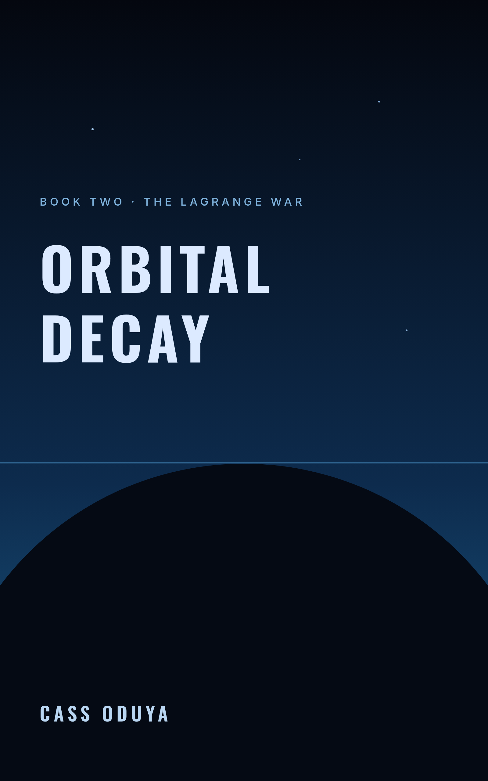
A planet's curve rising into the bottom of the frame, a gradient sky above it, and a condensed sans title with heavy tracking. Almost no detail — the scale does the work.
The rule: one horizon line, and put it low. The empty sky above is what reads as space. Fill that void with ships and nebulae and you get a 1980s paperback; leave it empty and you get something that looks published this decade.
A science fiction book cover, deep blue vertical gradient sky, the dark curve of a planet rising into the bottom third, faint stars, condensed sans title "Orbital Decay" in pale blue, "Book Two - The Lagrange War", author Cass Oduya
8. The Cosy Mystery
For: cosy crime, culinary mysteries, small-town series.
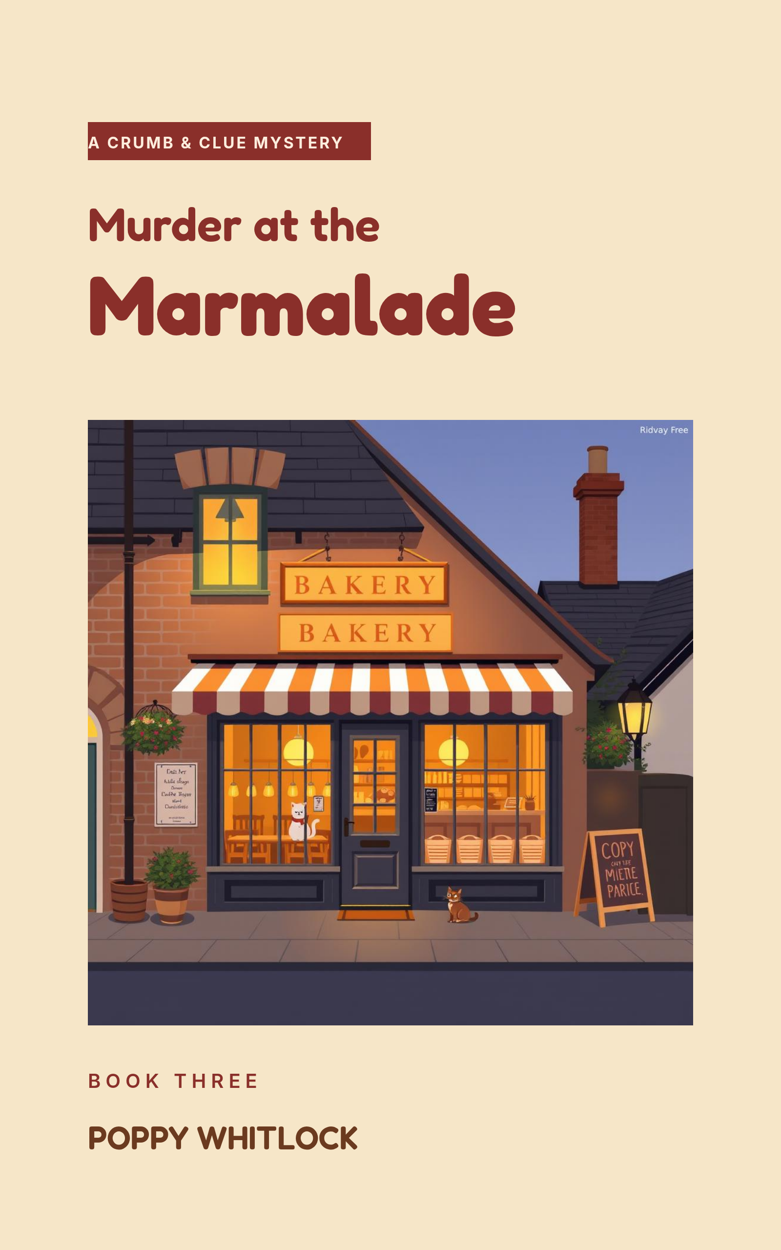
A charming illustrated location, warm pastels, a rounded title, and a little series badge at the top. The genre's entire contract is that nothing genuinely upsetting will happen.
The rule: the only dark thing on the cover is the word "Murder" in the title. No blood, no chalk outlines, no knives. The illustration should look like somewhere you'd want to have lunch — the joke is the contrast.
A cozy mystery book cover, warm cream background, flat illustration of a cheerful bakery storefront with awning and warm lit windows, badge reading "A Crumb & Clue Mystery", title "Murder at the Marmalade", Book Three, author Poppy Whitlock
9. The Minimal Poetry Cover

For: poetry, chapbooks, short literary fiction.
Lowercase serif, an enormous amount of empty paper, and exactly one accent mark. This is the hardest one to get right because there's nothing to hide behind.
The rule: empty space only reads as confidence if everything else is locked to a line. The hairline, the title, the accent rule and the author name all share one left edge here. Float one element loose in the middle and the whole thing stops looking minimal and starts looking unfinished — which is exactly what happened on my first attempt at this cover.
A minimalist poetry book cover, warm off-white background, thin vertical hairline, lowercase serif title "small hours", the word "poems" in small spaced capitals, a short terracotta accent rule, author Idris Faye
10. The Historical Duotone

For: historical fiction, sagas, literary history.
A photograph flattened to a single sepia tone under a heavy scrim, roman capitals, and thin rules above and below the title block. The duotone is what says past — colour photography reads as present tense.
The rule: crush the photo until it's texture, not subject. You want the reader to register "sea, old, cold" in a quarter-second, not to study the waves. If you can identify individual objects in the image at thumbnail size, your scrim is too light.
A historical fiction book cover, sepia toned photograph of a heavy grey ocean swell under an overcast sky, dark warm scrim over it, thin gold rules above and below, roman capital title "The Salt Roads", "A Novel of the Atlantic", author Hester Lowrie
Building one in Ridvay Studio
Every cover above started as one sentence. Here's the one for the thriller — paste it into Studio and you'll get the same kind of design back:
A thriller book cover at 1600x2560, dark empty doorway photograph at night, heavy condensed white capitals reading "The Quiet Hour" with the word HOUR in red, author name J. R. Mallory small at the top, tagline "Everyone lied. She counted." below the title
What comes back isn't a flat picture. It's an editable design — the title, the author name, the tagline, the red rule and the photograph are all separate layers you can click. That matters here more than in most design work, because a cover is never right the first time and you'll be nudging the title for an hour.
Four edits worth making immediately:
- Click the title and push the size up until it nearly touches both margins. Almost every first draft is too timid. At 100px the title needs to be enormous.
- Recolour one word. Select just the word carrying the threat, set it to your accent. This is rule number one from the thriller section, and it's a ten-second edit.
- Swap the photograph. Type what you actually want into the background prompt, or drop in your own image. Keep the dark, empty half — that's the part holding the type up.
- Drag the author name to the bottom and shrink it. Unless you're a household name, your name is the smallest thing on the cover.
Then shrink the whole thing on screen until it's the size of a postage stamp. If you can still read the title and tell the genre, it's done. If you can't, go back to edit 1.
Start your cover in Ridvay Studio →
Exporting for Kindle, print, and everywhere else
The covers here are 1600×2560 because that's KDP's recommended ebook size, and it's the safest single canvas to work from — it's big enough that nothing gets soft when you scale down.
A few things worth knowing before you upload:
- Ebook: 1600×2560 JPEG or PNG. Export at scale 1 and you're done.
- Paperback: print needs a full wrap — back cover, spine, front — at your book's exact trim size plus bleed, and the spine width depends on your page count. Design the front here, then place it into the wrap template your printer gives you.
- Print resolution: if you're printing anything, export at 2× so you land at 300 DPI rather than screen resolution. That single setting is the difference between crisp and blurry.
- Social: the same design resized square for an Instagram post, or dropped onto a story background for a launch countdown.
One more thing: keep the cover editable rather than exporting and forgetting it. Series get renamed, subtitles get rewritten after the first round of feedback, and a cover you can reopen and change in a minute is worth more than a perfect flattened JPEG you'd have to rebuild from scratch. If you want the step-by-step version of this process rather than the style tour, the how to make a book cover with AI walkthrough covers sizing and legibility in more detail.
Pick whichever of the ten is closest to your book, open it, and change the words to yours. That's a real cover in about ten minutes.