Top 10 Event Poster Designs for 2026 (All Editable)

There's a lamp post near my flat with eleven posters stapled to it. Ten of them are a photo with the band's name across the middle. The eleventh is two flat colours and a circle, and it's the only one I've ever actually stopped to read.
That's the whole problem with event poster design. The information is easy — who, what, when, where, how much. The hard part is that your poster is never seen alone. It's seen next to ten other posters, or in a feed between two other posts, and the thing that makes someone stop isn't the headline. It's the style — the colour, the shape language, the typeface — read from six feet away, before a single word has been processed.
So this is a style catalogue, not a tutorial. Ten event posters, each in a different visual idiom, each generated in Ridvay Studio and each one still fully editable — real text, shape and image layers you can open and change. Under every one is the prompt that made it and a link that opens that exact poster in the editor with your own copy ready to go in.
How to pick an event poster style
Pick the style that matches what the event feels like, not what you personally like looking at. A punk xerox poster for a charity gala is a joke; an art deco arch for a basement hardcore show is an insult. The style is a promise about the room.
Two rules worth holding onto as you scroll:
- One idea per poster. Every design below has exactly one thing doing the work — a grid, a photo, a glow, a border. The ones that fail are the ones that try two.
- The admin block goes together. Date, venue, price and URL belong in one tight group, usually at the bottom. Scatter them and people read none of them.
10 event poster designs for 2026
1. Swiss Grid
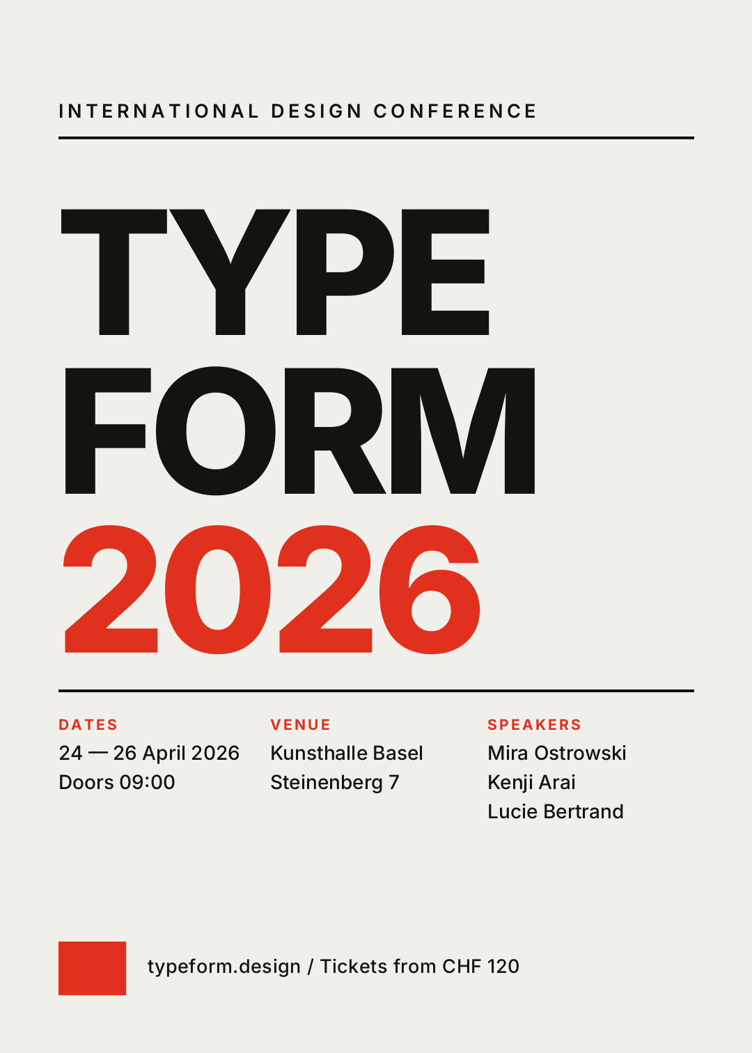
Everything hangs off one left margin. The headline is enormous, the type is one family at two weights, and the only colour in the whole poster is a single red word. No decoration at all — the grid is the decoration.
Best for: Conferences, lectures, exhibitions, film seasons, anything where the speaker list is the draw.
Design a 5:7 event poster in the Swiss International Typographic style on warm off-white. Giant left-aligned sans headline stacked on three lines reading TYPE / FORM / 2026 with the year in signal red, a hairline rule under a small letter-spaced kicker, and a three-column block at the bottom for dates, venue and speakers.
Open this poster in the editor
2. Risograph Duotone
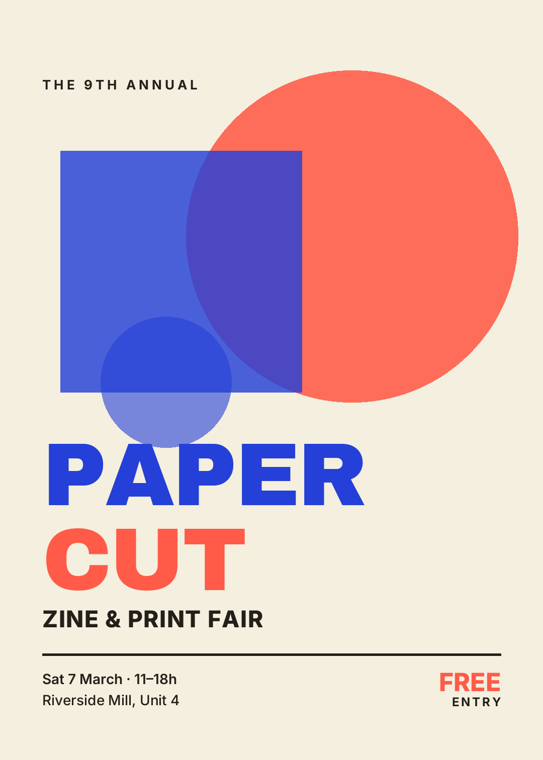
Two flat inks on cream stock, and where the shapes cross they overprint instead of hiding each other. The shapes carry the top half; the type sits underneath in a solid block.
Best for: Zine fairs, craft markets, independent gigs, student shows — anything with an indie-print audience.
Design a 5:7 risograph-style event poster on cream paper using exactly two inks, electric blue and coral. Big overlapping circle and square at 85% opacity so they overprint where they cross, a heavy black sans headline stacked underneath reading PAPER / CUT, and a rule above small date and venue lines.
Open this poster in the editor
3. Psychedelic Rings
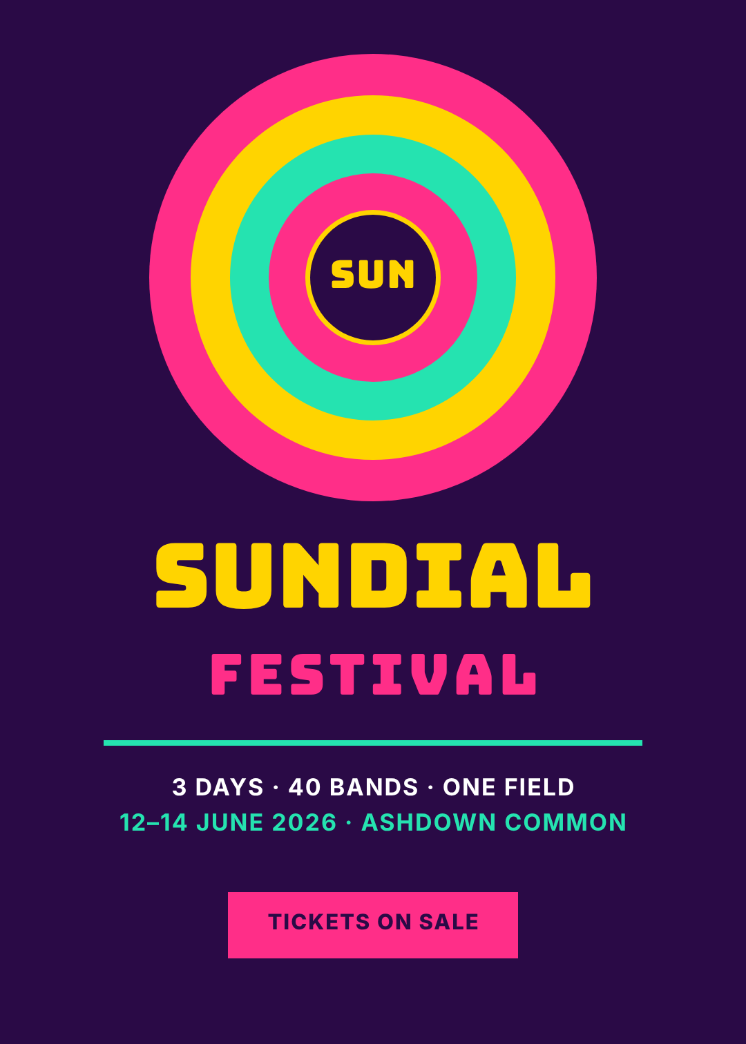
Concentric rings in three clashing brights, a fat rounded display face, and a purple so dark the colours vibrate against it. It's loud on purpose — this style is meant to be legible from the other side of a field.
Best for: Music festivals, block parties, summer fairs, club-night series with a retro streak.
Design a 5:7 psychedelic music festival poster on deep purple. Five concentric rings in hot pink, yellow and mint stacked at the top with a small dark disc in the middle, a fat rounded display headline below reading SUNDIAL with FESTIVAL letter-spaced underneath in pink, then a mint rule, the lineup facts and a pink ticket button.
Open this poster in the editor
4. Photo Hero + Blackout Band
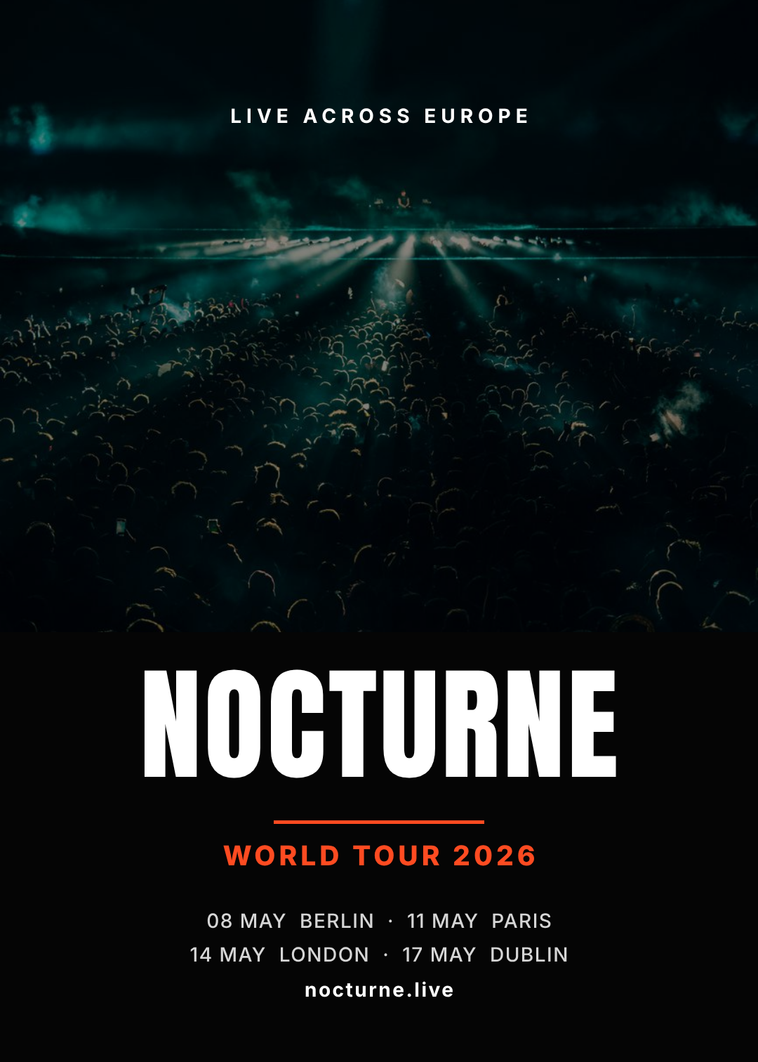
A full-bleed photo does the emotional work, then a solid black band cuts across the lower third and every word lives inside it. The band is the trick: text over an image is a gamble, text over a rectangle is a certainty.
Best for: Tours, club shows, comedy nights, sports fixtures — any event where the photo sells the ticket.
Design a 5:7 concert tour poster with a full-bleed moody photo of a packed crowd under stage lights, a dark scrim over it, and a solid black band filling the lower third. Put a tall condensed headline reading NOCTURNE inside the band, an orange rule, WORLD TOUR 2026 in orange, then four city dates and a URL.
Open this poster in the editor
5. Punk Xerox
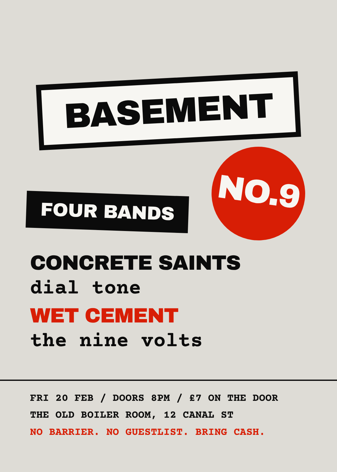
Rotated slabs, photocopier grey, and two typefaces that have no business together — a heavy grotesque and a typewriter mono. Nothing lines up, and that misalignment is the whole message: this show was not art-directed.
Best for: DIY gigs, basement shows, punk and hardcore nights, protest meetings, anything that would look wrong if it looked expensive.
Design a 5:7 punk xerox gig poster on photocopier grey. Rotated black slabs with white paper panels over them, a heavy grotesque headline reading BASEMENT tilted three degrees, a red disc with NO.9 knocked out of it, a four-band lineup alternating between the grotesque and a typewriter mono, and door details in mono at the bottom.
Open this poster in the editor
6. Art Deco Arch
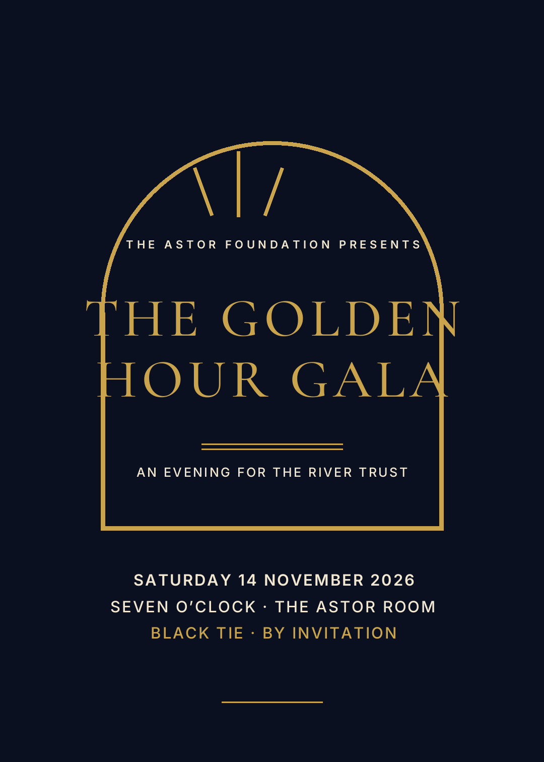
A thin gold arch, a small sunburst, a light serif letter-spaced until it's almost too wide to read. Every line is centred and every rule is a hairline. The restraint is the luxury signal — one heavy element would break it.
Best for: Galas, fundraisers, awards nights, New Year parties, hotel and jazz-bar events.
Design a 5:7 art deco charity gala poster on near-black navy with gold as the only accent. A thin gold arch outline with straight legs framing the centre, a small three-ray sunburst above it, a light serif headline in wide letter-spacing reading THE GOLDEN / HOUR GALA, double hairline rules, and centred date, venue and dress-code lines.
Open this poster in the editor
7. Neon Glow
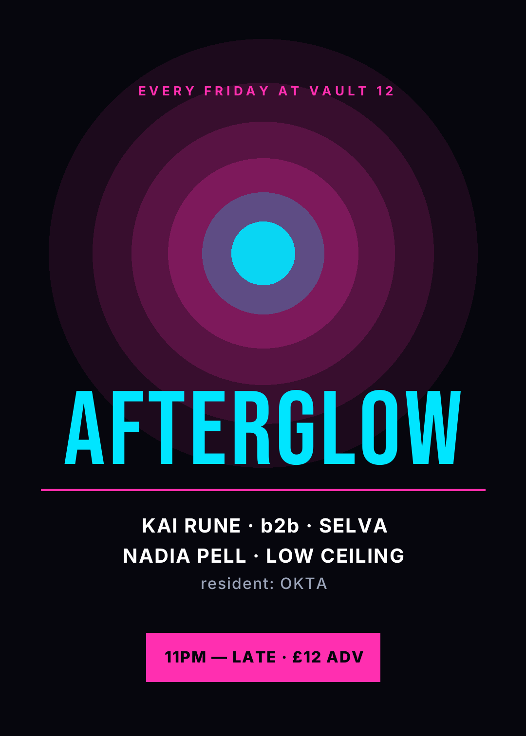
A near-black ground, one soft magenta glow behind the centre, and a huge condensed headline in cyan. Two neon colours is the limit — a third and it stops reading as neon and starts reading as a paint chart.
Best for: Club nights, DJ residencies, late shows, launch parties, esports and gaming events.
Design a 5:7 neon club night poster on near-black. Four concentric magenta discs at low opacity behind the centre to fake a glow, with a small cyan core. A huge condensed uppercase headline reading AFTERGLOW in cyan, a magenta rule, a DJ lineup in white, and a solid magenta bar at the bottom with the door time and ticket price.
Open this poster in the editor
8. Botanical Craft
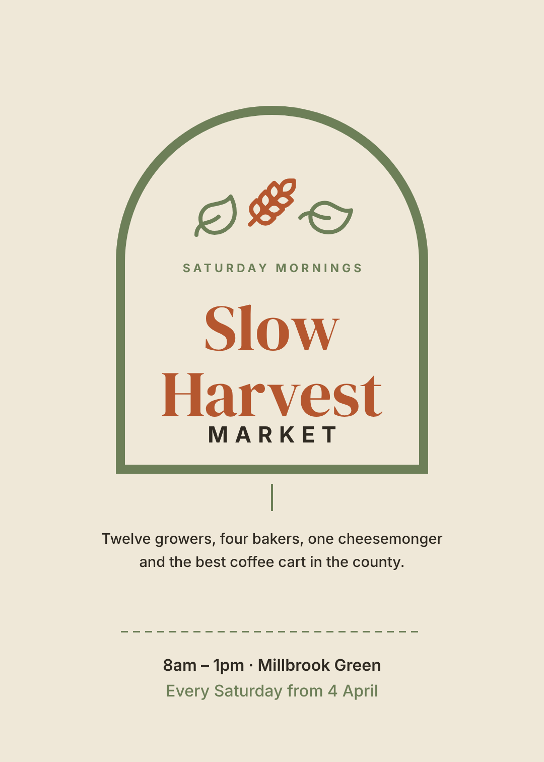
A sage arch outline, a couple of small botanical icons, and a warm serif in terracotta on oatmeal. Soft, hand-made, deliberately unslick — the palette is doing the talking before you read a word.
Best for: Farmers' markets, craft fairs, wellness retreats, garden openings, supper clubs.
Design a 5:7 farmers market poster on oatmeal cream. A thin sage arch outline framing the centre with small wheat and leaf icons resting on top of it, a warm serif headline in terracotta reading Slow / Harvest, MARKET letter-spaced below in dark ink, two lines of friendly body copy, a dashed sage rule and the opening hours.
Open this poster in the editor
9. Editorial Split

A hard vertical split — type on one side, photo on the other, no overlap — and a navy band along the bottom holding the admin. It reads like a magazine spread, which is exactly why conference audiences trust it.
Best for: Summits, panels, workshops, literary festivals, anything B2B or academic.
Design a 5:7 conference poster split vertically: left half white with a high-contrast serif headline reading The / Long / Form / Summit with one word in rust, right half a full-height photo of an audience in a dark auditorium. Put a navy band across the bottom third holding a speakers column and a when-and-where column in white.
Open this poster in the editor
10. Retro Letterpress
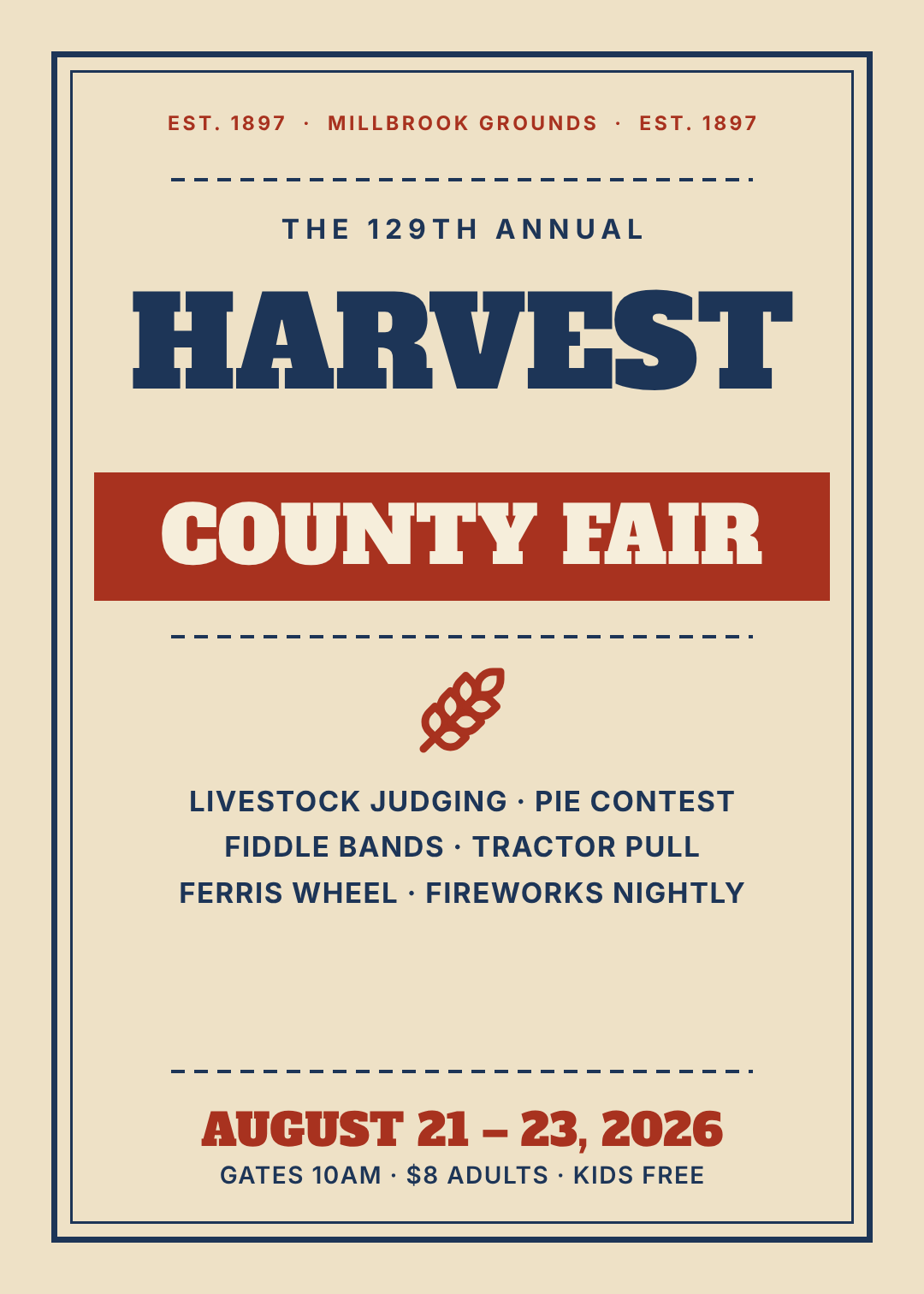
A double border, a slab serif, a solid banner, and dashed rules between every block. Eight or nine horizontal bands stacked down the page — it's the oldest poster layout there is and it still reads from thirty feet.
Best for: County fairs, food festivals, rodeos, church suppers, barn dances, anything with heritage in it.
Design a 5:7 retro letterpress county fair poster on aged cream. Double navy border, a small letter-spaced EST. line at the top, a heavy slab serif headline in navy reading HARVEST, a brick red banner below it with COUNTY FAIR in cream, a wheat icon, three centred lines of attractions, dashed rules between every block and the dates in slab at the bottom.
Open this poster in the editor
Building one in Ridvay Studio
Take the psychedelic festival poster — the loudest one on the list, and the one most likely to fall apart if you get it slightly wrong. Here's the sentence that produced it:
Design a 5:7 psychedelic music festival poster on deep purple. Five concentric rings in hot pink, yellow and mint stacked at the top with a small dark disc in the middle, a fat rounded display headline below reading SUNDIAL with FESTIVAL letter-spaced underneath in pink, then a mint rule, the lineup facts and a pink ticket button.
What comes back is not a flat picture. It's an editable design: the rings are shape layers, SUNDIAL is a text layer with its own font and letter-spacing, the ticket button is a rectangle with a label sitting on it. Nothing is baked in, so you fix things by editing them rather than by re-rolling the whole poster and hoping.
Four edits I'd make straight away, and why:
- Click SUNDIAL and type your own event name. If it's longer than eight characters, drag the font size down until it clears the canvas edges — this is the single most common way a generated poster breaks.
- Recolour the rings to two colours instead of three. Click each ring, change the fill. Three brights is festival; two brights is a club night. Same layout, different event.
- Move the whole admin block up or down as one. Select the lineup text, the rule and the ticket button together and nudge them — that's the "admin block goes together" rule from the top of the post, enforced by the layer panel.
- Apply your brand kit. If you've saved a palette and fonts, one click swaps the whole poster onto them — which is how a festival keeps ten posters looking like one series.
Then use the one-click resize to push the same poster out as an Instagram post and a story without redrawing anything, or export it at print resolution for the lamp post. If you want the process rather than the styles, how to make a poster with AI walks the whole thing end to end.
Generate this festival poster in Studio →
Printing and exporting your poster
All ten above are 1080 × 1512 — a 5:7 ratio that crops cleanly to A3, A2 and to an Instagram post. A few things to get right before you send anything to a printer:
- Export at the size you're printing. A 1080px-wide file is fine on a screen and mushy at A2. Set the canvas to the finished print size before you export, not after — here's why designs print blurry.
- Keep text off the edges. Anything within about 5mm of the trim can get cut. Every poster above keeps its type inside an 80px margin for exactly this reason.
- Check the photo-based ones hardest. Text over an image is where posters fail in print — the blackout band in design #4 is the reliable fix, and readable text over a photo covers the rest.
- Export a social cut too. Resize to 1080 × 1350 and 1080 × 1920 while the design is open; the same poster does the wall and the feed.
Start with the style, then write the words
If you take one thing from the ten above: decide what the poster should feel like before you write a word of copy. Pick the idiom — grid, riso, psychedelic, photo, punk, deco, neon, botanical, editorial, letterpress — and the typography, colour and layout decisions mostly make themselves. That's why a style catalogue is more useful than a checklist.
Every poster here is free to open, free to edit, and yours to change entirely. Start from the one closest to your event and make it wrong in the right direction.