Top 10 New Year's Eve Poster Designs for 2027 (Editable)

Every New Year's Eve poster gets judged twice. Once at full size, taped inside the venue window — and once at about 400 pixels wide, in a feed, by somebody on a bus who has roughly a second and a half to decide whether your night sounds better than the four other nights already in their group chat.
The second judgement is the one that sells tickets. And it's the one most NYE posters lose, because they're designed at 100% on a laptop where the words "DOORS 10PM · £22 ADVANCE" are perfectly legible, and then posted at a size where they aren't.
So: ten New Year's Eve party poster designs for 2027, all made in Ridvay Studio, all editable. Each one has the prompt that produced it and a link that opens it in the editor so you can put your own venue on it. But first, the thing that separates an NYE poster from every other poster I've covered here.
The door block is half the poster
A gig poster can get away with being a beautiful object that makes you look it up later. A New Year's Eve poster can't. NYE is a decision with a deadline, and people are comparing three or four options at once. If they have to open Instagram's comments to find the price, you've lost them to the venue whose poster said it.
So every one of the ten designs below carries the same structure at the bottom: four short label-and-value pairs. Date. Doors. Price. One qualifier — age, dress code, or whether entry's free.
Three rules make that block work:
- Values stay under about ten characters. "31 DEC" not "Thursday 31st December". "£22" not "£22 advance / £30 on the door" — split that into two columns instead. Long values force the type smaller, and smaller is exactly what you can't afford here.
- Labels are tiny, values are big. A 19px label over a 36px value is the ratio I used throughout. The label is there to be recognised, not read; the value is the thing someone screenshots.
- The block sits on its own contrast. Half these posters put the door details on a solid colour band — gold, magenta, cream — precisely so the information isn't competing with the art above it.
Then the test: shrink the poster to 25% and look at it. You should still be able to read the night, the year, and the price. If the price disappears first, the price was too small, no matter how good the rest looks. That's the same thumbnail discipline behind event posters generally — NYE just punishes getting it wrong more, because the sale window is three weeks long and then gone.
One more, specific to this artifact: the date is 31 December 2026 and the year on the poster is 2027. Obvious written down, embarrassing on 400 printed copies. Two of the designs below put both on the page for exactly that reason.
Right. The ten.
1. Art Deco Gold
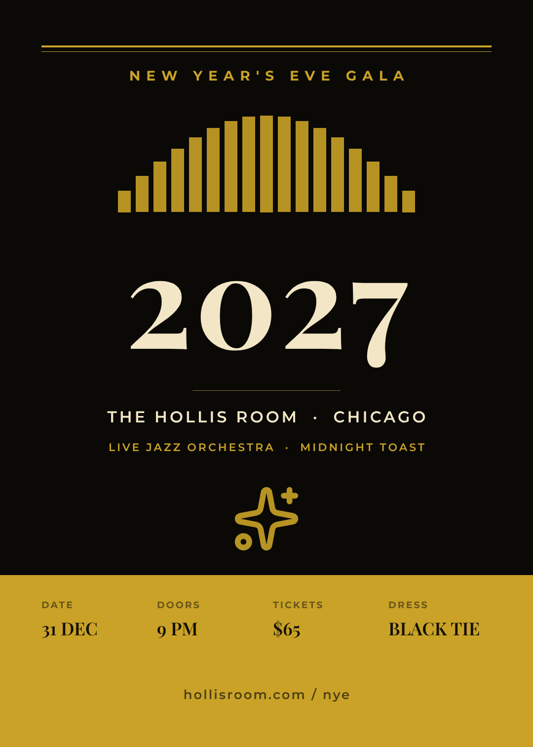
Gold on near-black, a stepped sunburst fan, and the year set in a high-contrast serif. Deco is the default NYE look for a reason — it reads as "champagne" before you've read a single word — and the fan does that job without a single photograph.
Who it's for: hotel ballrooms, upscale bars, black-tie dinners, anywhere the ticket is over $50.
A New Year's Eve gala poster for 2027, art deco style, gold on near-black, a stepped starburst fan above a large serif 2027, venue name beneath, and a gold band across the bottom with date, doors, ticket price and dress code
2. Neon Club
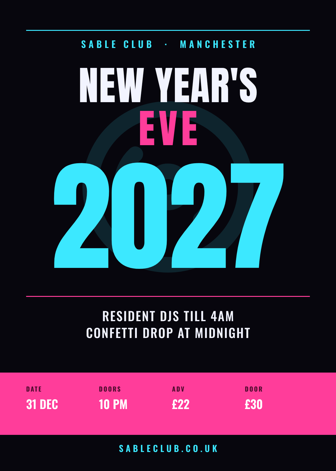
Electric cyan and magenta on near-black, condensed type stacked tight, and a faint record motif behind it all. The year is the hero at nearly 400px — which is the right call when your poster is going to appear next to nine others in a story.
The magenta bar at the bottom isn't decoration. It's the door block, given its own colour so nobody has to hunt for the advance price.
Who it's for: nightclubs, DJ nights, anything with a lineup and a 4am finish.
A neon nightclub New Year's Eve poster for 2027, cyan and magenta on near-black, huge condensed 2027, club name at the top, DJ lineup beneath, and a magenta bar across the bottom with date, doors, advance and door prices
3. Disco Mirrorball
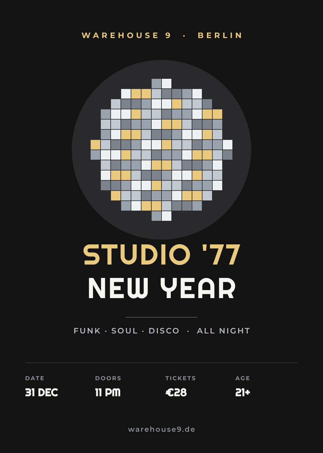
A mirrorball built from about 140 square facets in five tones of silver and champagne, over rounded seventies lettering. It's the one style on this list that tells you what the music is before it tells you anything else.
Worth knowing: the ball is made of flat squares, not a photo. That means you can recolour the whole thing — gold facets for a Studio 54 night, cold blue for something colder — without sourcing a new image.
Who it's for: disco and funk nights, retro parties, venues whose crowd is thirty-plus.
A disco New Year's Eve poster for 2027, faceted silver mirrorball on charcoal, rounded seventies display type in champagne, music genres in a row, and a door-information row with date, doors, ticket price and age limit
4. Countdown Typographic
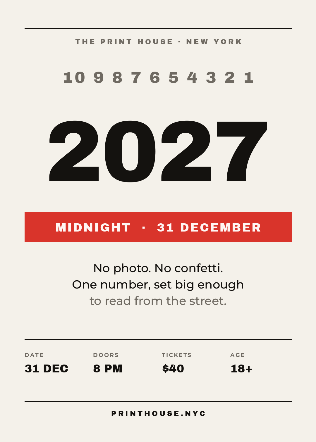
No photo, no confetti, no mirrorball. A countdown run across the top in small numerals, one enormous 2027, and a red bar that says MIDNIGHT · 31 DECEMBER. That's the whole poster.
This is the cheapest style to make well and the hardest to fake — at 296px the numerals are furniture, so a weak typeface has nowhere to hide. It's also the most reliable at thumbnail size, because there is nothing competing with the one thing you want read.
Who it's for: design-led bars, restaurants, anyone whose brand is already confident enough not to shout.
A typographic New Year's Eve poster for 2027, off-white paper, a countdown from ten to one in small caps across the top, a giant black 2027, a red bar reading MIDNIGHT 31 DECEMBER, and a door-information row at the bottom
5. Photo, Tinted Once
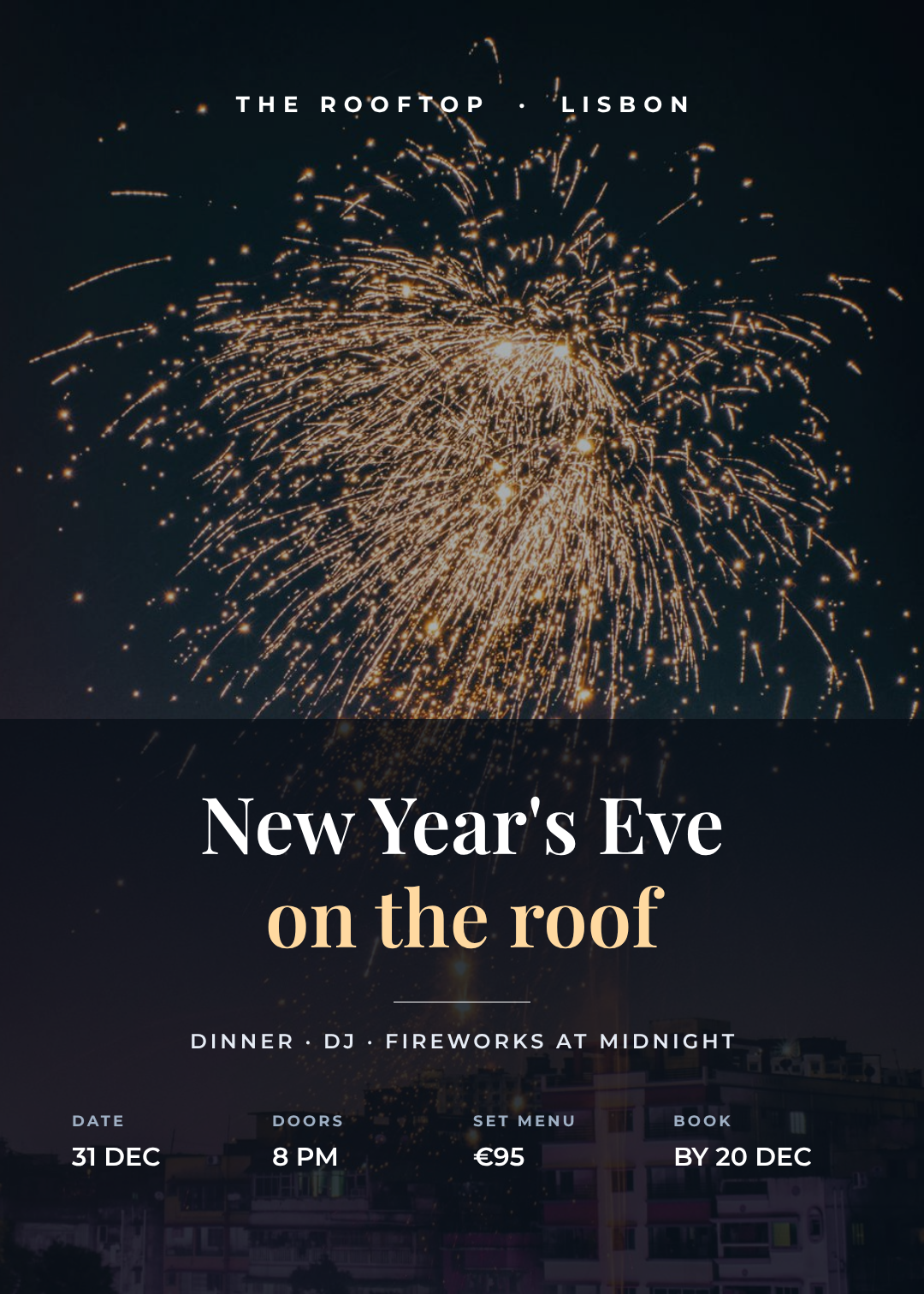
A full-bleed photograph, one flat tint over the whole image, and a dark scrim across the bottom third that the type sits on. The scrim is the part people skip, and it's the part that makes the design work: without it, white text over fireworks is legible in some places and invisible in others.
If you take one technique from this list, take that one — it's covered in more detail in putting readable text over a photo.
Who it's for: restaurants, rooftop bars, hotels — venues selling a view or a set menu rather than a lineup.
A New Year's Eve poster for 2027 using a night photograph of fireworks over a city, a dark tint over the whole image, a dark scrim across the bottom third, an elegant serif headline in white and gold, and a row with date, doors, set menu price and booking deadline
6. Black Tie Minimal
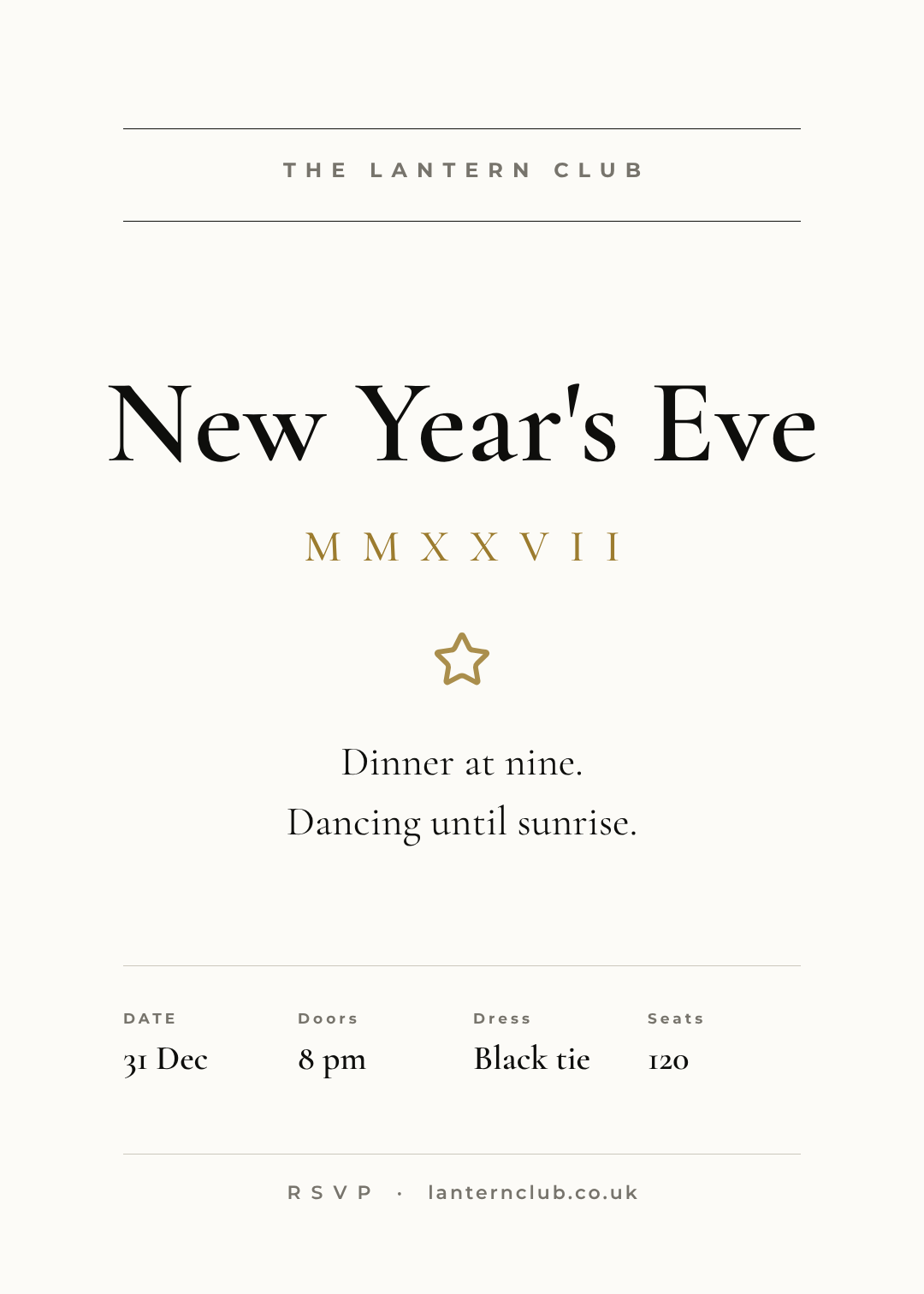
Warm white paper, hairline rules, a large old-style serif, and the year in Roman numerals. Roughly 60% of this page is empty, on purpose — restraint is the message, and it's the only NYE style on this list that whispers.
Note how the door block changes character here: the same four columns, but set in the body serif at sentence case rather than in caps. Same structure, different voice.
Who it's for: private members' clubs, charity galas, seated dinners with a guest list.
A minimal black-tie New Year's Eve poster for 2027, warm white paper, thin hairline rules, a large old-style serif headline, MMXXVII in gold beneath, generous whitespace, and a restrained row with date, doors, dress code and seat count
7. Risograph Overprint
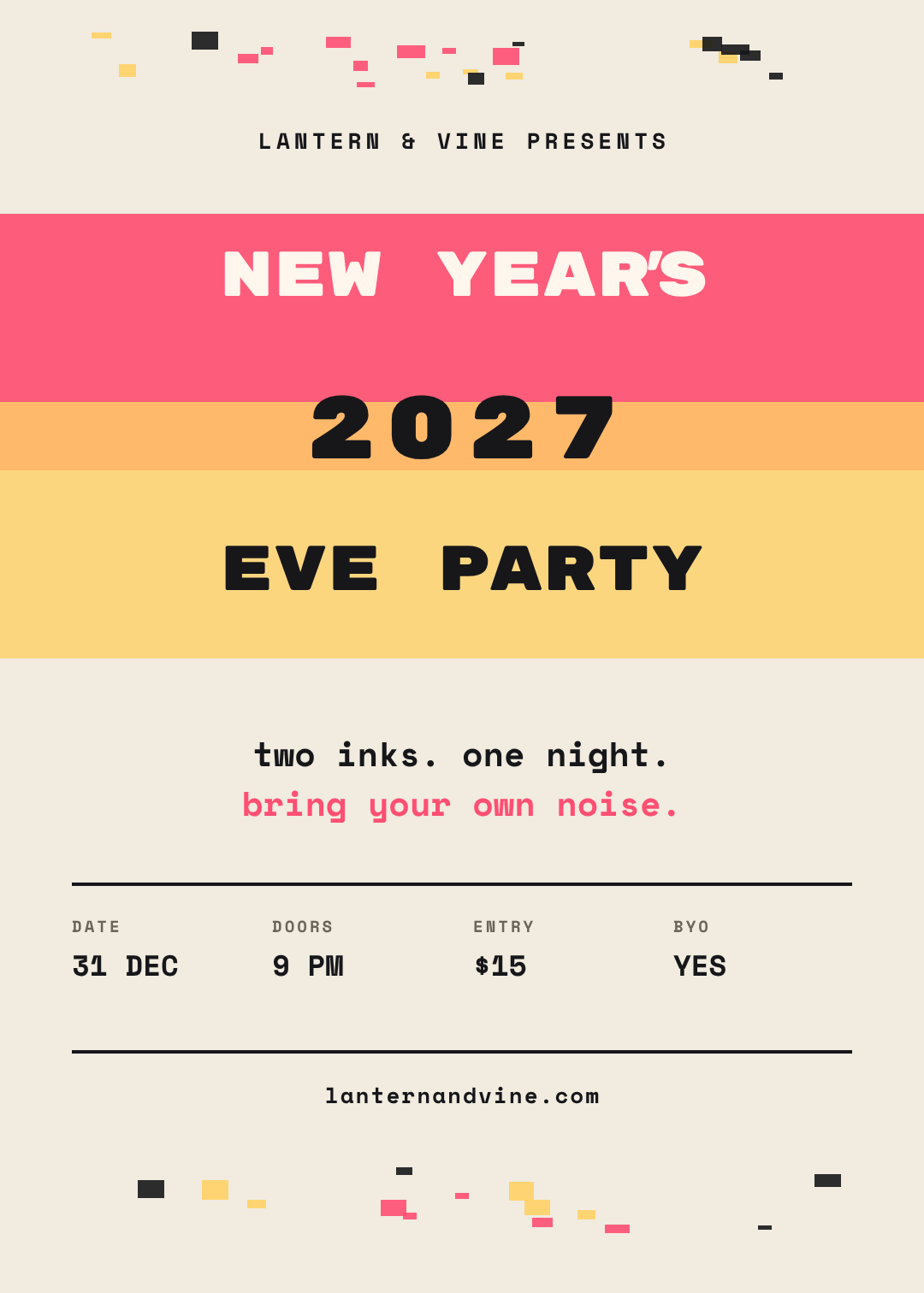
Two inks — pink and yellow — laid as horizontal bands that overlap into a third colour where they cross. That orange stripe through the middle isn't a third ink; it's the overprint, and putting 2027 directly on it is the whole joke.
The rule that keeps riso looking like riso: two inks, never three. Add a third and it stops reading as a print process and starts reading as a poster with a lot of colours on it.
Who it's for: independent venues, record shops, DIY parties, anywhere a slick poster would look like it was made by the landlord.
A risograph-style New Year's Eve poster for 2027, cream paper, two horizontal ink bands in pink and yellow overprinting to orange where they overlap, heavy monospace display type, confetti flecks at the top and bottom, and a mono door-information row
8. Ticket Stub
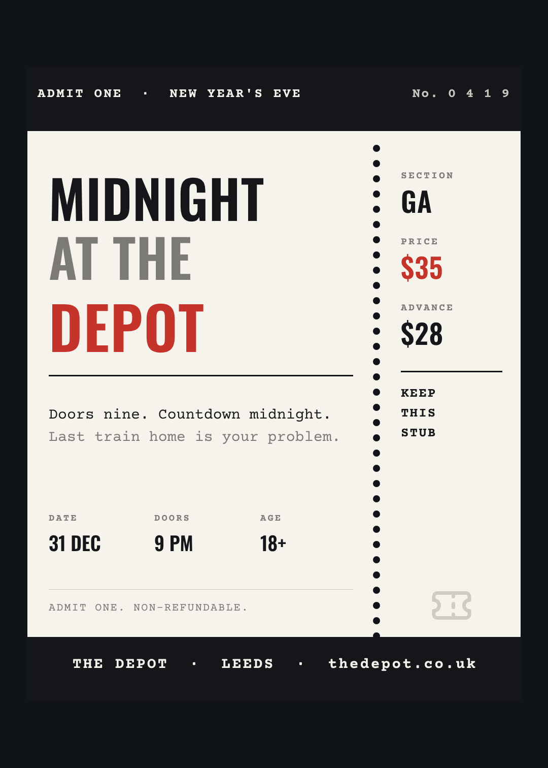
The poster is the ticket: a perforated edge, a serial number in the header, and a stub down the right with section, price and advance price stacked on it. It's the only design here that makes the advance price a visual feature rather than a footnote — which is the point, because the advance price is how you avoid a queue of people paying cash at 11:40pm.
Who it's for: ticketed events, venues pushing pre-sales, anything with a capacity you need to plan around.
A New Year's Eve poster for 2027 designed as a ticket, cream card with a dark header reading ADMIT ONE and a serial number, a perforated edge down the right, a stub with section, door price and advance price, and a monospace detail row
9. Noon Year's Eve
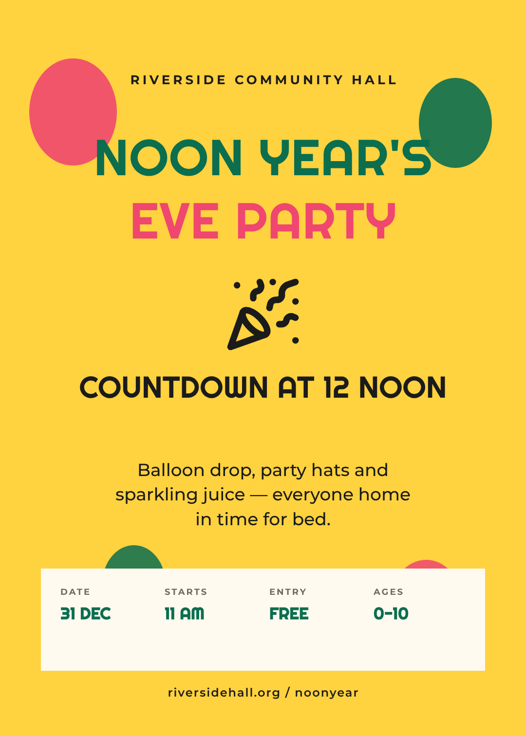
The countdown at midday, for the audience that is asleep by nine. Bright yellow, rounded friendly type, a balloon drop and sparkling juice. This category is quietly underserved — community centres and family restaurants run these events every year and almost all of them advertise with a Word document.
The door block does something different here: the qualifier column is AGES 0–10, because for this audience the single most useful piece of information is who it's for.
Who it's for: community halls, libraries, soft play, family restaurants, anywhere with a 6pm last seating.
A bright, friendly Noon Year's Eve poster for 2027 aimed at families, yellow background, rounded playful display type in green and pink, a party popper illustration, balloons, and a cream information panel with date, start time, entry price and age range
10. Brutalist Street Poster
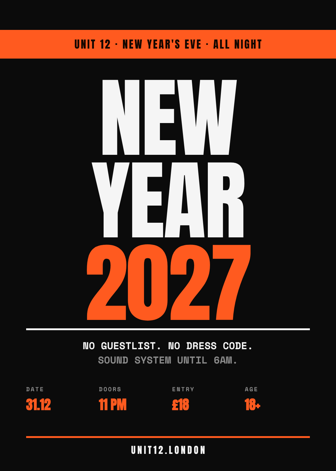
Three words, stacked edge to edge at 280px, in white and fluorescent orange on black. No imagery, no ornament, and deliberately no charm. It's built to survive being photocopied, pasted onto a wall next to forty other posters, and photographed badly.
Who it's for: warehouse parties, raves, underground promoters — anywhere "polished" would be a liability.
A brutalist street New Year's Eve poster for 2027, black background, the words NEW YEAR 2027 stacked in huge condensed type filling the page, white and fluorescent orange, a monospace line about no guestlist and no dress code, and a stark door-information row
Building one in Ridvay Studio
Every poster above started as one sentence. Here's the one that produced the deco poster, which you can paste straight in:
A New Year's Eve gala poster for 2027, art deco style, gold on near-black, a stepped starburst fan above a large serif 2027, venue name beneath, and a gold band across the bottom with date, doors, ticket price and dress code
What comes back isn't a flat image. It's an editable design — the fan is a set of shapes, the year is a text layer with its own font and size, the gold band is a rectangle you can recolour, and the four door-detail columns are eight separate text layers you can retype one at a time.
Which means the next four minutes look like this:
- Click the venue line and type yours. It's a text layer, not baked pixels — this is the edit that turns a template into your poster.
- Retype the four door values. Date, doors, price, qualifier. Keep each under ten characters, per the rule at the top — if your price needs "£22 adv / £30 door", make it two columns instead of one long string.
- Recolour the band to your brand. Select the rectangle, change the fill, and if you've set up a brand kit the palette's already there waiting.
- Drag the year bigger until it's the loudest thing on the page, then zoom out to 25% and check the price is still readable. If it isn't, the price goes up a size, not the year down.
Then resize it: the same design exports as an A3 print file and as a 1080×1350 feed post without re-laying it out, which matters when the poster has to exist in a window, in a story and in a WhatsApp forward on the same afternoon.
Start your New Year's Eve poster in Studio →
Printing it, posting it, or both
Most NYE posters live three lives, so build for all three from the start:
- Window and wall. Export at A3 or A2 at 300 DPI. Keep anything you need read at least 15mm from the trim edge — print shops trim with a tolerance, and the door block is the worst thing to lose. If your colours look duller on paper than on screen, that's the usual RGB to CMYK shift, not a bad print.
- The feed. Resize to 1080×1350 for a post and 1080×1920 for a story. Portrait posters like these translate almost unchanged; the only thing that usually needs adjusting is pulling the door block up above the story's caption area.
- The forward. This is the one nobody designs for, and it's how half your audience actually sees the poster — screenshotted and sent to a group chat at 11pm. That's the 25% test again: it either survives it or it doesn't.
Ten styles, ten prompts, and none of them need a designer or a subscription. Pick whichever one matches the night you're actually running, put your venue on it, and get it up while people are still deciding where they're going.