Top 10 Pitch Deck Slide Designs for 2026 (All Editable)

A founder sent me a seed deck last month and asked why it "felt junior." The story was fine. The numbers were real. But slide 3 was centered Montserrat on white, slide 7 was left-aligned Georgia on a stock photo, and slide 12 had a pie chart in six colors none of which appeared anywhere else in the deck. Eleven slides, four fonts, three layout systems.
Nothing on any single slide was wrong. The deck was wrong, because it looked like it had been assembled by four people who had never met.
That's the thing nobody tells you about pitch deck design: investors aren't grading your slides one at a time. They're forming an impression of whether you're the kind of operator who finishes things. A deck that holds one visual system for twenty slides says we have taste and we're consistent. A deck that changes personality every three slides says the opposite, no matter how good the traction is.
So this post isn't a lecture on hierarchy. It's ten finished slides in ten distinct styles — real designs, not mockups — so you can point at one and say "that's what my deck should look like." Each one comes with the prompt that made it and a link to open and edit it. The companies are invented. The layouts are not.
How to use these pitch deck design examples
Pick one style. Not the one you think is prettiest — the one that matches what your company actually is. A dev-tools seed round in soft peach reads as confused. A children's sleep app in acid yellow brutalism reads as hostile. Style is a claim about who you are, and investors read it before they read your headline.
Then build every slide in that system. The ten below are different slide types on purpose (problem, traction, market, business model, the ask) so you can see how each style handles a different job — but in a real deck, you'd apply one style across all of them.
1. The Big Number
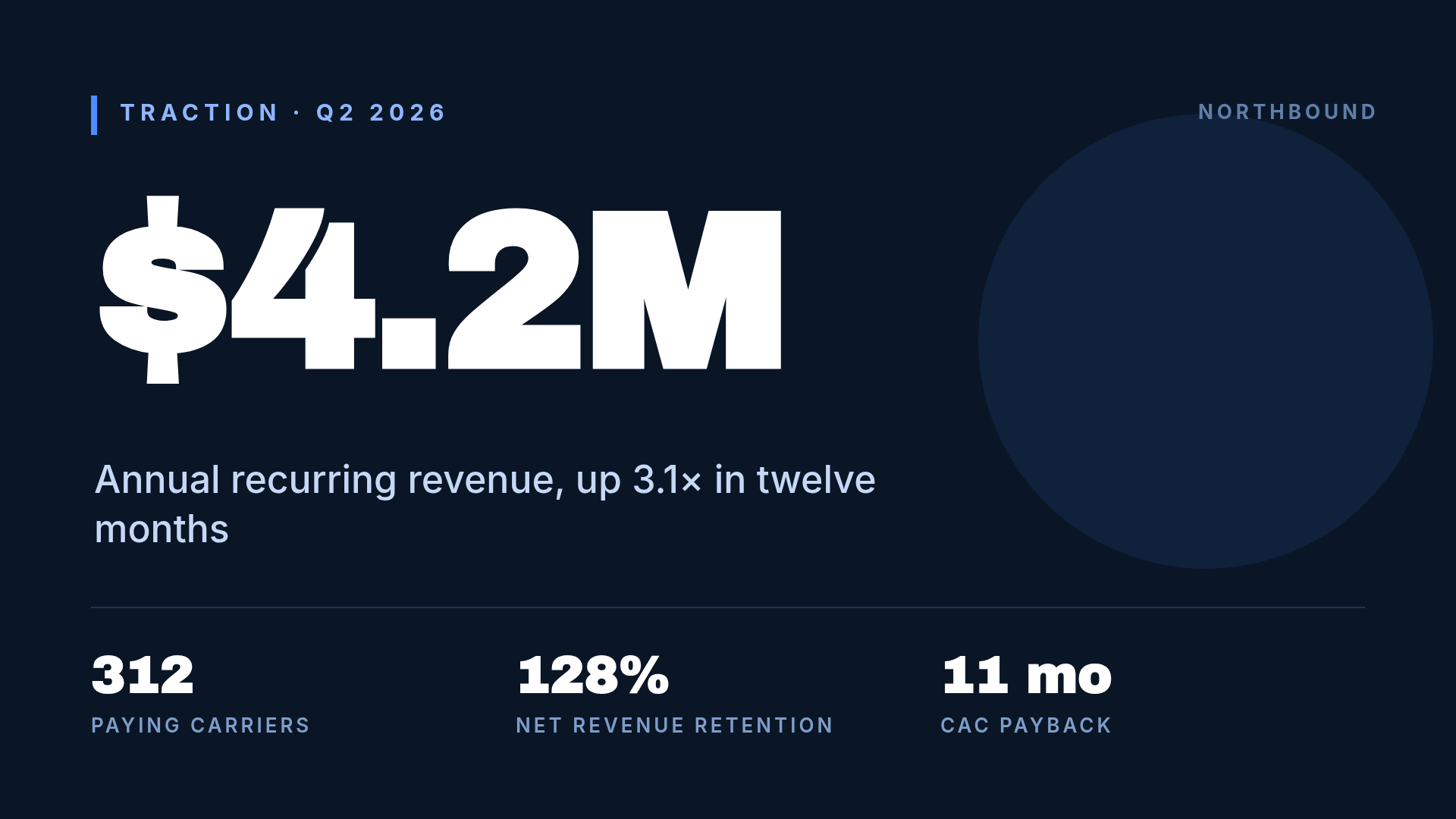
One metric, set enormous, with everything else demoted to a footnote. The whole slide is a single claim — you say the number out loud and the room has already read it.
Who it's for: anyone whose traction is the strongest thing in the deck. If your growth number is the reason you'll get a second meeting, don't bury it in a chart.
The discipline here is subtraction. Three supporting stats along the bottom, max. The moment you add a fourth, the big number stops being big.
Design a 1920x1080 pitch deck traction slide on dark navy. One enormous white number, "$4.2M", filling the upper left. Below it, one line: "Annual recurring revenue, up 3.1x in twelve months". A thin divider, then three small stats in a row: 312 paying carriers, 128% net revenue retention, 11 month CAC payback. Small blue kicker "TRACTION - Q2 2026" at the top.
2. Swiss Grid
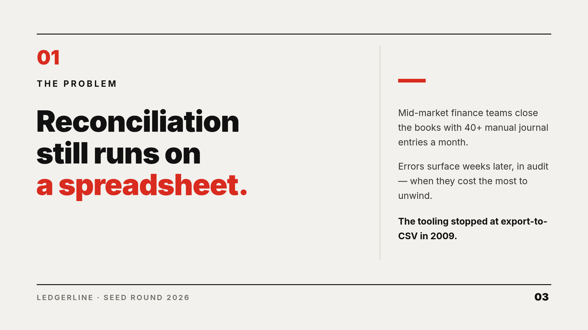
Hairline rules top and bottom, a numbered section marker, one heavy sans in two weights, and a single red accent doing all the emphasis. Deliberate empty space, not accidental empty space.
Who it's for: B2B and fintech. It reads as rigorous, which is what a finance buyer wants to feel about the company selling them software.
Note where the money goes: the headline is huge and the body copy is small and pushed into a narrow right column. That asymmetry is the whole style. Centering anything here breaks it.
Design a 1920x1080 pitch deck problem slide, Swiss/International style. Off-white background, thin black rules at top and bottom. Section number "01" in red, label "THE PROBLEM" below it. Three-line black headline: "Reconciliation still runs on a spreadsheet." — last line in red. Narrow right column with three short paragraphs of supporting text, separated by a vertical hairline. Footer: "LEDGERLINE - SEED ROUND 2026" and page number 03.
3. Dark Developer

Near-black background, monospace, one saturated accent — usually green or cyan — and an actual code sample sitting in a bordered panel. The kicker is a shell prompt.
Who it's for: dev tools, infra, API companies. Your buyer is an engineer and your investor probably was one. Showing six lines of config does more than a paragraph claiming the integration is easy.
Real code, not greeked code. If the snippet on your slide wouldn't run, engineers in the room will notice, and it's the one detail that costs you credibility for free.
Design a 1920x1080 dark developer pitch deck slide. Near-black background, green accent. Monospace kicker "~/relayd $ how-it-works". Headline in two lines: "Webhooks that never" / "silently fail." with the second line green. One supporting sentence, then three monospace bullets with small green squares: 99.99% delivery SLA, replay any event any time, SOC 2 Type II day one. On the right, a bordered dark code panel showing a six-line JavaScript config snippet with syntax colors.
4. Editorial Serif
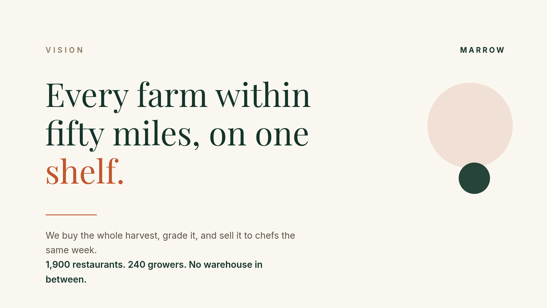
A big display serif, a warm off-white ground, and more empty space than feels comfortable. Two accent shapes, no photograph. It reads like a magazine spread rather than a slide.
Who it's for: vision and mission slides, consumer brands, food, hospitality, anything where the pitch is partly aesthetic. It's the one style on this list that can carry a sentence instead of a stat.
The trap is using it for a data slide. A serif this soft next to a bar chart looks like two decks glued together — which is exactly the failure from the top of this post.
Design a 1920x1080 pitch deck vision slide, editorial magazine style. Cream background. Small letterspaced kicker "VISION". Large Playfair Display headline in dark green across three lines: "Every farm within fifty miles, on one shelf." with the last line in terracotta. A short rule, then two lines of supporting copy. Two overlapping circles in terracotta and dark green on the right as a quiet accent. Lots of white space.
5. Full-Bleed Photo
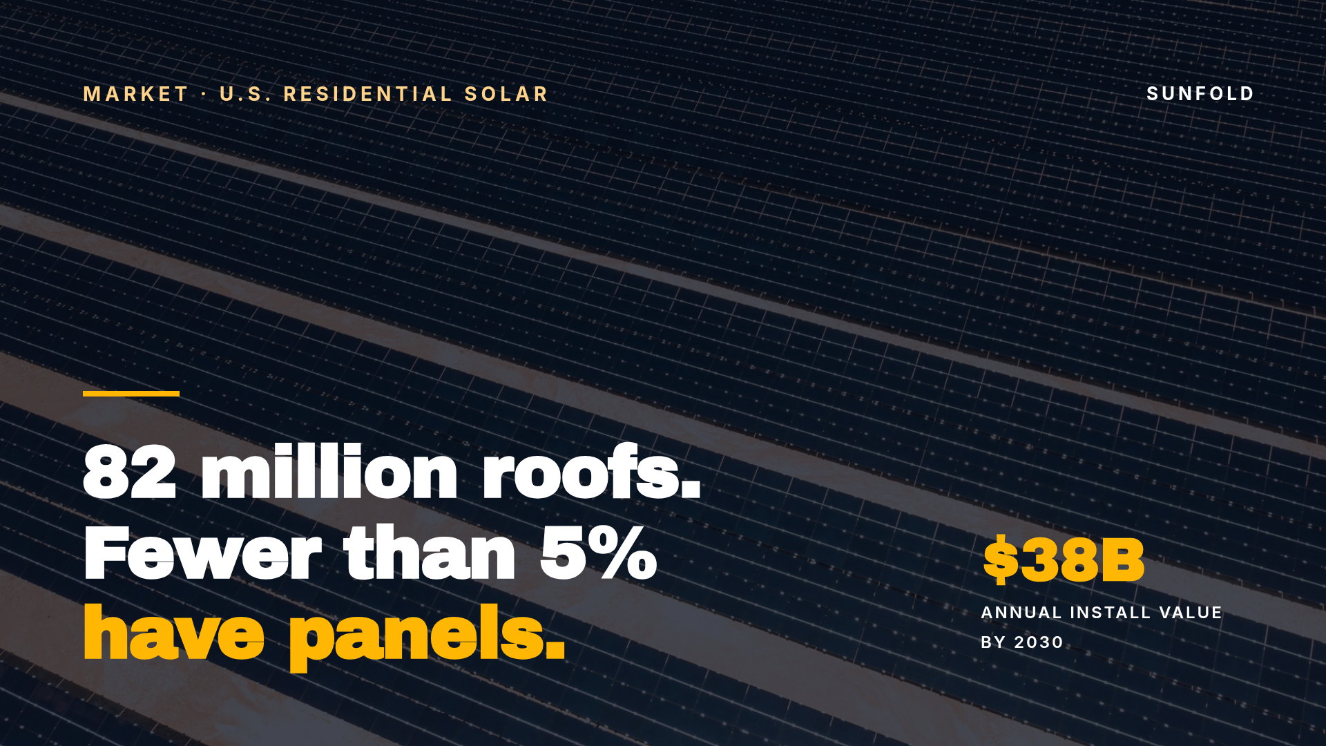
One photograph edge to edge, a dark scrim over the whole frame, and heavy type sitting on top. Used once or twice in a deck it lands hard. Used on every slide it becomes wallpaper.
Who it's for: market slides, climate, hardware, real estate, logistics — anywhere the physical world is the opportunity.
Two rules make or break it. The scrim must cover the entire canvas, not just the text area: a half-height panel leaves a visible seam across the middle of the slide, which is exactly what happened on my first pass at this one. And the photo has to show the actual subject. A generic aerial shot of some rooftops says nothing; rooftops with panels on them says the thesis before you open your mouth.
Design a 1920x1080 pitch deck market slide over a full-bleed photo of rooftop solar panels, with a dark navy scrim over the whole image. Yellow letterspaced kicker "MARKET - U.S. RESIDENTIAL SOLAR" top left. Bottom left, a short yellow rule and a three-line bold headline: "82 million roofs. Fewer than 5% have panels." with the last line in yellow. Bottom right, one stat: "$38B" over "ANNUAL INSTALL VALUE BY 2030".
6. Split Screen
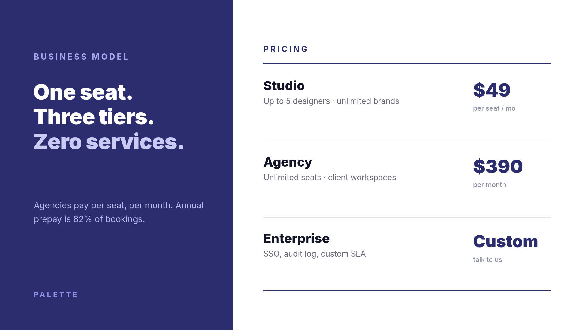
A solid color block takes 40% of the slide and holds the argument; the white 60% holds the evidence. It's the most reusable layout in this list because the ratio survives any content — swap the pricing table for a team grid, a roadmap, or a competitive matrix and the slide still works.
Who it's for: business model, pricing, and "how we compare" slides. Also the safest starting point if you're building your first deck and don't want to make ten layout decisions.
Keep the color block genuinely solid. A gradient there is the single fastest way to make a deck look like a 2014 template.
Design a 1920x1080 pitch deck business model slide, split screen. Left 40% is a solid deep indigo panel with kicker "BUSINESS MODEL" and a three-line white headline "One seat. Three tiers. Zero services." plus one small supporting sentence. Right 60% on white: heading "PRICING" over a rule, then three pricing rows separated by hairlines — Studio $49 per seat/mo, Agency $390 per month, Enterprise Custom — each with a one-line description.
7. Data Dashboard
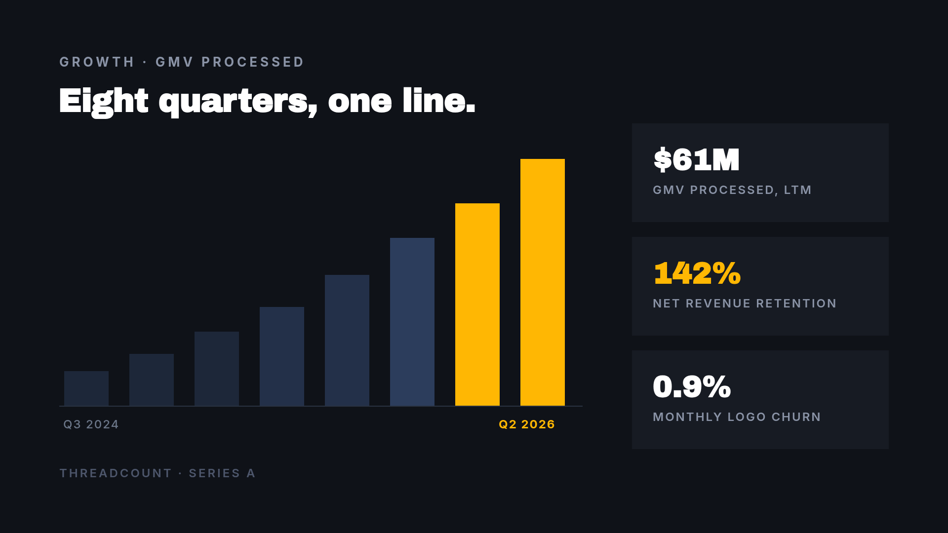
Chart on the left, stat tiles on the right, everything on a dark charcoal ground with one warm accent. The last two bars are the accent color and the rest are muted — the chart argues for you before anyone reads an axis label.
Who it's for: Series A and later, where "we grew" needs to be a shape, not a sentence.
Two things I'd fight for here: label only the first and last quarter, and color only the bars that matter. Eight labeled bars in eight shades is a spreadsheet screenshot, not a slide. If you want more on picking the chart itself, we wrote a whole post on bar vs. line vs. pie.
Design a 1920x1080 dark pitch deck traction slide. Charcoal background, amber accent. Kicker "GROWTH - GMV PROCESSED" and headline "Eight quarters, one line." On the left, a bar chart of eight rising bars — the first six muted navy, the last two amber — on a thin baseline, labelled "Q3 2024" on the left and "Q2 2026" on the right in amber. On the right, three bordered stat tiles: $61M GMV processed LTM, 142% net revenue retention, 0.9% monthly logo churn.
8. Soft Consumer

Warm neutral background, a soft serif, rounded shapes, and metrics in pill-shaped chips instead of a table. Every hard edge in the layout has been rounded off on purpose.
Who it's for: consumer apps, wellness, kids, DTC. It's the style that makes a company feel kind, which matters when your product lives in someone's home.
The chips are the trick worth stealing regardless of style: three short metrics as small standalone objects read faster than the same three numbers in a sentence, and they give the eye somewhere to land after the headline.
Design a 1920x1080 consumer pitch deck slide, soft and warm. Peach-cream background. Kicker "MILO - SLEEP FOR LITTLE ONES". Three-line soft serif headline in dark brown: "Bedtime, without the third glass of water." with the last line in burnt orange. One supporting sentence. Three white pill-shaped chips below it reading 180k families, 4.9 App Store, 11 min faster. Large overlapping peach and sage circles on the right.
9. Brutalist

Black, one acid color, type set as large as the canvas allows, thick bars top and bottom. No decoration at all — the scale is the decoration.
Who it's for: the ask slide, specifically. Most decks whisper the raise at the end after a long apology. This one states it. Marketplaces, blue-collar tech, and anything with an anti-establishment story can carry the style across a whole deck; for everyone else, use it once.
If you do use it once, use it for the number you most want remembered.
Design a 1920x1080 pitch deck ask slide, brutalist. Pure black background with thick acid yellow bars across the very top and bottom. Kicker "GRIT - THE ASK" in yellow. Giant two-line headline filling the slide: "WE'RE RAISING" in white and "$3,000,000" in acid yellow. A thick yellow rule, then three use-of-funds columns: 55% sales headcount in 6 metros, 30% marketplace liquidity, 15% compliance and payroll rails. Small grey footer "CLOSING SEPTEMBER 2026".
10. Flow Diagram

Three panels, numbered circles, a thin connecting line running behind them with a dot in each gap. Cool light grey ground, one deep accent. It's the "how it works" slide, and it's the one most founders overbuild.
Who it's for: healthcare, marketplaces, fintech, logistics — anywhere the product is a process rather than a screen.
Three steps. Not five, not seven. If your flow genuinely has seven stages, group them into three and put the detail in the appendix; a slide with seven boxes gets skipped by everyone in the room. Ours is a straight left-to-right line for a reason — the diagram's job is to be understood in two seconds, not to be complete.
Design a 1920x1080 pitch deck how-it-works slide on a light grey-blue background. Teal kicker "HOW IT WORKS" and a bold dark headline "Three steps from referral to first dose." Below, three equal white panels with thin borders, connected by a horizontal line with a teal dot in each gap. Each panel has a teal numbered circle, a bold step title — Referral lands, Site matched, Visit scheduled — and two lines of supporting text. Footer "CADENCE - SERIES A".
Building one in Ridvay Studio
Every slide above was made the same way: one sentence in, an editable design out. Here's the Big Number slide, which is the one most decks need and most decks get wrong.
Paste this into Studio:
Design a 1920x1080 pitch deck traction slide on dark navy. One enormous white number, "$4.2M", filling the upper left, with the line "Annual recurring revenue, up 3.1x in twelve months" underneath. A thin divider, then three small stats in a row: 312 paying carriers, 128% net revenue retention, 11 month CAC payback. Small blue kicker "TRACTION - Q2 2026" at the top.
What comes back is not a flat image. It's a real design — the number is a text layer, the divider is a shape, the kicker is its own element — so the next four edits are the actual work:
- Click the big number and type your own. If yours is longer (
$12.4Minstead of$4.2M), drag the font size down until it stops just short of the right margin. That gap is the design; closing it makes the slide feel cramped. - Replace the three bottom stats with yours, and delete one if you only have two that are genuinely good. Subtraction is the style, as noted above — a fourth stat kills the big number.
- Recolor the kicker and the accent bar to your brand blue. Save your palette as a brand kit once and every later slide picks it up, which is how you avoid the four-fonts-three-systems deck.
- Duplicate the page for your next slide. Keep the margins, the kicker position, and the divider exactly where they are, and change only the content. That repetition is the entire trick to a deck that looks designed.
Open this slide in Studio and make it yours →
Turning one slide into a deck
A single slide is the easy part. Some notes on the rest:
Size once, at 1920×1080. That's 16:9 at full HD and it's what every projector, Zoom share, and PDF export expects. Build at that size and you never think about it again.
Export to PDF, not PowerPoint. Investors open decks on phones. A PDF renders identically everywhere; a .pptx renders in whatever fonts that person happens to have installed, which is how a carefully-set headline turns into Calibri on someone else's laptop. Studio exports pages as PNG or PDF from the export menu.
Keep the appendix ugly. Seriously. The appendix is for the diligence questions, and over-designing it wastes the one afternoon you should spend on slides 1–12.
Reuse the slide, not the style guide. Don't write yourself a document about your deck's design system. Duplicate a finished slide and overwrite the text. It's faster and it's the only version of consistency that survives a 2am edit before a Monday meeting.
If you want the argument side of this rather than the visual side — what actually belongs on a slide and in what order — that's covered in how to design a pitch deck slide that lands and how to make a presentation with AI.
Pick one and start
Scroll back up, pick the style that looks like your company rather than the one that looks nicest, and open it. Every slide above is a live, editable Ridvay design — click any "open and edit" link and it lands in Studio with all its layers intact, yours to overwrite.
Then build the other nineteen slides in the same system. That's the whole difference between a deck that looks junior and one that doesn't.