Top 10 Product Label Designs for 2026 (All Editable)

A shopper picks up a jar, turns it over, and puts it back down. That whole loop takes about three seconds — and on a marketplace listing it's closer to one, because the label is 200 pixels wide and competing with eleven others in a grid.
Which means a product label isn't really a piece of packaging. It's a category signal. Before anyone reads your brand name, the label has already told them artisan or clinical or for children or expensive, and that judgement is made from the typeface, the colour field, and how much empty space you were brave enough to leave.
The good news: there are maybe ten looks that actually do this work, and they're all learnable. So here are ten product label designs, each built around the one rule that makes it read. I composed all ten in Ridvay Studio and every one is open for you to edit — change the name, swap the flavour, keep the layout. They're at 1050×1500, which is 3.5 × 5 inches at 300 DPI: a standard front-panel size for a bottle, jar or pouch.
If you want the process rather than the styles — bleed, safe zones, exporting for a printer — that's covered separately in how to design a product label with AI. This post is about picking a look.
1. The Apothecary Botanical
For: skincare, body oil, soap, candles, anything herbal.
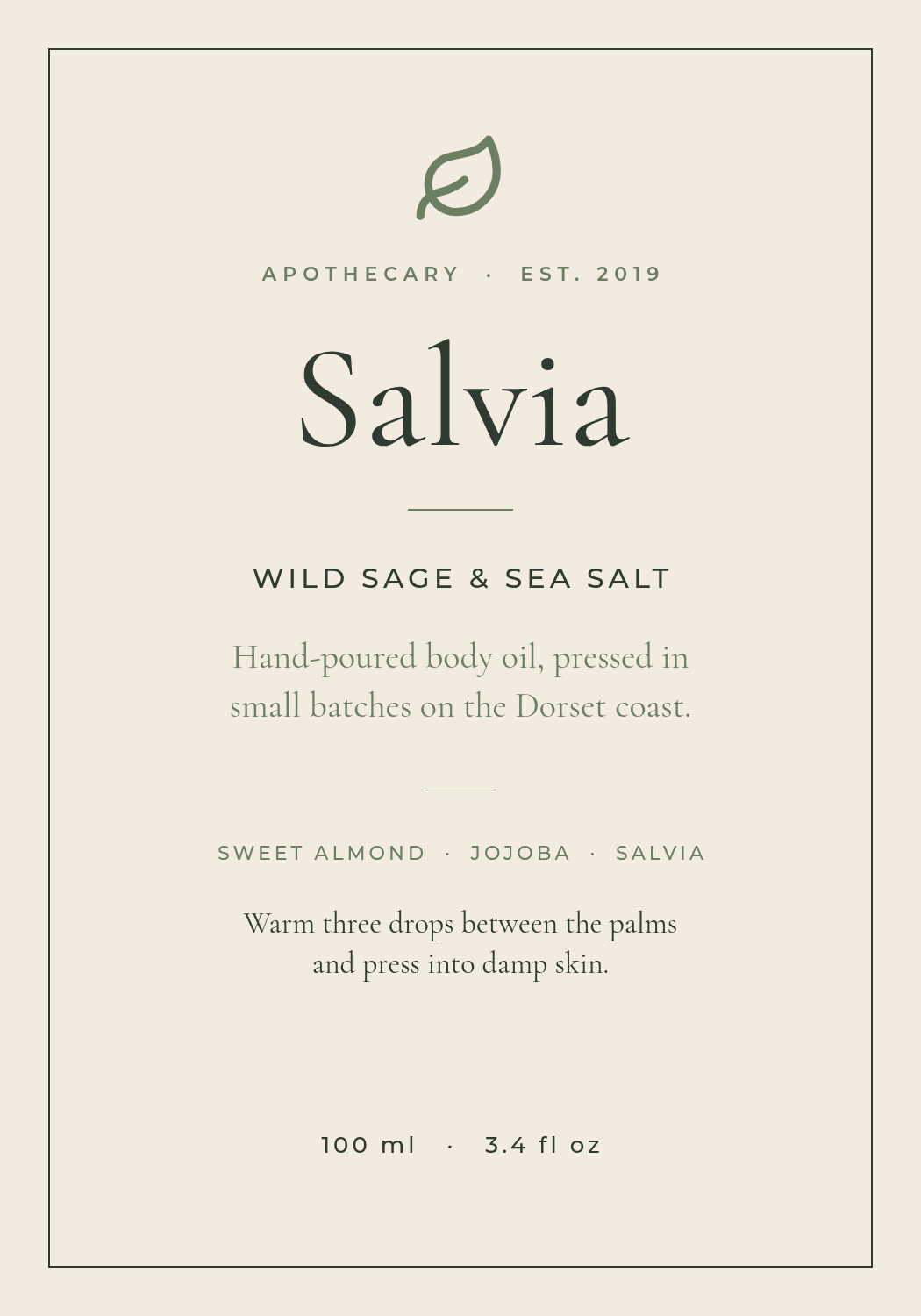
Cream stock, a hairline rule box, one drawn botanical, and a light serif set at a size that suggests confidence rather than volume. Nothing here shouts, and that's the entire pitch: expensive things don't need to.
The rule: one botanical, drawn — never photographed. A line illustration reads as apothecary; a stock photo of sage reads as a supermarket own-brand. And keep it to one. Two sprigs and a laurel wreath is a wedding invitation, not a bottle of body oil.
A cream apothecary skincare label, thin ruled border, single line-drawn sage leaf at the top, light serif brand name "Salvia" centred, "Wild Sage & Sea Salt" in spaced capitals, 100 ml at the foot
2. The Hot Sauce Shouter

For: hot sauce, BBQ rubs, energy products, anything that competes on intensity.
Black field, two words of very heavy type, one of them red, and a number. The condiment aisle is a shouting match and the only way to win it is to shout about something specific.
The rule: the heat number is the second-biggest thing on the label. Not the brand, not the flavour notes — the Scoville count, plus a visual scale so someone who doesn't know what 300,000 means can still count four blocks out of five. Buyers in this category are choosing a difficulty level, so put the difficulty level where their eye lands second.
A black hot sauce label, huge heavy capitals reading GHOST in red above PEPPER in white, brand "Tío Rey" small at the top, 300,000 Scoville heat units, a five-block heat scale with four filled red, 5 fl oz
3. The Scandinavian Minimal

For: home fragrance, candles, ceramics, minimal skincare.
Off-white, two hairline rules, and type occupying maybe a tenth of the label. This is the hardest one to hold your nerve on, because an empty label looks unfinished right up until it looks expensive.
The rule: give the emptiness one anchor. A tiny solid square, a single rule, a lone "No. 05" — one small deliberate mark is the difference between minimal and we ran out of time. Take that mark away and your eye has nowhere to land, and the whole thing reads as a mistake.
A minimal Scandinavian candle label on warm off-white, brand "Nordhavn" in tiny widely spaced capitals, a small solid black square, "Birch & Smoke" in a light serif, NO. 05, soy wax candle 220 g at the foot
4. The Kraft Artisan Stamp
For: jam, honey, bakery, farm shop, market stalls.
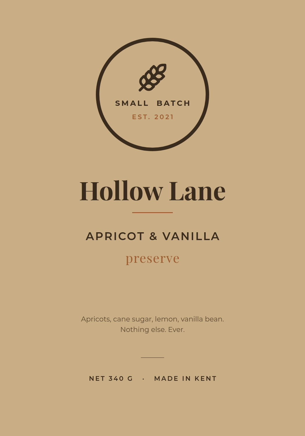
Brown kraft ground, a circular stamp at the top, a bold serif brand, and an ingredient line short enough to read as a boast. It's the look of something made by a person whose name you could find out.
The rule: a circle badge plus one ingredient line does all the work. You don't need a hand-lettered script font — those are what make small-batch labels look like a Word document with a nostalgia filter. Set it in a serif you'd trust on a book cover, put the "SMALL BATCH / EST. 2021" into a ring, and list four ingredients ending in nothing else.
A kraft brown preserve label, circular stamp emblem at the top with a wheat mark and SMALL BATCH EST. 2021, bold serif brand "Hollow Lane", APRICOT & VANILLA, a four-item ingredient line, net 340 g
5. The Retro Americana
For: soda, craft beer, cider, snacks with a heritage story.
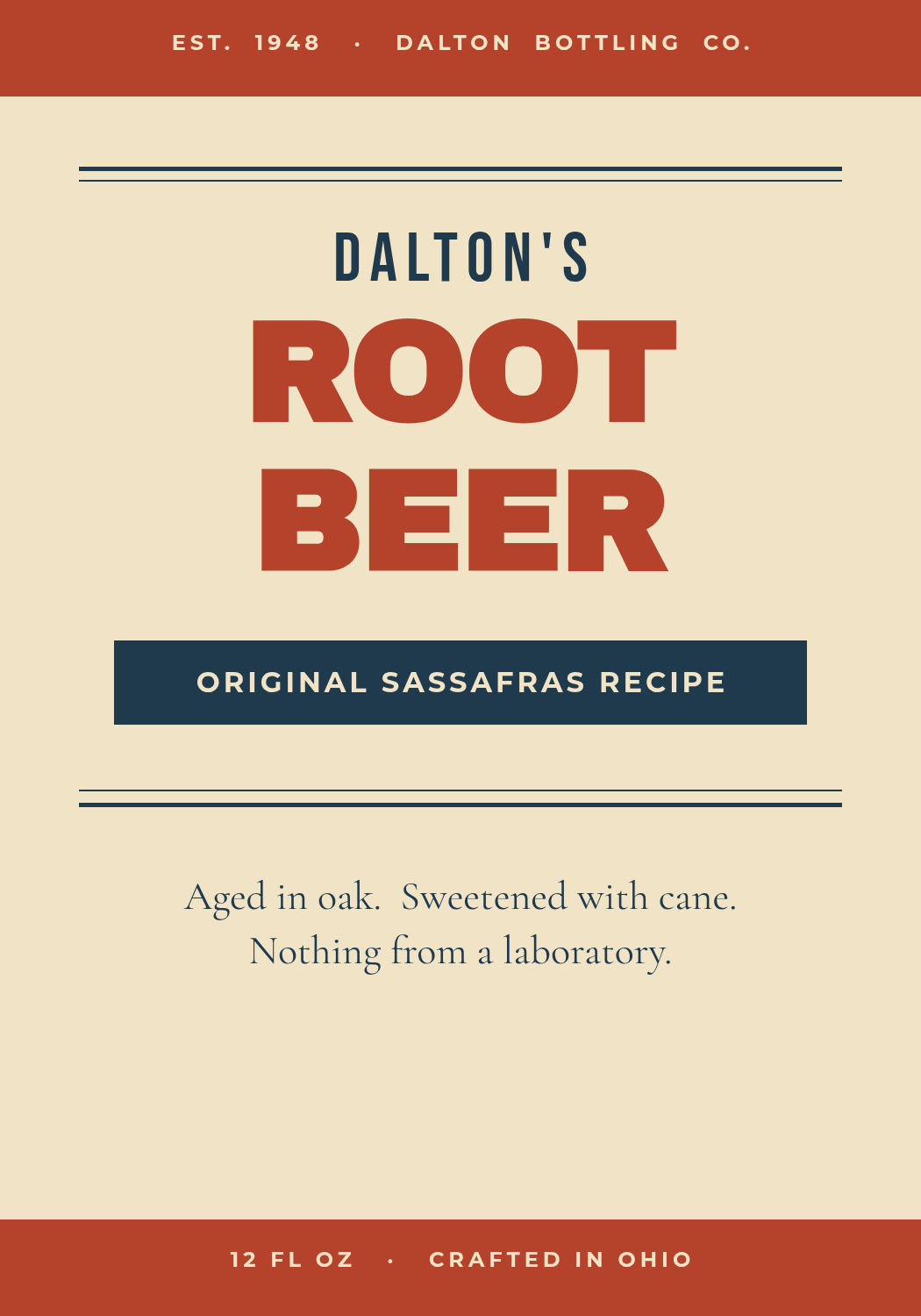
Cream field, rust bands top and bottom, three sizes of type stacked dead centre, and a ribbon carrying the claim. No photograph anywhere. It's a look from 1948 that never stopped selling because it signals recipe, not formula.
The rule: stack exactly three type sizes and centre all of them. Brand name small, product name enormous, claim in a ribbon between the rules. The discipline is what makes it read as period rather than pastiche — the moment you add a fourth size or slide something off-centre, it turns into a modern label wearing a costume.
A retro American root beer label on cream with rust bands top and bottom, "Dalton's" in a condensed face, ROOT BEER in huge heavy capitals in rust, a navy ribbon reading ORIGINAL SASSAFRAS RECIPE, 12 fl oz crafted in Ohio
6. The Clinical Supplement
For: vitamins, supplements, sports nutrition, medical-adjacent products.
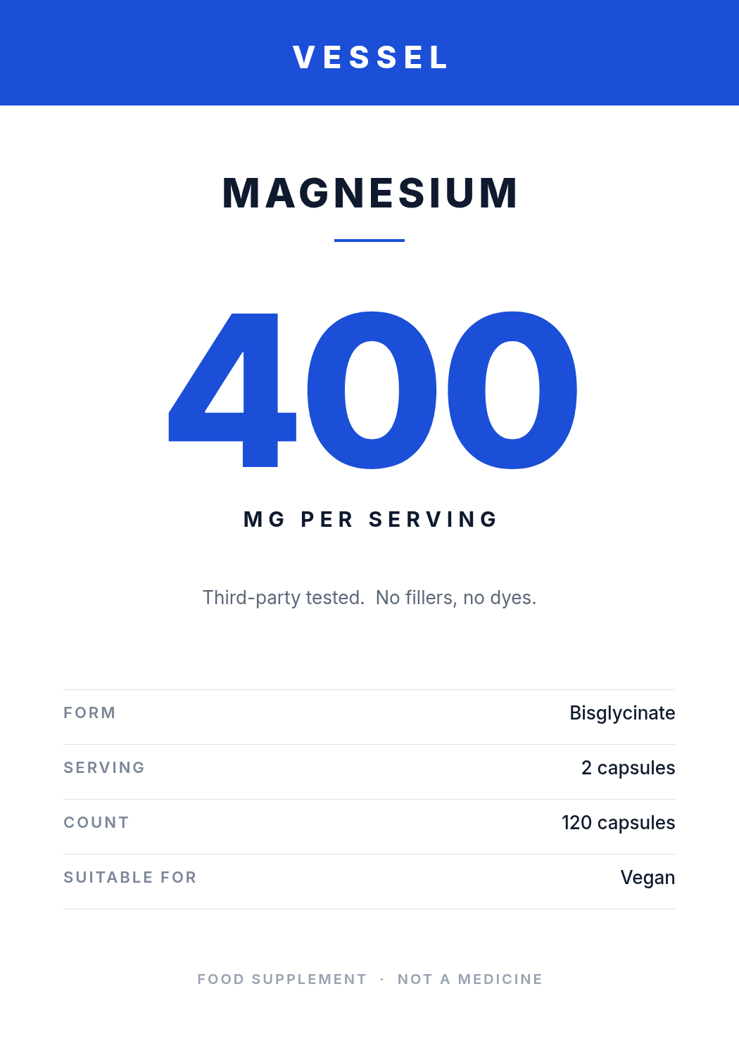
White, one blue band, a grotesque sans, and a dose number set larger than anything else on the label. Every decorative instinct has been removed on purpose, because in this category ornament reads as hiding something.
The rule: the dose is the hero, not the brand. Someone buying magnesium already knows they want magnesium; what they're scanning for is 400 mg versus 200 mg, and which form. Put the number at 300px, the form in a spec row underneath, and let your brand name live quietly in the header band.
A clinical white supplement label, blue header band with the brand VESSEL, MAGNESIUM in bold capitals, a huge 400 in blue with MG PER SERVING beneath, a four-row spec table for form, serving, count and suitability
7. The Coffee Spec Sheet
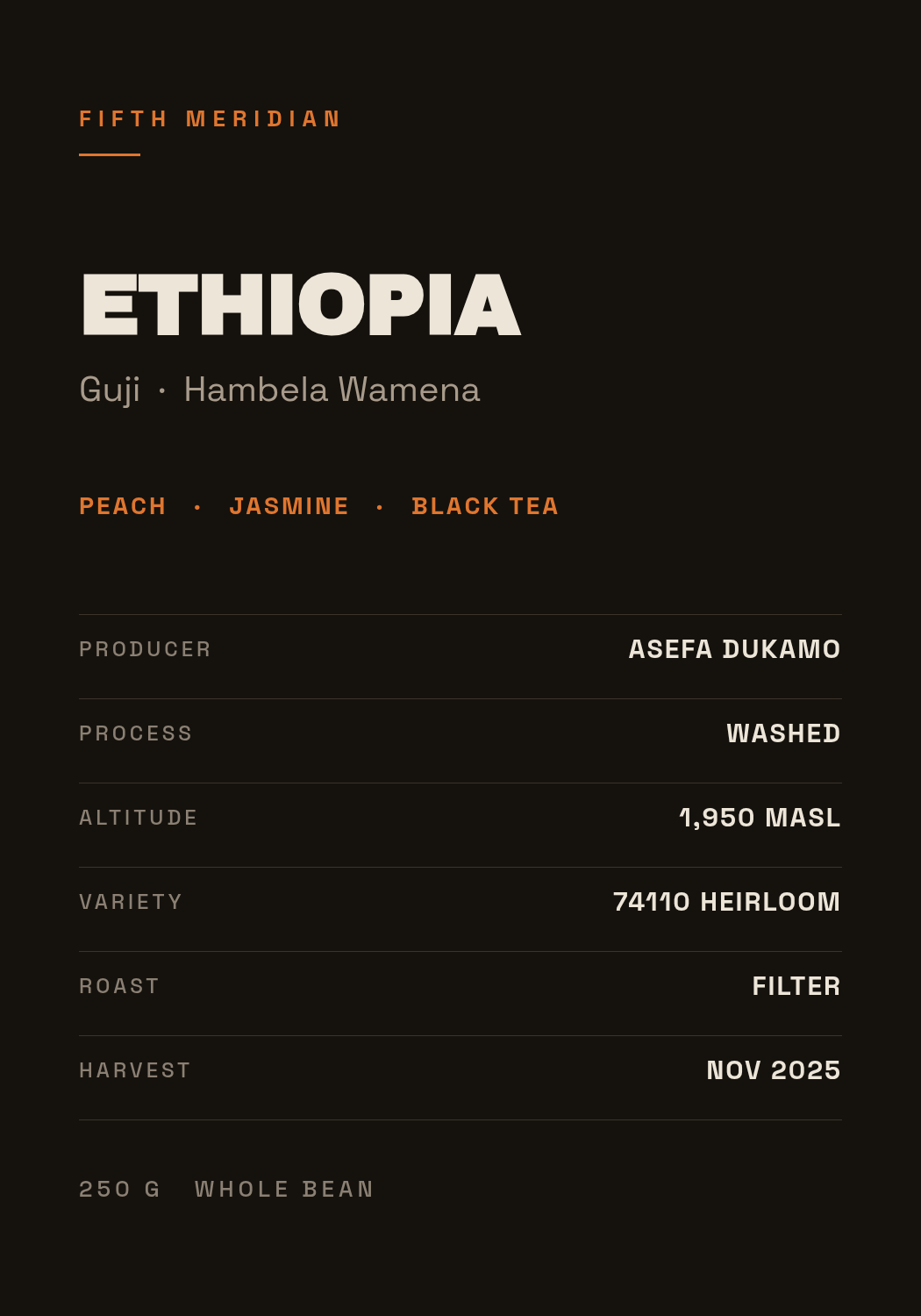
For: specialty coffee, tea, olive oil, wine — anything with provenance.
Near-black, a technical sans, and a table. This one is deliberately left-aligned while most of the others are centred, because a spec sheet is something you read down, not something you admire.
The rule: print the data, even the parts nobody asks about. Producer, process, altitude, variety, harvest. Specialty buyers use those rows to decide, and everyone else reads them as proof that you know what you're selling. A bag that says only "smooth and rich" is telling a knowledgeable buyer you have nothing to declare.
A near-black specialty coffee bag label, brand "Fifth Meridian" small in orange, ETHIOPIA in heavy capitals, Guji Hambela Wamena beneath, tasting notes peach jasmine black tea, a six-row spec table with producer process altitude variety roast harvest, 250 g whole bean
8. The Full-Bleed Photograph

For: sauces, ready meals, preserves, anything where the food is the argument.
A photograph running to all four edges across the top two-thirds, then a solid band of paper colour where the type lives. The photo sells the appetite; the band sells the brand.
The rule: type never touches the food. Every amateur food label puts the name across the tomatoes with a drop shadow, and it makes both harder to read. Give the words their own opaque ground and the photograph stays appetising. If you genuinely must overlap them, do it properly — but on a jar you almost never have to.
A pasta sauce label, full-bleed overhead photo of ripe tomatoes and fresh basil on dark slate across the top, a cream band across the lower third, "Sugo Rosso" in a dark red serif, TOMATO & BASIL, 580 g
9. The Luxe Monogram

For: olive oil, perfume, spirits, premium gifting.
Near-black, a gold hairline frame, a monogram in a roman serif, and roughly four short lines of information for the entire label. Price signalling is almost entirely about restraint, and restraint is measurable: count your words.
The rule: one metal, one serif, and everything else is air. Gold and silver reads as a supermarket premium range. A gold monogram, a gold hairline, and then nothing else metallic — with the rest of the label in a muted stone colour — reads as the real thing. The frame should be one pixel, not four.
A near-black luxury olive oil label with a thin gold hairline frame, large MO monogram in a roman serif in gold, MAISON OLIVA beneath, Extra Virgin Olive Oil, first cold press single grove, Puglia Italy, 500 ml
10. The Playful Colour Block

For: kids' food and drink, pet treats, snacks, anything bought by an adult for someone who can't read yet.
Three flat bands of colour, one chunky rounded face used at four sizes, and a white card carrying the claim a parent is actually scanning for. Bright, but not chaotic — the structure is as strict as the minimal one.
The rule: let the colour blocks carry the identity, and use exactly one typeface. The temptation is a second "fun" font for the flavour name; resist it. Change size and weight instead. The reason this look survives being printed badly on a small pouch is that the bands are still recognisable at ten feet even when the type isn't.
A playful kids' drink label in three flat colour bands — magenta, yellow, teal — brand WIGGLE in the top band, BERRY BOOST in a chunky rounded face, a NO ADDED SUGAR pill, a white card reading 1 of your 5 a day, 200 ml
Building one in Ridvay Studio
Pick whichever of the ten is closest to your product and start from it, or describe your own. Here's the prompt I'd type for a candle brand:
A minimal product label for a soy candle, 1050 × 1500 px, warm off-white background, brand name "Fernwood" in small widely-spaced capitals at the top, a hairline rule, "Cedar & Rain" in a light serif in the centre, NO. 03 beneath it, and 220 g at the foot
What comes back isn't a flat picture. It's an editable design: the brand name, the rule, the serif line and the weight are each their own layer with their own font, size, colour and position. That's the part that matters for a label, because a label is never right first time — you'll change the flavour name six times before the print run.
Three edits worth making straight away:
- Click the product name and drag its size up until it nearly fills the column. Almost every AI-generated label comes back timid. On a real shelf your product name should be the second-largest thing after nothing at all.
- Delete a line. Whatever's left after you remove the least important sentence is the label. This is rule 3 and rule 9 in practice, and it works on all ten styles.
- Recolour the accent to your actual brand colour — select the rule, the badge or the band and set the hex. If you've built a brand kit, it's already in the palette and every future flavour variant will match without you thinking about it.
Then duplicate the design for each flavour. Changing one text layer per variant is the whole job, and it's why an editable layout beats a regenerated image for anything that ships in more than one version.
Getting it onto an actual bottle
Three things trip people up between the screen and the print shop.
Size it for the container, not the screen. Measure the flat panel of your bottle or jar and design at that size times 300 — a 3.5 × 5 inch panel is 1050 × 1500 px. Export at 2× if your printer asks for 600 DPI. Designing small and scaling up is how labels come out soft and pixelly.
Add bleed and keep off the edges. Give your printer 3 mm of background past the trim on every side, and keep all text at least 4 mm inside the cut line. Wrap-around labels lose more than you'd expect at the seam.
Check the colour before you order 500. Screens are RGB and label presses are CMYK, and the colours that shift hardest are exactly the ones these styles rely on — that hot-sauce red, the teal band, and any gold. RGB vs CMYK covers what actually changes and how to pick colours that survive the conversion.
One more practical note: matte and kraft stocks eat contrast. If you're printing the minimal or the apothecary style on uncoated paper, darken your text one step from what looks right on screen.
Which of the ten is yours?
Match the style to what the buyer is deciding. If they're choosing on trust, go apothecary or kraft. On intensity, go hot sauce. On specification, go clinical or spec sheet. On appetite, go full-bleed photo. On price, go luxe. Getting that one question right matters more than any font choice you'll make afterwards.
All ten above are open — click any "Edit this label" link and it opens in Studio with every layer intact.