Top 10 Restaurant Menu Designs for 2026 (All Editable)

The fastest way to read a restaurant is to look at the menu before you look at the food. A cream page with one serif and a lot of empty space says one thing. A black card with gold rules and "22oz" sitting next to a big number says something completely different — and neither is better. They're aimed at different people, and they're doing different jobs.
That's what most menu-design advice misses. It tells you about margins and font sizes, but not about style — the thing your customer actually clocks in the first half-second, before they read a single dish.
So this is a style gallery, not a tutorial. Ten restaurant menu designs for 2026 that look genuinely different from across the room, what each one signals, and who it's for. Every one was built in Ridvay Studio, and every one is still fully editable — the type, the colours, the section names, the prices. There's an edit link under each. Open it, swap in your dishes, done.
One rule before the gallery: pick the style that matches your room, not the one you liked on Pinterest. A hand-lettered chalkboard menu in a white-tablecloth dining room reads as a mistake, not as charm.
1. Warm Minimal
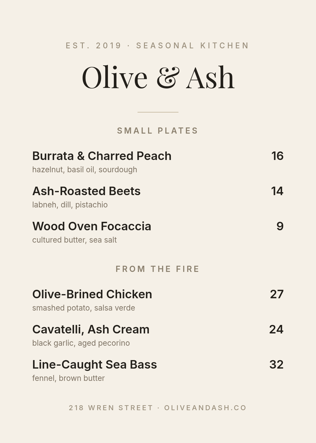
Who it's for: modern bistros, new-American kitchens, anywhere the food is the loud part.
Cream paper, one serif for the name, one sans for everything else, and about a third of the page left empty. The discipline here is the description line: three ingredients, lower case, no adjectives. "hazelnut, basil oil, sourdough" tells you more than "our chef's signature creation" ever will. If you can only take one idea from this list, take that one.
A one-page dinner menu for a modern bistro called Olive & Ash, cream background, Playfair Display headline, small plates and mains sections, prices right-aligned
2. Editorial Grid
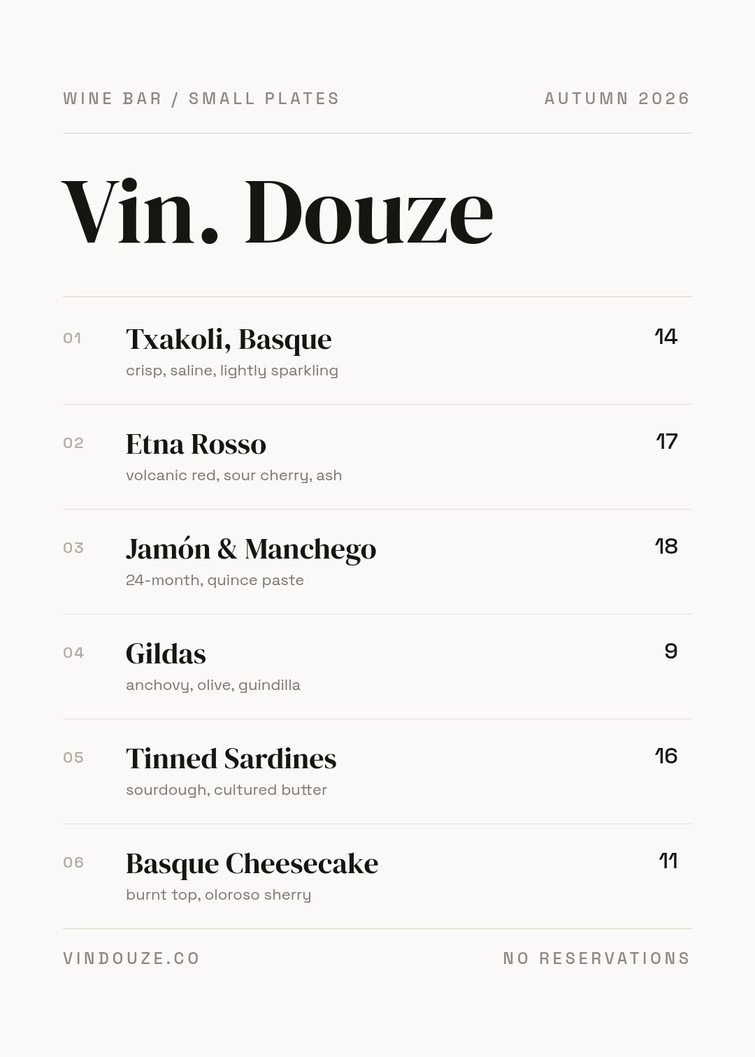
Who it's for: wine bars, tasting counters, places with a short list that changes often.
This one borrows from magazines: numbered items, a hairline rule under every row, a season stamped in the top corner. The numbers do real work — staff can say "the 04" across a noisy room, and guests who don't want to attempt guindilla out loud can point at a digit instead.
Notice the header says AUTUMN 2026. A dated menu makes a short list feel deliberate rather than thin.
An editorial-style wine bar menu, off-white, DM Serif Display name, six numbered items with hairline rules between them, small descriptions and prices
3. Dark Chophouse

Who it's for: steakhouses, whisky bars, hotel grills — anywhere the average cheque is high and nobody wants it to feel casual.
Near-black background, gold hairlines top and bottom, a condensed all-caps name. What makes it work isn't the colours, it's the cut weights next to the dish names: 22oz, 8oz, 36oz. On an expensive menu, specificity is what justifies the number on the right. Vague dish names on a $68 line read as nervous.
Prices are set in the gold accent rather than white. It keeps them present without making the page feel like a price list.
A dark steakhouse menu, near-black background, gold accents, Bebas Neue restaurant name, cuts section with ounce weights and a sides section
4. Botanical Brunch
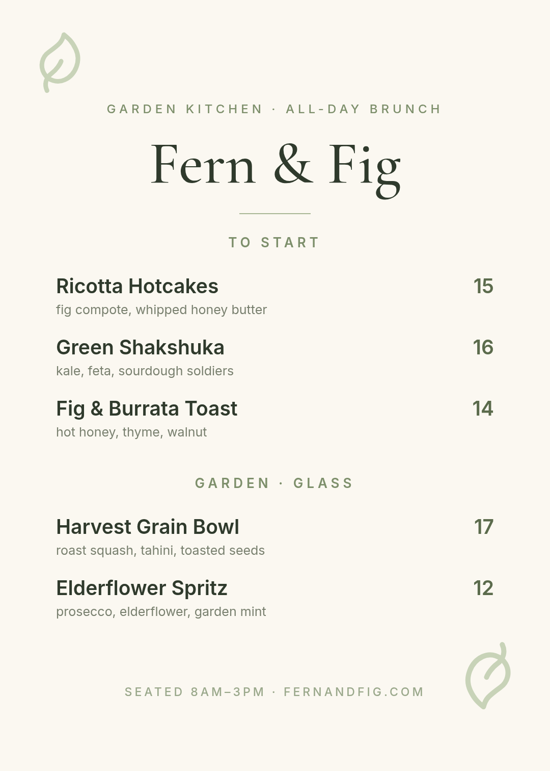
Who it's for: all-day brunch spots, garden cafés, farm-to-table rooms.
Soft off-white, sage green, and two leaf marks placed at diagonal corners. The restraint is the point — one botanical element top-left, one bottom-right, and nothing in between. The version of this style that fails is the one with a full floral border, because the border eats the margin and the dish names end up cramped.
Keep the greenery in the corners and let the middle of the page stay boring.
An all-day brunch menu for a garden café called Fern & Fig, warm off-white background, sage green accents, Cormorant Garamond name, two leaf illustrations in opposite corners
5. Prix Fixe Card

Who it's for: fine dining, tasting menus, wedding and event catering.
Everything centred, three courses, and — this is the whole trick — no price next to any individual dish. One number at the bottom: 85 per guest. The moment you price each course, guests start doing arithmetic instead of anticipating dinner.
Deep forest green with a muted gold, and a lot of vertical air between courses. If you're adapting this for an event, the course names are the easiest thing to relabel: Premier / Deuxième / Troisième become Starter / Main / Dessert in about ten seconds.
A fine dining prix fixe tasting menu, deep green background, gold accents, centred Cormorant Garamond, three courses with French course labels, one price per guest at the bottom
6. Chalkboard Daily

Who it's for: coffee shops, bakeries, soup-and-sandwich counters, anything that changes daily.
Slate background, a thin drawn frame, handwritten lettering, prices in a warm chalk yellow. Five items, no descriptions. A chalkboard menu that runs to fourteen lines stops being a chalkboard and starts being a badly-set menu.
The style has an obvious practical advantage: because you're editing text layers and not repainting a board, tomorrow's version takes a minute. Change "Filter of the Day", export, print, slide it back into the A-frame.
A daily specials chalkboard menu for a coffee shop, dark slate green background, handwritten Caveat lettering, thin drawn border, five items with prices, no descriptions
7. Bold Type Poster

Who it's for: burger joints, pizza counters, food trucks, anywhere people order standing up while reading from six feet away.
The type is the design. Four items, no descriptions, set at a size you can read from the back of a queue. The single yellow block behind DOUBLE SMASH is doing the real commercial work here — it's a highlight, and highlights sell. Pick your best-margin item and put the block behind that one.
This is also the style that survives being printed small, blown up huge, or screenshotted for Instagram, because there's nothing delicate in it to lose.
A bold black and yellow burger menu poster, huge Archivo Black item names, four burgers with prices, one item highlighted with a yellow block, no descriptions
8. Retro Pastel

Who it's for: ice cream parlours, dessert bars, juice counters, kids' menus.
Peach, terracotta, teal and a rounded typeface, with solid colour bands doing the section headings instead of centred small caps. Those bands are the load-bearing element: on a playful menu, coloured blocks separate sections far better than whitespace does, because the whole page is already warm and busy.
Three dots in three colours at the top and nothing else decorative. Retro reads as retro through colour and type, not through clip art.
A retro 1970s ice cream parlour menu, peach background with a cream panel, terracotta and teal accents, rounded Fredoka headline, two sections with coloured heading bands
9. Neon Night Market

Who it's for: late-night kitchens, bars, street-food stalls, Asian and Latin small plates.
Black background, cyan and orange, and a name set twice with a few pixels of offset so it reads as a chromatic neon glow. That offset trick is two text layers, not a filter — which means you can recolour both and keep the effect.
The orange block near the bottom is a happy-hour bar. Any menu that runs a time-limited offer should give it a solid block rather than a line of small text, because it's the only thing on the page with a deadline.
A neon night market street food menu, black background, cyan and orange, Bebas Neue name with an offset colour shadow, five dishes with prices, a happy hour bar at the bottom
10. QR Table Menu

Who it's for: quick-service, cafés and bars running table ordering, anywhere the full menu lives online.
The mistake most QR menus make is being only a QR code — a naked square on a card, with nothing to look at while the page loads. This one keeps three items visible, so a guest who never scans still knows what the kitchen is proud of, and the wifi password sits in the footer where people actually look for it.
The QR here is a real vector, not a pasted screenshot, so it stays sharp at any print size. Point your camera at it and it resolves.
A QR code table menu for a taqueria, dark green header block, large QR code in the centre, three favourite dishes with prices below, wifi details in the footer
Building one in Ridvay Studio
Every menu above started as one sentence. Here's the one behind the first design, copy it and change the words:
A one-page dinner menu for a modern bistro called Olive & Ash, cream background, Playfair Display headline, small plates and mains sections, prices right-aligned
What comes back isn't a flat picture you have to regenerate when a price changes. It's an editable design: the restaurant name is a text layer with its own font, the divider is a shape, every dish name and price is its own element you can click and retype. That's the difference that matters for a menu specifically, because menus change — a supplier puts fish up two dollars and you need the new version printed by Friday, not a fresh generation that comes back looking like a different restaurant.
Four edits worth making straight after it generates:
- Cut every description to three ingredients. Click the description line, delete the adjectives. This is the single change that makes an AI-generated menu stop looking generated.
- Push the section headings apart. Drag the second section down until there's roughly a finger's width of blank space above it. Cramped section breaks are the most common flaw in a first draft, and the one your eye notices without being able to name it.
- Recolour the prices to your accent. Select a price, change the fill to your brand colour, repeat. On the chophouse menu above, the prices are gold rather than white — present, but not shouting.
- Apply your brand kit so the fonts and palette match your signage, your table tents and your Instagram posts. A menu that shares a typeface with everything else in the room is the cheapest possible upgrade to how expensive a place feels.
Generate your restaurant menu in Ridvay Studio →
Printing it, or putting it on a table
Menus get used harder than almost any other piece of design you'll make, so a couple of practical notes.
Export at the largest scale Studio offers before you send anything to a printer. A menu that looks crisp on your laptop can arrive with soft, fuzzy type if it was exported at screen size — that's a resolution problem, not a design one, and it's covered properly in why your design prints blurry.
If you want the process side rather than the style side — how to order the sections, where to put your highest-margin dish, how to price without a currency symbol — that's in how to design a restaurant menu with AI. This gallery and that guide are meant to be read together: one gives you the look, the other gives you the layout logic.
And if you're printing the menu, print the table tent in the same style while you're at it. One design system, two pieces, one trip to the printer.
Pick one and change the words
None of these ten is the "best" menu design. The steakhouse card would be absurd in an ice cream parlour, and the pastel one would sink a tasting menu. Match the style to the room, then be ruthless about the descriptions — that's most of the job.
Everything above is editable and free to start from. Open the one closest to your place, replace the dishes with yours, and you'll have a menu in the time it takes to finish a coffee.