Top 10 Birthday Invitation Designs for 2026 (All Editable)

My neighbour asked me last week to help with an invitation for her daughter's tenth birthday. She'd already made one. It was a stock template with a balloon border, three fonts, and the words "You're Invited!" in a curly script above a block of details set in 11px grey. She showed me the party she was actually planning — a sleepover, six girls, pizza, one film, collect at ten the next morning — and none of that was on the card.
That's the gap worth closing. A birthday invitation is the only thing guests see before they decide whether to come, and it's doing two jobs at once: telling people what's happening, and telling them what kind of evening it is. A balloon border tells them nothing. A card that says PYJAMAS ARE MANDATORY tells them everything.
So here are ten birthday invitation designs, each one a different answer to "what kind of party is this?". They're real generated designs, not mockups — every one has a prompt you can copy and an edit link that opens the design in the editor. Pick the one closest to your party and change the names.
1. The Dinosaur Dig

What defines it: an earthy palette (sand, fern green, clay orange), one rounded playful typeface doing all the work, and a single illustrated mark instead of a scene. The child's name is the biggest thing on the card — bigger than the word "birthday".
Who it's for: parents of 4–7 year olds who want a themed party that doesn't look like a licensed-character party.
The move that makes it work is the instruction panel: Bring a shovel. Every explorer digs up one fossil to take home. That line does more for attendance than any amount of clip art, because it tells a parent exactly what their kid is walking into.
Design a 5x7 dinosaur dig birthday invitation for a boy turning five, sand and fern green and clay orange, rounded playful type, the name in huge letters, and a fossil-dig instruction panel at the bottom
2. The Gold Milestone

What defines it: black, one metal, and a numeral treated as the illustration. The "50" is set 300px tall in a high-contrast serif and everything else is small, wide-tracked capitals arranged symmetrically around it.
Who it's for: 40th, 50th, 60th — any milestone where the party is a dinner, the dress code matters, and the guest list includes people who'd find confetti undignified.
One rule holds this together: one metal only. Gold and silver on the same card is the visual signature of a supermarket premium range. Pick gold or pick silver, then let the black do the rest.
Design an elegant 5x7 50th birthday dinner invitation, black background with gold, a huge serif numeral 50 as the hero, the name in wide-tracked capitals, black tie, RSVP line at the foot
3. The Neon Twenty-First
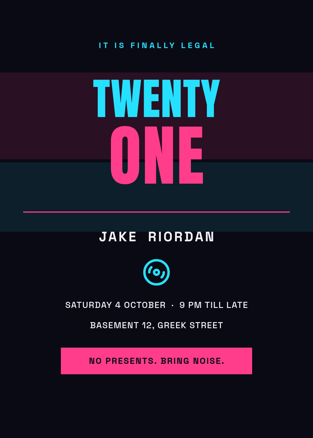
What defines it: a near-black ground, two saturated colours fighting each other (magenta and cyan), a condensed sans set enormous, and soft colour washes behind the type instead of a border.
Who it's for: 18ths, 21sts, and any night out where the venue is a basement.
The detail worth stealing is splitting the number across two sizes and two colours — TWENTY at 150, ONE at 230 — so the "one" lands like a punchline. And the bottom bar reads No presents. Bring noise, which sets expectations more usefully than a dress code.
Design a 5x7 neon 21st birthday invitation, near-black background with magenta and cyan, the word TWENTY above a much larger ONE, venue and time in a condensed sans, and a solid bar at the bottom reading no presents bring noise
4. The Pastel First Birthday
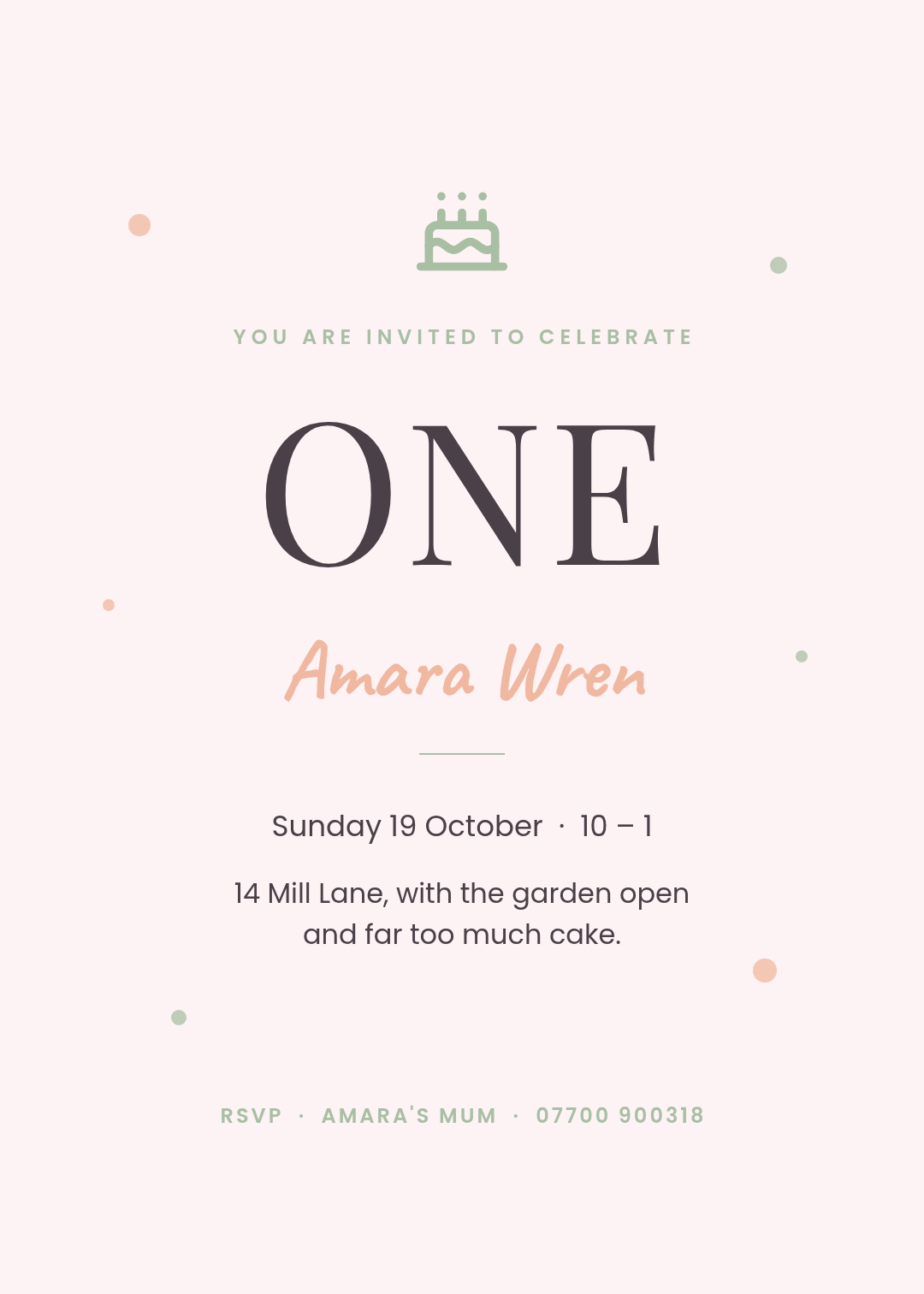
What defines it: a blush ground, sage and peach as the only accents, a serif numeral, and a handwritten script used once — for the child's name and nothing else.
Who it's for: first birthdays, christening-adjacent celebrations, and anyone whose party is mostly other people's parents drinking tea in a garden.
Most first-birthday cards fail by putting the script everywhere. Script is a seasoning. Use it on one line — here, Amara Wren — and set every practical detail in a plain sans, so the people who actually need the address can read it.
Design a soft 5x7 first birthday invitation, blush background with sage and peach accents, a small cake icon, the word ONE large in a serif, the baby's name once in a handwritten script, details in a plain sans
5. The Colour-Block Confetti
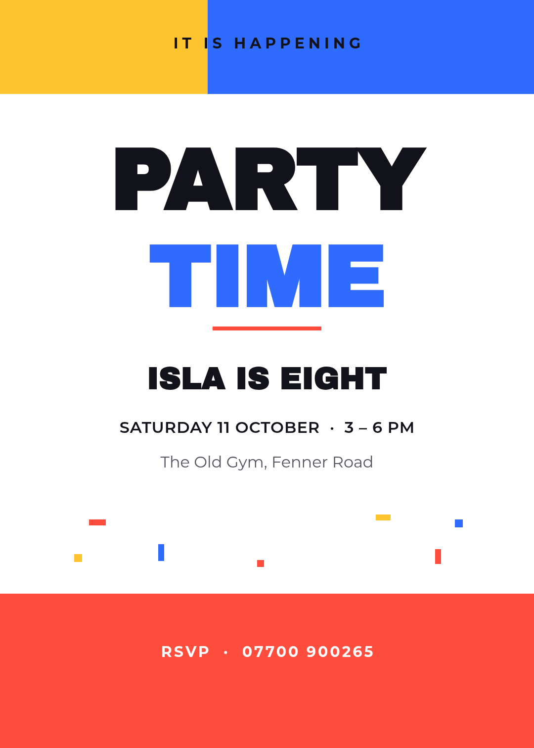
What defines it: flat blocks of primary colour at the top and bottom edges, a heavy grotesque headline in two colours, and confetti as small solid rectangles rather than an illustration.
Who it's for: kids aged 6–10 when there's no theme, just a party. Also good for adults who want cheerful without twee.
This is the most forgiving layout on the list, because the colour blocks carry the personality and the type only has to be big and clear. Keep it to three colours and one typeface at two sizes; a fourth colour turns it from bold into a toy-shop window.
Design a bold 5x7 kids birthday invitation, white background with flat yellow blue and red colour blocks at the top and bottom, PARTY TIME in a heavy grotesque, small confetti rectangles, name and age below the headline
6. The Retro Sunset Disco
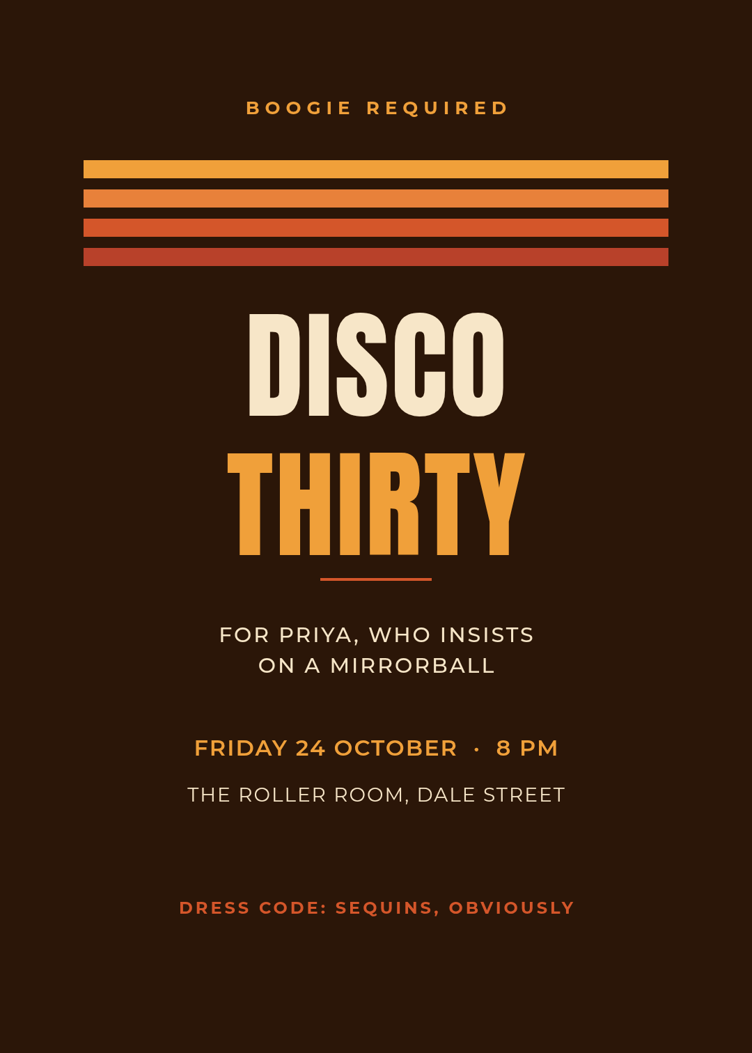
What defines it: four stacked bands stepping from amber to rust — a sunset abstracted to stripes — over a cocoa ground, with a tall condensed sans in cream and amber.
Who it's for: 30ths and 40ths with a theme, roller discos, anything where the phrase "dress code: sequins" is doing real work.
The stripes are the whole idea. They're four rectangles, not an illustration, which is why this reads as designed rather than decorated. If you want it warmer, add a fifth band; if you want it to read as 1978 rather than 2026, narrow the bands and add a fifth colour.
Design a retro 70s 5x7 disco birthday invitation for a 30th, cocoa brown background, four stacked stripes stepping from amber to rust, DISCO THIRTY in a tall condensed sans, dress code sequins at the bottom
7. The Minimal Dinner
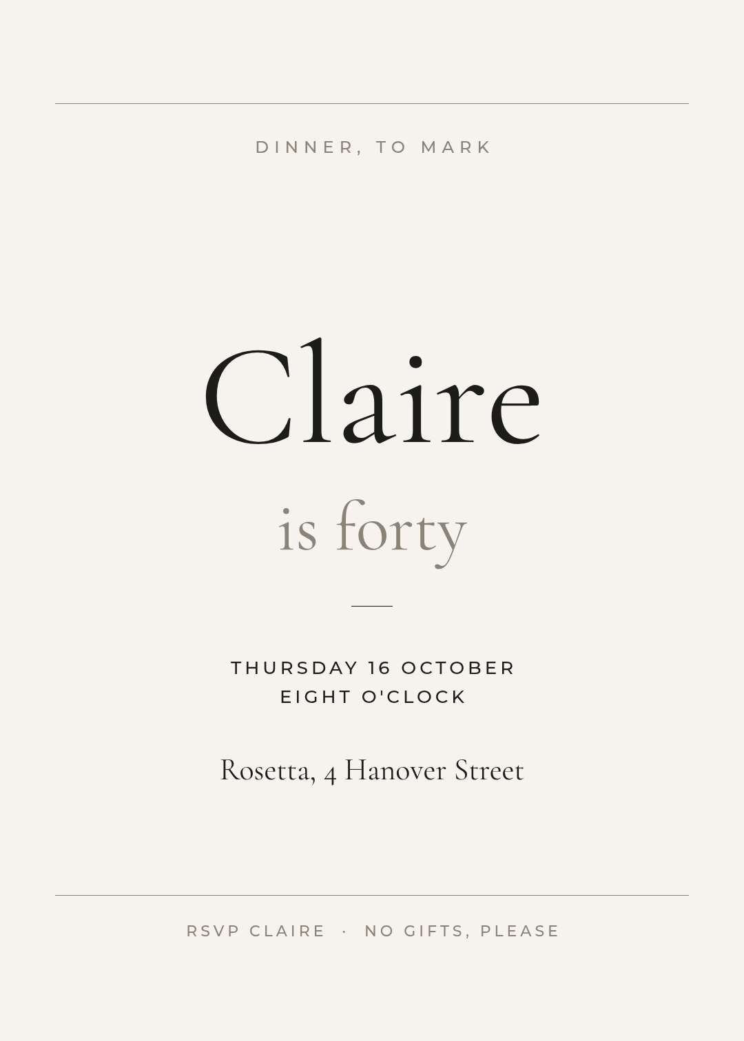
What defines it: a paper-white ground, a single high-contrast serif set very large for the name, and roughly sixty percent of the card left deliberately empty.
Who it's for: adult birthdays where the party is a table for twelve at a restaurant, and the invitation is closer to a dinner-party card than a birthday card.
The trick with minimal layouts is that empty space only reads as confident when there's one clear anchor. Here it's the name at 210px with is forty underneath at half the size. Remove the anchor and the same card reads as unfinished.
Design a minimal 5x7 birthday dinner invitation, off-white background, the name set very large in a high-contrast serif with is forty beneath it, hairline rules, restaurant and time in small tracked capitals, lots of empty space
8. The Sleepover
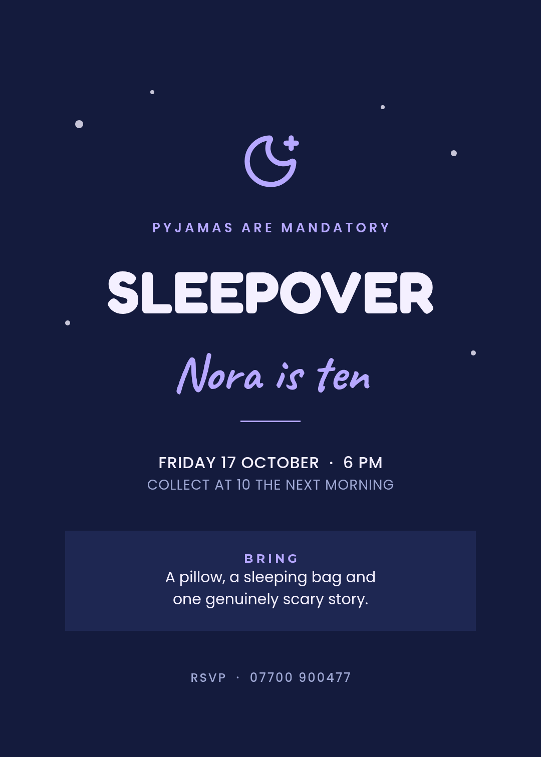
What defines it: a deep navy ground scattered with small pale dots, a rounded sans for the headline, a script for the name, and a boxed panel listing exactly what to bring.
Who it's for: the party my neighbour was actually throwing. Tweens, slumber parties, anything where parents need to know a collection time.
This is the design that fixed her problem, and the fix wasn't decorative. It was the panel: A pillow, a sleeping bag and one genuinely scary story, plus collect at 10 the next morning on the card itself. Every parent who reads it stops texting you to ask.
Design a 5x7 sleepover birthday invitation for a girl turning ten, deep navy background with small pale stars, a rounded sans headline reading SLEEPOVER, her name in a handwritten script, and a boxed panel listing what to bring plus a collection time
9. The Garden Tea Party

What defines it: linen and sage, a hairline rule top and bottom instead of a full frame, a classic display serif, and a small menu panel at the foot of the card.
Who it's for: 60ths, 70ths, afternoon parties, and any birthday where the food is the point.
Putting the menu on the invitation is underrated. Scones · cucumber · Victoria sponge tells guests whether they need to eat first, and the line about a rain plan — the conservatory — quietly answers the question every British guest is already asking.
Design a 5x7 garden tea party birthday invitation for a sixtieth, linen and sage green, a small flower mark, Afternoon Tea in a classic display serif, and a menu panel listing the food plus a rain plan
10. The Game Day
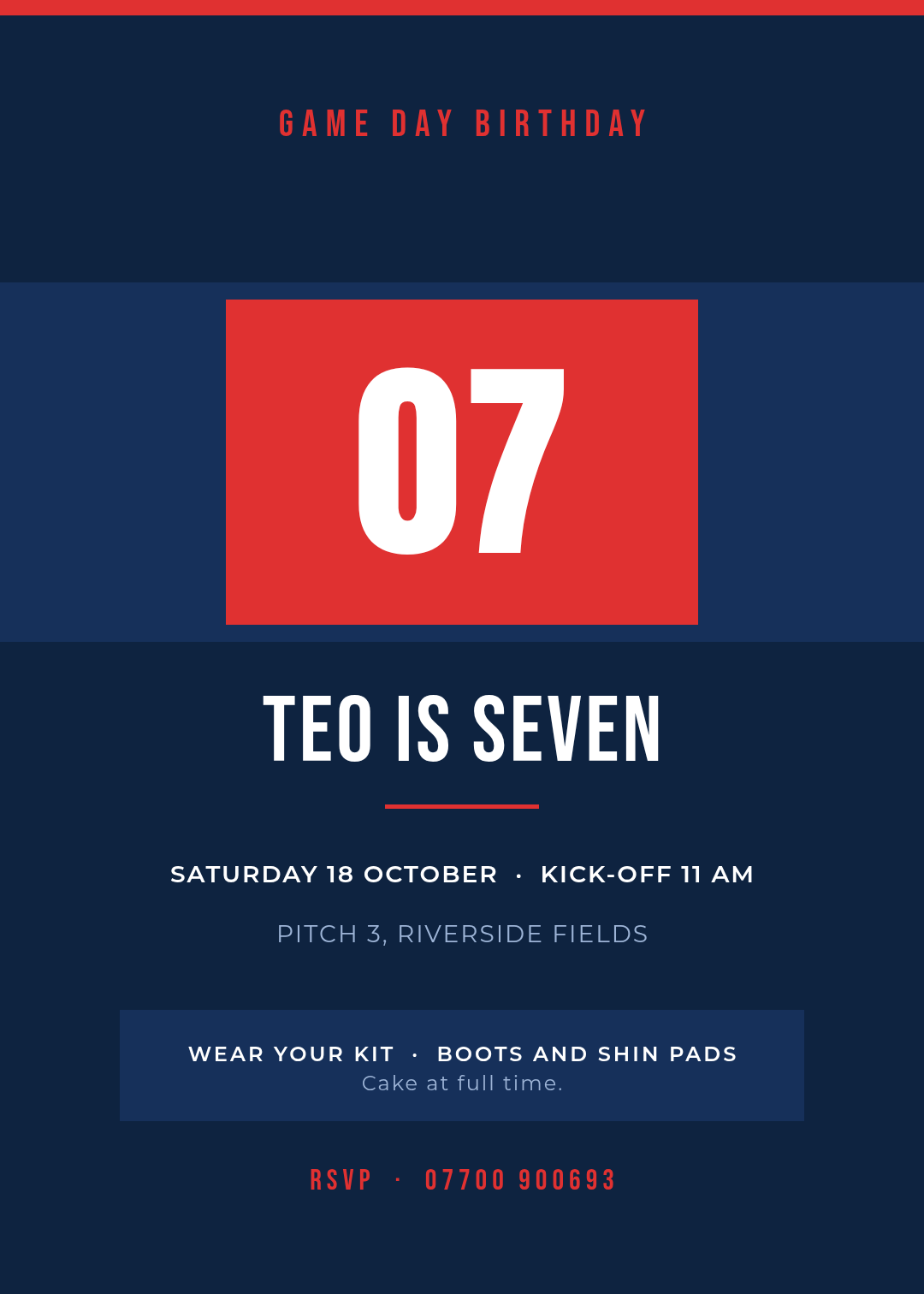
What defines it: team colours, a squad number set inside a solid block like a jersey, and a condensed all-caps face throughout. Structured like a fixture announcement rather than a party invite.
Who it's for: sporty kids, football-mad seven-year-olds, and any party that starts on a pitch and ends with cake.
The number is the design here — it's the age and the shirt number at once, which is why it earns 250px. Everything below it is logistics set in one clean sans: kick-off time, which pitch, boots and shin pads, cake at full time.
Design a 5x7 football game day birthday invitation, navy and red, the child's age as a squad number inside a solid jersey block, name and age in a condensed all-caps face, kick-off time and pitch below, wear your kit line at the bottom
Building one of these in Ridvay Studio
Every card above came out of a single prompt. Here's the one for the sleepover, which you can paste straight into Studio:
Design a 5x7 sleepover birthday invitation for a girl turning ten, deep navy background with small pale stars, a rounded sans headline reading SLEEPOVER, her name in a handwritten script, and a boxed panel listing what to bring plus a collection time
What comes back isn't a flat picture. It's an editable design — the headline, the script name, the star dots, the panel and every line of detail are separate layers you can select and change. That matters, because you're going to change all of them: the name, the date, the phone number.
Four edits that turn any of these into your invitation:
- Click the name and retype it. If your child's name is longer than the one in the template, drag the font size down until it fits on one line — a name that wraps loses the whole effect.
- Change the detail block, not the layout. Date, time, address and RSVP number live in one text layer each. Edit the text; leave the positions alone.
- Recolour to your theme. Select the accent shape — the panel, the jersey block, the stripes — and pick a new fill. On the milestone card, swap gold for silver and it becomes a different party.
- Rewrite the instruction line. This is the one people skip and shouldn't. Wear boots, we're getting muddy / No presents, bring noise / Collect at 10 — one specific sentence beats any amount of decoration.
If you'd rather work from a saved starting point, every design above has an edit link, and the template gallery has more layouts in the same format.
Open Studio with the sleepover invitation prompt →
If you'd rather start from the process than from a style, the step-by-step guide to making an event invitation with AI walks through the whole thing from blank prompt to finished card. And if the birthday in question is a wedding-adjacent affair, the ten wedding invitation styles gallery covers that vocabulary instead.
Printing it, or sending it
These are all composed at 5:7 — the standard invitation proportion — so they work three ways without being redesigned:
- Print at home or at a shop. Export at 5×7 inches and print on card at 300 DPI. If your export looks soft, the canvas was too small rather than the printer being bad; why your design prints blurry explains the DPI maths in one page.
- Send it in a message. Export a PNG and send it in the group chat. The 5:7 shape previews well in WhatsApp and Messenger without cropping the RSVP line off the bottom.
- Post it as a story. Resize to 1080×1920 and the layout re-flows rather than stretching, so the headline stays the headline.
One last thing worth saying plainly: the best invitation on this list isn't the prettiest one, it's the one that answers the most questions. Time, place, what to wear, what to bring, when to collect. Get those on the card and you'll spend the week before the party doing something other than replying to texts.