Top 10 Christmas Card Designs for 2026 (Free to Edit)

Every Christmas card gets the same two seconds. Out of the envelope, a glance, onto the shelf — where it stands next to a dozen others that all made the same three decisions: a photo, a script font, four names underneath.
The cards that survive that shelf aren't the busiest ones. They're the ones that picked one idea and committed to it. A card that is only a wreath. A card that is only type. A card that is only a photograph, printed big, with the words kept out of the way. Adding a second idea — a snowflake border on the photo card, a script headline on the typographic one — is what makes a Christmas card look homemade in the bad way.
So here are ten Christmas card designs for 2026, each one committed to a single idea, all built at 1080 × 1512 — the pixel size of a standard 5 × 7 flat card. Each has the prompt that made it and a link to open the real file and change it. None of them are flat images: every headline, panel, photo and colour is a layer you can click.
1. The Photo Card
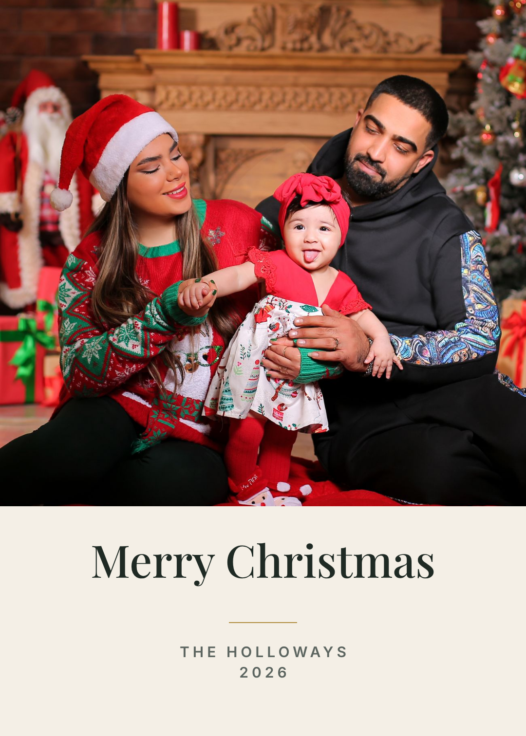
What defines it: one photograph, edge to edge, and the words kept underneath it — never on top. Who it's for: families who took one good picture this year and want it to be the whole card.
The mistake almost everyone makes here is putting "Merry Christmas" over the photo in white script. It's the reason so many photo cards look like stock imagery: the type fights the faces for the same space and both lose.
Give the photo the top two-thirds and give the words a clean band of their own at the bottom. The type can then be small and quiet, because it doesn't need to shout over anything. A short gold rule between the greeting and the names is the only decoration this card needs.
A 5x7 Christmas card, a full-bleed family photograph filling the top two thirds, a cream band below it with Merry Christmas centred in an elegant serif, a short gold rule, then the family surname and 2026 in small letterspaced caps
2. The Scandinavian Minimal
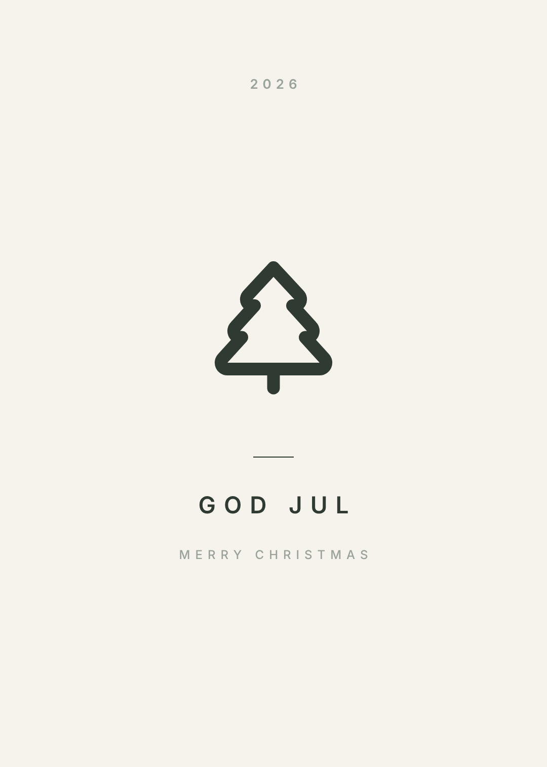
What defines it: one small mark, an enormous amount of empty paper, and type set tiny. Who it's for: anyone sending a hundred cards who wants every one to look expensive; brands with a restrained identity.
This is the hardest style to hold your nerve on. The finished card is about 90% blank, and the instinct at that point is to add something — a border, a second line, a snowflake in the corner. Don't. The emptiness is the design; it's what makes the little tree read as deliberate rather than as clip art.
The one rule: keep the mark small. Scale that fir up to fill the card and it stops being Scandinavian and becomes a poster of a tree.
A minimal 5x7 Christmas card on warm cream, a single small thin-line fir tree outline centred, generous empty space, GOD JUL in wide letterspaced dark green caps below it, MERRY CHRISTMAS in tiny grey caps underneath, 2026 in small caps at the top
3. The Vintage Botanical
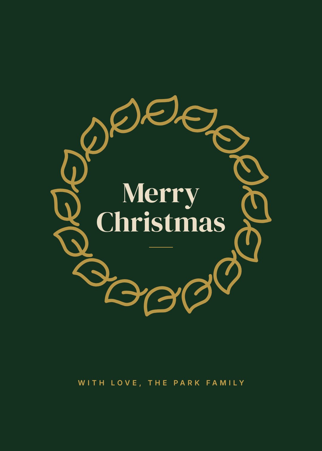
What defines it: a wreath of botanical line art in gold on a deep forest green, with the greeting inside the ring. Who it's for: traditionalists; anyone who wants the card to look like it came from a stationer rather than a printer.
A wreath works because it does two jobs at once: it decorates and it frames. The greeting sits in the middle with a ring of empty green around it, so it stays perfectly legible while being surrounded by ornament.
The thing to watch is weight. Fill those leaves in solid gold and the ring closes up into a heavy donut. Keep them as outlines with green showing between them and the wreath breathes — the difference between an antique engraving and a sticker.
A 5x7 Christmas card on deep forest green, a circular wreath of gold botanical leaf outlines, Merry Christmas centred inside the wreath on two lines in an ivory display serif, a short gold rule beneath it, and WITH LOVE THE PARK FAMILY in small gold letterspaced caps at the bottom
4. The Art Deco Gold
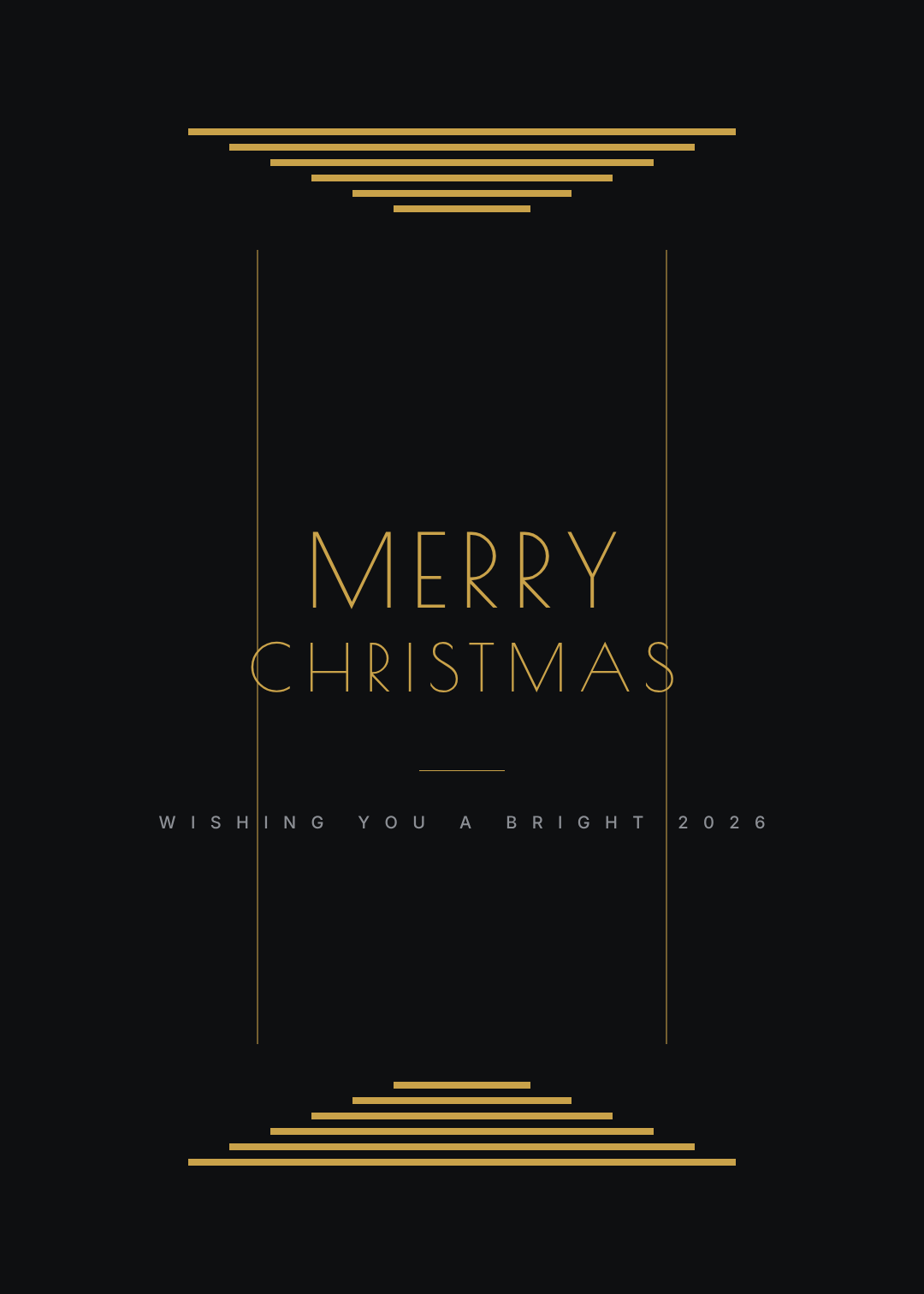
What defines it: stepped gold geometry, thin vertical rules, and a light, very widely tracked capital. Who it's for: hotels, restaurants, jewellers, anyone whose brand is already black-and-gold.
Deco is a grid, not a texture. Three stepped bars narrowing toward the centre say 1926 more clearly than any amount of swirling filigree, and they take about thirty seconds to build.
The other half of the look is the type. Deco capitals are thin and tracked out until the letters almost stop being a word. If you set this headline in a heavy font it collapses into an ordinary black-and-gold card — the delicacy is the whole point.
A 5x7 Christmas card on near black, stepped gold Art Deco bars narrowing toward the centre at the top and mirrored at the bottom, two thin vertical gold rules down the sides, MERRY CHRISTMAS centred in a thin geometric deco capital in gold with very wide letterspacing, and a small grey letterspaced line beneath
5. The Playful Classroom

What defines it: flat geometric shapes, three colours, and a rounded friendly typeface. Who it's for: teachers, nurseries, kids sending cards to a whole class, family businesses that want to feel warm rather than tasteful.
Children's design goes wrong on colour count, not on brightness. Green, red and white make a snowman. Add a yellow star, a blue sky and a purple scarf and you get a jumble that reads as cluttered even to a five-year-old.
Everything on this card is a circle or a rectangle — three white ellipses, two dots, a rotated orange rectangle for the nose, two red rectangles for the scarf. That's a real advantage when a class of thirty needs the same card with a different name on it: shapes never go wrong at print size.
A 5x7 Christmas card on a rich green background, a large friendly snowman built from three white circles wearing a red top hat and a red scarf with an orange carrot nose and black dot eyes and buttons, Merry Christmas! in a rounded bold white font at the bottom, and FROM MRS ADLER'S CLASS in small pale green caps
6. The Bold Type Card
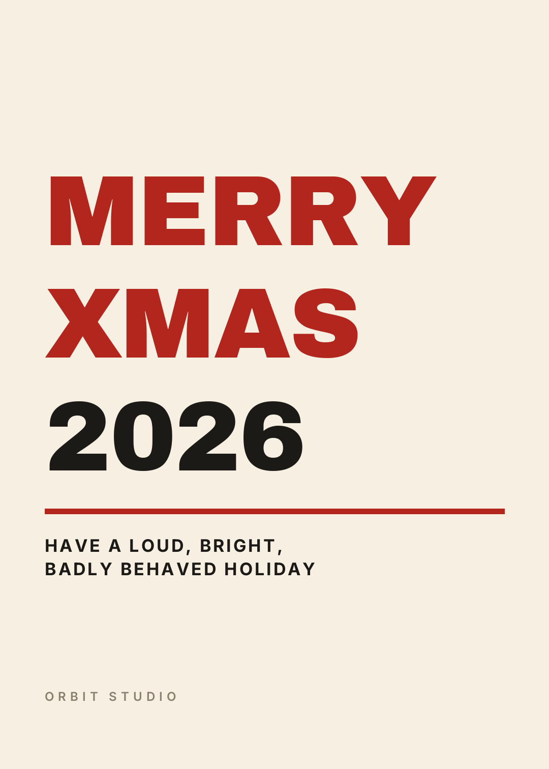
What defines it: the words are the artwork — no tree, no wreath, no photo. Who it's for: design studios, agencies, and everyone allergic to schmaltz.
This card works on the strength of one decision: the type runs edge to edge. Set it 60% of the width and it becomes a greeting with a lot of awkward space around it; set it flush to the margins and it becomes a poster.
Watch the last line. "MERRY" and "XMAS" are short enough to set enormous, but "CHRISTMAS" is nine characters and will either shrink to half the size of the others or wrap in the middle of a word. Pick words that are the same rough length when you're setting type this big — that's a real constraint, not a compromise.
A 5x7 Christmas card on cream, MERRY and XMAS in enormous heavy red block capitals filling the width, 2026 below them in the same size in near black, a thick red rule, then a two line message in small bold letterspaced caps and a studio name in muted grey at the bottom
7. The Mid-Century Retro
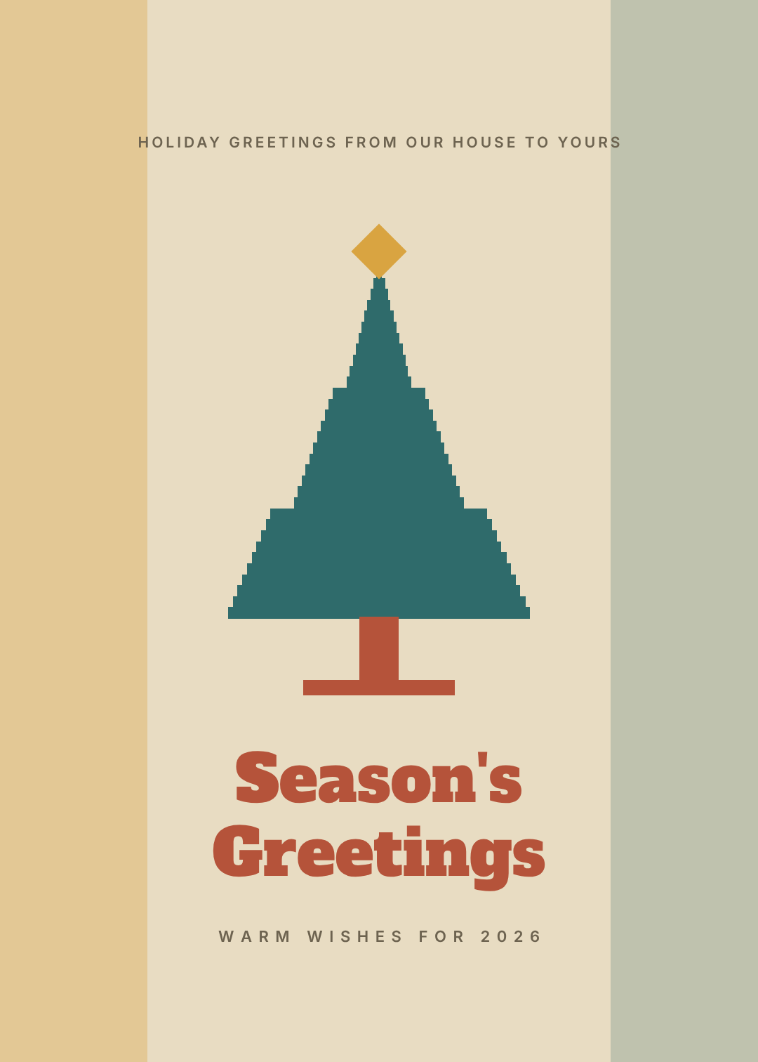
What defines it: a geometric tree built from steps, a mustard-teal-rust palette, and a chunky slab serif. Who it's for: record shops, coffee roasters, anyone whose whole aesthetic is 1962.
The mid-century look lives in the palette. Mustard, teal and rust on an oat background is instantly period — the same layout in green and red would read as a plain modern card.
The tree is built as a stack of narrowing bars rather than a smooth triangle, with a slight step in the silhouette a third of the way down and again two-thirds down. That's what turns a cone into a fir. And the star is just a square turned 45°; a real five-pointed star would be too fussy for this style.
A 5x7 Christmas card on warm oat, a geometric fir tree built from narrowing stepped bars in teal with a rust trunk and a mustard diamond star on top, soft mustard and sage colour blocks down the left and right edges, Season's Greetings on two lines in a rust slab serif, and a small letterspaced line beneath
8. The Editorial Photo Grid

What defines it: three photographs on a strict grid, thin hairline rules, and a large light serif. Who it's for: people who can't pick one photo; anyone whose year had more than one moment worth showing.
A grid is what stops three photos looking like a collage. One tall image on the left, two stacked on the right, the same gutter between all of them, and the right-hand pair adding up to exactly the height of the left one. Get those edges to line up and the card looks art-directed; miss by fifteen pixels and it looks like a scrapbook page.
Choose photos that agree with each other. Three warm indoor shots work. A bright beach photo next to two candlelit ones will fight no matter how well the grid is built.
A 5x7 Christmas card on white, three warm winter photographs in a strict grid with one tall image on the left and two stacked on the right, hairline rules above and below, the family name and 2026 in small caps at the top, Merry Christmas on two lines in a large light editorial serif below the photos
9. The Nordic Knit

What defines it: fair-isle knitting bands top and bottom, a cream panel floating in the middle. Who it's for: cabin people, knitwear and homeware brands, anyone whose Christmas is about being indoors.
The pattern is nothing but rotated squares — a row of large red diamonds, a row of small green ones, hairlines between them. Repeat that at the top and mirror it at the bottom and you have fair isle. The trick is to leave the middle completely alone.
If you extend the pattern behind the greeting, even at low opacity, the card turns muddy. A clean panel over a busy border is a more convincing knit than a pattern that runs the full height.
A 5x7 Christmas card on cream with bands of red and green fair-isle knitting pattern made of diamonds across the top and bottom, hairline rules between the bands, a clean cream panel floating in the middle with a red line across its top, God Jul in a large green serif with a small red ampersand and Merry Christmas below it, and a family line in small brown caps
10. The Letterpress Monogram
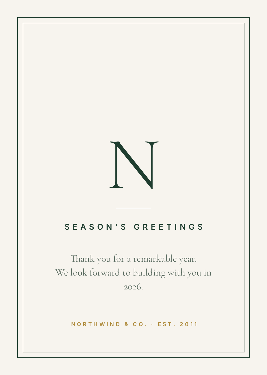
What defines it: a double hairline border, a single large monogram letter, and a short sentence of real writing. Who it's for: businesses — the card you send to clients when "Merry Christmas" would be too familiar and nothing at all would be rude.
A corporate holiday card fails when it tries to be festive. No tree, no snow, no red. A double hairline rule, the initial of the company set large in a light serif, and two lines that say something specific about the year — that's the whole job.
Write the message like a person. "Season's greetings from all of us at Northwind" says nothing; "Thank you for a remarkable year — we look forward to building with you in 2026" says you actually noticed. This is also the only card of the ten where the sender's name belongs at the bottom in small caps rather than as a signature.
A 5x7 corporate holiday card on off-white with a thin double hairline border in deep green, a single large letter N monogram in a light classical serif in the centre, a small gold rule, SEASON'S GREETINGS in letterspaced green caps, two lines of thank-you message in a serif, and the company name and EST 2011 in small gold caps at the bottom
Building one in Ridvay Studio
Take number 6, the bold type card — it's the fastest of the ten and the least forgiving, which makes it the best one to learn on. Open Ridvay Studio and type this:
A 5x7 Christmas card on cream, MERRY and XMAS in enormous heavy red block capitals filling the width, 2026 below them in the same size in near black, a thick red rule, then a two line message in small bold letterspaced caps and a studio name in muted grey at the bottom
What comes back isn't a picture of a card. It's a real file: the headline is a text layer with a font, a size and a letterspacing value; the rule is a rectangle with a fill; the cream is a background colour. Everything is clickable, and nothing has to be regenerated to be changed.
Four edits that turn the generated version into yours:
- Click the headline and drag the size up until the widest word almost touches the margins. This is the single change that makes the card look designed. Stop as soon as a word wraps — a headline that breaks mid-word reads as a mistake, not a style.
- Swap "2026" to your own line. Your surname works, your studio name works, "SEE YOU IN JANUARY" works. Keep it the same number of characters as the words above it if you can; that's what keeps the block square.
- Recolour the red once, at the top level. Change it to deep green, or to the exact red on your logo, and every element using it updates — that's the brand kit doing its job. Two colours plus the paper is the ceiling for this style.
- Rewrite the small caps at the bottom in your own voice. It's the only place on this card with room for a sentence, so don't waste it on "Season's Greetings".
Open this card in Studio and start editing →
Printing it, or sending it as a file
All ten are built at 1080 × 1512, which is a 5 × 7 card at a comfortable screen resolution. Two things to sort out before you send anything to a printer:
- Export at the print size, not the screen size. Studio will render the same design at 2× or 4× — a 5 × 7 at 300 DPI wants 1500 × 2100 pixels. Exporting the preview and hoping is the single most common reason a card comes back soft. There's more on that in why your design prints blurry.
- Check the colour before you order 200. Deep green and gold in particular shift on press. RGB vs CMYK covers what actually changes and what you can do about it.
If you're emailing the card instead, resize it to a square or a 4:5 and it'll sit properly in a feed or a message thread — the layers reflow rather than getting cropped. And if you're doing invitations for a party in the same week, the same approach applies there: ten invitation layouts built on the same principle of one idea per card.
Pick a style, then stop
The ten above are ten different answers to the same question, and none of them is better than the others — the botanical wreath and the bold type card are opposites and both work. What they have in common is restraint: one idea, two colours, and nothing added after the idea was already working.
The version that goes wrong is always the one where a second idea got bolted on at the end.