Top 10 Magazine Cover Designs for 2026 (All Editable)

A magazine cover has about two seconds and three jobs. It has to say what the magazine is called, sell exactly one story, and stack the rest without looking like a cluttered noticeboard. Get the order wrong and you get the thing every first-time cover looks like: a nice photo with six equally-sized lines of text floating on it.
I built ten covers in Ridvay Studio to show how differently that same problem gets solved. Every one below is a real generated design — you can open it, change the masthead to your own title, and export it. They're ordered roughly from loudest to quietest, and each one names who it's actually for, because a zine cover and a quarterly design journal want opposite things.
One rule runs through all ten: the masthead and the hero cover line are never the same size. If they are, the reader doesn't know whether they're looking at a brand or a headline.
1. Fashion masthead: the name is the design
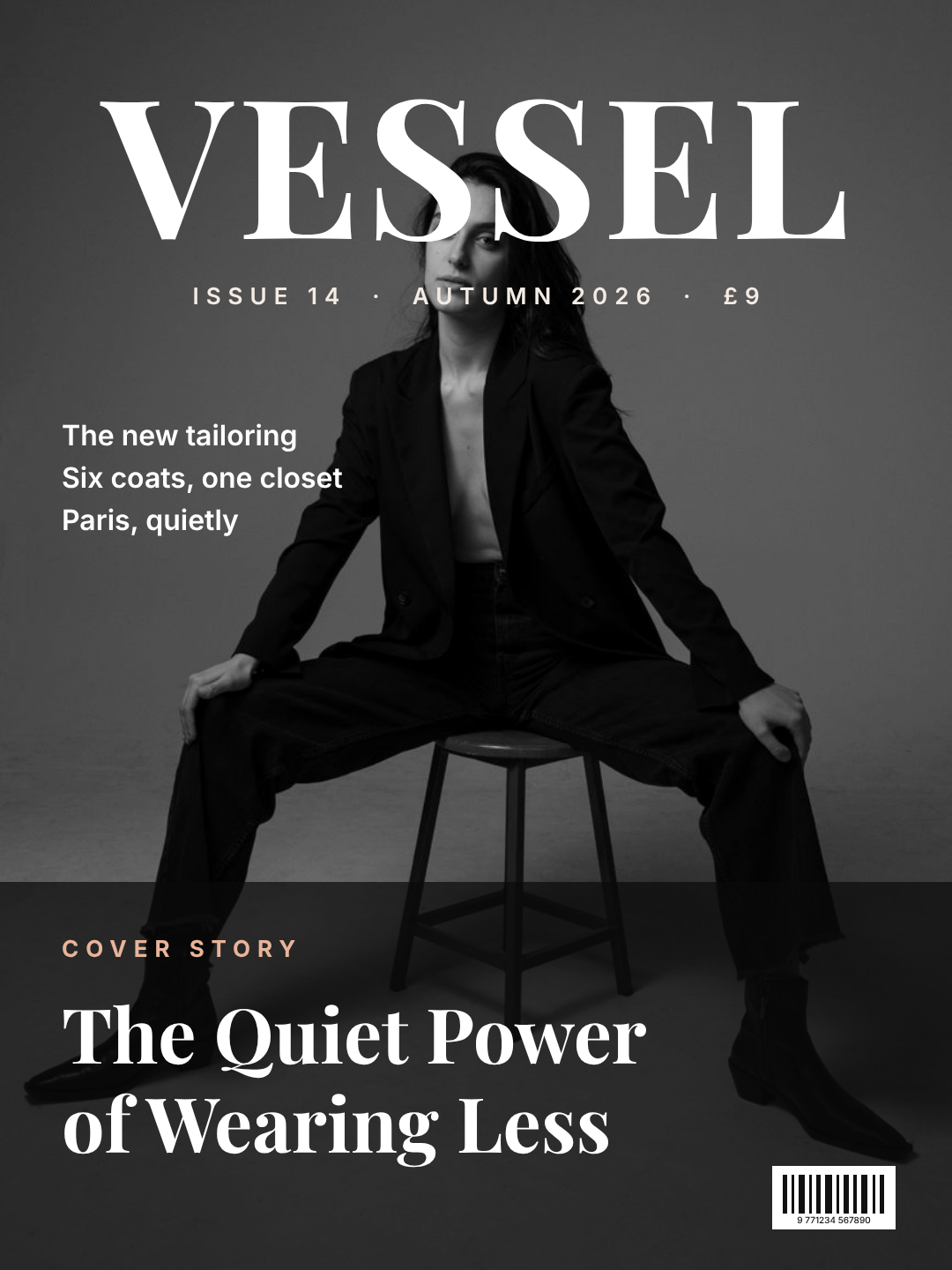
The masthead runs edge to edge in a high-contrast serif, the subject sits slightly in front of it, and there's exactly one hero cover line — at the bottom, on a dark scrim. Everything else is set small and left aligned. It's the most copied cover formula in the world because the name does the selling.
Who it's for: fashion, culture and portrait-led titles — anything where you shoot a person every issue.
A fashion magazine cover, portrait: the masthead VESSEL in a huge high-contrast serif across the top, a full-bleed studio portrait behind it, three small cover lines stacked top-left, one hero cover line bottom-left on a dark scrim, barcode bottom-right.
2. Swiss editorial: one colour field does the work
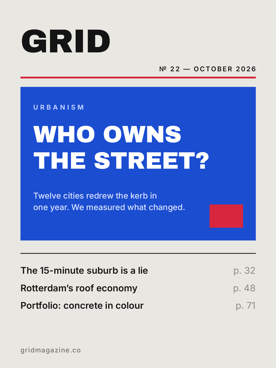
No photo. A single saturated block holds the hero story, a red rule separates masthead from content, and the remaining features run as a contents list with page numbers — which is a genuinely underused move, because it tells the reader the issue is thick.
Who it's for: urbanism, architecture, research and B2B titles. It also survives being printed on cheap stock better than any photo cover.
A Swiss-style magazine cover on off-white: masthead GRID in a heavy sans top-left, a thin red rule, a big blue colour field holding the headline WHO OWNS THE STREET?, and three contents lines with page numbers underneath.
3. All type: kill the photograph
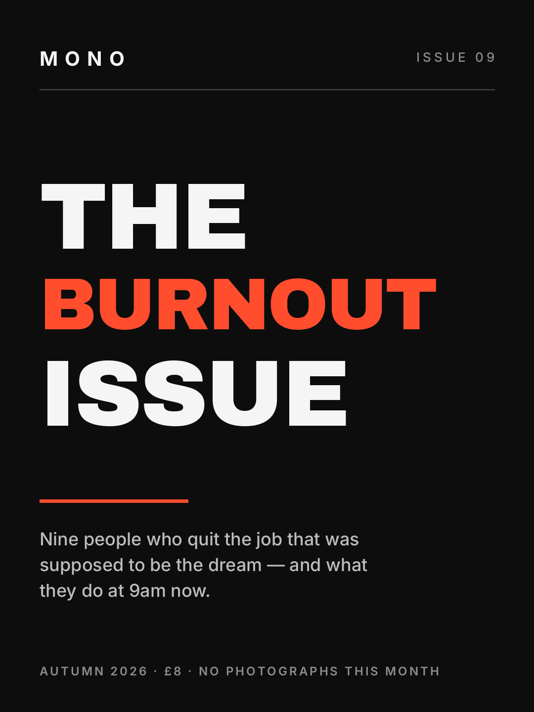
When the theme is the story, the picture gets in the way. Three words at 150–190px, one of them in the accent colour, and a standfirst doing the explaining. The small print at the bottom ("no photographs this month") is the kind of detail that makes a cover feel edited rather than assembled.
Who it's for: themed issues, essay collections, anything with a strong single argument.
An all-type magazine cover on near-black: small MONO masthead top-left, then THE BURNOUT ISSUE in enormous heavy sans filling the page with BURNOUT in orange, a short standfirst below, and issue details in small caps at the bottom.
4. Newsstand tabloid: loud, and organised about it
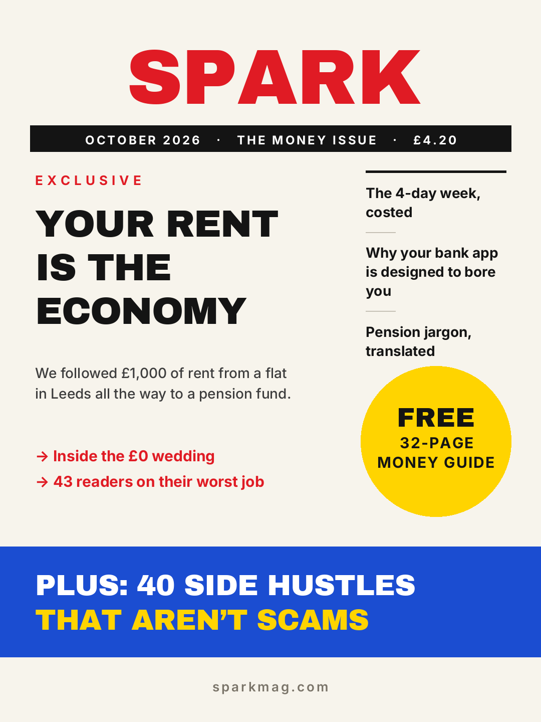
Eight cover lines, a yellow burst, a coloured band at the foot. Busy covers only work when the clutter is on a grid: hero story in the left column, secondary lines in a fixed right column, promo in the circle, and the "plus" band anchoring the bottom. Nothing floats.
Who it's for: consumer, money, health and celebrity titles — plus anything sold in a physical rack where you're competing with thirty other covers.
A busy newsstand magazine cover: SPARK masthead in red, a black issue strip, a three-line hero headline left, three short cover lines in a right column, a yellow circular burst reading FREE 32-PAGE MONEY GUIDE, and a blue band at the bottom.
5. Indie zine: rotate everything two degrees
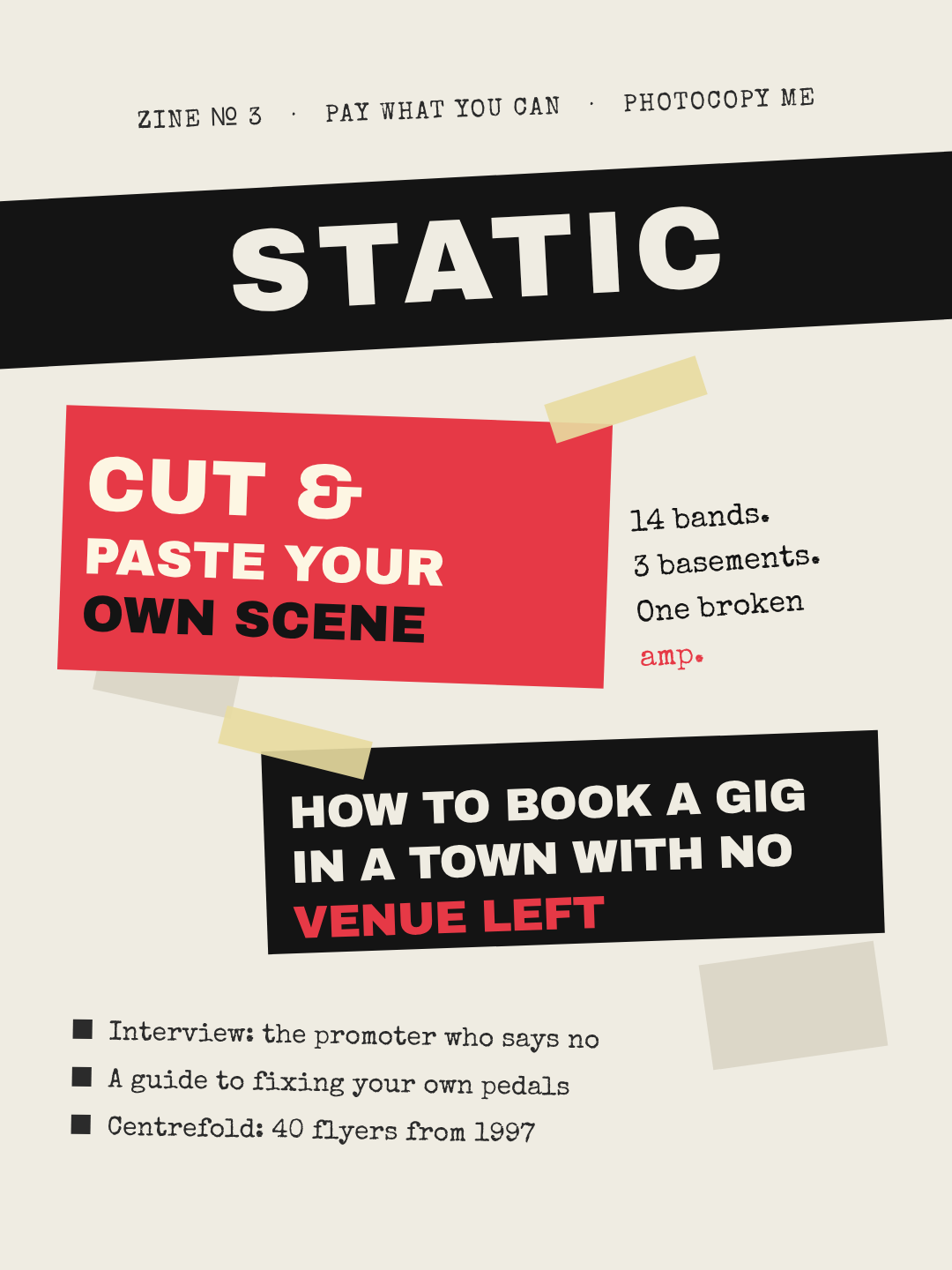
Cut-paper blocks at slight angles, masking-tape strips, a typewriter face for the small stuff. The trick is restraint on the rotation — nothing here is turned more than about three degrees except the tape. Ten degrees reads as a mistake; three reads as glued down by hand.
Who it's for: music scenes, fanzines, student publications, anything photocopied.
A cut-and-paste zine cover on paper stock: STATIC masthead reversed out of a black band rotated a few degrees, a red block with the headline CUT & PASTE YOUR OWN SCENE, typewriter-style notes beside it, masking tape strips, and three bullet cover lines at the bottom.
6. Tech dark: a grid you can see
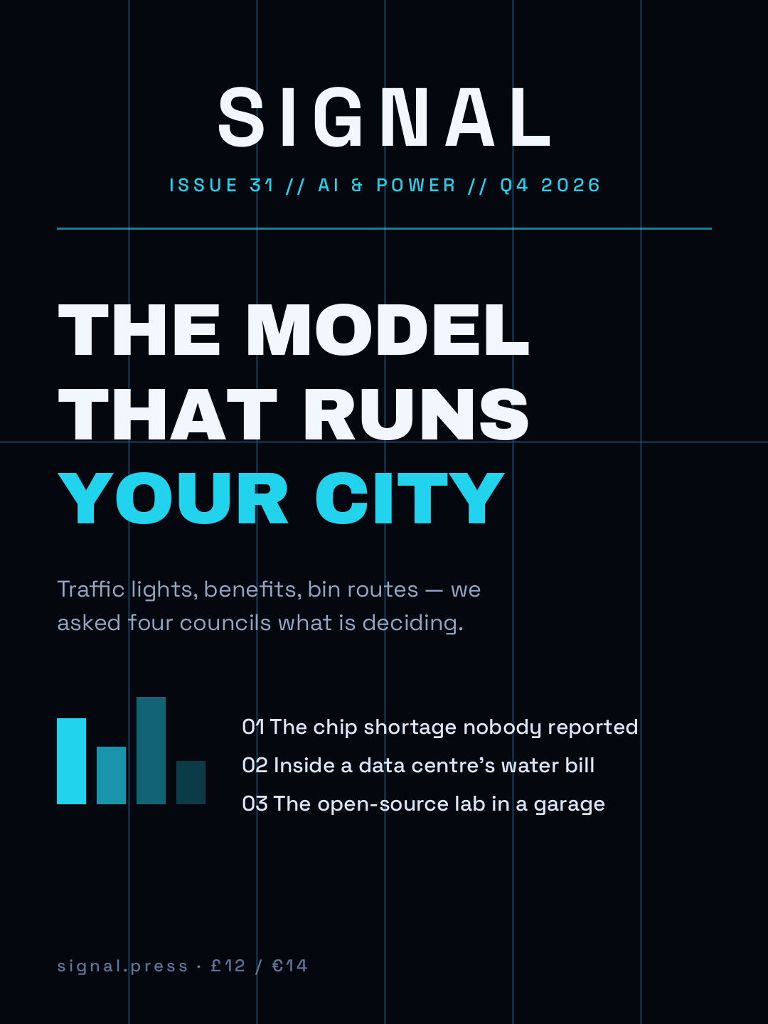
Near-black background, one cyan accent, and faint vertical rules left visible so the layout shows its own structure. The numbered cover lines and the little bar chart do what a photo would do on a consumer title: give the eye something to land on that isn't type.
Who it's for: technology, science and policy titles, plus internal reports that want to look like a publication.
A dark technology magazine cover: SIGNAL masthead in a geometric sans with wide letter spacing, a faint blue grid in the background, the headline THE MODEL THAT RUNS YOUR CITY with the last line in cyan, a small bar chart, and three numbered cover lines.
7. Minimal luxury: a window, not a full bleed
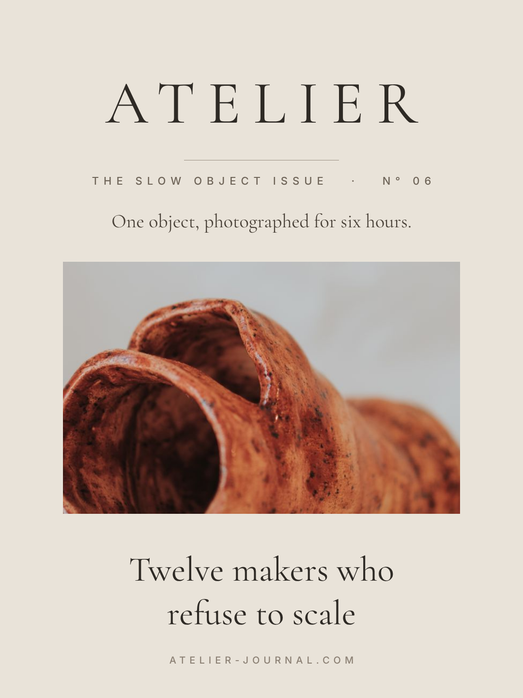
The photo is cropped to a rectangle in the middle of the page instead of filling it, the masthead is thin and widely letterspaced, and there are four text elements on the whole cover. All the expense here is in the empty space — which is also why it's the hardest one to leave alone.
Who it's for: craft, interiors, food and design journals; premium print runs.
A minimal luxury magazine cover on warm stone: ATELIER masthead in a thin serif with very wide letter spacing, a single small photo window of a ceramic vase in the middle of the page, one italic-feeling cover line below it, and nothing else.
8. Travel full bleed: let the landscape breathe
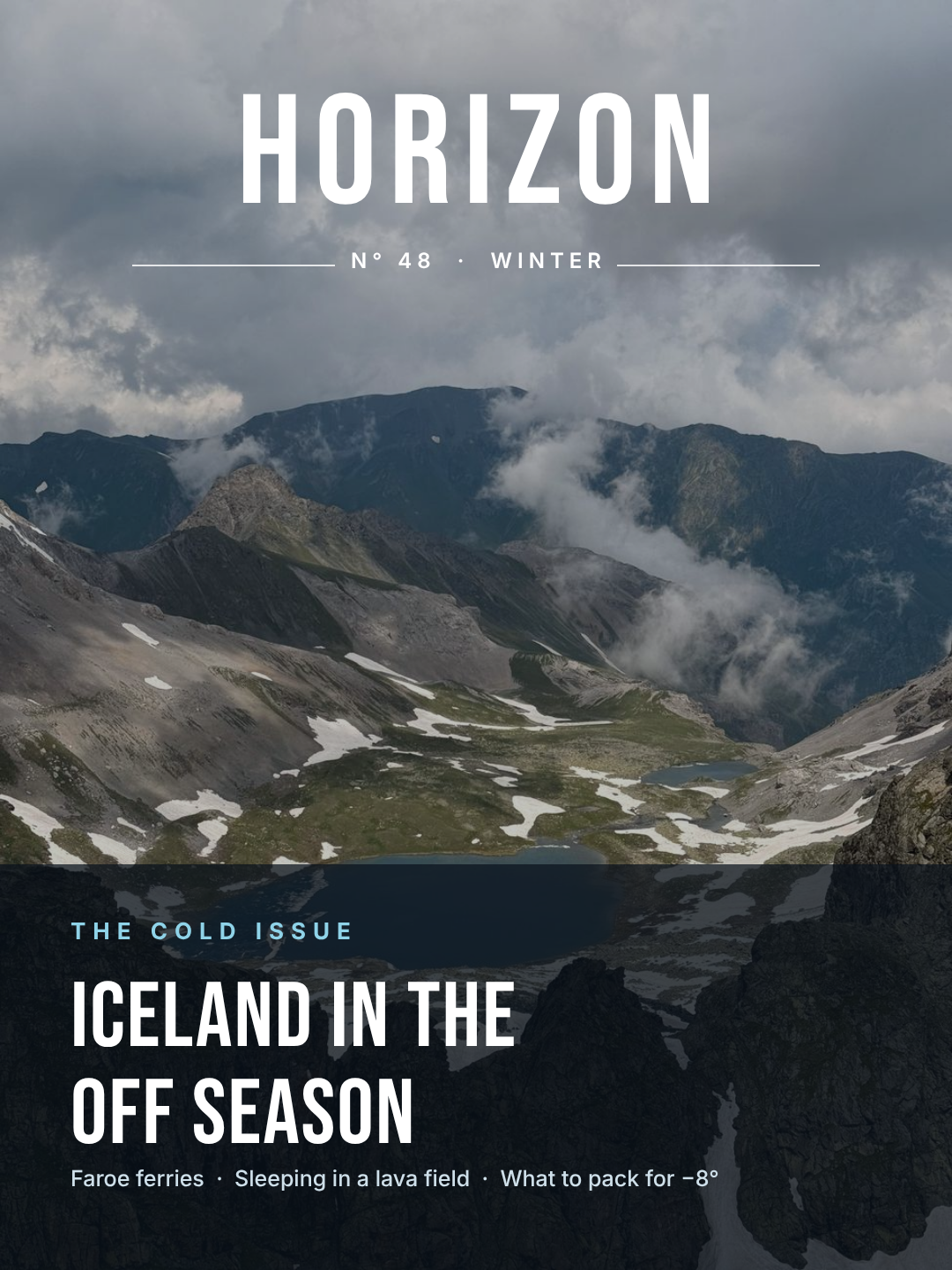
A full-bleed photograph, a condensed masthead in white, and everything else pushed into a scrim at the bottom third. The middle of the image is deliberately left empty — the whole point of a landscape cover is the landscape, and text across the horizon wastes what you paid the photographer for.
Who it's for: travel, outdoors, nature and property titles.
A travel magazine cover: HORIZON masthead in a tall condensed sans across the top of a full-bleed mountain landscape, a thin rule with the issue number, and a dark scrim across the bottom third holding the headline ICELAND IN THE OFF SEASON plus three short cover lines.
9. Retro seventies: one shape, one palette
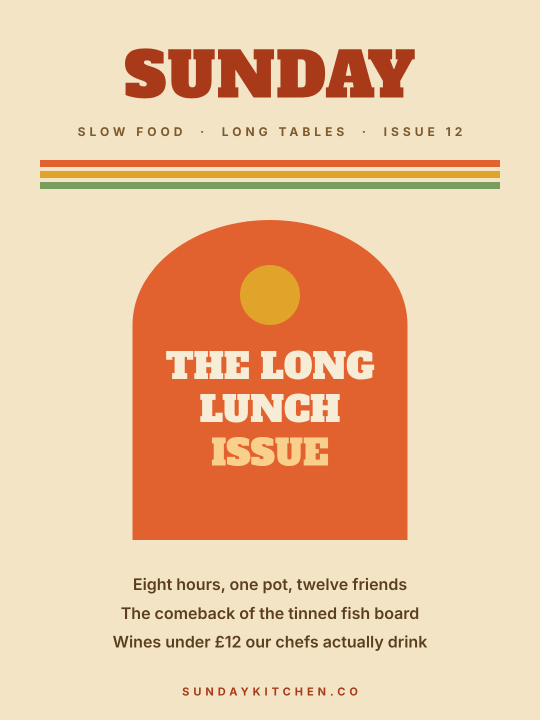
An arch — a rectangle with a half-ellipse on top — carries the hero line, three stripes in the period palette sit under the masthead, and a slab serif does the rest. Almost all seventies revival design is this: one big geometric shape, warm cream, and no more than four colours.
Who it's for: food, hospitality, wellness and lifestyle titles, and anything that wants to feel unserious in a good way.
A seventies-style magazine cover on cream: SUNDAY masthead in a heavy slab serif, three stripes in orange, mustard and avocado, a big orange arch shape in the middle holding THE LONG LUNCH ISSUE, and three cover lines centred underneath.
10. Brutalist numeral: the issue number is the image
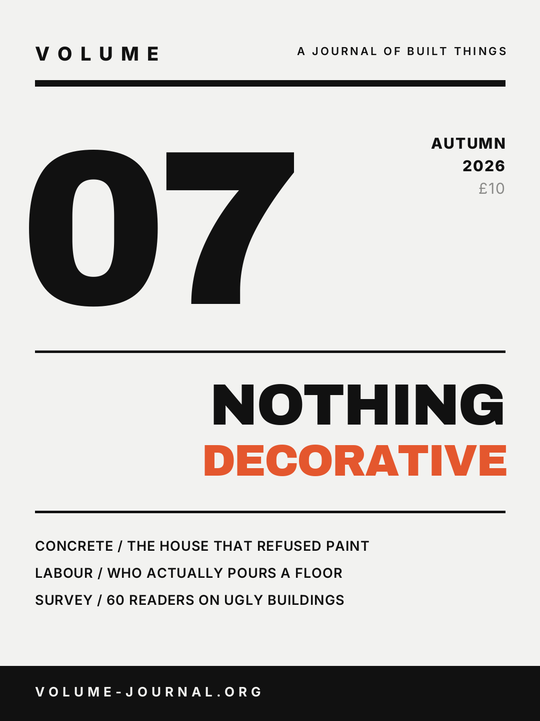
A 440px numeral, heavy rules top and bottom, and cover lines set as SECTION / HEADLINE in one weight. No photograph, no decoration, and the only colour is a single orange word. It's the cheapest cover in the list to produce and the most consistent across a year of issues — swap the number, keep everything else.
Who it's for: journals, annual reports, design studios' own publications, anything numbered rather than dated.
A brutalist magazine cover on off-white: VOLUME masthead in a wide letterspaced sans, a thick black rule, a giant black numeral 07, the headline NOTHING DECORATIVE right-aligned with the second word in orange, three cover lines in caps, and a black band at the bottom.
Building one in Ridvay Studio
Every cover above started as one sentence. Here's the one behind the first design, which you can paste straight in:
A fashion magazine cover, portrait: the masthead VESSEL in a huge high-contrast serif across the top, a full-bleed studio portrait behind it, three small cover lines stacked top-left, one hero cover line bottom-left on a dark scrim, barcode bottom-right.
What comes back isn't a flat picture. It's an editable design — the masthead, each cover line, the scrim, the photo and the barcode bars are all separate layers you can select and change. Three edits get you from the example to your own title:
- Click the masthead and type your own name, then drag the size up until it nearly touches both margins. A masthead that stops short of the edges is the single clearest tell of an amateur cover. If your title is long, it goes down in size and up in letter spacing — not onto two lines.
- Swap the photo. Select the background and describe what you want instead, or drop in your own shoot. If the new image is busy behind the hero line, drag the scrim rectangle taller rather than fighting the photo — same fix covered in how to put readable text over a photo.
- Recolour the kicker and keep one accent. Every cover in this list uses exactly one accent colour. Click the "COVER STORY" line, set your brand colour, and use that same value on nothing more than two elements.
If you have a brand kit saved, apply it and the fonts and palette drop onto all of the above at once — useful when you're producing a cover every month and want issue 12 to look related to issue 1. For the type pairings themselves, font pairing for non-designers covers the serif-plus-sans combinations most of these covers use.
Make your magazine cover in Studio →
Printing it, or posting it
These are built at 1080×1440, which is the 3:4 proportion most magazines print at — close enough to 8×10.75in that you can export at 2× or 3× scale and send it to a printer without re-laying anything out. Export as PNG for digital, and give the printer a file at 300 DPI; if the words "300 DPI" are why your last cover came back soft, why your design prints blurry is the short version.
For a digital-only issue, one more thing worth doing: after you've exported the cover, resize it once for a feed post and once for a story so the announcement matches the issue. That's a per-platform resize rather than ten separate designs.
And if you're designing a cover for something that isn't a magazine, the sibling galleries are book covers and podcast cover art — same three-job problem, different rectangle.
All ten covers above are free to open, edit and export. Take the one closest to what you're making and change the name first.